4.5 Developing Accessible Buttons
Buttons in Universal Theme offer great display flexibility while supporting accessibility.
Label
The label is crucial for button accessibility. Assistive technologies such as screen readers announce the button label, and users with speech recognition software can speak the name of the label to activate the button. Ensure your button labels are clear, unique, and meaningful.
Button Template
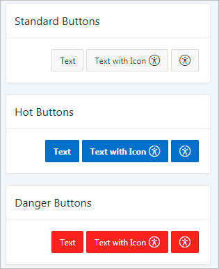
- Icon
- Text
- Text with Icon
Template Options
Be aware that in the Template Options dialog, the Type option changes the button design in ways that can affect accessibility. For example, the Danger type colors the button background red and the foreground text white. Conveying information by color alone is an accessibility issue, so only use the Type template options with this potential problem in mind. For example, the Danger type can still be accessible if the button text clearly indicates the purpose of the button (as opposed to only an exclamation point).
Tip:
You can review and update all item in an app with the Grid Edit of all Button Labels page. You should review all labels for accuracy and meaning, especially items with the same label on the same page.
See Also:
Accessing Page Specific Utilities in Oracle APEX App Builder User’s Guide
Parent topic: Developing Accessible Apps
