8.5.1 Example Cards Page
View an example cards page.
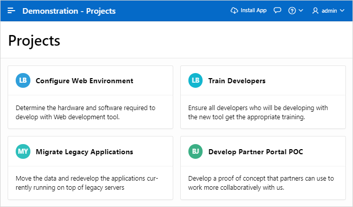
Both the Create Application Wizard and Create Page Wizard support the creation of cards pages. First, you select a table or view or provide a SQL query on which to build the page. Then, you specify the general page layout, for example, Grid, Float, or Horizontal (Row). Finally, you specify the Title Column, Body Column, and optionally Icon Initials Column.
The
following is an example of a cards page built on the
EBA_PROJECTS table.

Description of the illustration cards.png
- Title - Maps to the
NAMEcolumn. - Icon - Maps to the
PROJECT_LEADcolumn. - Body - Maps to the
DESCRIPTIONcolumn.
Key features of cards pages include:
- Customize every aspect of a cards region's UI (including layout, appearance, icon, badge, and media).
- Declaratively create links from a cards page by adding actions. Action types include Button, Full Card, Title, Subtitle, or Media.
- Supports advanced HTML expressions including template directives for client-side conditional formatting.
Tip:
To view an example, install the sample app, Sample Cards. To learn more, see Installing Apps from the Gallery.
Parent topic: Managing Cards