Stretching Vertically Using CSS
In Cascading Style Sheets (CSS), the viewport is the visible browser area. One vertical stretching strategy sizes a component to the remaining vertical space after accounting for other page elements.
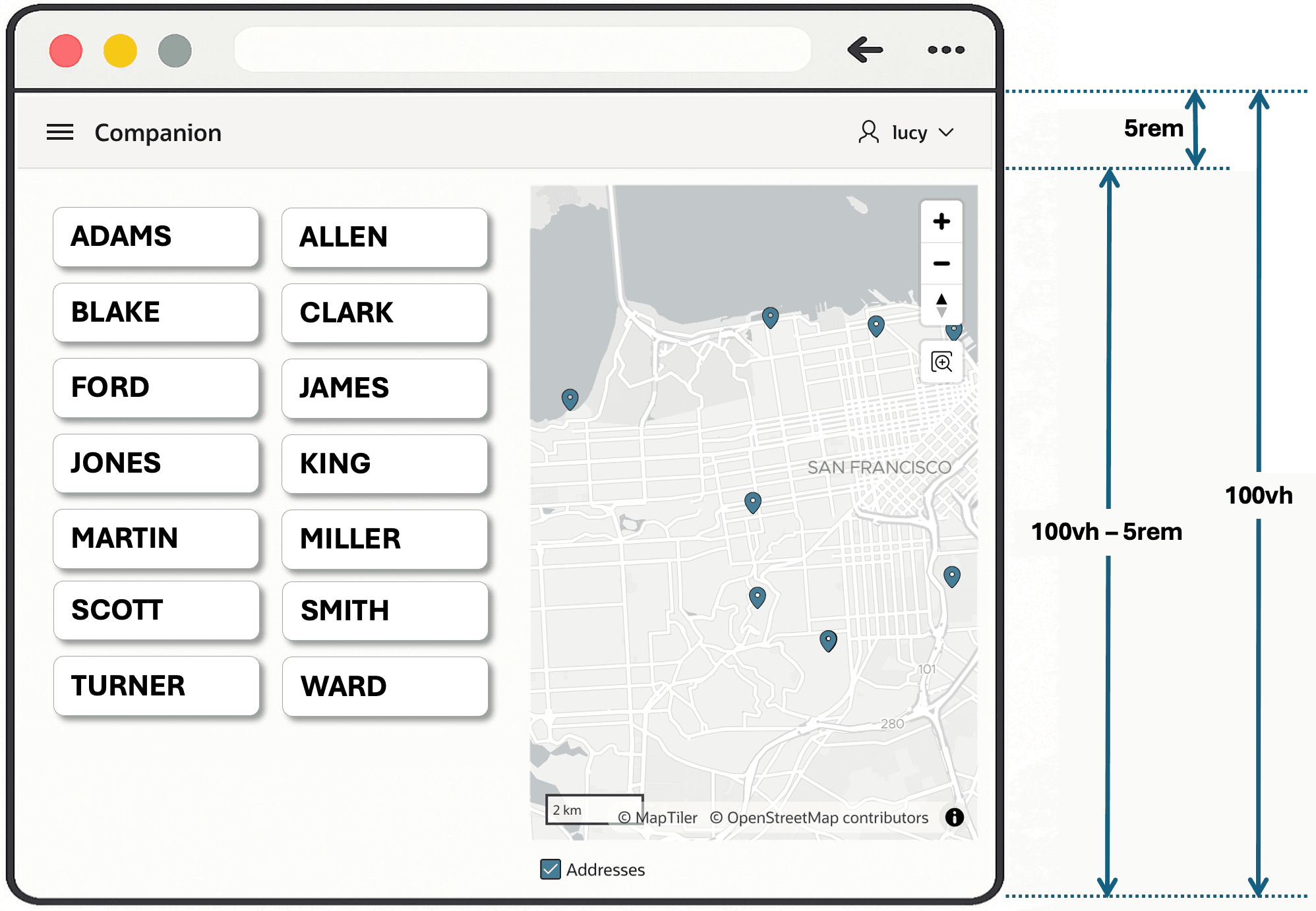
As shown below, the CSS expression 100vh represents 100% of the viewport height. One rem unit is the height of a character in the current page’s root font. It’s a relative unit so it works correctly even when the user zooms or shrinks the font size at runtime. For example, you might estimate the height of the navigation bar to be about five (5) lines of text in the root font size (5rem). So the expression below represents the vertical height remaining after accounting for the fixed navigation bar.
100vh - 5remThe figure illustrates the height of the viewport, the height of the navigation bar, and the difference between the two representing the remaining vertical space.