Appearance
The Appearance panel appears as shown:
Figure: Appearance
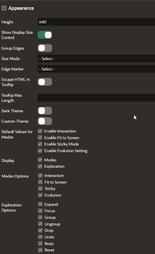
Description of the illustration apex_appearance_panel.png
The following table describes the attributes in the Appearance panel:
Table: Appearance Attributes
| Attribute | Description |
|---|---|
| Height | An integer value (in px) to set the size of the graph visualization panel. Default value is 400 px. |
| Show Display Size Control | This toggle determines if the display size control feature needs to be displayed at the bottom of the graph visualization. It is switched ON by default. If this toggle is switched OFF, then the display size control feature is not displayed in the graph visualization panel. |
| Group Edges | When this option is enabled, multiple edges between the same source and target vertex will be grouped together in the graph. The grouped edges will be shown as a single edge with a number on it, indicating how many edges have been grouped. |
| Size Mode | Two size modes are supported:
|
| Edge Marker | Supported edge markers are:
|
| Escape HTML in Tooltip | Switch on this toggle if you wish to escapes HTML content used on vertex or edge tooltip. |
| Tooltip Max Length | An integer value that determines the maximum length of characters for the tooltip. Default value is 100. |
| Dark Theme | Enable this toggle to switch to a dark theme. |
| Custom Theme | Enable this toggle if you wish to configure a custom theme for the following:
|
| Default Values for Modes | Specifies the default state of mode for the following options:
|
| Display | You can enable or disable the Modes and Exploration options. Supported Modes Options are:
Supported Exploration Options are:
|