4 Creating OGL Content
Creating a Guide
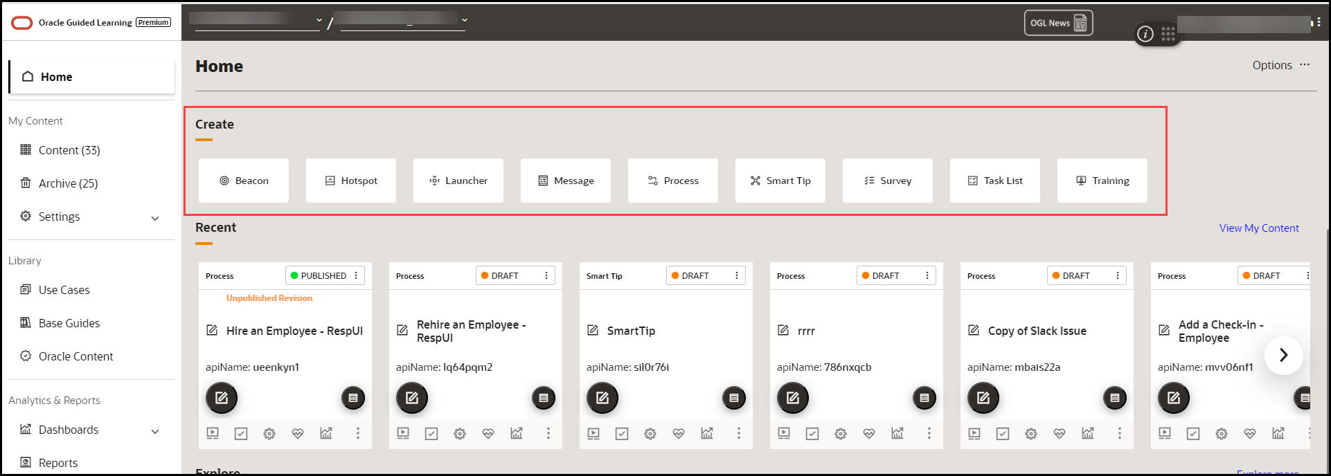
Creating a guide on OGL is a seamless process, thanks to its intuitive homepage interface that showcases the entire range of content types that can be created.
To create a Guide:
- On the homepage, under the Create section, select the Guide type you want to create.
- Alternatively, select Content on the homepage and then the
Create(
 ) button.

The content editor opens in a modal tab. The editor appears as an overlay on your application.
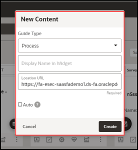
- Choose the Guide Type you want to create.
- Enter the desired name in the Display Name in Widget field.
Note:
The following characters are not allowed: / \ | : " < > ? - Enter the Location URL.
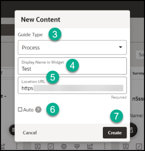
- Select Create.
The OGL launches the editor now.

The OGL Editor launches in a new tab, where you can start capturing the steps for the guide.
Note:
The editor appears as an overlay on your application.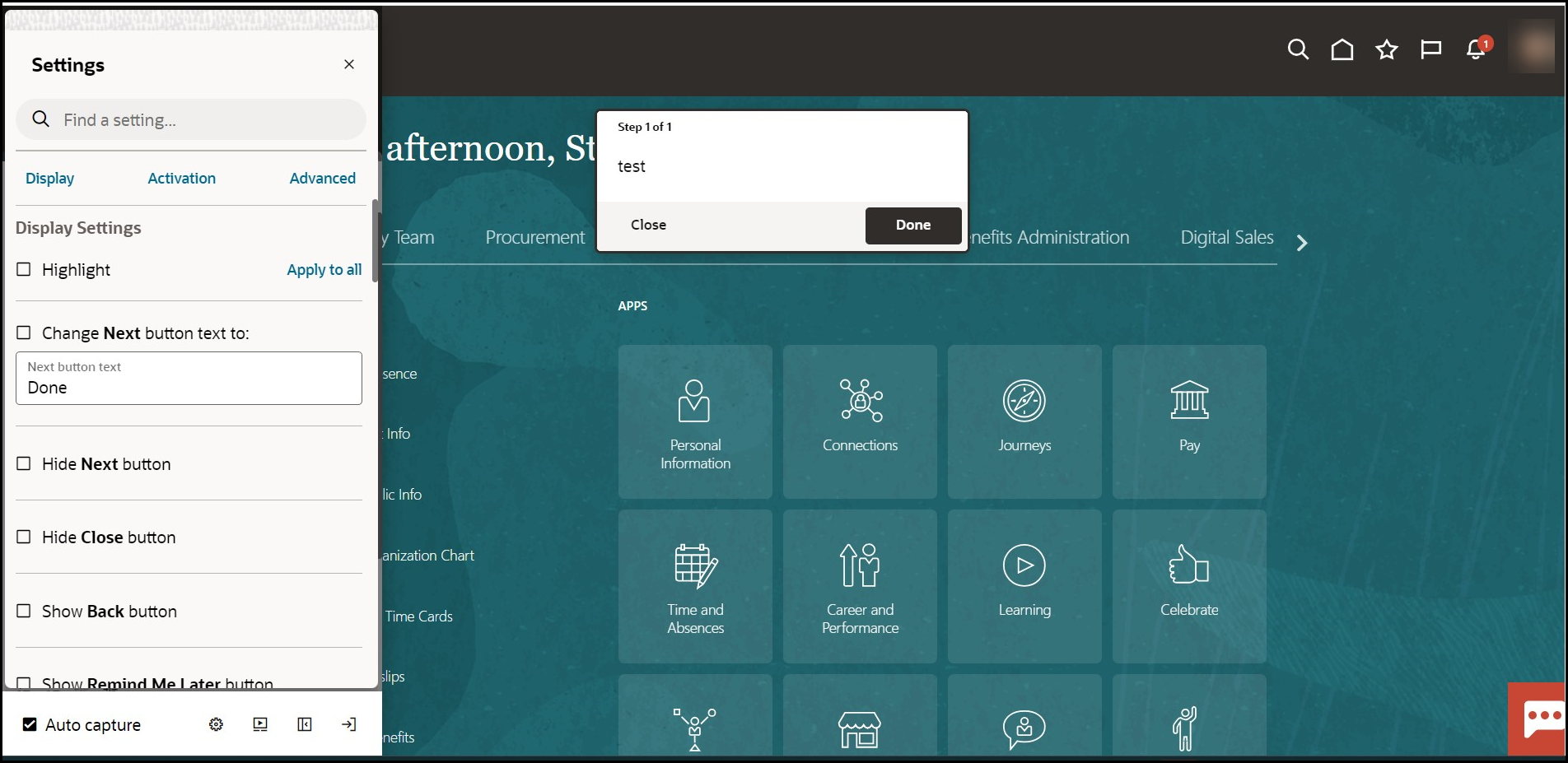
To create your first step, go to Adding the First Step to a Guide.
Adding the First Step to a Process Guide
After you create a process guide, the OGL Editor appears over the URL you entered. You are prompted to select an element or to create a Splash step:
- Select Add a Step to capture the screen element for your first
step.

- Place the cursor on the element which you want it to be the first step
and then select the Select icon.
 ).
).
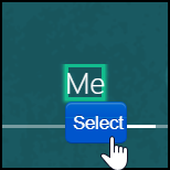
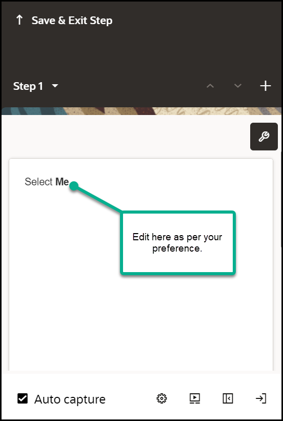
The OGL now fills the step command automatically and displays a real-time preview of the guide.
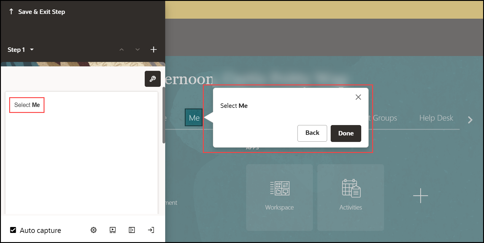
You can modify the automatically generated step commands according to your preferences.
- Select the Step Settings icon (
 ).
).
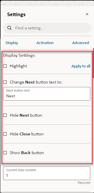
The Step Settings now appears below the editor.
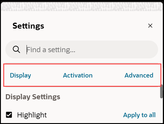
- Edit the Display Settings as per your preferences.
Learn more about Display Settings.

Proceed to add an Interactive Step.
Adding an Interactive Step
Interactive steps include clicking or selecting an element within the application.
To add an Interactive Step:
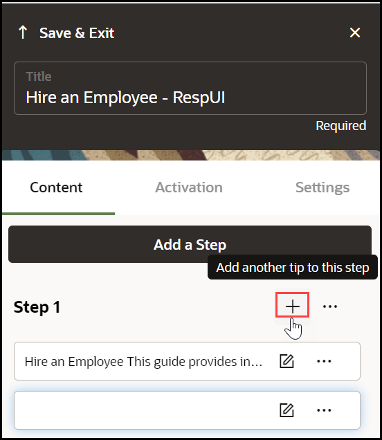
- Select the Step where you want to add the additional step.
The Add Step option appears, which lets you create additional steps.
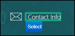
- Select the next UI element.
- Edit the step commands (Optional).
- Open the Step Settings.
- Edit the Display Settings:
- Clear the Highlight check box.
- Select the Hide Next check box.
- Clear Show back button if needed.
- Choose a different Tip-placement.
- When finished, select Save & Close.
Selecting Targets
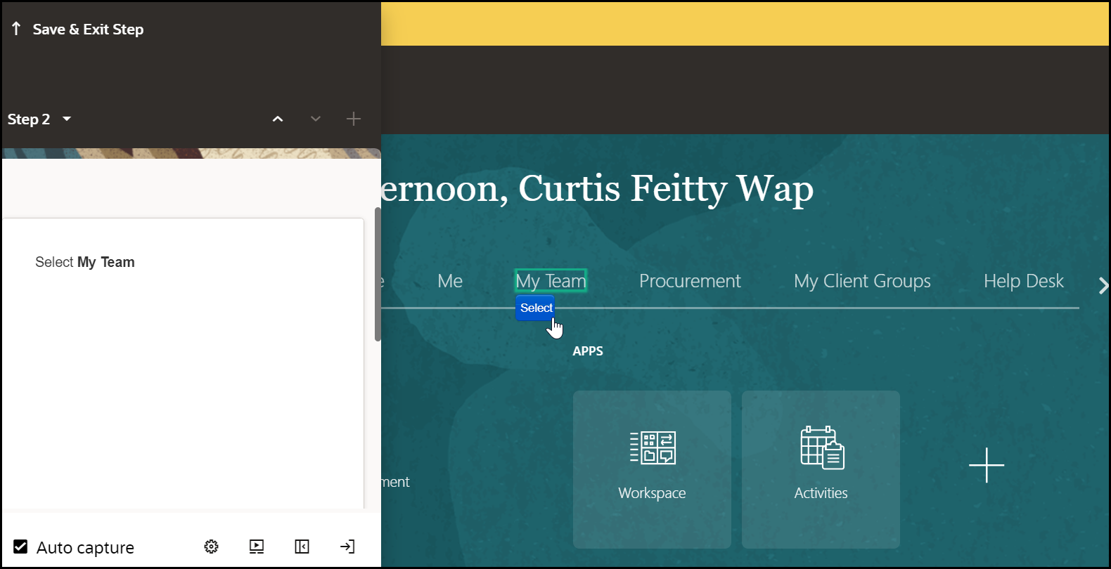
Targets are HTML elements within a page to which guides can be anchored and can allow users to interact with, such as selecting or hovering over. Selecting target elements is a combination of art and science. Using the OGL Editor, you can select most targets by hovering over elements and either right-clicking (Control+click for Mac) or choosing the Select button.
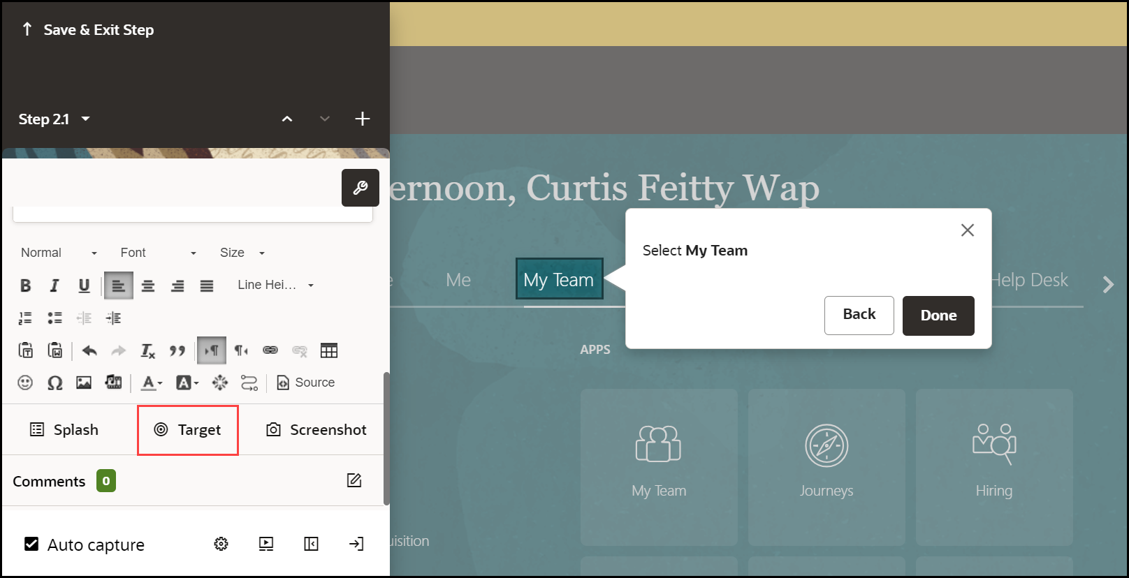
You can select a target at any time by selecting Target.
Viewing Selected Targets
You can view the target selector to troubleshoot or see how OGL selected the target.
To update the selector:
- Select Change Tip Target.
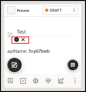
- On the selector dialog, select the Edit icon.
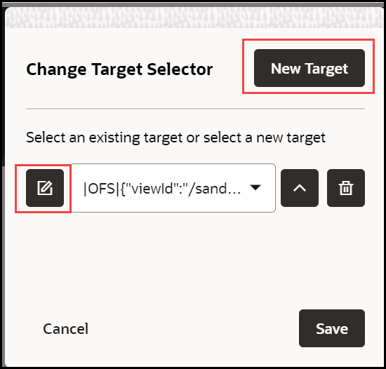
- Update the selector.
- Select the check mark to save the new target.

Selectors
OGL supports a variety of jQuery and CSS selectors.
Examples:
- [id$="HRD_CAREERDEV_MANAGER::icon"]
- [id*="HRD_CAREERDEV_MANAGER::icon"]
- span:contains('Career Statement')
- label:contains('Goal Name')
- src:contains(‘qual_personstar_32.png’)
- button:contains("OK"):first
Editing Guide Content
OGL provides a basic editor called the Content Editor and an advanced editor called the Full Editor. The Content Editor is used primarily for basic editing and formatting, while the Full Editor allows for more advanced editing and configuration of guides, including Display, Activation, and Advanced Settings. You can do most of your work in the Content Editor, but you will need to open the Full Editor from time to time to apply more advanced settings. The underlying content is created in HTML, which you can also access through the Full Editor.
With the Content Editor, you can:

- Apply Bold, Italics, or Underlines to the text.
- Create a bulleted list.
- Change text color.
- Add hyperlinks.
- Insert a variable.
- Add a title as an H1 paragraph.
- Add a link to another guide.
To add Bold, Italics, or Underlines:

- Select desired text.
- In the editor, select the Bold, Italics, or Underline icon.
To add a bulleted list:

- Select desired lines.
- In the editor, select the Bulleted List icon.
To add a numbered list:

- Select desired lines.
- In the editor, select the Numbered List icon.
To change the color of the text:
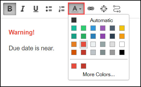
- Select desired lines.
- In the editor, select the Text Color icon.
- Choose the desired color.
Hyperlink in a Step:
To add a hyperlink to step text within a guide:
- Select the tip and enter the descriptive text.
- Select the text that you want to turn into a hyperlink.
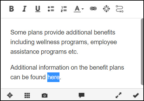
- Select the Hyperlink icon.

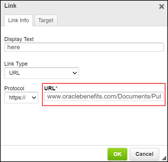
The Hyperlink modal window is displayed.
- Enter or paste your hyperlink and select OK.
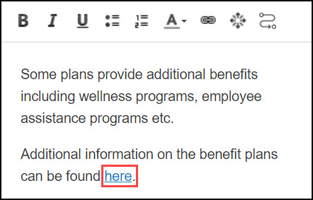
The selected text is now turned into a hyperlink.
Embed Media:
Your guide can include a picture, video, audio, or other multimedia content.
To embed media:
- From the tip editor, open the full editor.
- Select the Embed Media from External Sites icon.
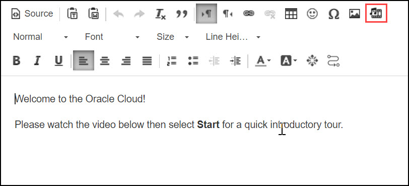
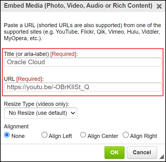
The Embed Media modal window is displayed.
- Enter the Title of the media.
- Enter the URL of the media.
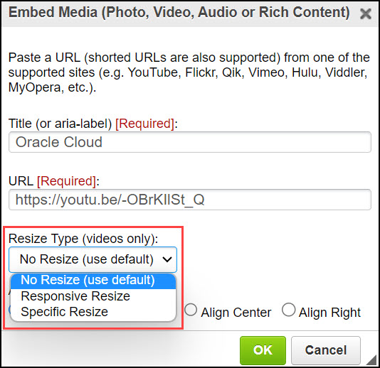
- Resize the media if required. (Only valid for videos.)
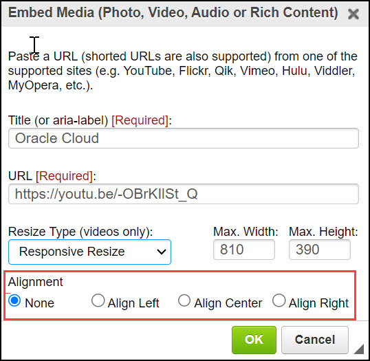
- Select the desired Alignment option.
- Select OK.
To add Session Variable Properties:
- On the desired step, select Iridize Session Variables
icon.

The Session Variables modal window is displayed.
- Enter the Variable Name and Variable Value.
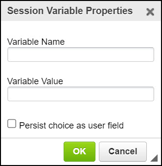
- Select OK.
Launch a Guide:
With the Launch a Guide feature, you can now easily include a link to a relevant guide within your guide. With this feature, users can easily find and access the related guide they are looking for.
To insert the link to another guide:
- Go to the desired guide.
- Select the desired step.
- Select the Launch a Guide icon.

The Launch a Guide modal window is displayed.
- Enter the display text.
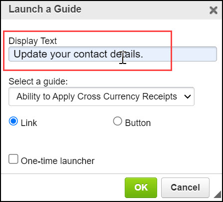
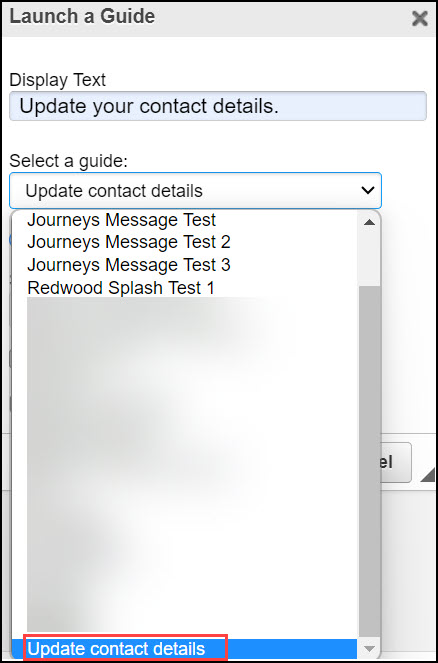
- Select the existing guide from the dropdown to link it with the
current guide.
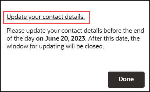
- Select the desired display option (Link or Button).
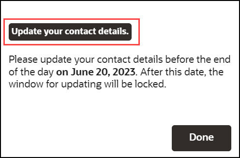
Link view:
Button view:
- Choose the starting step to be shown in the guide.
- Check the option "Keep this guide running" to keep the main guide running, even when the new guide is launched.
- Check the option "One-time launcher" to restrict the guide to launch only once.
- Select OK to save.
With the OGL Editor, you can:
Add a Splash Tip:
Splash steps are also known as modal or lightbox steps. They are non-interactive informational steps that draw attention by graying out the background and focusing the user on the step itself. Splash steps are common at the beginning and end of a flow to describe the objective of the flow and summarize what the user learned.
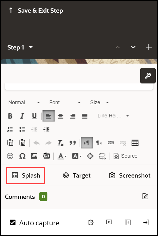
The tip's background appears greyed out because of the activated splash tip feature.
When you create a new tip, select Add Splash. However, change the target to just “body” if you need to update an existing tip.
Change the tip target to the body:
- Select Change Tip Target.
- On the selector dialog, select the Edit icon.

- Update the selector
- Click Save to save the new target.

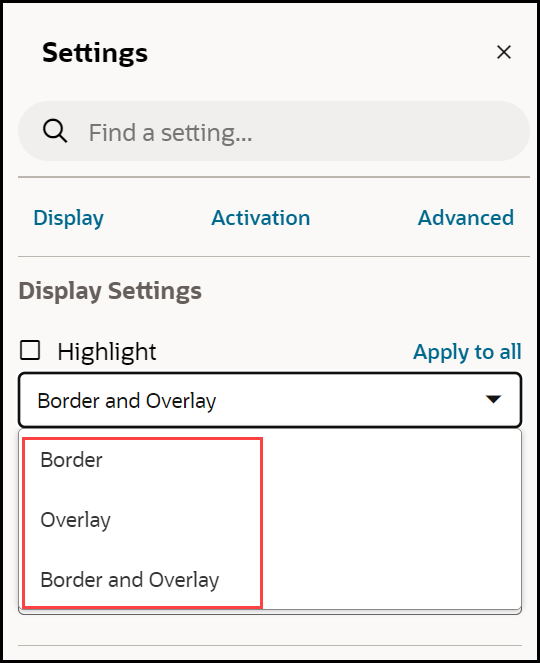
- Close the selector dialog, and then select Display Settings.
- Change the Highlight option to Border and Overlay or
just Overlay.
Adjust Tip Size:
Follow the tip sizing guidelines when adjusting the tip size.
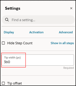
- Open the step Display Settings.
- Select the tip size (default value: 280px), and then enter your
new size.
- Press Enter.
Creating Optional Steps:
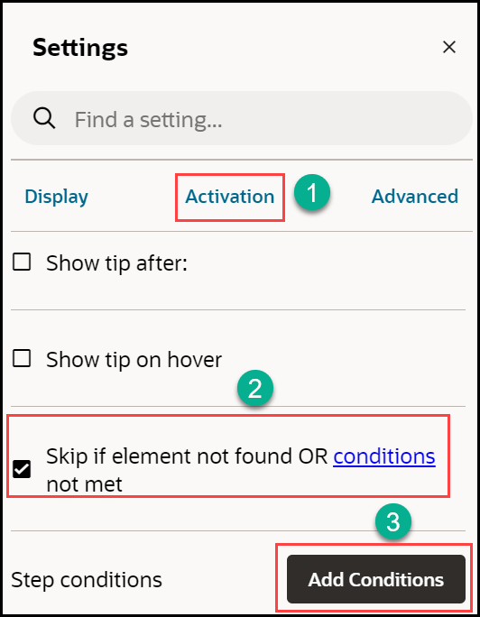
- Open the Activation Settings.
- Check the option Skip if element not found OR conditions not met
- Select Add Conditions, next to Step Conditions.
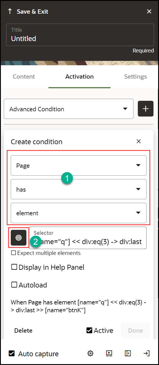
- Select When page > has > element.
- Select the Pick a Selector icon.
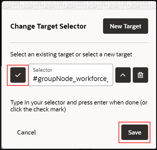
- Select an element or, select the Edit (
 ) icon in the selector dialog, and enter a selector.
- Select the checkmark icon.
- Select Save.
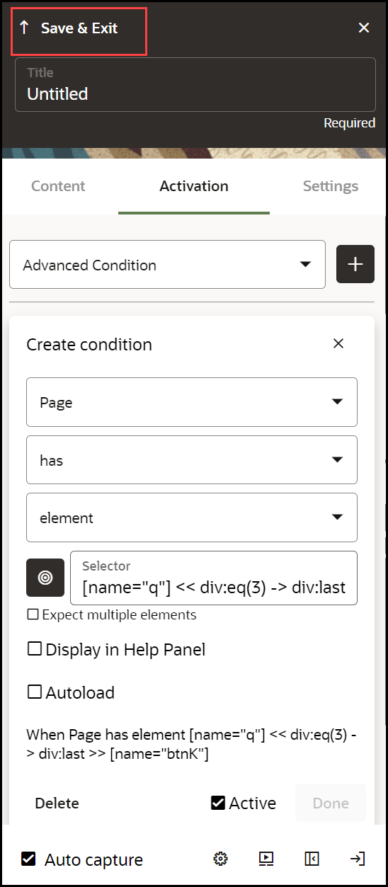
- Select Save & Exit under Edit Step
Conditions.
Changing a Tip Position:
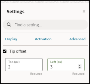
In addition to specifying the general position (top, bottom, left, and right) you can enter offsets in pixels to precisely position tips.
- Open the Step Settings.
- Expand Display Settings.
- Choose a location in Tip Placement.
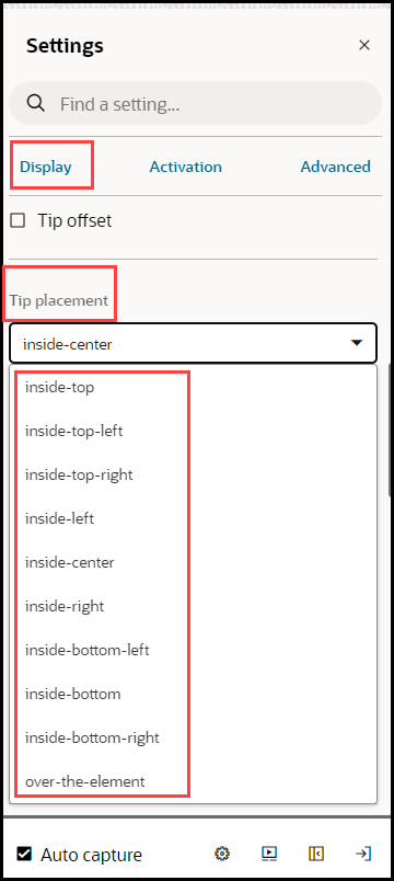
To get more precise:
- Select Tip Offset.
- Enter numbers in pixels to adjust the placement. These are
offset from values, so positive numbers will move the step down or to the
left. Negative numbers will move the step up or to the right.
Working with Step Settings
This section includes details about some of the more complicated step settings. See the Step Settings section for details about all the step settings.
Adding Step Conditions
Step conditions define when a step appears. You can use step settings to create an optional step or set up multi-tip steps where only one tip shows at a time.
To add a step condition:
- Go to the Step on which you want to add the condition.
- Click Edit tip icon.

- Select Step Settings icon.

- Click Activation Settings.
- Click Add Condition.
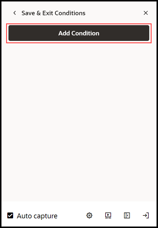
- Configure your expression.
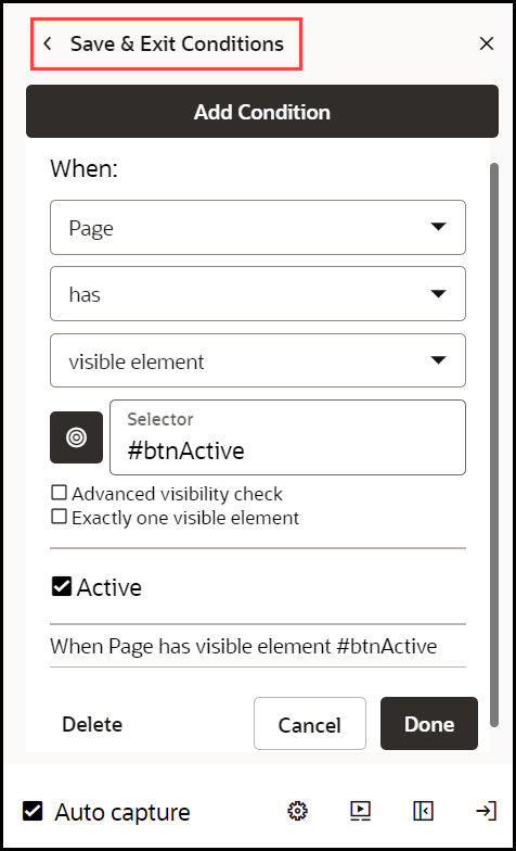
When configuring an element expression, use the target selector to choose an element. Uses of some common expressions:
- when page has element: to have the tip appear when a certain element is on the page
- when page has not element: to have the tip appear when a certain element is not on the page
- when page has visible element: to have the tip appear when a certain element is visible on the page
- when page has not visible element: to have the tip appear when a certain element is not visible on the page
- when page has URL matching: to have the tip appear on a certain page. Note, for Fusion application, you cannot use the actual URL and must use the route. This is advanced functionality and, if needed, contact support.
- When page has not form field with value 'ogl': The tip will appear when the specified form field is either absent or present with a value other than 'ogl'. If the 'Require Field Presence' option is enabled, the tip will only appear when the form field must be present and contains a value other than 'ogl'.
- Select Done.
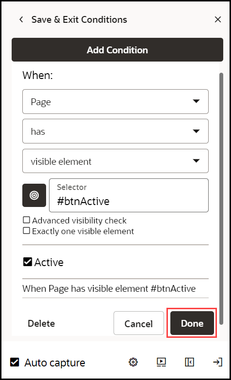
- Select Save & Exit Conditions .
Adding Branches
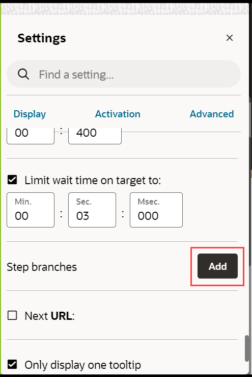
Branches allow you to specify where the guide goes after a user completes a step. You can go to a step within the guide, open another guide, close the current guide, or launch cross-domain or cross-app guides.
- Open the Step Settings.
- Expand Advanced Settings.
- Select Add, next to Step Branches.
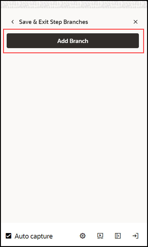
- Select Add Branch.
- Choose the desired Branch Type from the dropdown.
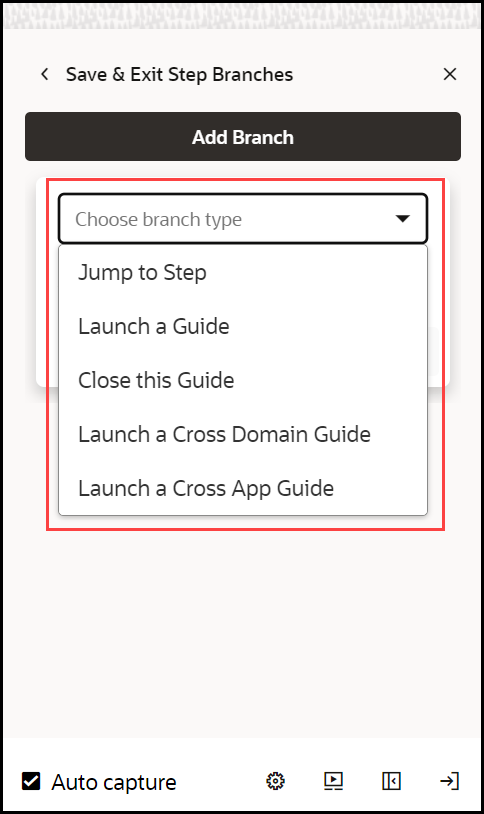
Branch types include:
- Jump to Step: Go to a specific step within the current guide
- Launch a Guide: Go to another guide at a specified step
- Close this Guide: End the guide
- Launch a Cross Domain Guide and Launch a Cross App Guide: These are advanced features and we recommend contacting support for assistance if the guides are needed
- Optionally add conditions that affect when to branch
- Select Done under Add Conditions.
- Select Done under Edit Branches.
Working with Tabs and Multiple Tips
In any guide, each step can display one or more tips simultaneously. This setup is commonly found on steps that include Smart Tips or the first few steps of a guide that can vary depending on what is on the page.
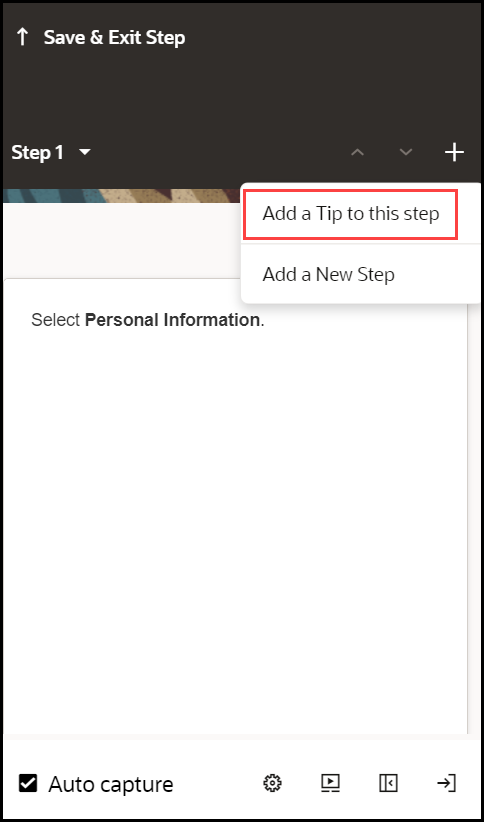
- To add a tip, select the step where you would like to add another
tip, and then select the Add (
 ) icon in the Step Settings panel.
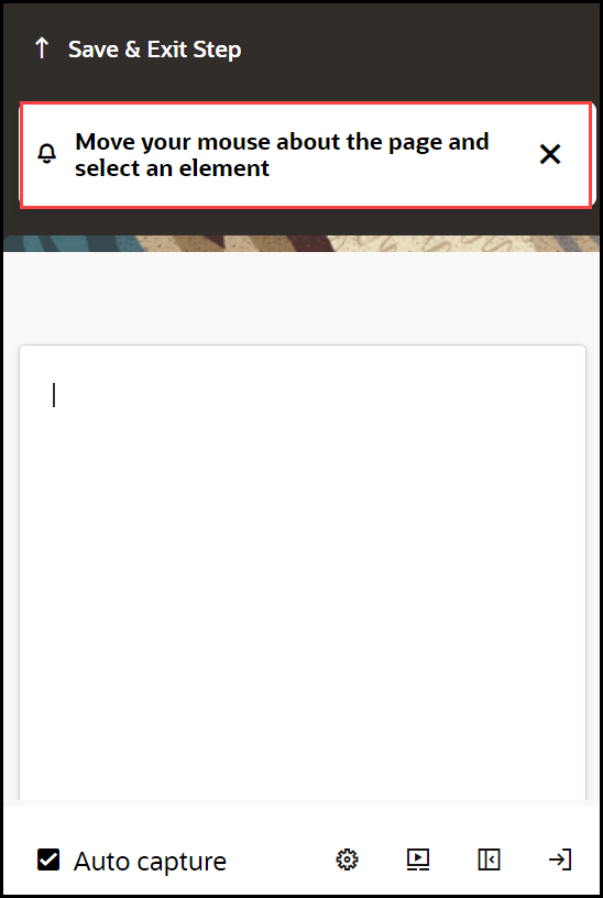
- Choose the target element for the new tip.
- Configure the Display Settings, Activation Settings, and Advanced Settings for each tip individually.
Saving and Discarding Guides
When editing a guide in the full editor, OGL loads it to your account, preventing others from editing it. If you close your browser or your computer crashes, you will be prompted to resume editing the guide when you try to access it again. To be sure the guide remains accessible to other content developers, make sure you either save your changes or discard your changes when you are finished working with a guide.
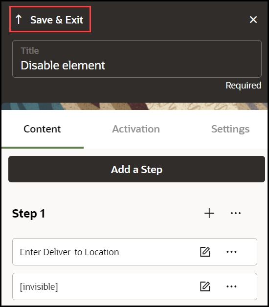
- To save your changes, select Save and Close.
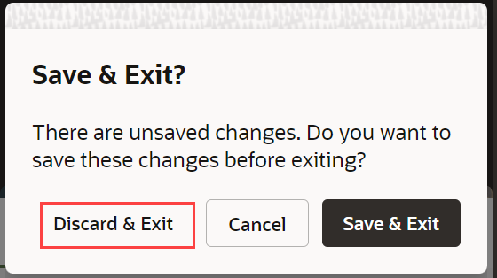
To exit without saving, select Discard.
Note:
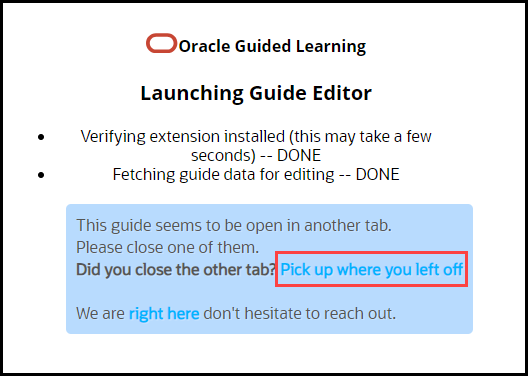
When the browser is closed without saving the OGL session and you open and resume editing, the following message is displayed.
Renaming a Guide
There are two ways to change the name of a guide.
Method 1:
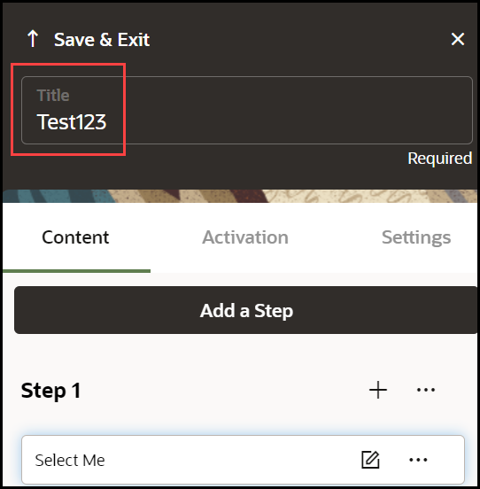
- Open the guide in the full editor and edit the text of the title.
- Select Save & Exit.
 ) icon next to the name of the guide.
Method 2:
- Go to the OGL console homepage.
- In the left navigation panel, select Content.
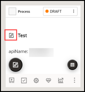
- On the guide that you want to rename, select the Edit
(
 ) icon next to the guide title.
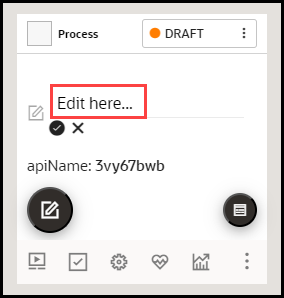
- Edit the name field.
Note:
The following characters are not allowed: / \ | : " < > ? - When finished, select the Save (
 ) icon.
To discard changes, select the Cancel (
 ) icon.
Creating Smart-Tips & Beacons
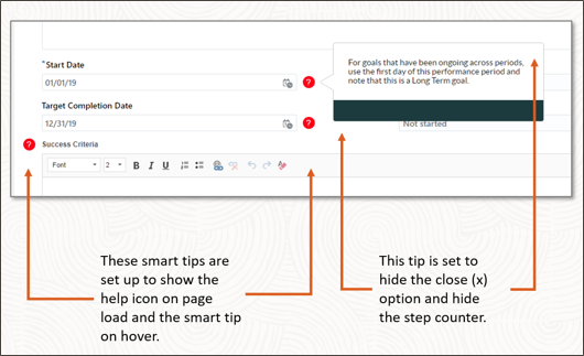
Smart-tips and beacons provide context-sensitive help on a field, button, or other UI element.
- Visible Smart-Tips: Used to provide context-sensitive help,
on-hover of the selected text, and provide supplemental information to buttons,
labels, and other screen elements. This uses a help icon (
 ) to draw the user's attention. This can be set as an icon with/without an
animation.
- Invisible Smart-Tips: Anchored to an element on the page, Invisible Smart-Tips are used to provide context-sensitive help without displaying the help icon.
- Beacon: Adds a pulsing animation to draw the reader's attention. The best practice is to use beacons for emergency and temporary notifications.
Creating Visible & Invisible Smart-Tips
Smart-Tips appear when a user hovers over an element. Configuring Smart-Tips involves setting up the correct step-level settings and activation conditions. You can utilize Smart-Tips in the following ways:
- Create independent Smart Tips as a single-step guide
- Create a Smart Tip as part of an existing guide
Creating Smart-Tips
- On the OGL console homepage, select Smart Tip under the
Create tab.

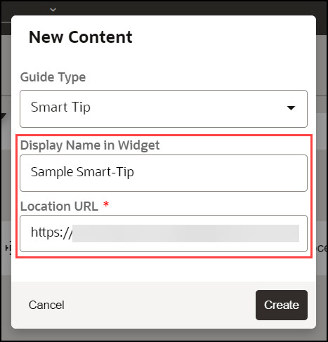
The New Content modal dialog is displayed.
- Enter the Display Name and the Location URL.
- Select the
 button to launch the OGL Editor.
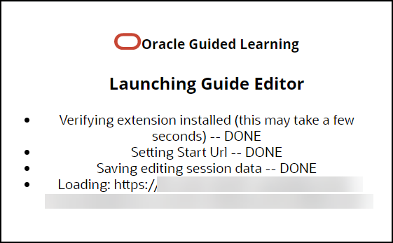
The OGL Editor launches in a new tab, where you can start capturing the steps for the guide.
Note:
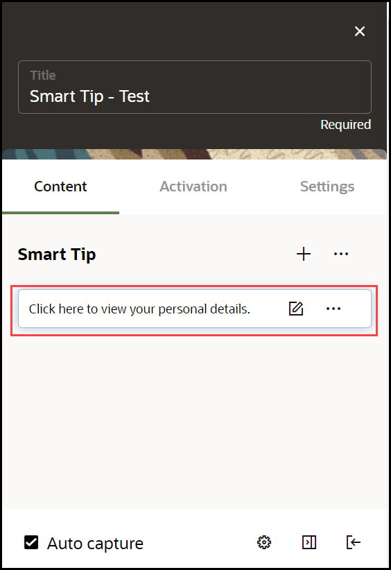
The editor appears as an overlay on your application. - Enter the desired text to display in your Smart-Tip.
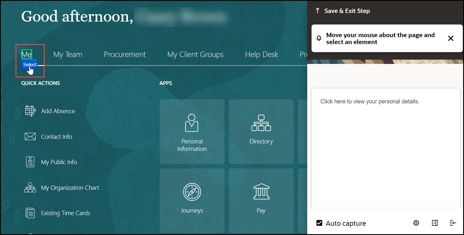
- Select the desired target element. (Hover over the desired element
and select the
 button.)
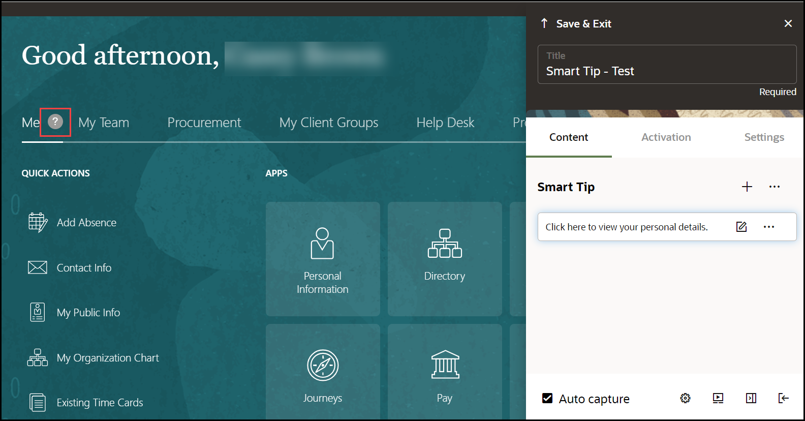
You can view the live preview of the Smart-Tip you just created.
- Select the wrench icon (
 ) to go to Step Settings.
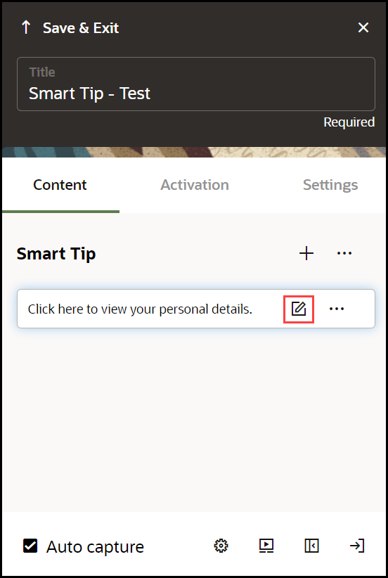
The settings window is displayed. Select on each tab to view the setting details.
- Set the required Display Settings:
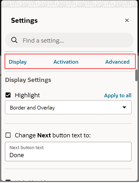
For more information, please see the Display Settings, Activation Settings and Advanced Settings pages.
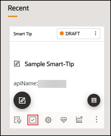
- On the OGL Console homepage, select the Activation icon
(
 ) for the Smart-Tip that you want to activate.Refer to the Enabling Guide Activation Settings section
for further information on activation.
Note:
Set the Smart-Tip to autoload when activation conditions are met.Creating an Invisible Smart Tip
An Invisible Smart-Tip appears when a user hovers over a field, but there is no Help Icon or Beacon to indicate the Smart-Tip is there. Use Invisible Smart Tips to push information to your users at the point of interaction.
Configure an Invisible Smart-Tip just as you would a regular Smart-Tip or Beacon. However, do not choose Show Beacon or Show Help icon. Instead, leave those options blank and just configure the step to appear on hover in the Activation settings.
Creating Beacons
Beacons provide a pulsing animation to draw the reader's attention, then displays a message when the user hover over the item. The best practice is to use beacons for emergency and temporary notifications.
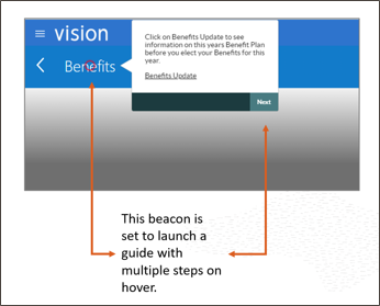
Creating a Beacon
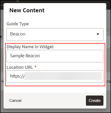
- On the OGL console homepage, select Beacon under the
Create tab.

The New Content modal dialog is displayed.
- Enter the Display Name and the Location URL.
- Select the
 button to launch the OGL Editor.

The OGL Editor launches in a new tab, where you can start capturing the steps for the guide.
Note:
The editor appears as an overlay on your application. - Enter the desired text to display when the Beacon is hovered
through.
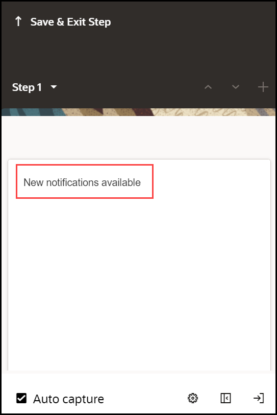
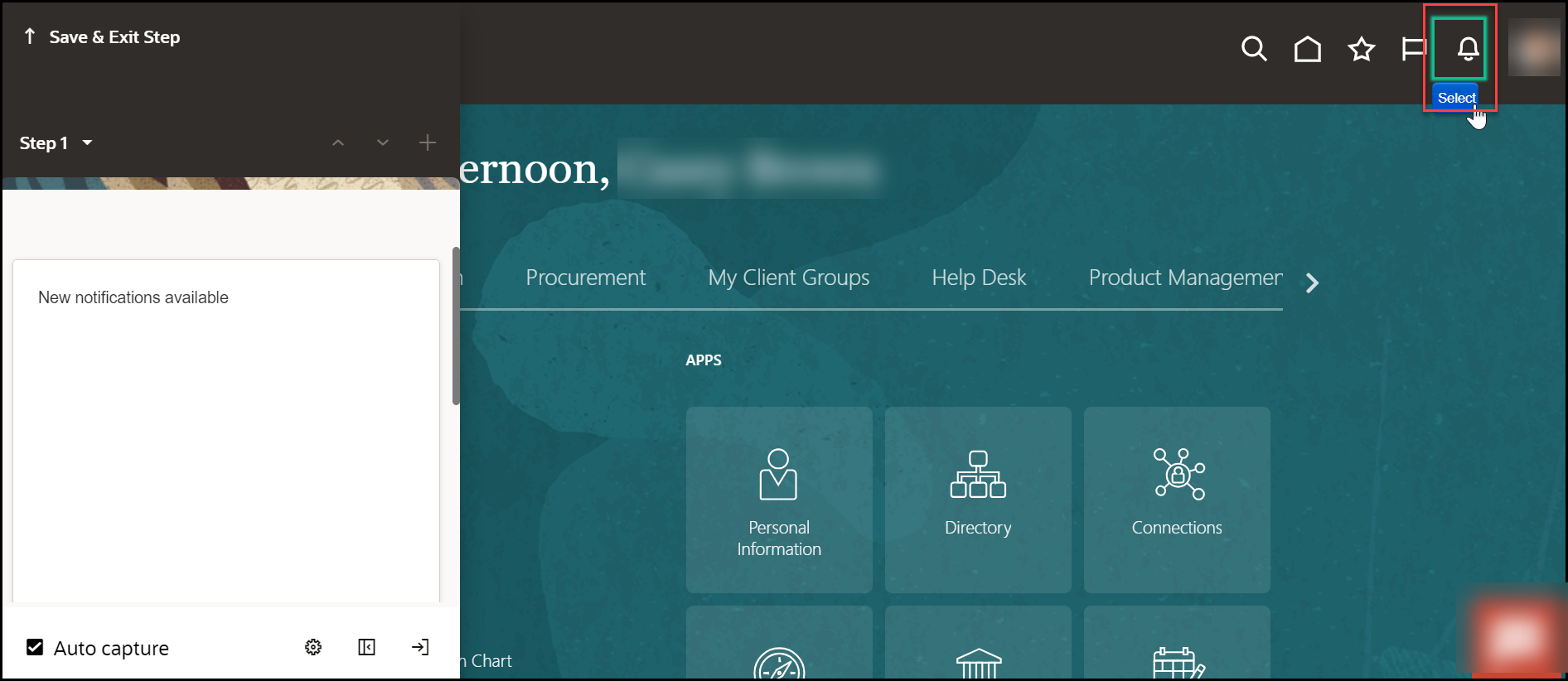
- Select the desired target element. (Hover over the desired element
and select the
 button.)
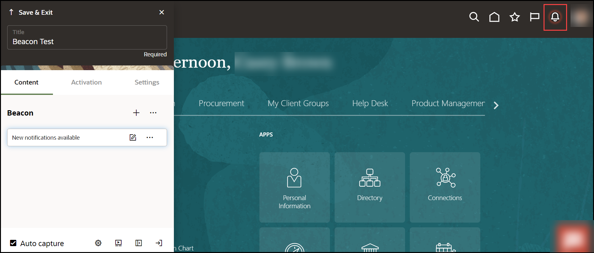
You can view the live preview of the Beacon you just created.
- Select the wrench icon (
 ) to go to Step Settings.
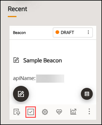
- On the OGL Console homepage, select the Activation icon
(
 ) for the Beacon that you want to activate.Refer to the Enabling Guide Activation Settings section for further information on activation.
Note:
Set the Beacon to autoload when activation conditions are met.
Creating Mobile Guides
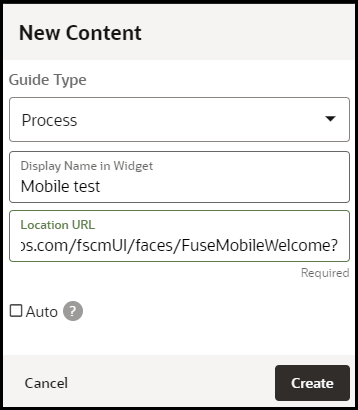
- Select the
 button on the home page of OGL Console
- Select Process from the Guide Type list
- Enter the Mobile
URL in the Location URL field.
Note: The Mobile URL is your instance URL (i.e. https://ucf6-zvdr-fa-ext.oracledemos.com) + the mobile UI string (/fscmUI/faces/FuseMobileWelcome?) resulting in https://ucf6-zvdr-fa-ext.oracledemos.com/fscmUI/faces/FuseMobileWelcome?. This is only applicable to Fusion Applications.
- Enter the title in Display Name in the Widget field
- Select Create Content
Note: The OGL Editor launches in a new tab, where you can start capturing the steps for the guide.
Adding the First Step to a Mobile Guide
After you create a guide, the OGL Editor appears over the URL you entered. You are prompted to select an element or to create a Splash step:
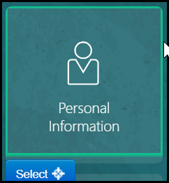
- To capture the screen element for your first step, move the mouse
on the screen and right-click an element to select it, or click Select
- Enter the text in the Content Editor field.
Note: As a best practice, it is recommended that:
- You consider the amount of text entered into the tip to ensure proper readability on mobile devices and to prevent impeding the functionality of tip buttons.
- You test the guide from end-to-end on various mobile devices prior to publishing the guide.
- The content types that are supported on mobile devices are as follows: Process Guides, Smart Tips, Beacons, Surveys, Links, Messages, Task Lists and Launchers.
- Open the Step Settings

- Set the Display Settings

Note:
- By default, the tip placement is set at the bottom regardless of what is selected in the Display Settings.
- The Tip Width is always fixed for Mobile Guides.
- Set the Activation Settings

Note:
- You can set the Advance When option to advance on-click of a button. The tip is displayed at the bottom of the page and advances on-click of the selected button.
- For steps with a Next button, you can select any element on the page, the tip will be displayed at the bottom of the page and advance on-click of the Next button.
- Set the Advanced Settings

- Repeat steps 1 to 6 for the subsequent steps.
Note: After creating the first step and moving from the HomePage the mobile UI string in the URL might change from (/fscmUI/faces/FuseMobileWelcome?) to (/fscmUI/faces/FuseOverview?). Please replace Fuse with FndMobile so it becomes (/fscmUI/faces/FndMobileOverview?)
- After adding all of the guide steps, click Save and Close.
Note: The editing tab will close. Please go back to the OGL console tab.
Defining the Settings
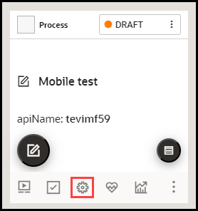
- Select Settings
- Ensure the Mobile Guide checkbox is checked and the Sticky
Guide box is unchecked
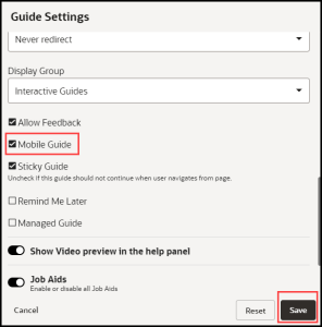
- Select Save Settings
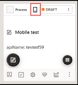
Note: After saving the settings, a mobile device icon
 will display to identify mobile guides/smart tips.
Testing the Mobile Guide
IMPORTANT: It is recommended that you test the guides on a mobile device for optimum results. Note: steps 1 to 3 below are relevant only when not testing on a mobile device.
| Step | Example |
|---|---|
| 1. Open a new tab | |
| 2. Open Developer Tools (Right-click > Select Inspect/ Inspect element) | 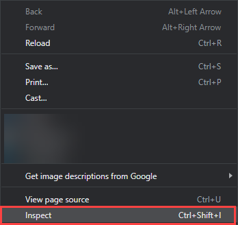 |
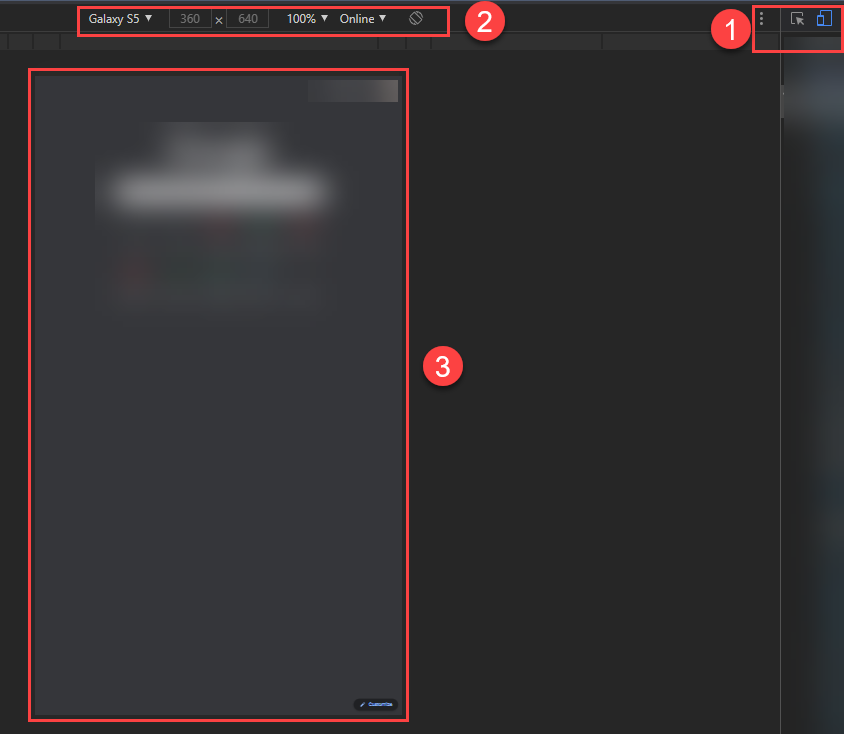
| 3. Go to Toggle Device Toolbar
(Ctrl+Shft+M)
1 = Toggle Device Toolbar indicator 2 = Device selector 3 = Page |
 |
| 4. Log in to the application |
 |
| 5. Open the OGL widget |
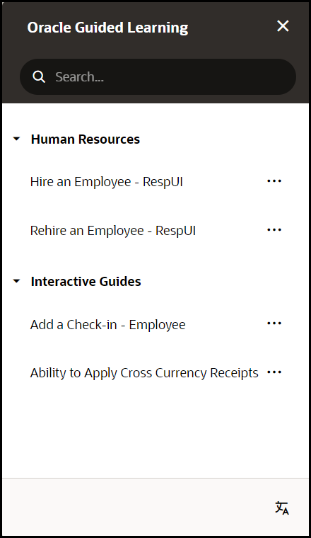 |
| 6. Run the guide
Note: The instructions will display at the bottom of the screen and advance on-click of the instructed button/link or the Next button. Use the Close(X) button to exit the guide. |
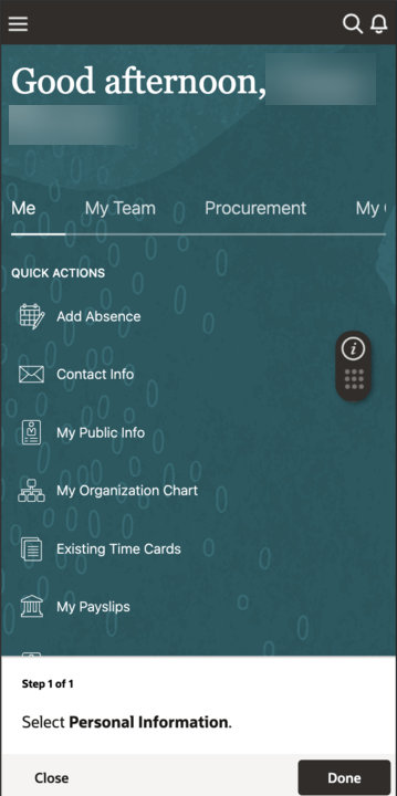 |
Creating Mobile Smart Tips
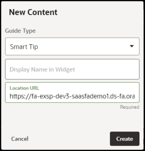
- Select the
 button on the OGL Console
- Select Smart Tip from the Guide Type list
- Enter the Mobile
URL in the Location URL field(see Creating a Mobile Guide).
Enter the title in Display Name in the Widget field
- Select Create Content
Note: The OGL Editor launches in a new tab, where you can start capturing the steps for the guide.
Adding the first Smart tip for your Mobile Smart Tip Collection
After you select Create Content, the OGL Editor appears over the URL you entered. You are prompted to select an element:
- To capture the screen element for your first smart tip, move the
mouse on the screen and right-click an element to select it, or click Select

- Enter the text in the Content Editor field.
Note: Limited to 50 characters.
- Open the Step Settings

- Set the Display Settings as below

Note:
- By default, the tip placement is set at the bottom regardless of what is selected in the Display Settings
- The Tip Width is always fixed for Mobile Smart Tips
- Set the Activation Settings as shown below
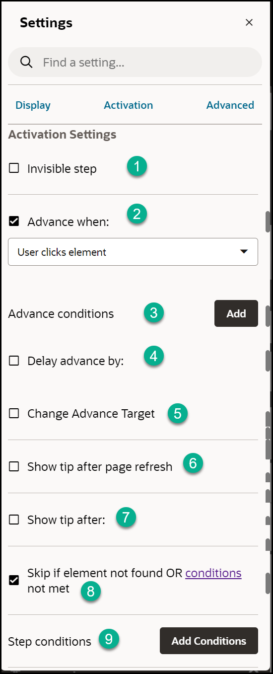
- Set the Advanced Settings as shown below

- Repeat steps 1 to 6 for the subsequent steps, then select Save&
Exit.
IMPORTANT: Refer to Defining the Mobile Guide /Smart Tip Settings
Testing the Mobile Smart Tips
IMPORTANT: It is recommended that you test the smart tips on a mobile device for optimum results. Note steps 1 to 3 below are relevant only when not testing on a mobile device.
| Step | Example |
|---|---|
| 1. Open a new tab | |
| 2. Open Developer Tools (Right-click > Select Inspect/ Inspect element) |  |
| 3. Go to Toggle Device Toolbar
(Ctrl+Shft+M)
1 = Toggle Device Toolbar indicator 2 = Device selector 3 = Page |
 |
| 4. Log in to the application |
 |
| 5. Navigate to the page where the Smart tip is intended to display. i.e. About Me > Goals and Performance > Goals |  |
| 6. Tap on the Smart tip icon (1) to display the
information
Note: The information will display at the bottom of the screen (2) and tapping any area outside the tip (3) will close the tooltip. |
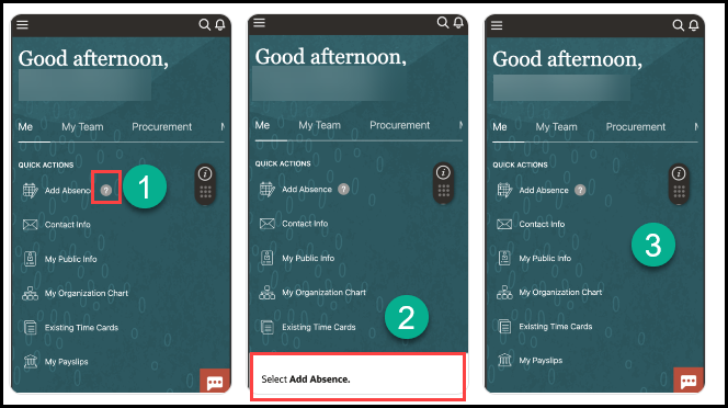 |
Enabling Guide Activation Settings
Introduction
Conditions allow you to determine where and/or when an OGL item is available/shown to the user in the application. These are called guide activation conditionsand are managed at the guide level. There also exist step conditions, these are set at the step/tooltip level within a guide.
This article focuses on guide activation conditions.
How to access the Guide Activation Settings Interface
From the OGL Console, select the check icon (![]() ) for the guide that you want to access.
) for the guide that you want to access.
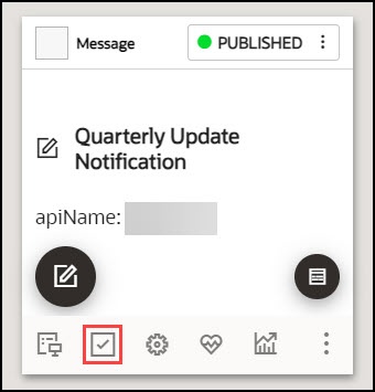
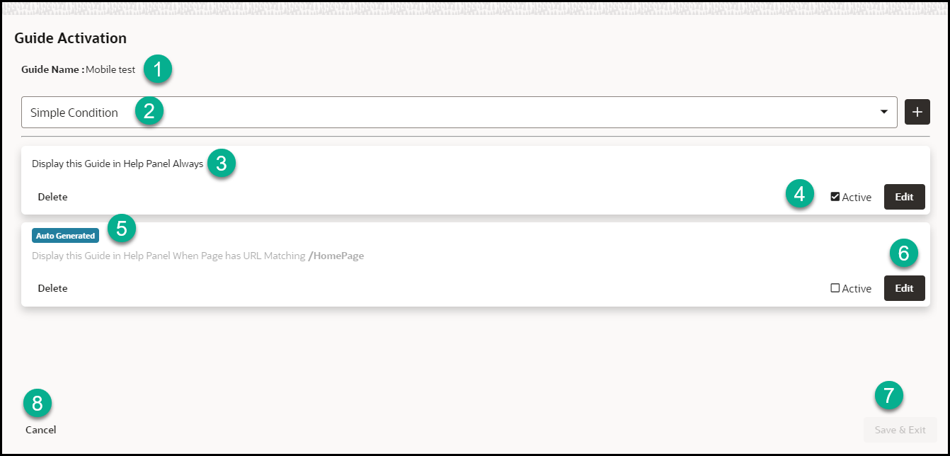
The below-pictured interface will be presented:
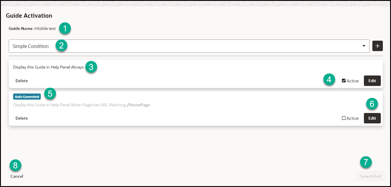
1 = Guide Name: This shows the name of the guide
2 = This dropdown is used to add new simple, advanced, and time conditions.
3 = A summary of the guide conditions
4 = The status of the is displayed. Active means the condition is set and active. Inactive means the condition is set but not active
5 = Auto-Generated tag, this identifies conditions that have been automatically generated.
6 = Edit condition button. Select the dropdown options and edit the condition accordingly.
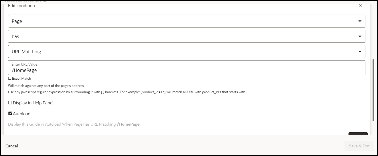
7= Cancel the changes and exit.
8 = Save the changes and exit.
Note:
Guide Activation conditions are evaluated using the AND Boolean operator. A guide will display/autoload if all the active conditions (C1, C2,...Cn) are evaluated to TRUE. In the example above, the guide will be available in the widget only if all three conditions (Simple, Advanced, Time) are evaluated to TRUE. The OR operator (denoted by the pipe character "|") is only possible within an advanced condition (see advanced conditions).Guide Activation Options
Important:
These options are set at the guide level.When adding a new condition, there are three main settings:
- Enabled checkbox: Determines if the condition is active or inactive. If this is not checked, the condition will not be evaluated
- Help Panel checkbox: Determines if the guide will be available from the OGL Help Widget
- Autoload checkbox: Determines if the guide should start automatically if the condition is met
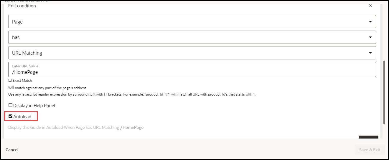
There are three types of conditions, these are:
- Simple conditions
- Advanced conditions
- Time conditions
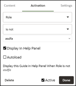
Simple conditions offer a simplified process of setting activation conditions by leveraging predefined pages and user roles.
To set a new condition, select the Simple Condition button.
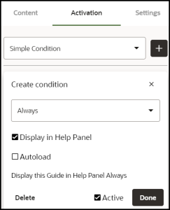
The below interface will be displayed.
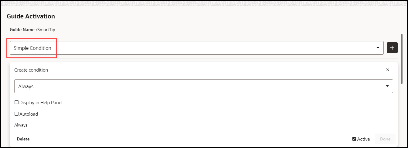
To set a new condition, click on the simple condition button, this will bring up the following interface:
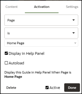
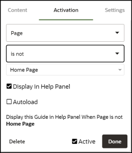
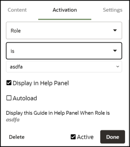
There are five basic combinations in simple conditions, these are summarised in the table below:
| Display When | Description |
|---|---|
| Always |
Displays the guide in the widget, all the time. Note: We recommended NOT to use the Autoload option with this type of condition. |
| Page IS |
Displays the guide in the widget only when the user is on the Homepage Note: If the Autoload option is used, the recommendation is to add additional conditions to limit the number of times the guides will autoload (see advanced conditions). |
| Page IS NOT |
Displays the guide in the widget only when the user is not on the Homepage Note: We recommended NOT to use the Autoload option with this type of condition. |
| Role IS |
Displays the guide in the widget only when the user role is = Payables Specialist Note: Simple conditions (AND conditions) allow you to associate only one user group (i.e. Payables Specialists) to the guide. If you add multiple simple conditions to the same guide(i.e. a condition for Payables Specialists and another for Receivables Specialists), then all conditions will have to be met for the guide to be displayed in the widget or autoloaded (that is, a user will have to be both a Payables Specialist and a Receivables Specialist). Conditions (OR conditions) that allow the user to be either a Receivables Specialist or Payables Specialist are covered in advanced conditions. |
| Role IS NOT |
Displays the guide in the widget only when the user role is not = Payables Specialist |
Remember: Multiple conditions are joined by the Boolean AND operator. All conditions have to be TRUE for the guide to be activated accordingly (help widget/autoload).
Advanced Conditions
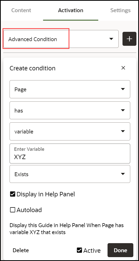
Advanced conditions offer a variety of options in setting activation conditions, this includes multiple user roles. To set a new condition, click on the advanced condition button, this will bring up the following interface:
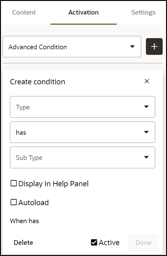
There are four basic combinations in advanced conditions, these are:
- Page has / Page has NOT
- User has / User has NOT
Options within Page HAS / Page HAS NOT:
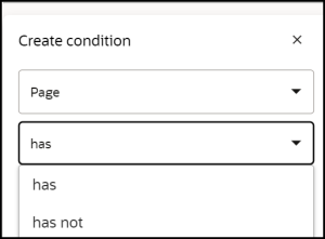
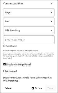
| Display When Page has / Display When Page has NOT | Description |
|---|---|
| URL matching |
Will match against any part of the page's address. You can use regular expressions as well. Use any
javascript regular expression by surrounding it with [ ]
brackets. For example: [product_id=1.*] will match all URL with
product_id's that starts with 1.
Note: Use the exact check box if you want the entire path to match exactly with the provided value. Note that the domain (e.g. http://www.your_app.com) will be ignored in this evaluation.
FUSION APPLICATIONS: Display Guide Only on Certain Pages
Note that if the Route is saved in Pages, OGL will automatically convert the condition to a Simple condition. |
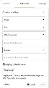
| URL parameter |
Will match against a specific URL parameter. You can either test that the specific URL parameter exists or evaluate its value. |
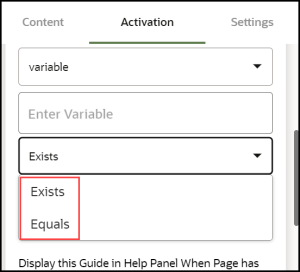
| variable |
Will match against a javascript variable. You can either test the existence of a variable or test its actual value. |
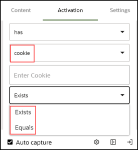
| cookie |
Will match against a browser cookie. You can either test the existence of a cookie or test its actual value. |
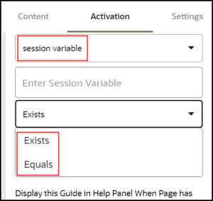
| session variable |
Will match against a special OGL variable. The OGL javascript API allows setting session variables that exist only throughout the duration of the currently logged in user. You can then condition your guides to display based on these variables. |
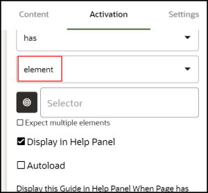
| element |
Will match against any element on the page's Document Object Model (DOM). You can also extend this condition by telling iridize to wait for multiple objects matching the provided selector. |
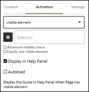
| visible element |
Will match against a visible element on the page's Document Object Model (DOM). This is more restrictive than an element condition because in HTML an element can be invisible. |
Options within User HAS / User HAS NOT:
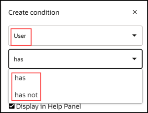
| Display When User has / Display When User has NOT | Description |
|---|---|
| field |
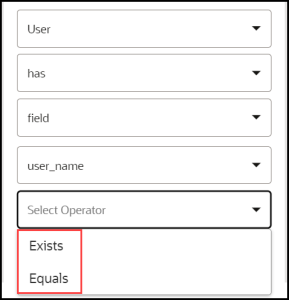
Will match against a user-specific field as it was relayed to OGL using the api.fields.set call. You can either test the existence of a user field or test its actual value. Use this to govern your guides based on user roles, permission level, or user country. Note: The required field has to be set/read in the OGL JavaScript. Please contact us for support. Multiple User Roles To set role conditions, the roles must be defined in JavaScript or in the Oracle Fusion configuration. Advanced conditions allow you to associate multiple user roles to a guide/a group of guides utilizing the OR operator. When you create a field (i.e. user_role) matching condition you can use a regular expression. To tell OGL that the string is a regular expression surround it with square brackets []. So, let's say you have the following roles in your application: Line Manager, HR Manager, Payroll Manager To show an OGL guide only if the user has or has NOT either of the three roles, the advanced activation condition would be as follows: 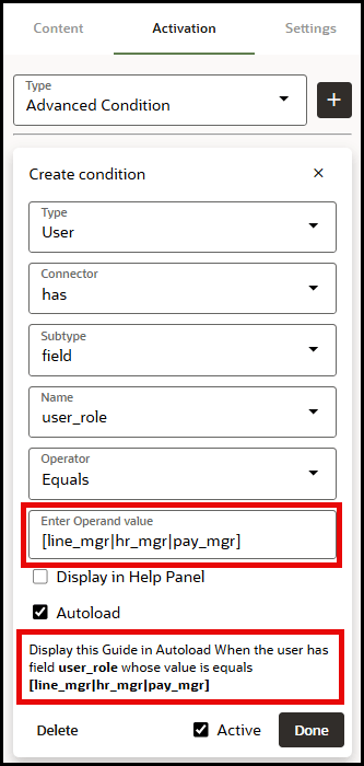 |
| seen guide |
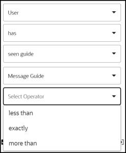
Will display the current OGL item (in the widget or autoload) if the user has seen the provided guide (i.e Create Requisition from Catalog) X number of times in the past. Note: If you have guides A, B, and C, you can set the condition such that: Guide A is displayed in the widget and/or autoloaded When the User has or has NOT seen guide A/B/C more than/less than/exactly X number of times. |
| seen guide (timed) |
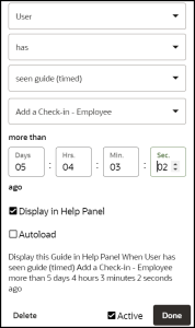
This type of condition is similar in essence to the seen guide condition but it is based on how long ago the user last saw the provided guide (i.e Create Requisition from Catalog) instead of the number of times a user has seen the provided guide. Note: If you have guides A, B, and C, you can set the condition such that: Guide A is displayed in the widget and/or autoloaded When the User has or has NOT seen guide A/B/C more than X number of seconds ago. |
| advanced in guide |
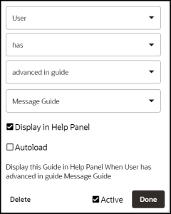
Will match if the user has engaged with the guide at least once. A user is considered to have engaged with a guide if and only if s/he has advanced past the first step in the guide. Note: If you have guides A, B, and C, you can set the condition such that: Guide A is displayed in the widget and/or autoloaded When the User has or has NOT advanced in guide A/B/C |
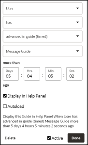
| advanced in guide (timed) |
This type of condition is similar in essence to the advanced in guide condition but it is based on how long ago the user last advanced past the first step in the provided guide (i.e Create Requisition from Catalog) instead of the number of times a user has advanced in the provided guide. Note: If you have guides A, B, and C, you can set the condition such that it is: Guide A is displayed in the widget and/or autoloaded When the User has or has NOT advanced in guide A/B/C more than 86400 seconds ago. |
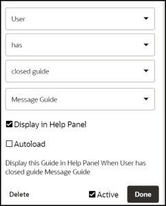
| closed guide |
Will match if the user has decided to manually close the guide by clicking on the 'X' button located at the top-right corner of one of the tooltips. |
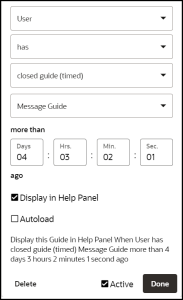
| closed guide (timed) |
This type of condition is similar in essence to the closed guide condition but it is based on how long ago the user last closed the guide. Note: If you have guides A, B, and C, you can set the condition such that it is: Guide A is displayed in the widget and/or autoloaded When the User has or has NOT closed guide A/B/C more than 86400 seconds ago. Clicking the Remind me later button does not count as closing the guide. |
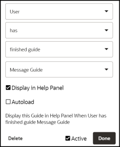
| finished guide |
Will match if the user has gone through the whole guide from start to finish. Note: If you have guides A, B, and C, you can set the condition such that it is: Guide A is displayed in the widget and/or autoloaded When the User has or has NOT finished guide A/B/C. |
| finished guide(timed) |
This type of condition is similar in essence to the finished guide condition but it is based on how long ago the user last finished the guide. Note: If you have guides A, B, and C, you can set the condition such that it is: Guide A is displayed in the widget and/or autoloaded When the User has or has NOT finished guide A/B/C more than 86400 seconds ago. |
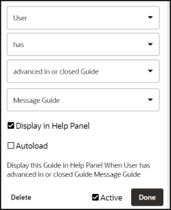
| advanced in or closed the guide |
This condition is a combination of the Advance in Guide and the Closed Guide conditions. It will match if the user has either engaged with the guide or closed it manually. Note: The Remind me later button does not count as closing the guide. So using this condition in combination with the Seen Guide condition "completes" the remind me later functionality. |
![]() Time Condition
Time Condition
A time condition allows you to set when and for how long a guide should be displayed in the widget or autoloaded.
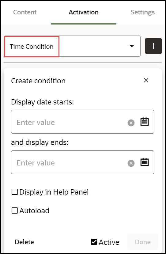
In the example below the guide is set to display for a period of seven days, commencing on March 15, 2024.
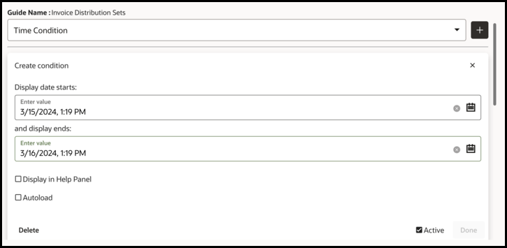
Important: The time condition does not auto-adjust for different time zones, if the target audience is in a different time-zone to the person setting the condition, the difference in time needs to be considered and where necessary, adjusted by the person setting the condition.
OGL Standard Roles
Click here to download a list of Role mappings.
Autosegmentation
AutoSegmentation works with any application that provides OGL with page information. AutoSegmentation also ensures that the widget displays only the guides relevant to the page the user is currently on. When selecting a guide from the widget, it will begin on the first step on the page that the user is on. In addition, the account and – if used, the embedded JavaScript-- must be configured for AutoSegmentation. Contact your Oracle/OGL account manager to verify that your account is properly configured. AutoSegmentation occurs automatically. OGL stores the page location (or Route) as you select elements while creating guides. OGL then uses those pages to build the default Activation Condition for the guide. The AutoSegmentation pages are used instead of a standard URL to identify the pages where the guide can be run. The following image shows the Activation Condition automatically created by AutoSegmentation (this condition is identifiable by the Auto-Generated tag):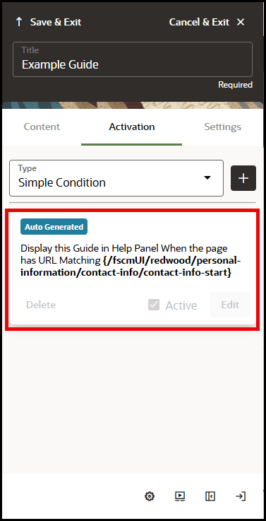
To ensure auto segmentation works as intended, we recommend you do not change the default activation condition.
Current status as of March 2024A brief explanation of the guide's condition summary (3):
- syntax:
-
{cond1 || cond2 || [cond3]}
- 'cond1', 'cond2', 'cond3' are placeholders for specific condition or url part
- '||' signifies the logical OR.
- '[]' brackets indicates that the enclosed condition ('cond3') is using regex matching
- Curly braces '{}' denote that the conditions inside them are of exact matching, implying that 'cond1' and 'cond2' are checking for exact values or matches without pattern
- inside the square brackets we can use '|' symbol within a regular expression
Guide Activation Enhancement
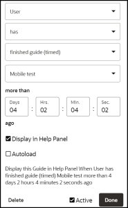
Guide Activation functionality has been enhanced to enable developers to target content more accurately to specific end-users for more content personalization. This enhancement allows content developers to create user-based advanced conditions based on the end-users’ actions; such as interacting with hotspots, completing task lists, or responding to surveys.
This enhancement includes an update to the UI/UX in both the Guide Activation modal and Full Editor within the Advanced Condition settings for user-based conditions:

Newly added Subtypes:
- Activated hotspot – When a user interacts with and activates an active hotspot in the application.
- Completed task list – When a user completes all tasks in an active task list
-
Responded survey – When a user advances beyond the first step in an active survey guide
This enhancement also adds a Time Limit – more than # ago setting to the condition to allow developers to specify additional time-based settings to the condition:

- Activated hotspot – When a user interacts with and activates an active hotspot in the application.
- Completed task list – When a user completes all tasks in an active task list
- Responded survey – When a user advances beyond the first step in an active survey guide
This enhancement also adds a Time Limit – more than # ago setting to the condition to allow developers to specify additional time-based settings to the condition:
Preview Modes of Process Guides
When working with Process Guides, you have the option to experience and validate the guide in different ways before sharing it with end users. The following options allow you to see how the guide will appear or behave in various formats.
- Preview
- Video, and
- Simulation

Preview
Opens the guide in a new browser tab, allowing you to walk through the steps as they would appear to a user. This helps ensure the content, flow, and triggers are functioning as intended.
Video
Generates a video-style preview in a new browser tab. This format displays each step along with its corresponding screenshot and tool tip, providing a complete visual walkthrough of the guide.
Simulation
Introduced into the product in Release 24C, Simulations launches an interactive version of the guide in a simulated application environment. Users can follow along step-by-step, practicing actions just as they would in the real application. This is especially useful for training and onboarding scenarios where hands-on experience is important.
Note:
For Simulations to function as intended, ensure that Global Image Capturing is set to Enabled in a Simulation-enabled account. Simulation playback relies on screenshots captured during the guide creation process. Once a Process Guide is created and saved, Simulation playback should be automatically available.Pre-requisites & Expected Behavior for Simulation
- Availability
- Simulations is automatically available for OGL accounts provisioned after the OGL 24C release (post July 7, 2024).
- Administrators of existing accounts (prior to July 7) must reach out to their OGL point of contact to enable Simulation. (Please note that Simulation is not available for included/base accounts.)
- Content Compatibility
- Simulations is not automatically available on content created before the feature was enabled.
- To enable Simulation preview mode on legacy guides, Content Developers must re-capture screenshots for all steps. This applies to both Base guides and Use Cases copied into the Content Library.
- Behavior in Simulation-enabled Guides
- In guides built with Simulation, tool tips will not appear within the screenshots on the Content Editor or in Step Guide/Job Aid view.
- Instead, a blue border highlights the selector point on each step.
Simulation & Video Playback Settings
Simulation and Video modes can also be configured to be displayed to end users on process guides visible in the help widget, offering them additional ways to consume and interact with the guide content.
Users with the appropriate permissions can manage the availability of Simulation and Video preview modes for the DEV and PROD domains through:
Settings > Application > Capture & Playback
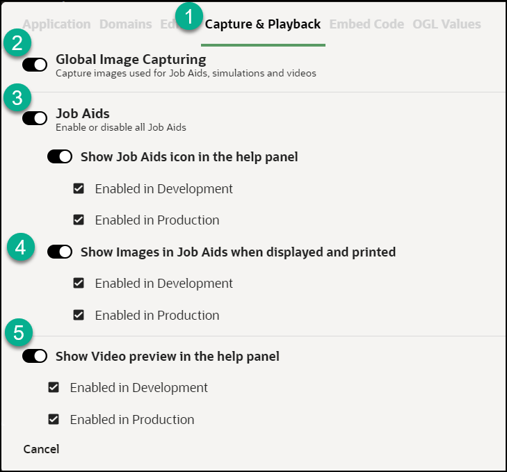
These settings are also available at the guide level for individual Process Guides and determine whether these preview modes are visible to end users.

- If Simulation or Video is disabled at the account level, enabling it at the guide level has no effect.
- If enabled at the account level, you can choose to disable Simulation or Video for specific guides, giving you control over how content is consumed.
Note:
Simulation links generated from the OGL Help Widget/Panel can be shared outside the widget and embedded into external webpages or applications that accept link inputs. Please note that simulation links generated directly from the console are not shareable.Quick Builder Guide
The Quick Guide Builder feature allows process experts and developers to quickly create prototypes of process guides by simply recording a navigation process in the host application without the need to identify HTML element selectors. Once recorded, a process guide is automatically created which can be then edited and configured using the OGL Guide Editor or Content Editor. This can be especially helpful for developers and content creators to enhance their collaboration with process experts when creating guides.
Note:
This feature will be automatically enabled on OGL Premium accounts beginning November 19 and will be coming soon for OGL Included accounts in a future release.Oracle Guided Learning Auto-Recorder Extension Required
The Quick Guide Builder feature will require a separate Google Chrome browser extension called “Oracle Guided Learning Auto-Recorder” (Version 2310.4.5), which is available from the Chrome Store.
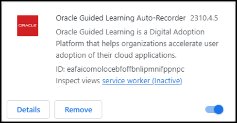
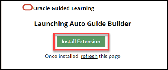
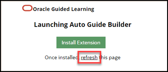
When recording your first process guide using the Quick Guide Builder, you will be prompted to install the extension. If you see the following message, select Install Extension to proceed.
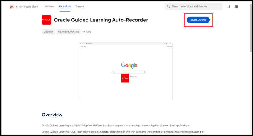
From the “Oracle Guided Learning Auto-Recorder” extension page, select Add to Chrome.
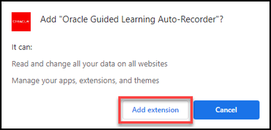
When prompted, select Add extension to proceed with the installation.
If necessary, close the Extensions tab to return to the OGL editor. Refresh the page to continue, if needed.
Quick Guide Builder Process Flow
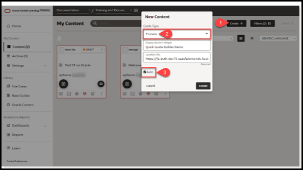
Follow the steps below to create a Process Guide using the Quick Guide Builder feature. Simply use the “Auto” checkbox to record a process and automatically create a process guide.
- From the Content page, create a new content item using the Create+
- In the New Content modal, select Process in the Guide Type drop down menu, enter a display name and location URL.
- Select the “Auto” checkbox to enable the Quick Guide Builder.
- Select the Create button to start
Note:
If this is your first time recording a process with the Quick Guide Builder, you will be prompted to install the Oracle Guided Learning Auto-Recorder browser extension, as shown below. (Refer to the “Oracle Guided Learning Auto-Recorder Extension Required” section above. Once the extension is installed, continue to Step 5.)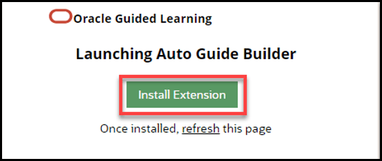
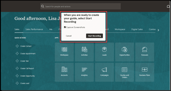
- In the host application, you will see the Auto-Recorder open on the screen
instead of the OGL guide editor. When ready, select the Start Recording
button to begin recording the process. (Note: Select the “Capture
Screenshots” option if you want the Auto-Recorder to capture screenshots with
each step.)
- While recording, notice the recording toolbar at the bottom of the screen that
indicates the number of steps captured.
Note:
If the “Advance on Click” option is checked, the Auto-Recorder will automatically apply an activation setting to advance the step when the user clicks the element.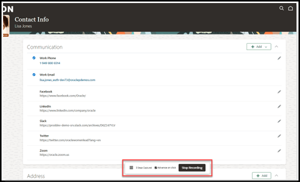
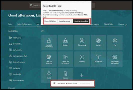
- While recording, you can stop the recording at any point during the process and
choose Discard All & Exit, Done Recording, or Continue
Recording. To finish and save the guide, select Done
Recording.
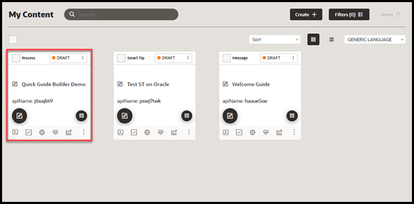
- Once the recording is complete. A new process guide will appear in the My
Content page where it can be further edited and configured using the OGL Guide
Editor just like any other process guide.
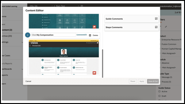
- The guide can also be edited using the Content Editor to make simple text and
formatting edits.
- The guide can now be deployed to the host application for further testing or
publishing.
Known Issues/Expected Behavior of Quick Guide Builder in 23D release
- Quick Guide Builder is currently only available for creating Process Guides.
- No Auto-segmentation for pages/routes will be applied.
- Guides created with the Quick Guide Builder will apply an auto-generated
guide activation condition set to “Display the guide in the Help Panel
Always”. Any additional guide activation conditions will need to be manually
configured.

- Navigating from one page route to another in the host application is
achieved with the Advance on click setting, which is enabled by
default (no form elements or Next button on tool tips).

By enabling this option while recording, the Quick Guide Builder will automatically apply an advanced an activation setting to advance the step when the user clicks the element. This setting can be changed in the Full Editor after recording, as needed.
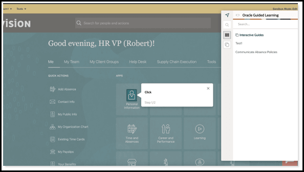
- OGL Widget is showing while Auto Recorder is active – Quick Guide Builder functionality allows users to switch between active tabs as well as windows and the recording jumps to that tab/window. The user could have a fusion instance already open prior to launching the Quick Guide Builder, so we will not be able to block the player from loading.
Creating Non-Process Guides
Creating a Message Guide
Use Message Guides to provide notification content.
To create a Message Guide:
- On the OGL console Homepage, select Message in the Create row.

Or
On the My Content page, select the (
 ) button.

The New Content modal appears
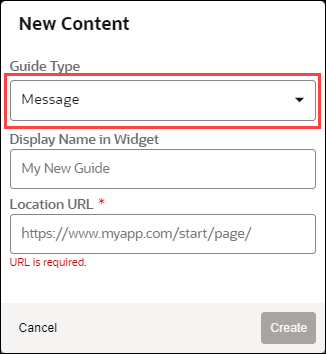
- Select Message from the Guide Type drop-down menu.
- Enter the Display Name and the Location URL.
Note:
The following characters are not allowed: / \ | : " < > ?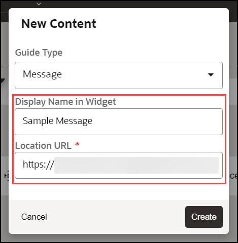
- Select the Create button (
 ) to launch the OGL Editor.
The OGL Editor launches in a new tab, where you can start capturing the contents of the guide.
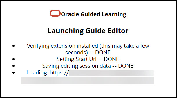
Note:
The editor appears as an overlay on your application. - Select the (
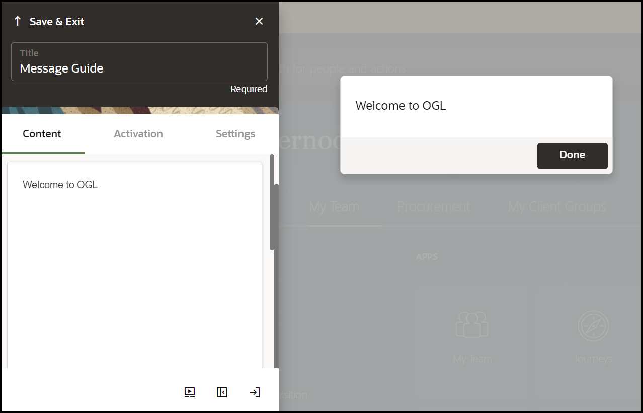
 ) button to display a message on the page.
- Enter your message text into the Message field.
A live preview of your text will appear in the message as you type.
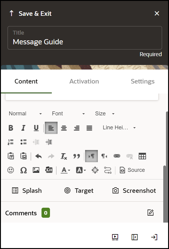
- Scroll down to view more tools options.
- Format your text, as required.
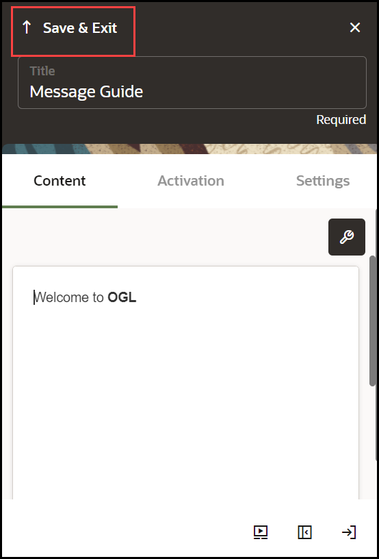
- Select Save & Close to exit the full editor.
Note:
After creating a message, you may need to check and configure the Guide Activation Settings to ensure that the guide displays and behaves correctly. For more information, refer to the Enabling Guide Activation Settings section.
Creating a Task List
What is a Task List?
A Task List represents a group of related guides, usually performed sequentially. Task lists also track the user's progress as they complete each task in the list.
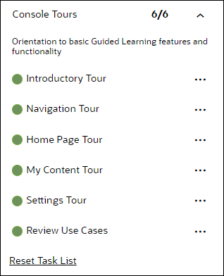
Task Lists can be used for:
- Training flows that walk your users through a new software platform.
- Onboarding sequences that train and certify new employees.
- Pre-defined checklists that users need to complete while working on a certain process.
To create a Task List:
-
On the OGL console homepage, select Task List.

The New Content modal dialog is now displayed.
Note:
The following characters are not allowed: / \ | : " < > ? - Enter the Display Name and the Description.
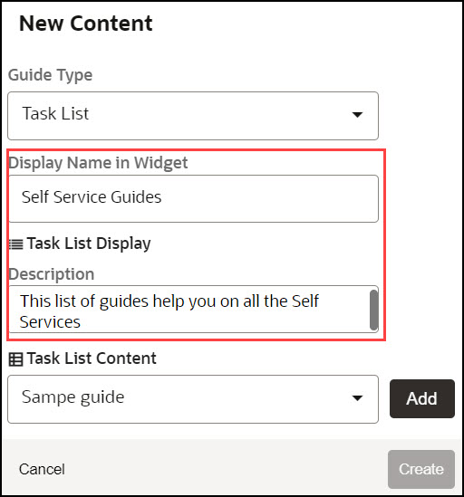
- Use the Task List
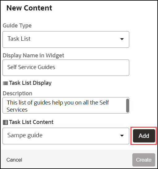
Content dropdown to add guides to your Task List.
- Choose the guide from the dropdown and select Add.
- Add multiple guides from the dropdown as required.
- Check the option User can reset progress to enable users to reset
the progress.
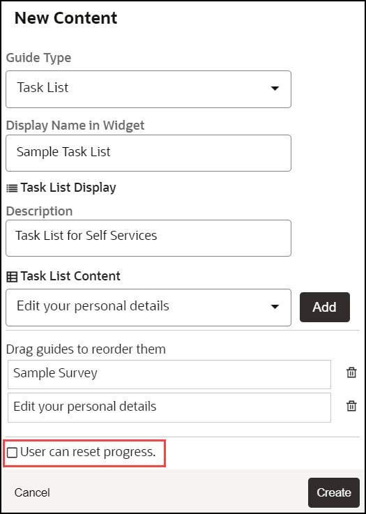
- Select Create.
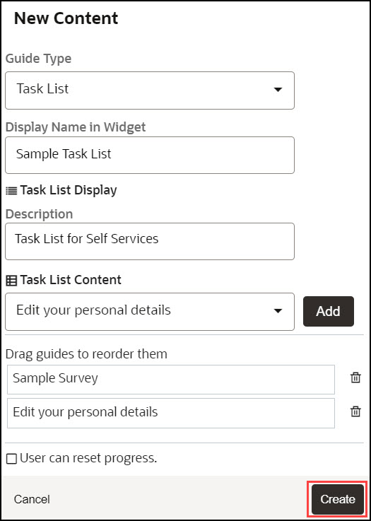
The Task List is now created.
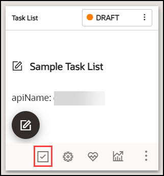
- Configure guide activation settings, as needed, by selecting Guide
Activation in the guide tile.
Note:
Remember to set your activation conditions, refer to Enabling Guide Activation Settings section. For multi-language deployments, refer to the Translations section.Creating a Launcher
What is a Launcher?
Launchers take advantage of the existing event listener capabilities. This allows OGL to track user events such as clicks and key presses. We use these events to launch an OGL content item, and these OGL items are intended to inform users of new information, assist them in completing a task, or serve as a reminder of internal policies and procedures.
Important:
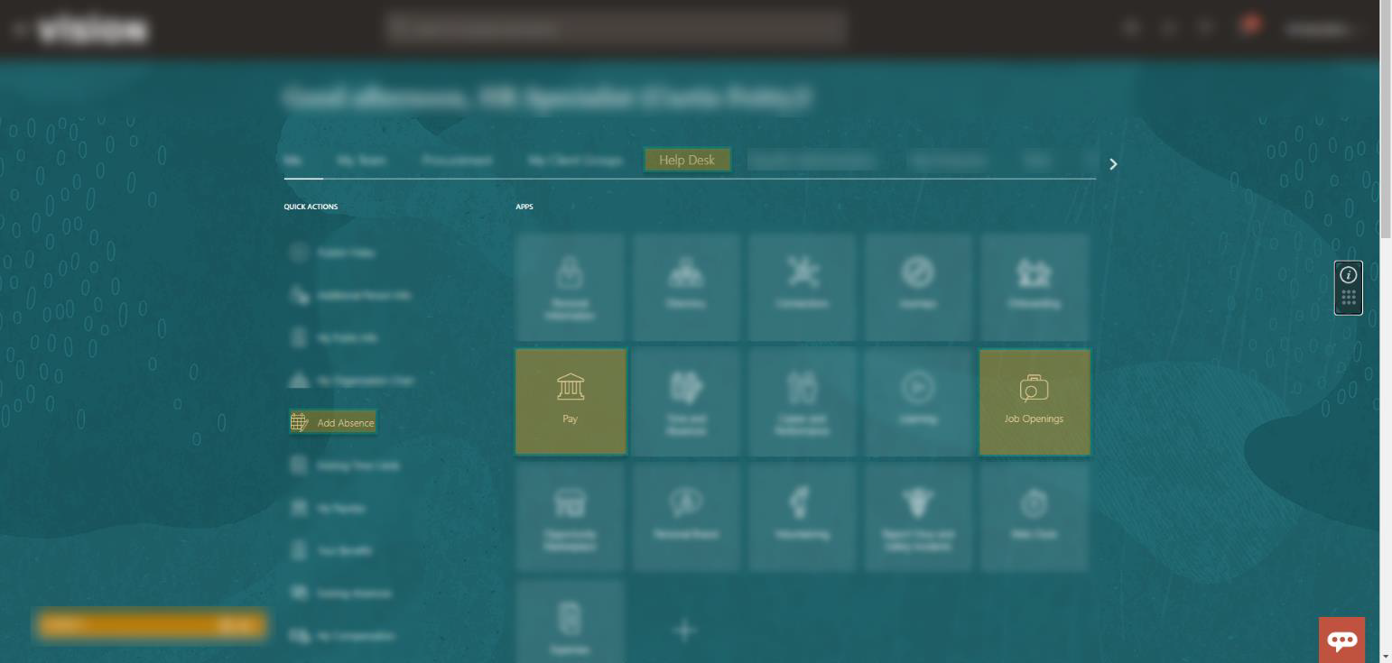
Launchers cannot read user data; they are only limited to identifying actions performed by the user on the application.The image illustrates what the set of invisible Launchers would look like on the backend.
Creating a Launcher
- On the OGL console homepage, select Launcher.

The New Content modal dialog is now displayed.
- Enter the Display Name and the Location URL.
Note:
The following characters are not allowed: / \ | : " < > ?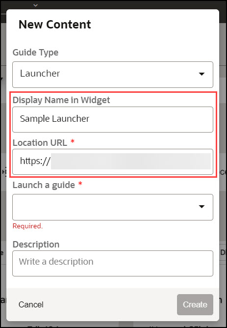
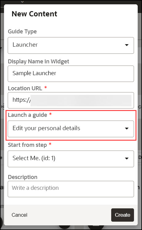
- Use the Launch a Guide dropdown to choose the guide to
launch.
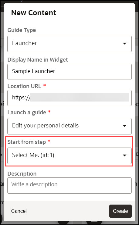
- Use the Start from step dropdown to choose the step to
launch.
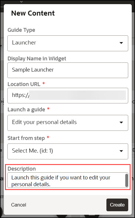
- Enter a description for the launcher.
- Select the Create button (
 ) to launch the OGL Editor.
The OGL Editor launches in a new tab, where you can start capturing the contents of the guide.
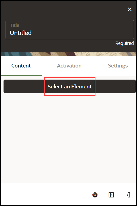
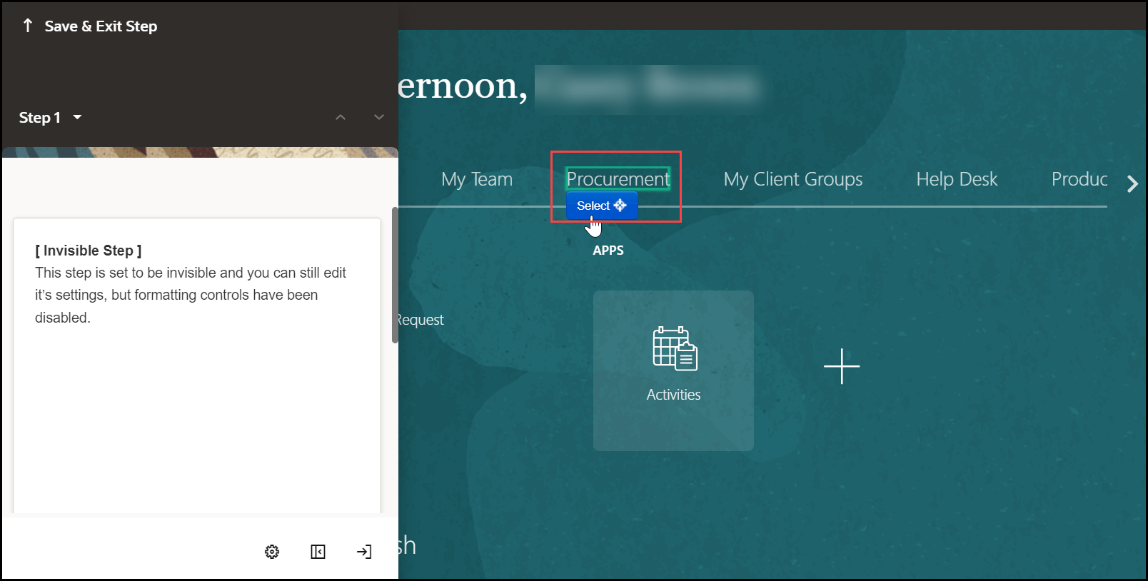
- Click the Select an Element on the application.
- Select the target element on the application.
- Go to Step Settings.
- Set the desired Activation Settings and Advanced Settings.
- Select Save & Close.
- Go to the OGL console homepage and activate the Launcher.
Note:
Remember to set your activation conditions, refer to Enabling Guide Activation Settings section.Creating a Hotspot
What is a Hotspot?
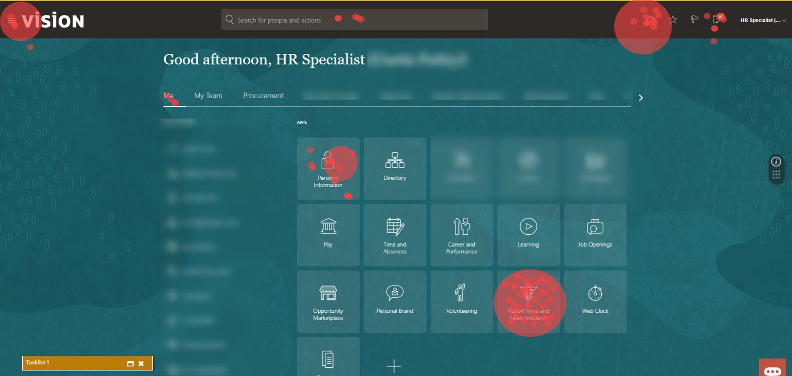
A Hotspot is a type of "event listener" that allows you to gather critical information on how your users interact with and use your application. In principle, Hotspots are a variation of Launchers; while Launchers listen for an event, and when that event occurs (i.e., a click of a button), OGL launches an item. Hotspots listen for an event, and when that event occurs, OGL registers that event in analytics. Use this feature to set up hotspots around your application to gain insight into how users navigate or monitor key differences between starting a process and not submitting it.
The image illustrates what the invisible Hotspots would look like on the application and the analytics dashboard after a month of use.
Creating a Hotspot
To create a Hotspot:
- On the OGL console homepage, select Hotspot.
Note:
You can also select the Create+ ( ) button from the My Content page and select the Hotspot
type.

The New Content modal dialog is now displayed. Select Hotspot from the Type dropdown menu, if needed.

- Enter the Display Name and the Location URL.
Note:
The following characters are not allowed: / \ | : " < > ?
- Enter the Description for the Hotspot, as needed.

- Select the Create button (
 ) to launch the OGL Editor.
The OGL Editor launches in a new tab on your host application.
- In the OGL Editor, select Select and Element button.

- Move your mouse about the page and select an element where you want
to place the Hotspot, then select the Select (
 ) button..

- A tool tip will appear to indicate the selected target element.
Note:
This tool tip will not display for the end user. - Select the Step Settings (
 ) button top open the Step Settings panel in the OGL Editor.

- Set the desired Activation Settings and Advanced
Settings.
Note:
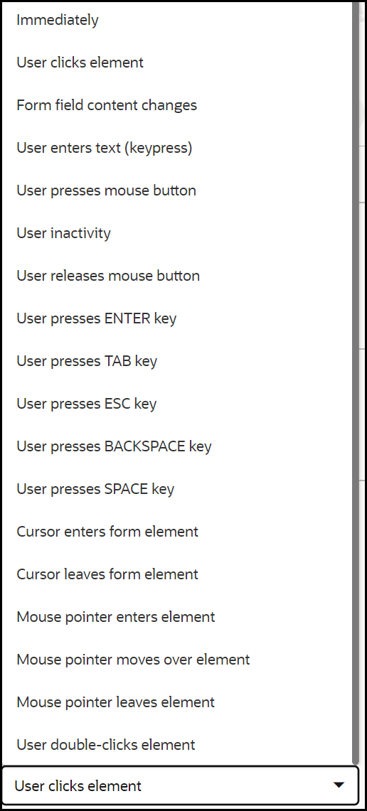
In the Advance when: setting, choose the user action that you wish to be counted when the user interacts with the selected element. For example, if you want the Hotspot to count the number of times the element is clicked, then select 'User presses mouse button' instead of 'User clicks element'.When a user clicks an element, there are two distinct events that can be counted:
- User presses mouse button (i.e., "mousedown") : Records the event as soon as the mouse button is pressed down.
- User clicks element (i.e., "click") : Records the event after the mouse button is pressed and then released on the same element.
Key Differences:
- 'mousedown' = happens before the full click is completed. Use 'mousedown' for immediate response.
- 'click' = requires both press and release on the same target. Use 'click' for actions that confirm a full click.

- Select the Close button to close the Settings panel when
finished.

- Select Save & Exit Step to return to the OGL Editor main
panel.

- Select Save & Exit when finished.

- From the OGL console, be sure to activate the Hotspot. Configure Guide
Activation settings for this Hotspot, as needed, by selecting Guide
Activation in the guide tile and Publish the guide when you ready
to deploy the Hotspot.

Note:
Remember to set your activation conditions, refer to the Enabling Guide Activation Settings section.Creating a Survey
Surveys and Survey Analytics
Surveys allow you to create and deploy targeted, customizable, interactive surveys and polls to collect application user feedback and insights almost anywhere in the host application.
Surveys can be created with the following response types:
- Multiple Choice - Up to 5 answer choices allowing multiple answer selections
- Single Select - Up to 5 answer choices allowing only 1 answer selection
- True or False - Binary answer choice with customizable answers
- Rating Scale - Customizable numeric scale ranging from 1 to 10
- Experience Rating - Preset 3-option rating
- Question - Free text field for responses up to 1,000 characters maximum
Note:
An OGL Premium subscription is required to create and deploy Surveys, Survey Analytics, and their related features.
Key Features of the Survey
| FEATURE DESCRIPTION | ROLE | ADDITIONAL INFORMATION |
|---|---|---|
| Surveys |
|
|
Creating and Publishing the Survey
To create a Survey:
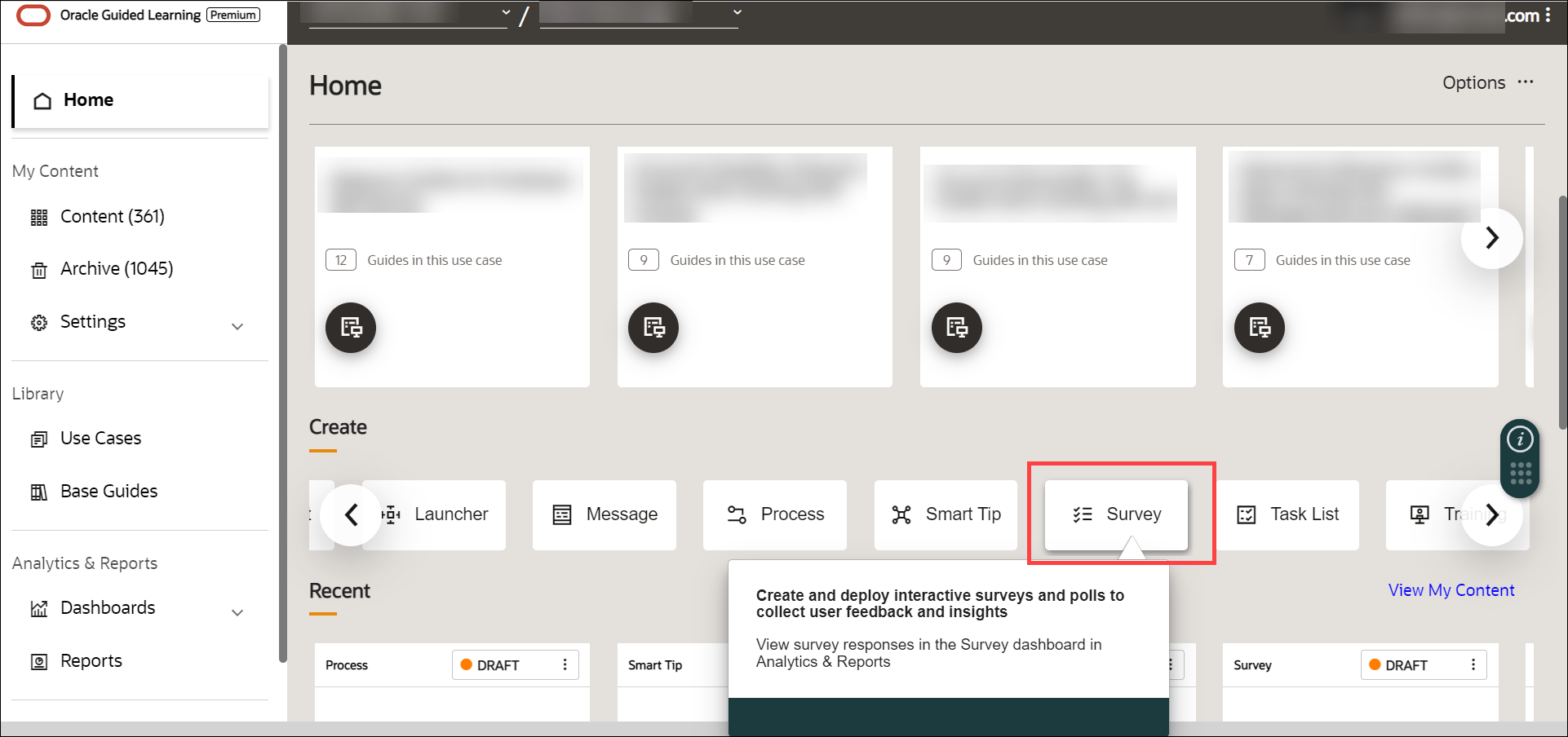
- On the OGL homepage, select Survey.
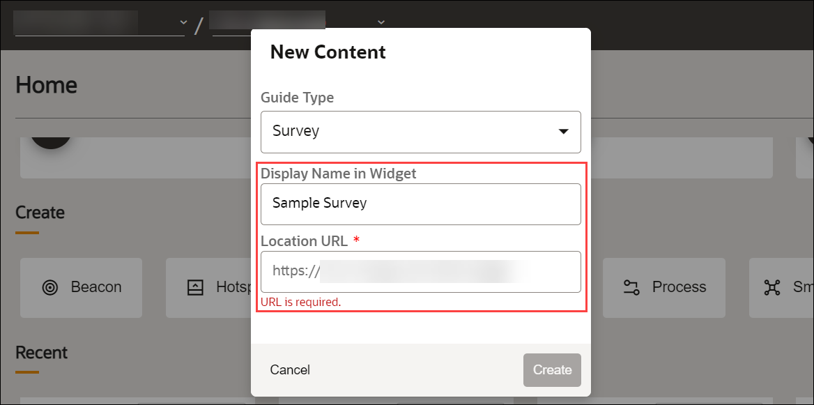
- Enter the desired Survey name and the Location URL.
- Select Create.
The Survey editor is displayed.
Note:
The Survey editor opens in a new tab. The editor appears as an overlay on your application.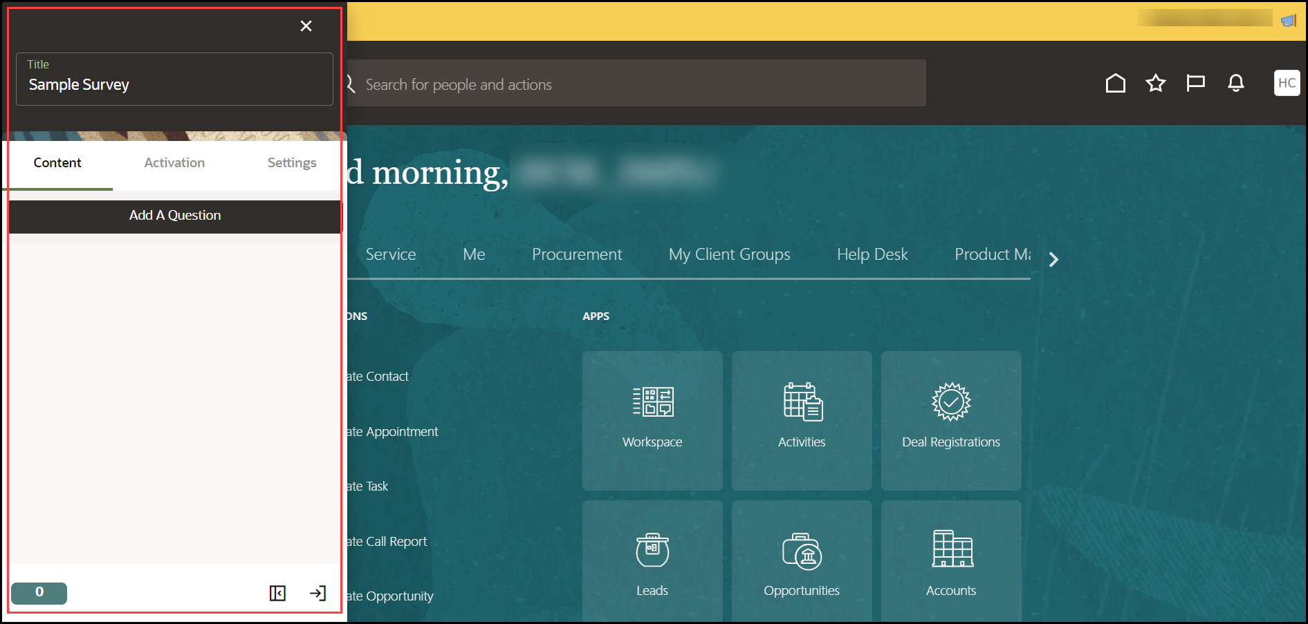
- Select Add A Question.
Tip:
To include more questions in your survey, select Add A Question again to add another one. You can have multiple questions in a single Survey.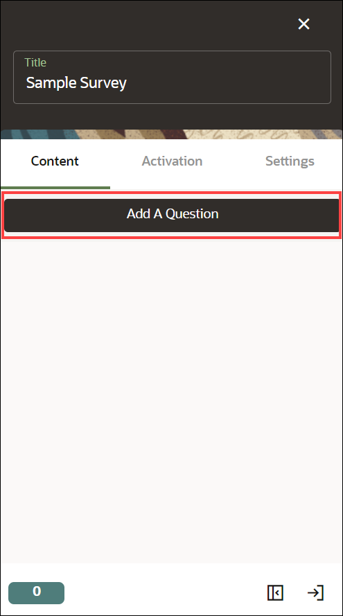
The Survey template appears. You can see the changes you make through the real-time preview.
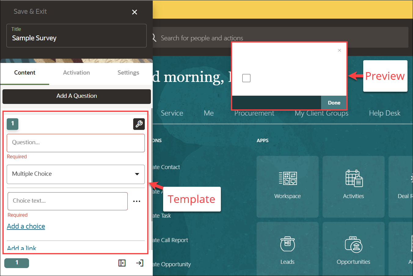
- Enter the question.
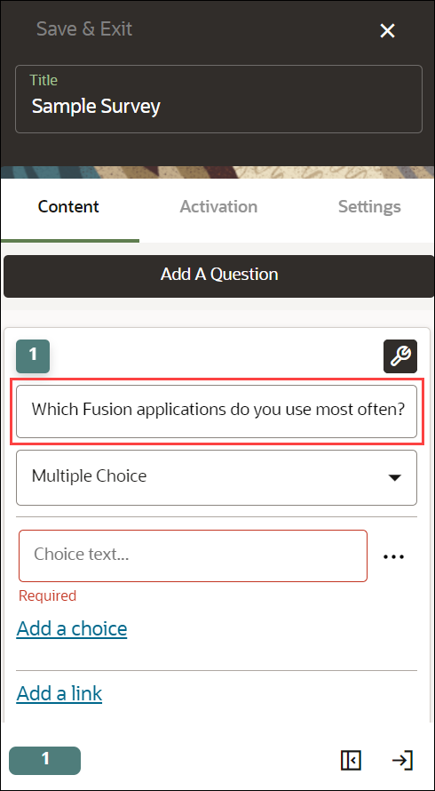
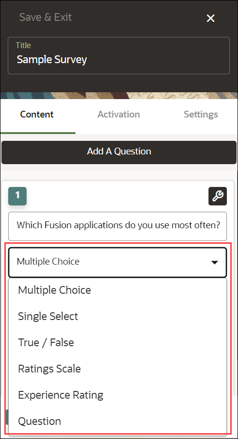
- Select the Survey type from the dropdown menu.
(In this example, we have chosen Multiple Choice for the demo.)
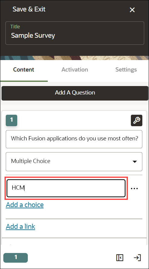
- Enter the Choice text(s).
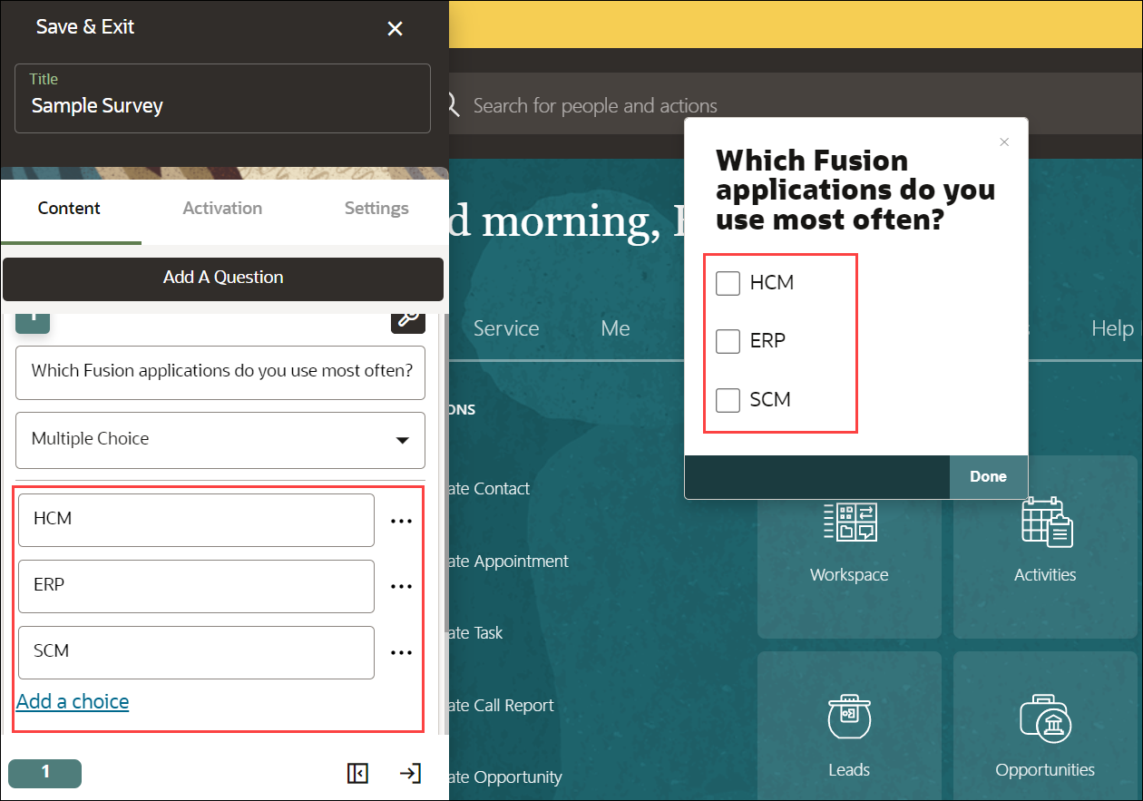
Select Add a choice to add multiple choice.
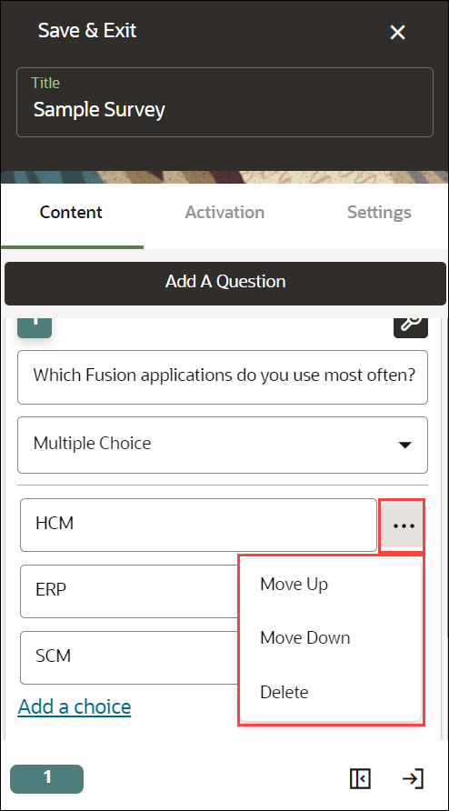
Use the ellipsis icon to explore the choice's menu. You can Move Up, Move Down or Delete the choices.
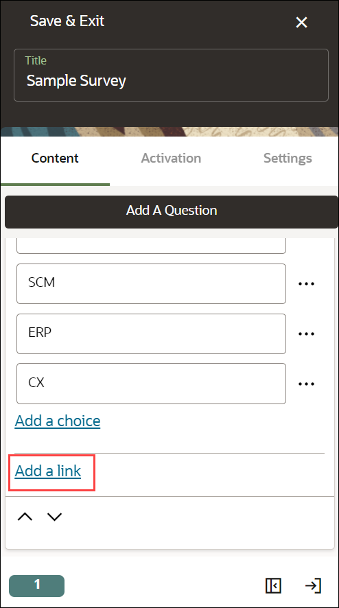
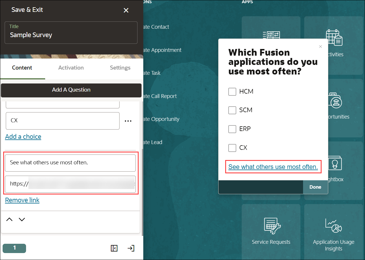
- Select Add a link,ifyou want to point out to any target page
(Optional).
Enter the display name of the link and the link URL.
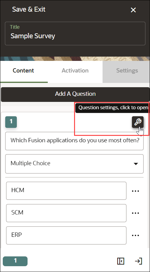
- For additional settings, select the Settings icon (
 )
)
The Settings modal window appears.
- Display Settings
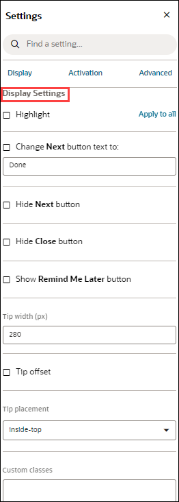
- Check the Highlight option to highlight the Survey modal window.
- Check the "Change Next button text to" option to
give an alternative text instead of the default text "Next".
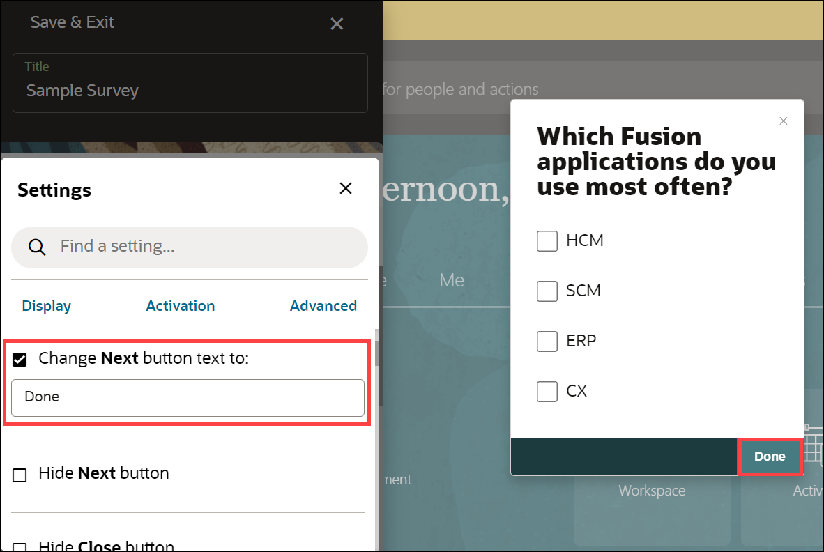
- Check the "Hide Next button" to hide the Next/Done button.
- Check the "Hide Close button" to hide the close button.
- Check the "Show Remind Me Later button" to show the
reminder option in the Survey window.
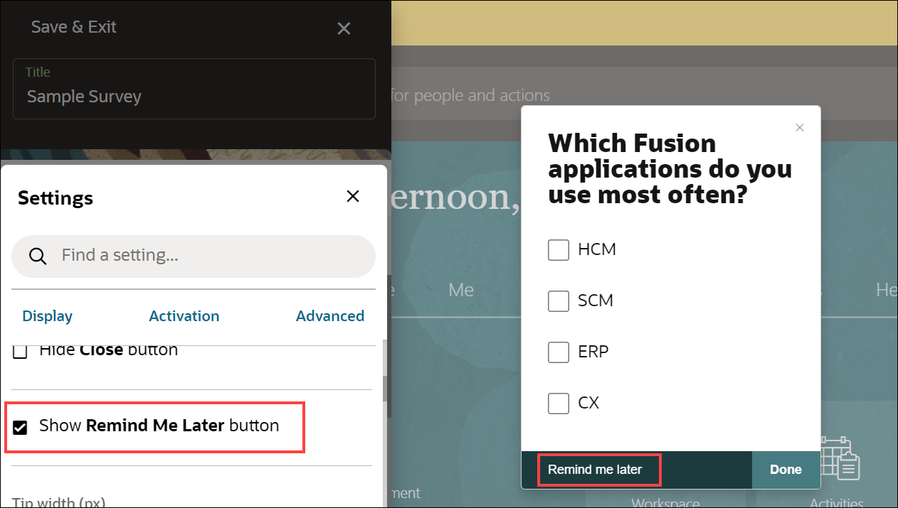
- Configure Tip width and Tip offset.
- Select the desired Tip placement.
- Activation Settings
Select the Activation Settings tab to view the activation settings.
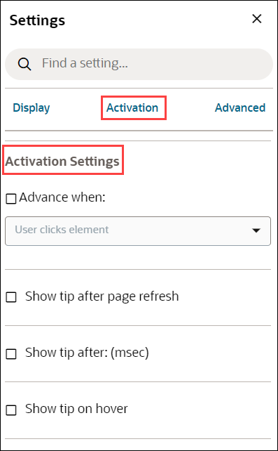
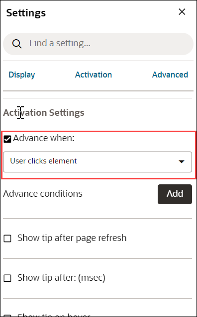
- Check the "Advance when" option to decide when the
Survey will appear. Then, you can select the action that triggers the
Survey from the dropdown menu.
- Check "Show tip after page refresh" to prevent tip flashing.
- Check "Show tip after: (msec)" to delay the appearance of the current tip.
- Check "Show tip on hover" to show the tip when the user moves their mouse over the target element, help icon, or beacon.
- Check the "Advance when" option to decide when the
Survey will appear. Then, you can select the action that triggers the
Survey from the dropdown menu.
- Advanced Settings
Select the Advanced Settings tab to view the Advanced settings.
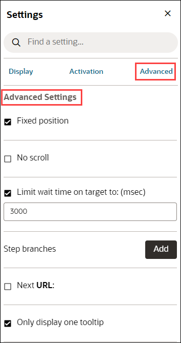
- Check "Fixed position" to keep the tip visible even if the user scrolls up or down the page.
- Check "No scroll" to disable the scrolling of the page.
- Check "Limit wait time on target to: (msec)" to send an error message if the current target element does not appear within "x" ms so that we can notify you and fix the problem.
- Select Add button to add Step Branches.
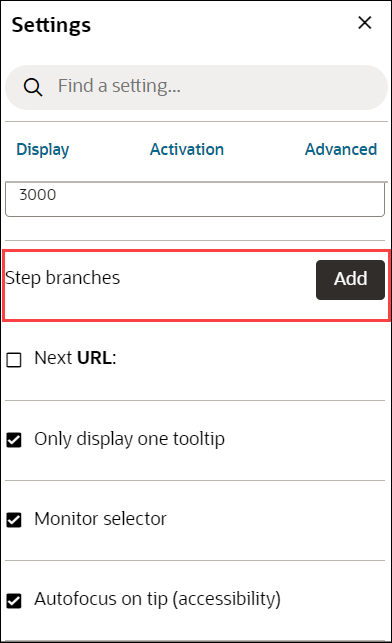
- Check "Next URL:" to enable navigation to a new page when selecting the Next button.
- Check "Only display one tooltip" to avoid displaying duplicate tips.
- Select the Close icon to close the settings window.
- Select Save & Exit.
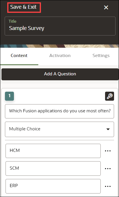
A new Survey has been created and can now be viewed on the homepage. The survey is currently in Draft status.
After creating the Survey:
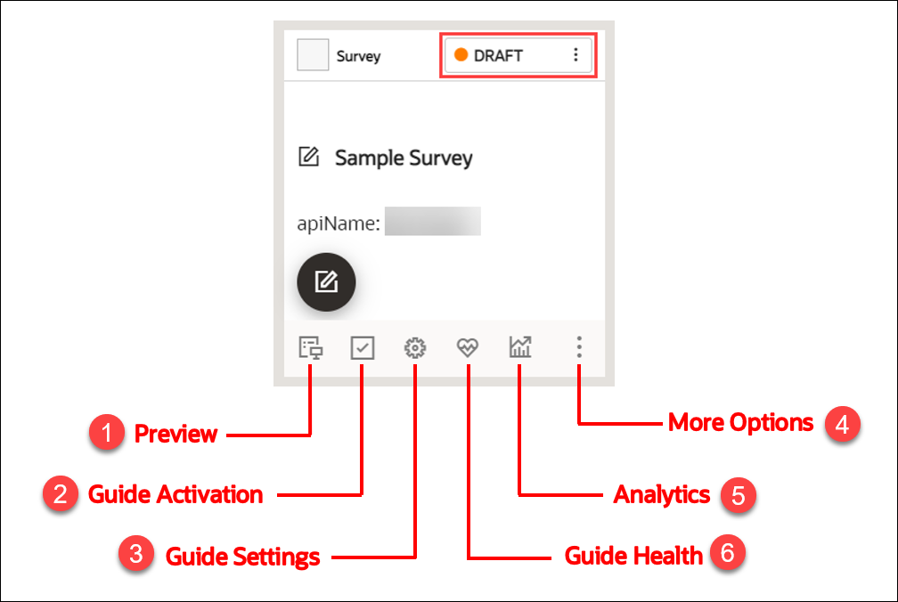
![]() Select the Preview icon to preview the Survey.
Select the Preview icon to preview the Survey.
![]() Select the Guide Activation icon to set the activation conditions.
Select the Guide Activation icon to set the activation conditions.
Learn more about Guide Activation.
![]() Select the Guide Settings icon to manage settings.
Select the Guide Settings icon to manage settings.
Learn more about Guide Settings.
![]() Select the More Options icon to Delete/Clone the
Survey.
Select the More Options icon to Delete/Clone the
Survey.
![]() Select the Analytics icon to view the statistics of your
Survey.
Select the Analytics icon to view the statistics of your
Survey.
![]() Select the Guide Health icon to view the history of errors reported
to your Survey.
Select the Guide Health icon to view the history of errors reported
to your Survey.
To publish the survey:
- On the homepage, select Content.
- Select the status button on the Survey that you want to publish.
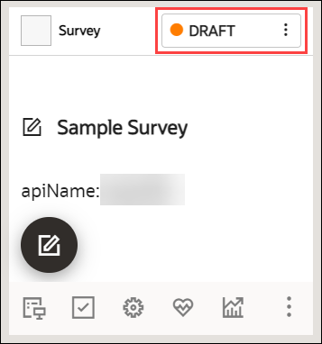
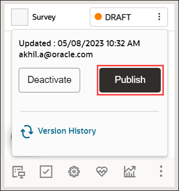
Now select Publish.
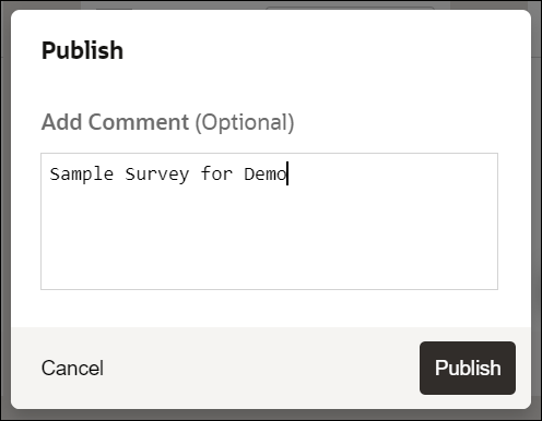
- Add comments (optional) and select Publish.
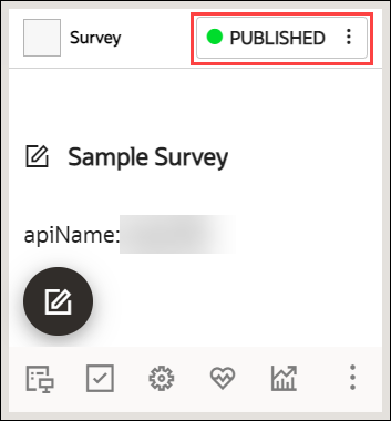
Your Survey is now published, and the status is set to "PUBLISHED".
Editing the Published Survey and Republishing
You can always make changes to the surveys you published.
- Select the Editor icon on the Survey to make changes.
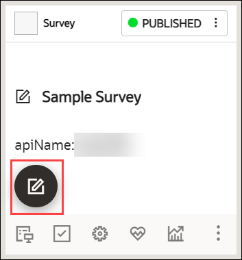
- Publish the Survey.
Each republish creates a new Survey version, with easy access to version history. In addition, you can restore to an older version of the Survey if you wish.
- Select the status button to view the version history.
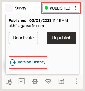
The revision history is now displayed.
- Select the Restore button, if you wish to restore to an
older version.

Survey Analytics
Survey Analytics are used to process, store, and visualize survey data. This adds another tool in OGL’s "insight to action" toolchest supporting content management, product management, and analytics. OGL console users with View Analytics security permissions can generate a downloadable report from the Survey Analytics dashboard that will be emailed to them.
| FEATURE DESCRIPTION | ROLE | ADDITIONAL INFORMATION |
|---|---|---|
| Survey Analytics |
|
|
View the Survey Analytics
To view the Survey Analytics:
- On the main navigation menu, select Dashboards >
Surveys.
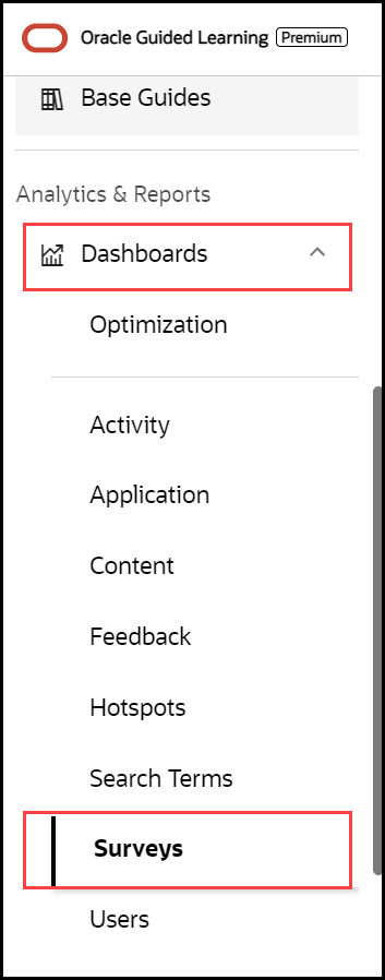
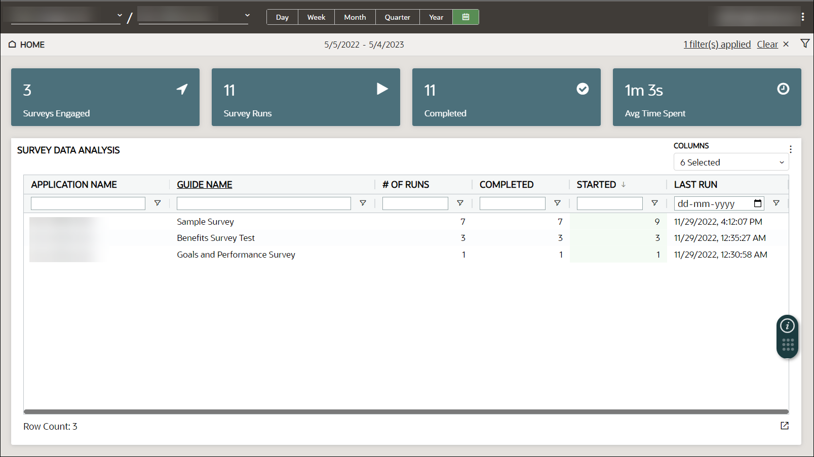
The Survey analytics dashboard is displayed. You can see the statistics like the Number of Runs, surveys Started and Completed, and the Last Run date.
- Select the time frame for which you would like to view the analytics
data. You can also select a custom date(s).

- Select the Filter icon (
 ) to filter the analytics data.
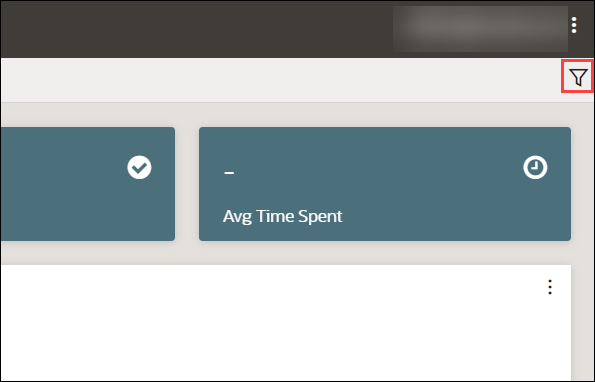
Generate a Survey Analytics Report
Note:
The procedure below will run a report that will be sent to the email address in your OGL user profile. To update or verify your email address, select your username in the top-right corner of the OGL console and select My Profile.
To generate and receive a Survey analytics report via email:
- On the main navigation menu, select Dashboards in the
Analytics & Reports section, then select Surveys.
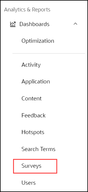
The Survey Analytics dashboard is now displayed.
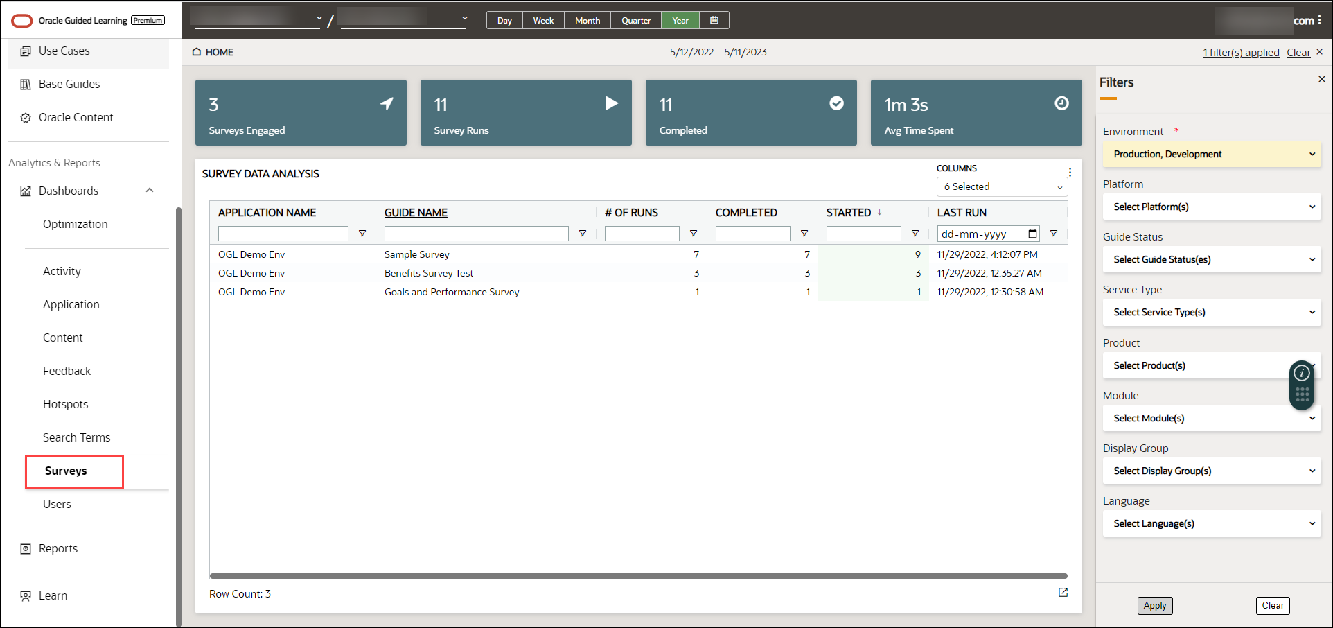
The Filters slider window is displayed on the right side of the Reports screen. Apply filters, as needed.
- Select the Survey guide for which to generate the report.
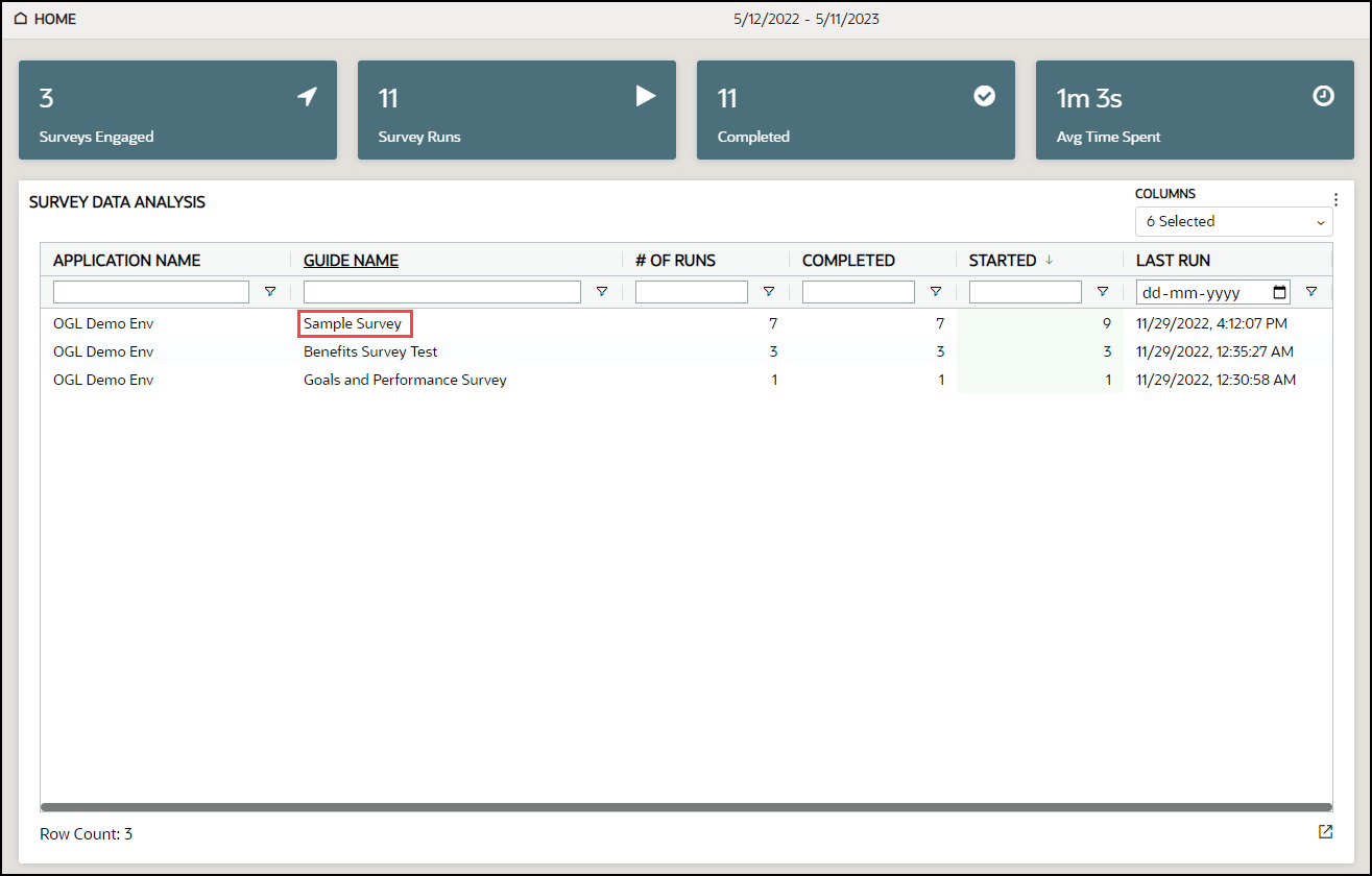
A dashboard of the selected Survey guide is displayed.
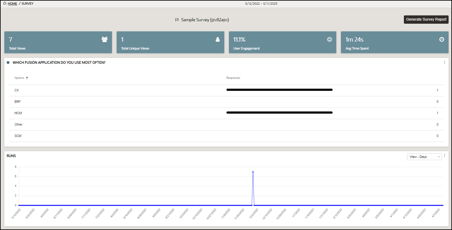
- Select the Generate Survey Report button.

- The following message will appear in the banner to alert you that
your report is being processed and will be sent to you via email when ready.

- Go to your email inbox and check for the new mail with subject
"OGL Survey Report".
The email should look like this.
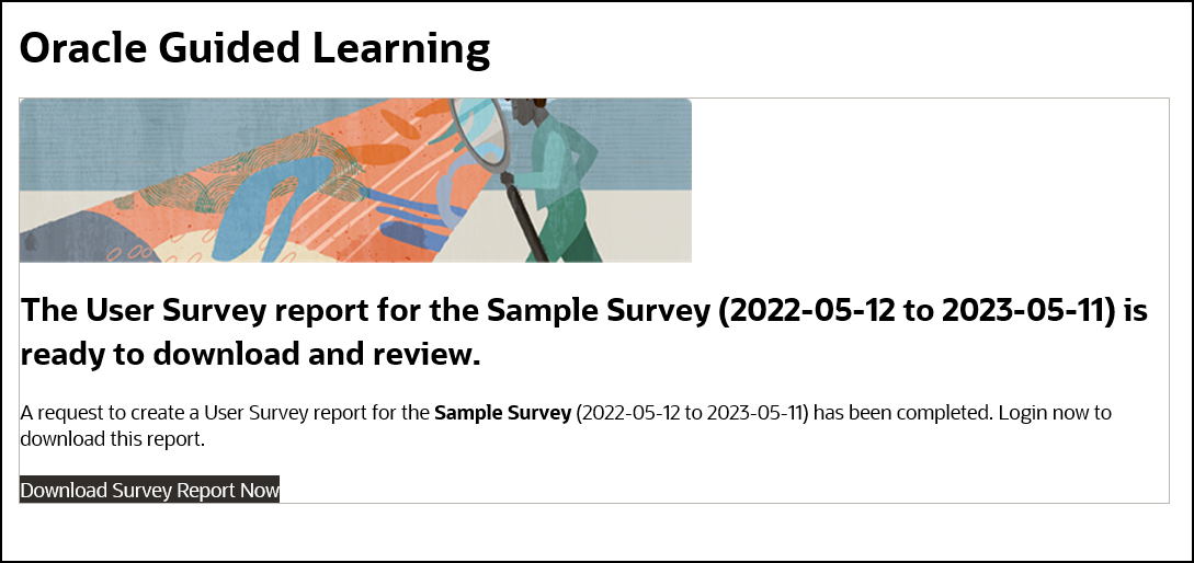
- Select the Download Survey Report Now link provided in the
email.
The browser now downloads the report.
Net Promoter Score (NPS) Survey
In addition to the other available survey question types (Multiple Choice, Single Select, True or False, Rating Scale, Experience Rating, and Question), OGL also offers a New Promoter Score (NPS) survey type. This unique survey type employs a slightly different guide editing flow than traditional survey types and also has a separate analytics dashboard for analyzing NPS survey responses.
Note:
An OGL Premium subscription is required to create and deploy Surveys, Survey Analytics, and their related features.
The survey feature requires the following OGL security role and permissions: Developer role → Edit Guides and Create/Import Guides permissions.
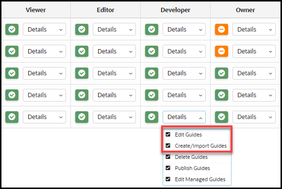
What is a NPS survey?
Net Promoter Score (NPS) is a market research metric that is based on a single survey question that asks respondents to rate the likelihood that they would recommend a company, product, or a service to a friend or colleague. The survey asks customers a single question: "How likely are you to recommend our products or services to others?"
Customers respond on a scale of 0-10, with 0 being "not at all likely" and 10 being "extremely likely".
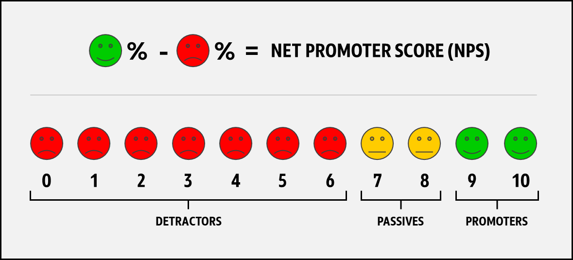
Based on the survey responses, customers are classified into three groups:
- Promoters (score 9-10): These customers are loyal enthusiasts who are likely to recommend the business to others and are valuable assets to the business.
- Passives (score 7-8): These customers are satisfied but not necessarily loyal and may be easily swayed by competitors.
- Detractors (score 0-6): These customers are unhappy and likely to spread negative feedback about the business, which can harm the business's reputation.
How is a Net Promoter Score calculated?
Net Promoter Score is calculated by subtracting the percentage of detractors from the percentage of promoters. The formula for calculating Net Promoter Score is:
NPS = % Promoters - % Detractors
Note:
For example, if 60% of respondents are promoters, 10% are detractors, and 30% are passives, your NPS would be: 60-10=50Steps to create a NPS survey
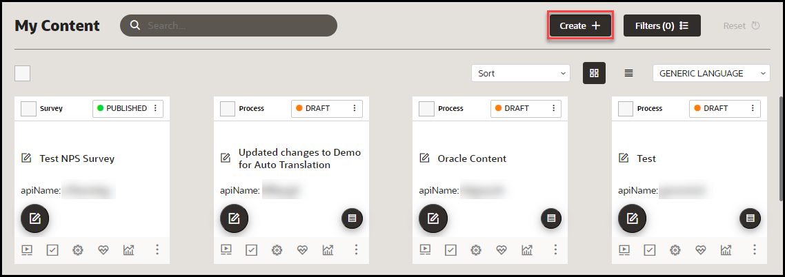
- From the My Content page, select the “Create” icon to create a new
guide.
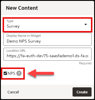
- In the New Content modal, select Survey from the Type
dropdown menu, enter a display name, and location URL, as
required.Important: Select the NPS checkbox. This will load
the NPS survey guide editor and flow.Then select Create.
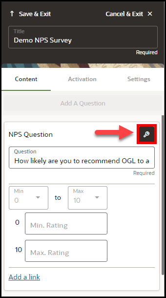
- In the NPS Survey editor, enter the text for your survey question
in the Question field.(Optional - You can select Add a link to create a
hyperlink to a specified URL.)

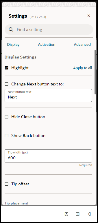
- Select the Question Settings button (
 )to apply any additional Display, Activation, or Advanced settings, as
needed.
Apply settings, as needed, and close the Settings panel.
The survey question will appear in the NPS survey tip, as shown below:

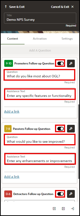
- To enable follow questions, select the Switch to show button
(
 ) to enable follow up questions for Promoters, Passives, and Detractors,
as needed.
- The Follow up question will be triggered based upon the
survey respondent's rating
(Rating of 9-10 triggers the Promotors Follow up Question, rating of 7-8 triggers the Passives Follow up Question, rating of 0-6 triggers the Detractors Follow up Question)
- Enter the Question text and Assistance Text for each follow up question, as needed.
- Select the Question Settings button (
 ) to apply any additional Display, Activation, or Advanced
settings, as needed.
- The Follow up question will be triggered based upon the
survey respondent's rating
- Select Save & Exit.
NPS Survey Analytics
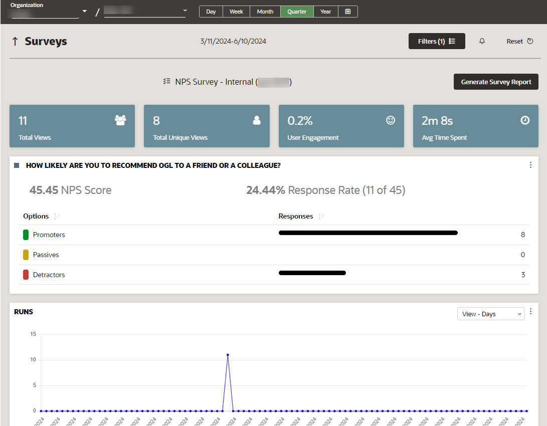
OGL's NPS Survey feature offers a unique analytics dashboard that allows OGL administrators to view analytics specific to the NPS survey responses. The NPS Analytics dashboard allows to you see data related to Total Views, Total Unique Views, User Engagement, and Average Time Spent as well as an analysis of the NPS survey responses, including a breakdown of the total responses by Promoters, Passives, and Detractors. The Net Promoter Score is calculated by subtracting the percentage of detractors from the percentage of promoters.
The formula for calculating Net Promoter Score is:
NPS = % Promoters - % Detractors
Note:
For more information about the NPS Survey analytics, refer to the Surveys Analytics Dashboard topicWorking with Link Guides
Consolidation of Link, Video, and Training guides
In OGL 24B Release, the Link, Video, and Training guide types have been consolidated into a single guide type called Links, while preserving the full functionality and guide options previously available in Training Guides to offer more efficient management of similar guide types. All previous Link, Video, and Training guides that were created before OGL 24B release have all been converted into the new Link guide type and automatically tagged with the labels “Legacy Link”, “Legacy Video”, and “Legacy Training”, respectively, to ensure proper classification of these guides and to allow console users to easily identify all pre-existing guides of these types.
Creating Link Guides
Creating Links
To create a new Link Guide:
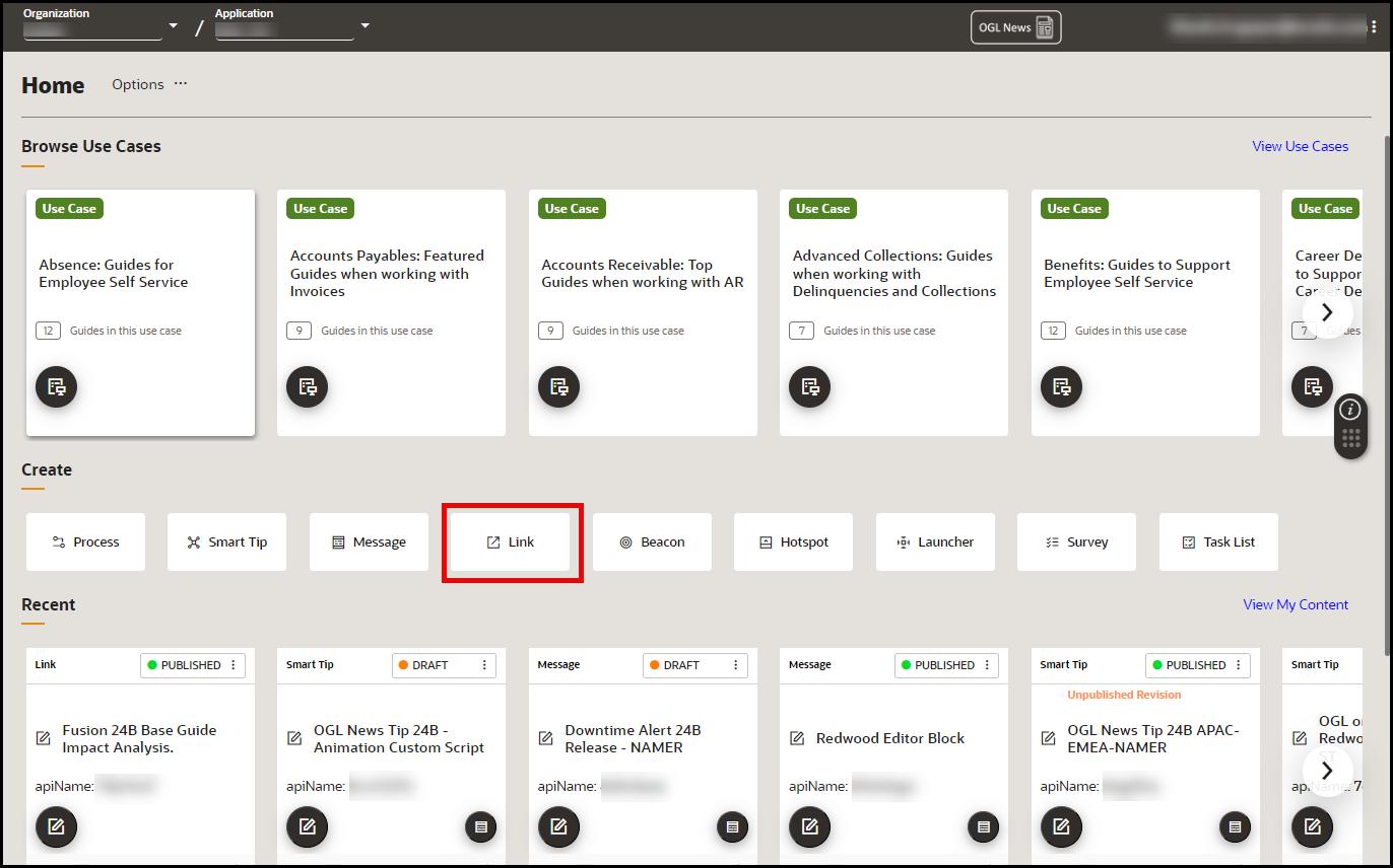
- On the OGL homepage, select Link button in the Create row. (You
can also select the
button from the Content page and select Link from the Type dropdown menu)
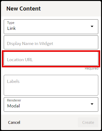
- In the Display Name in Widget field, enter the name of the link
as it should appear in the Help Panel (Widget). In the Location URL
field, enter the complete URL of the page you wish to reference.
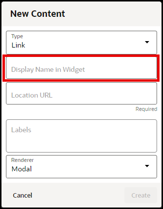
- In the Location URL field, enter the complete URL of the
page you wish to reference (For example:
https://education.oracle.com/oracle-cloud-guided-learning-premium).
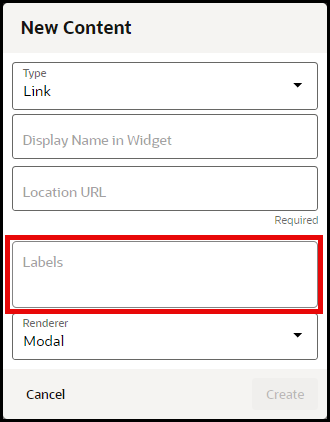
- (Optional) In the Labels field, enter or select any labels with which you
want to associate or tag the guide. You can also apply and manage labels in the
Guide Settings for the guide at anytime.
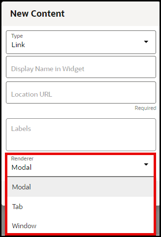
- Choose the desired Renderer for the link to determine whether
the content will open in a modal, a new tab, or a new browser window..
- Select Create button when finished.
Note:
Remember to set your activation conditions, refer to the Enabling Guide Activation Settings sectionWorking with Created Content on the Console
Content Management
The Guided Learning content management interface provides a detailed overview of the content in the app ID. Chose from over 40 columns to achieve the view that best supports your content analysis.
Accessing the Content Management Interface
- On the Main Navigation Menu, select Content.
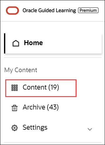
My Content screen is displayed.
- Use the Filters option (
 ) to filter the contents you want to view/manage.
By default, all contents are selected.
Note:
Exporting guide content using the Content Management interface may take longer depending upon the number of guides selected for the exporting and whether you choose to include screenshots. Prior to using the Content Management export feature, apply the desired filters (or language selection) in the OGL Console, then access the Content Management interface. The table will only display the filtered items.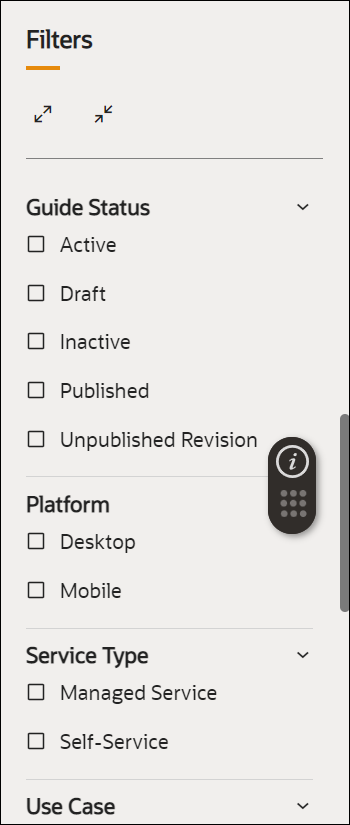
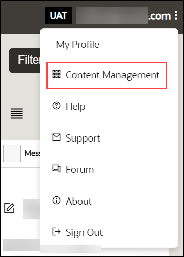
- Select the User Menu in the top-right corner.

The drop-down menu is displayed.
- Select Content Management.
- The below interface is presented.
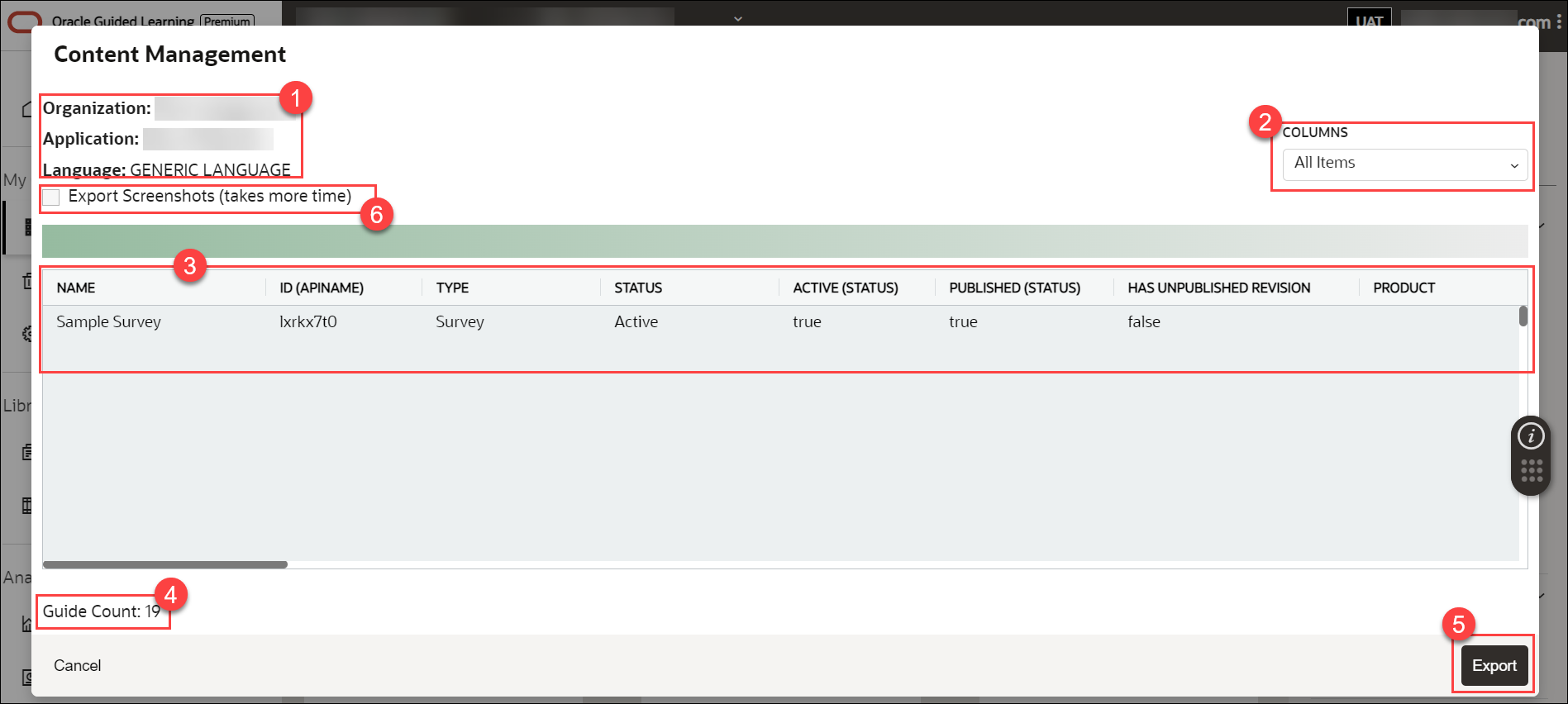
Legend Description Additional Information 1 Account Information This section provides the organization, application, and language information.
Note:
To analyze information in any of the available languages, select the language from the OGL Console, then access the Content Management interface.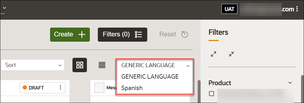
2 Content Infomation Columns There are over 40 columns to support analysis of the content, this includes, step text, selector ID, item status, etc 3 Content Detail Table This table lists all the contents that you filter. It also shows additional details like the API ID, content type, status, etc. 4 Guide Count This is the total guide 5 Export Export allows you to export the Content Detail to a spreadsheet file for further analysis 6 Export Screenshots This option allows you to include screenshots of all selected guides in the export file. Note:
Selecting this option may take more time to export. - Check the Export Screenshots option if you want to include screenshots in the report.
- Select the Export button (
 ).
).
The browser now downloads the report in Excel format (.xlsx).

- Open the downloaded file.
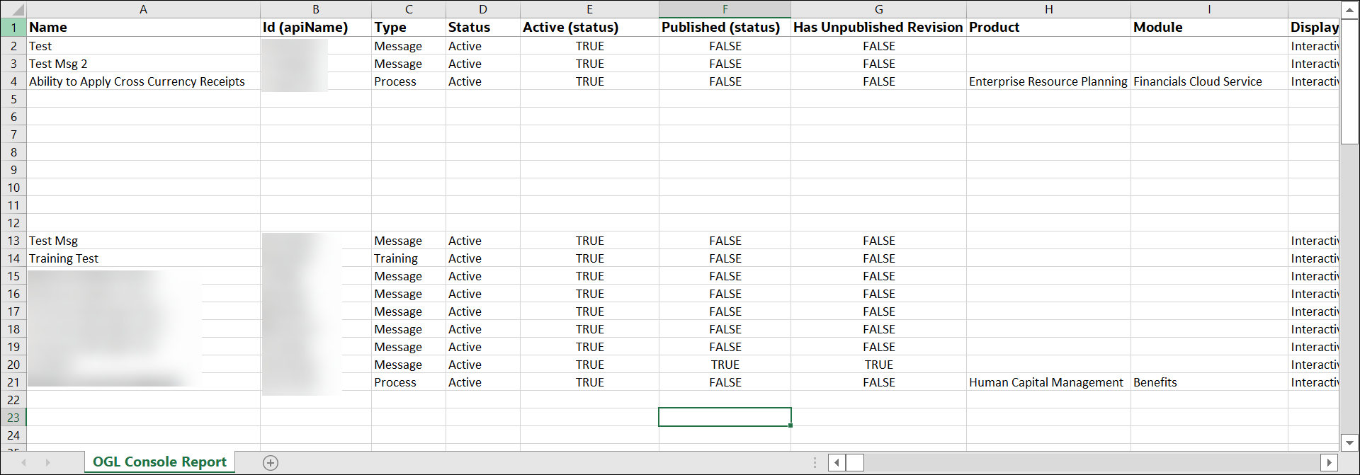
The Excel report looks like this.
Note:
Known Issue with this feature:When exporting data in the Content Management interface with the "Export Screenshots" option unchecked, the export file will include a column labelled "Screenshot" (last column) that contains URLs. These URLs, when accessed, will open a file containing a very long text string that is not valuable to the user. This will be fixed in a future release in which the URLs listed in the Screenshot column will be replaced with a True/False value indicating whether or not a screenshot is present.

Guide Status Management
Guide statuses are displayed on top right corner of the guide in the tile view.
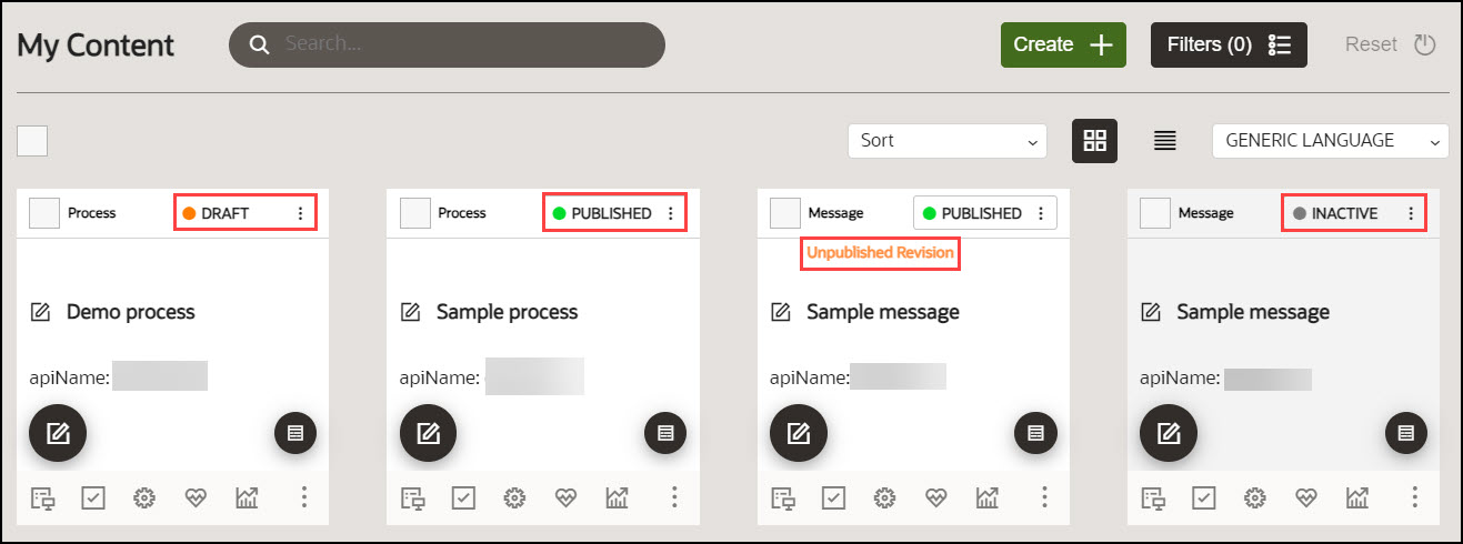
A guide can be in one of the following statuses:
Table 4-1
| Guide Statuses | Description |
|---|---|
| DRAFT | The guide is available only in DEVELOPMENT environments. |
| PUBLISHED | The guide is published and available in both DEVELOPMENT and PRODUCTION environments. |
| PUBLISHED with an Unpublished Revision | There is a published revision of the guide, which is available in the PRODUCTION instance, and there is also an UNPUBLISHED REVISION (usually an updated version) of the guide which is only available in the DEVELOPMENT environment. |
| INACTIVE | The guide is not active and cannot be accessed in the DEVELOPMENT or PRODUCTION environments. |
Guide Cycle
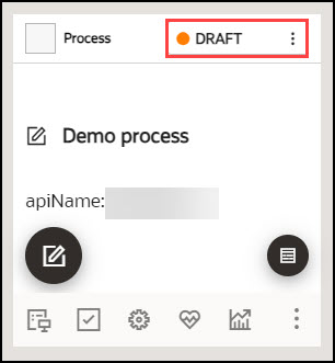
Draft Status
When a guide is created but not yet published, it is assigned a DRAFT status. Guides with Draft status can only be accessed in Development instances.
Published Status
Publish the guide in DRAFT status to change their status to "PUBLISHED". Once published, these guides will be accessible in both the Production and Development instances.
To publish a guide in DRAFT status:
- Select the DRAFT button.
- Select Publish.
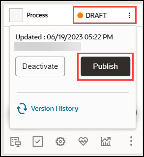
The status is changed now to PUBLISHED.
Note:
Please be aware it may take up to 5-10 minutes for the changes to reflect in the Production instance.
To unpublish a guide in PUBLISHED status:
- Select the PUBLISHED button.
- Select Unpublish.
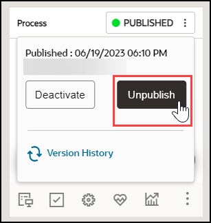
The status of the guide now changes to Draft.
Published Status with Unpublished Revision
After guides are published, they can still be revised. When revisions are made but have not yet been published, the guides will be labeled as "Unpublished Revision."
To revise a published guide:
- Select the Editor icon on the PUBLISHED guide.
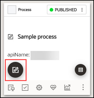
The guide editor launches.
- Make desired changes in the guide.
- Select Save & Close.
The guide is now labeled as "Unpublished Revision."
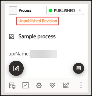
To publish an Unpublished Revision:
- Select the PUBLISHED button.
- Select Publish.
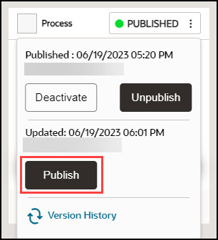
Inactivated Status
Both the guide in DRAFT and PUBLISHED status can be inactivated.
To make a guide inactive:
- Select the DRAFT/PUBLISHED button.
- Select Deactivate.
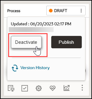
The guide is now inactivated.
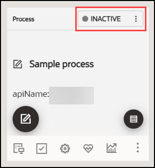
- Select the INACTIVE button.
- Select Activate.
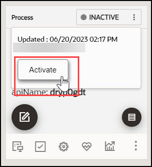
The status is now changed back to its previous state, either as a draft or as published.
Version History
This feature allows OGL developers to automatically save multiple versions of their active guides and provides the ability to preview any prior versions of guides. OGL console users with appropriate permissions can view the version history of guides and can select a previous version to be restored. OGL console users must have the Developer security role and Edit Guides permission.
To access the version history of a guide:
- Select the DRAFT/PUBLISHED button, then select Version History.
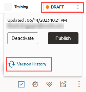
The Version History opens in a modal displaying all prior versions of the guide, including the date and time of each revision, and the username of the OGL administrator who edited/saved each version.Guide versions are listed sequentially in descending order by date (newest to oldest).
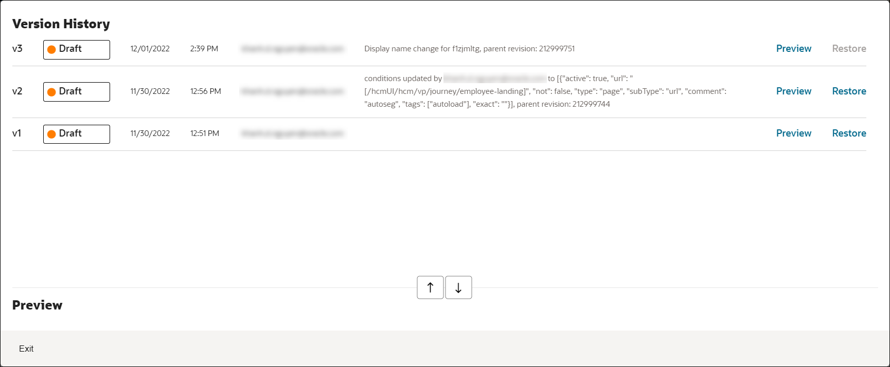
- To preview any prior version of the guide, select the corresponding
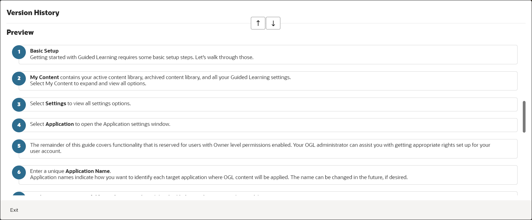
Preview link to the right of the version.

The preview will expand in the modal to display a step video, screenshots, and steps contained within of the guide (if applicable) as well as well as the text contents of each step.
Note:
The preview displayed within the Version History is read-only and will not allow you to edit the guide contents. To edit the guide content, you will need to use the OGL Editor or Content Editor to make changes. - To restore the guide to a previous version, select the corresponding
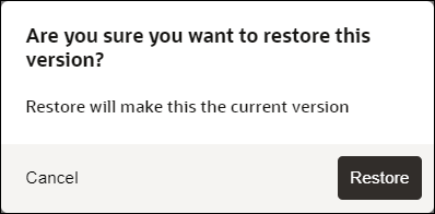
Restore button to the right of the version you wish to restore.

A dialog message will appear prompting you to confirm the action or cancel. Select Restore to confirm and continue.
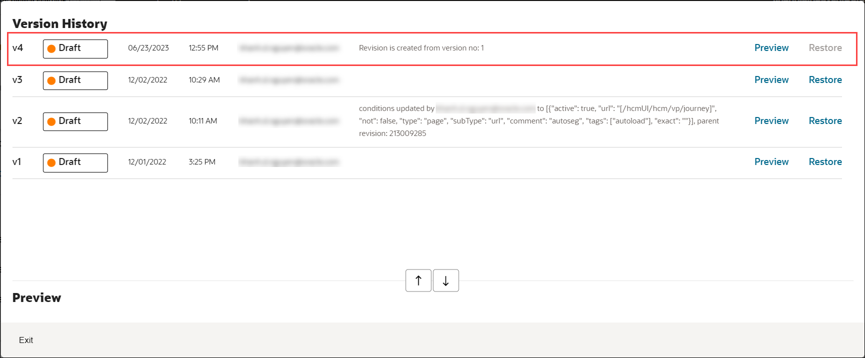
A new version of the guide will appear at the top of the Version History modal with a comment indicating that a new revision has been created from a previous version.
Note:
Known Issue:If you create a guide, translate it to another language, and then delete any steps from the guide in the original Generic Language folder, the translated version will also show the steps deleted, as intended. However, the older versions of the guide in Version History will also show those steps as deleted within the Preview. This issue occurs only within the Preview and will not delete those steps from prior versions. If you restore the guide to an older version, the Preview will be restored in the Content Editor and will show the deleted steps as restored.
Content Editor
The Content Editor enables you to make simple text edits to guides without the need to access the OGL Editor. OGL administrators can provide you access to the Content Editor only (if required) for reviewing and making simple updates. Users who have the appropriate security role and permissions can make the following changes to a Guide from the Content Editor:
- Edit and format guide step text.
- Translate guide step text in a connected guide.
- Add links to a guide step.
- Add/edit Guide and Step Comments.
Important:
In order to access the Content Editor, your profile must have Editor Role/Permissions enabled.Learn more about User Management.
To learn how to access the Content Editor, please refer to the "Working with the Editors" section.
Editing the Text Using the Content Editor
On the Content Editor panel, select the text in a specific step to make changes.
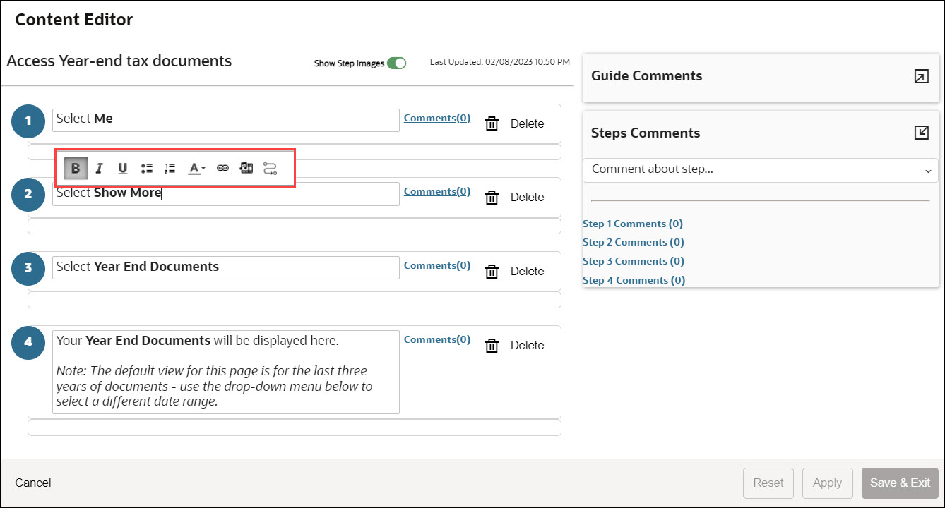
The below controls are displayed when you select a step, allowing you to make changes to the text, add bullet points, change the font color, or embed a link and multimedia.

To learn how to use the formatting tools, please refer to the "Editing Guide Content" section.
Showing or Hiding Step Videos and Step Images
To display or hide the step images and videos, use the toggle button.
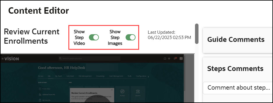
With the Content Editor, you can delete guide steps.
Important:
Deleting guide steps using the Content Editor requires the Developer security role and Edit Guides permission.Learn more about User Management.
To delete a step, select the Delete button located next to the respective step.

To delete the step, a confirmation dialog will appear, and you must select Yes.
Important:
Use caution when deleting guide steps using the Content Editor as this may cause some guides to break or malfunction. It it strongly recommended that you test your guide after deleting any steps.
Learn more about User Management.
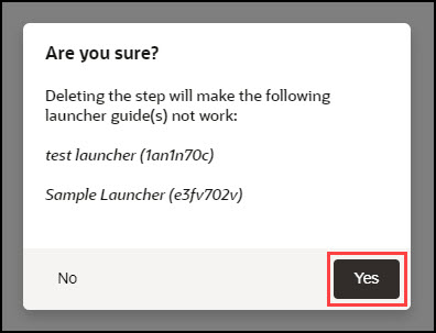
Important:
Once a guide step is deleted using the Content Editor, you cannot undo this action. Instead, you will need to restore the guide to a previous version using the Version History in the Guide Status.Learn more about Version History If you delete any steps from a guide, the other versions of the guide in Version History will also show those steps as deleted within the Preview. This issue occurs only within the Preview and will not delete those steps from prior versions. If you restore the guide to an older version, the Preview will be restored in the Content Editor and will show the deleted steps as restored.Guide and Step Comments
To support collaboration between multiple OGL developers or guide reviewers, OGL provides a comments feature that allows guide reviewers with editor access to add comments to a guide or an individual step within a guide. This feature allows OGL developers and reviewers to collaborate efficiently on edits and guide status throughout the review and approval process. This incorporates a simple "What you see is what you get" (WYSIWYG) editor.
Examples of potential comments that could be made about an overall guide include:
- "Guide passes testing"
- "I cannot find this guide in the widget"
- "This guide failed testing, see comment on Step 12"
- "We don't use Milestones, so this guide must have those steps removed."
- "This guide must be expanded upon because we have some custom workflows.''
Examples of comments that might be made at the step level include:
- "Please change the selector for this step to Personal Information"
- "Guide does not advance after this step"
- "Please insert a smart tip on the date field"
- "Please insert a link to the travel policy in this tip"
Comments can be added, viewed, and edited through the content editor or included when editing in the full editor.
Adding Guide Comments
This feature allows you to enter issues or comments into the guides.
To add guide comments:
- Select the expand icon to access the text field.

- Enter the comments and select the Send button (
 ).
).

The issue/comment is now added to the guide and is visible here.
Comments are displayed in date/time order, with the newest comment at the top of the list. OGL Editors can review all comments added to a guide from the comments panel and use the comments links to view comments related to a specific step. All comments are date, time, and user stamped.
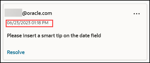
Comments can be edited or deleted from the comments panel.
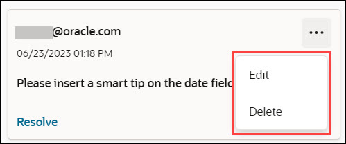
Resolving an Issue
After fixing the issue, the concerned individual can mark it as resolved.
To mark an issue as resolved, select Resolve.
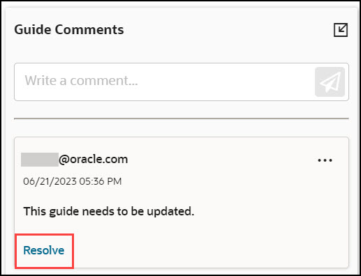
The issue is now marked as resolved.
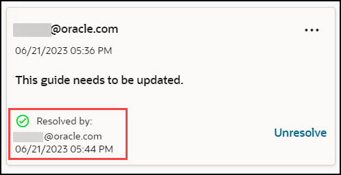
Revert a Resolved Issue
To undo the resolved issue, select Unresolve.
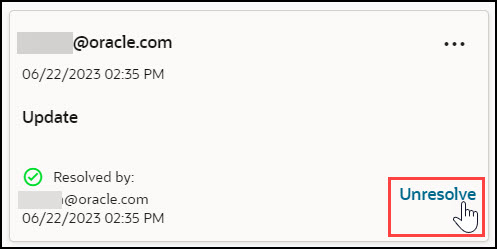
Adding Step Comments
This feature allows you to enter issues or comments into specific steps.
- Select the expand icon to access the text field.
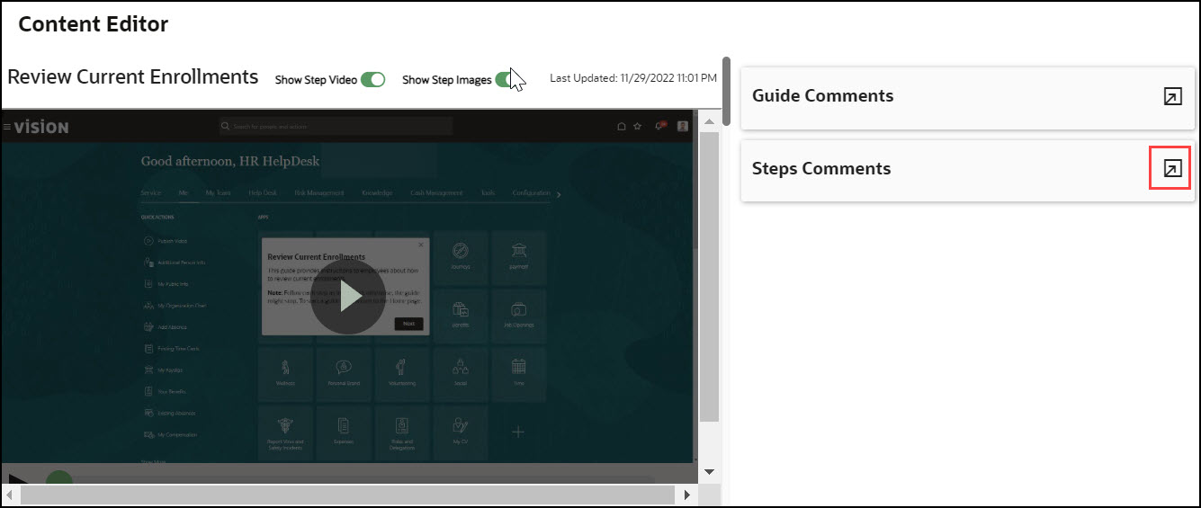
- Select the step you want to add the comment/issue to.
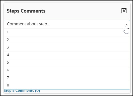
- Enter the comments and select the Send button (
 )
)
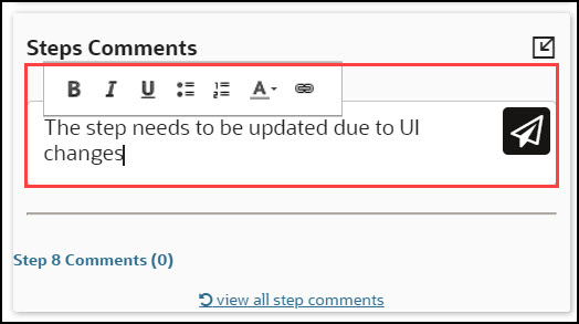
The issue/comment is now added to the step and is visible here.
Comments are displayed in date/time order, with the newest comment at the top of the list. OGL Editors can review all comments added to a guide from the comments panel and use the comments links to view comments related to a specific step. All comments are date, time, and user stamped.
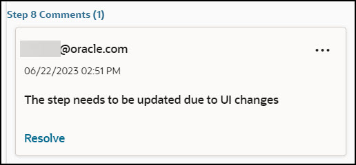
Resolving an Issue
After fixing the issue, the concerned individual can mark it as resolved.
To mark an issue as resolved, select Resolve.
Revert a Resolved Issue
To undo the resolved issue, select Unresolve.
Note:
To view comments for a step, simply access the OGL Editor. If there are comments available, the Comments button will display the number of comments as highlighted in the below screenshot.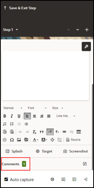
Saving Changes
Once you finish editing, select Apply or Save & Exit, andthe guide status will update to Unpublished Revision. Depending on your permissions, you can either publish the guide changes to production or request that the changes are published by an OGL administrator with the appropriate permissions.
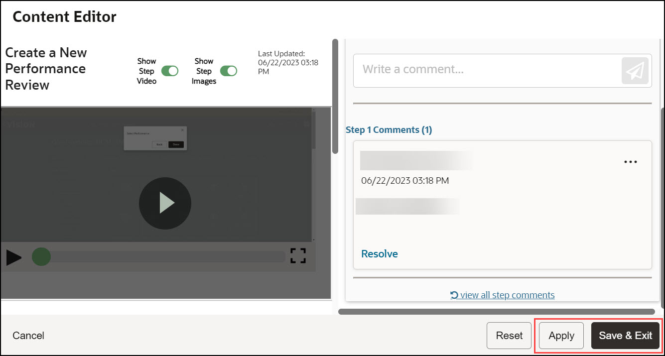
Remember:
- Comment Edit and Delete buttons are only available if the OGL developer or User has the correct permissions.
- All comments show the user name of the user who added them and the date that the comment was added. If the date is today's date, then it will show the number of hours since the comment was made.
- Comments can be edited and deleted by the creator of the comments.
- Users with the Manage Comments permission under the Owners group can edit or delete comments.
- Comments remain with the guide for the life of the guide.
- Comments are copied with the guide if it is cloned.
- When a tip or entire step is deleted, the comments are deleted also., even if the user does not have the Manage Comments permission.
- The character limit in all comments is 512 characters.
- Each comment creation field includes a character limit counter that dynamically counts down from the character maximum as the user types.
- When a user deletes a comment, they are prompted with the following message: “Are you sure that you want to delete this comment?”.
- If the user has not seen the guide or step comments, an indicator lets them know that new comments are available.
Guide and Step Comments
Note:
The Guide and Step Comments feature and functionality will be removed from the OGL console in OGL 25D.To support collaboration between multiple OGL developers and or guide reviewers, OGL now provides a comments feature that allows guide reviewers with editor access, to add comments to a guide or to an individual step within a guide. This feature will allow OGL developers and reviewers an efficient way to collaborate on edits and guide status throughout the review and approval process. This incorporates a simple wysiwyg editor.
Examples of potential comments that could be made about an overall guide include:
- "Guide passes testing"
- "I cannot find this guide in the widget"
- "This guide failed testing, see comment on Step 12"
- "We don't use Milestones, so this guide will need to have those steps removed"
- "This guide will need to be expanded upon because we have some custom workflows"
Examples of comments that might be made at the step level include:
- "Please change selector for this step to Personal Information"
- "Guide does not advance after this step"
- "Please insert a smart tip on the date field"
- "Please insert a link to the travel policy in this tip"
Comments can be added, viewed, and edited through the content editor or included when editing in the full editor.
Content Editor
The OGL Editor can now open the Content Editor for a specific guide to review and add comments. When OGL Opens the guide a comment panel will open on the right side of the screen. By default, comments are hidden. To view previously entered comments, click the File Folder icon to the right of the Guide Comment or Step Comment fields.
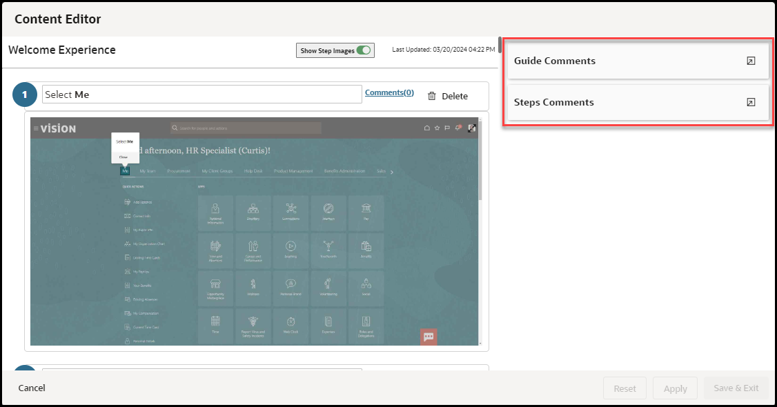
The OGL Editor has the option to view, edit, delete
and add comments at the guide level or add comments for individual steps. Clicking
the Comments
![]() button at the top right corner of a step in the the "Step Guide" opens the
comments panel for that particular step.
button at the top right corner of a step in the the "Step Guide" opens the
comments panel for that particular step.
To add a new comment the
Editor enters the text in the “Write a comment” field and clicks the Green Paper
Airplane
![]() at the end of the comment field to add the comment to the Guide or
Step.
at the end of the comment field to add the comment to the Guide or
Step.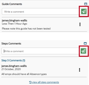
Comments are displayed in date/time order, with the newest comment at the top of the list.
OGL Editors can review all comments added to a guide from the comments panel and use the comments links to view comments related to a specific step. All comments are date, time, and user stamped.
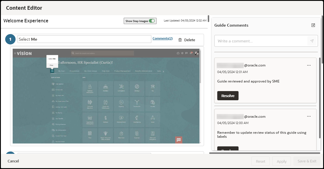
Comments can be edited or deleted from the comments panel.
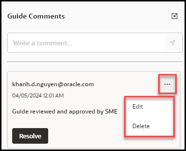
Once the update has been made to the comment, the OGL Editor clicks the Save button to save the change or Cancel to discard any changes.
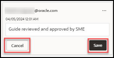
To indicate that the issue noted in the guide/step comment has been resolved or that you have taken necessary action, you can select Resolve on the comment as an indication to other administrators.
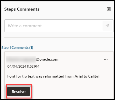
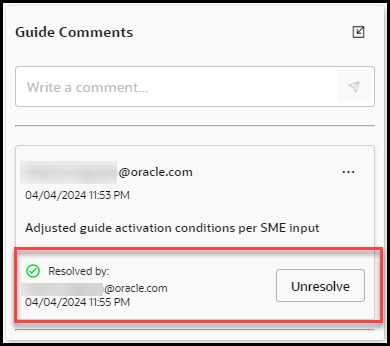
Full Editor
When an OGL Developer is working with a guide in the Full Editor, step comments are viewed, added, edited or deleted using the new comments button located directly below the text editor for a particular step. (To the right of the camera Icon) Click the comment button to open the comments panel for the selected step.

Select the Edit Comments button to view, add, edit or delete any Step Comments within this step.
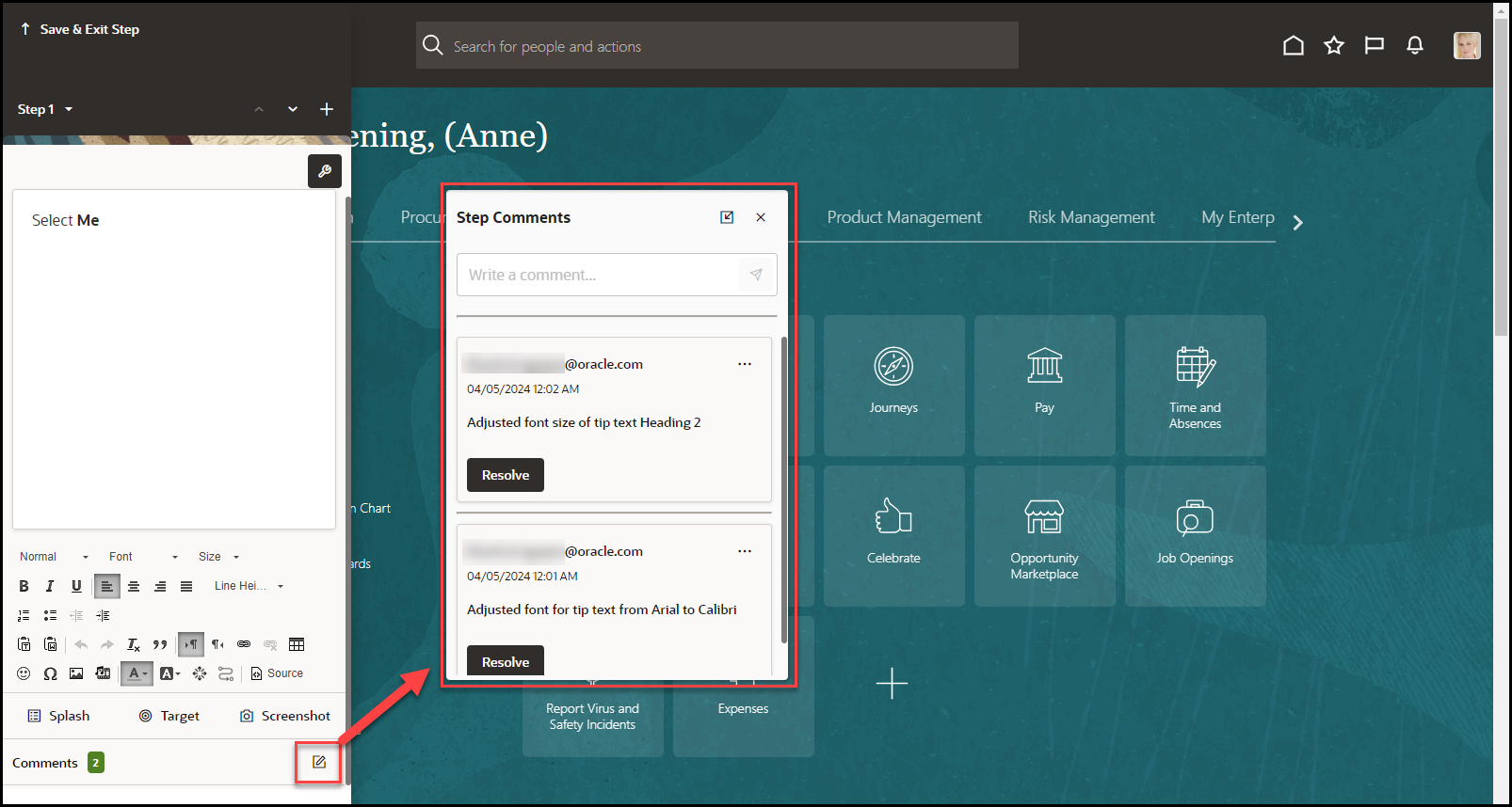
To add a new comment, enter your text in the
“Write a comment” field and select the Paper Airplane
![]() button to add the comment to the step.
button to add the comment to the step.
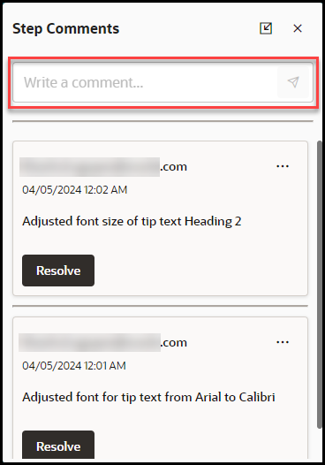
Note:
If there are comments available, the Comments button will display the number of comments and they are highlighted in green colorKey Points
- Comment Edit and Delete buttons are only available if the OGL developer or User has the correct permissions
- All comments show the user name of the user who added them and the date that the comment was added. If the date is today's date, then it will show the number of hours since the comment was made
- Comments can be edited and deleted by the creator of the comments
- Users with the Manage Comments permission under the Owners group can edit or delete comments
- Comments remain with the guide for the life of the guide
- Comments are copied with the guide if it is cloned
- When a tip or entire step is deleted, the comments are deleted also., even if the user does not have the Manage Comments permission
- The character limit in all comments is 512 characters
- Each comment creation field includes a character limit counter that dynamically counts down from the character maximum as the user types
- When a user deletes a comment, they are prompted with the following message: “Are you sure that you want to delete this comment?”
- If the user has not seen the guide or step comments, an indicator lets them know that new comments are available
Guide Setting Management
To access the Guide settings, select the Settings
![]() for the target guide.
for the target guide.
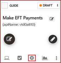
Settings include:
Table 4-2 Guide Settings
| Option | Description | |
|---|---|---|
| API Name | A unique identifier for the guide. | 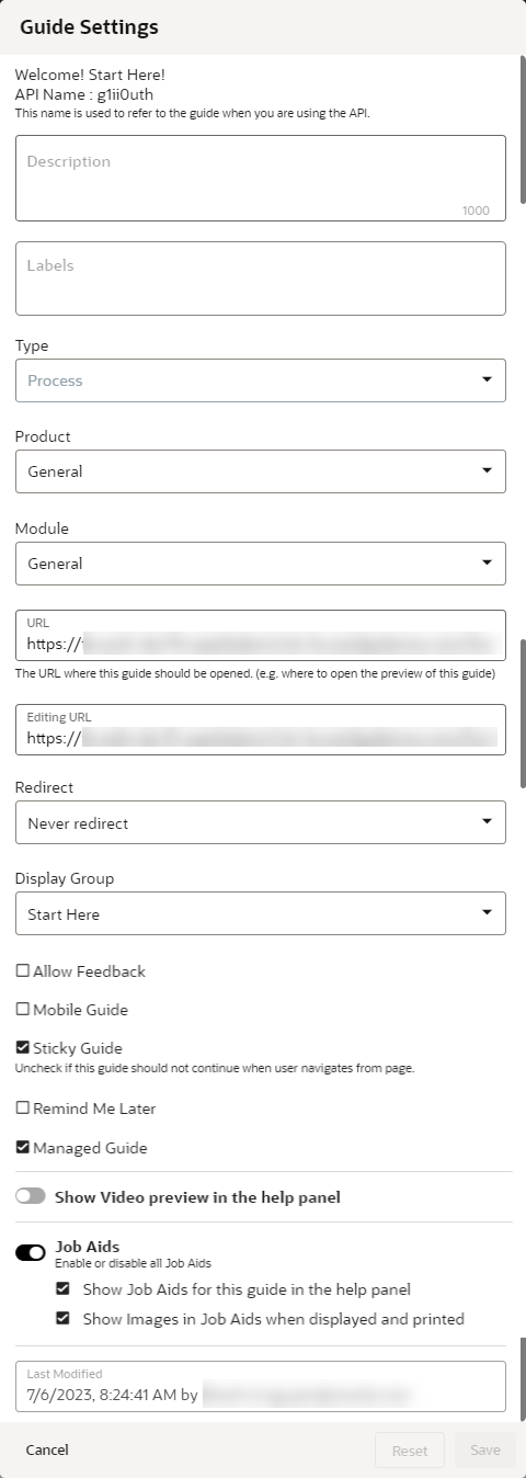 |
| Description |
Brief description of the guide. Note: The description is searchable, and you can add keywords to help your searches here. |
|
| Labels | Allows console users to create and assign labels for use in organizing and filtering guidesaccordingly to their labels. Labels can also be created and managed as a bulk action for multiple guides. | |
| Type | Indicates the type of guide: Beacon, Hotspot, Launcher, Link, Message, Process, Smart Tip, Survey, Task List, Training, or Video. | |
| Product | Lists the available Fusion Products set up for the OGL AppID. Select the product that the guide applies to. | |
| Module | Lists the available Fusion Modules set up for the OGL AppID. Select the module that the guide applies to. | |
| URL | The URL where the guide starts. This is also where the preview will display. | |
| Editing URL | The page to open when editing the guide. This can be different from the URL. | |
| Redirect | Specifies where to begin the guide. Typically, Never Redirect, the default option, is the best choice here. | |
| Allow Feedback | Specifies whether the guide will prompt the end-user to provide feedback on the guide per the Feedback settings. | |
| Mobile Guide | Specifies whether the guide is intended to appear on mobile devices. | |
| Sticky Guide | A Sticky guide remains active when the user leaves
the page on which the guide is running. Upon returning to the page
with the last step, the guide will start up again from the last
position.
Note: The Sticky Guide setting must be enabled for all Process guides to ensure that users can resume the guide from the last position if they leave the page and later return to resume the guide. |
|
| Remind Me Later |
This setting allows content developers to enable a button on the guide that allows end-users in the host application to temporarily hide auto-launched guides and to specify a time delay for the guide to re-launch at a later time that may be more convenient for user to take action (e.g., In 20 minutes, in 1 hour, in 3 hours, Tomorrow, or Next Week). Note: This feature can only be used on the following guide types: process, message, beacon, smart tip, and survey, and will only display on the first step of the guide. |
|
| Managed Guide | If your organization purchased Managed Service packs along with OGL, you will work with Oracle to identify Managed Service guides. Manage Service guides are maintained by Oracle and individuals without the appropriate permissions have limited access. This setting identifies which of your guides fall into that category. | |
| Show Video preview in help panel | Allows you to enable a video preview option for end users to play a video recording of the guide through the help panel. (Available for Process guides only.) | |
| Job Aids | Allows you to determine whether Job Aids (or "Step Guides") will be available to end-users through the help panel for this guide and whether images will be displayed in the Job Aids. (Available for Process guides only.) | |
| Last Modified | Indicates the date, time, and username of the OGL console user to last modified the guide. |  |
Deleting / Cloning Guides
- Select More
 for the target guide
- Select Clone
 to create a duplicate of the OGL item or select Delete
 to archive the item
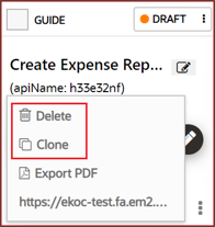
Creating Step Guides
With the help of Step Guides, you can create a job aid from an existing Process guide which includes all guide steps and associated screenshots, where applicable. Step Guides can then be printed or emailed.
To create a Step Guide from an existing Process guide, follow these steps:
From any Process guide in your My Content Library,
- Select the More

icon located at the bottom left of the guide title.
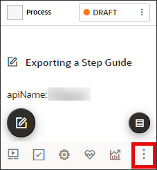
- Select Step Guide from the More actions menu.

- The Step Guide modal will open. You can select from the following
options:
- Show Screenshots - Enable this setting if you want to include screenshots for each step (if available).
- When Printed, print invisible steps - Enable this setting if you want to include any invisible steps in the Step Guide.
- Print - Send the Step Guide to your available printer.
- Email - Send an email using your default email application. The email body will include a link from where the recipient can download the Step Guide.

- Select Done, when finished.
Step Guides enhancement
Step Guides can now be exported in an editable PowerPoint (.pptx) file format as opposed to the previous un-editable PDF format. This enhancement allows OGL developers and administrators to edit and format the exported Step Guide using common PowerPoint tools, such as adding text boxes, colors, and images, to enhance the Step Guide.
Exported Step Guides will also include the following guide details in the exported slides:
- Guide name
- apiName
- APPID (first slide)
- Step ID
- Description of flow (first slide)
To export a Step Guide, select the More (…) button on the guide tile, then select Step Guide.

In the Step Guide modal, select Export to download the file to your Downloads folder:

Example of legacy Step Guide export in PDF format (legacy):

Example of new Step Guide export in PPTX format (post 24D.1):
Slide 1

Slide 2

The Step Guide can now be edited in PowerPoint, as needed.
Retrieving Deleted Content from the Archives
To access and recover deleted content items from the archives:
- Select My Content from Home page, and then select
Archive.
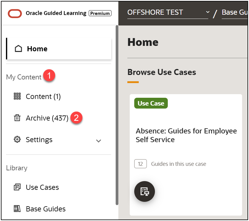
- Locate the target guide.
Note: Use Search (1) and Sort (2), the guides are filtered and listed accordingly.
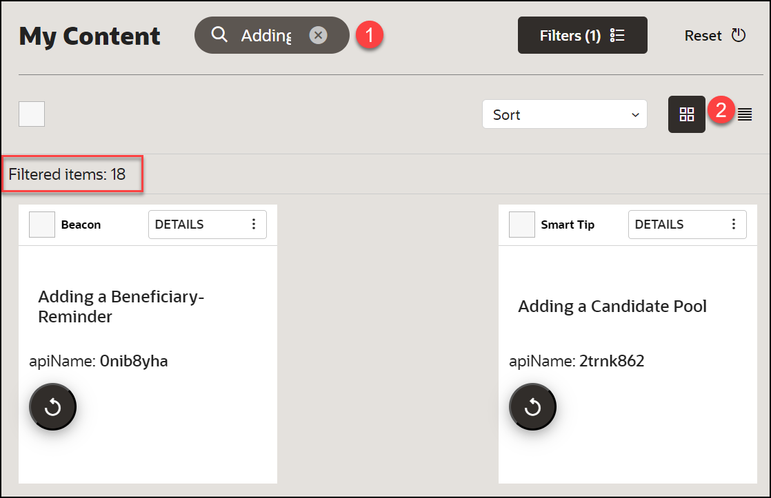
- Select the checkbox of the target guide and click on
Recover
 icon.
icon.
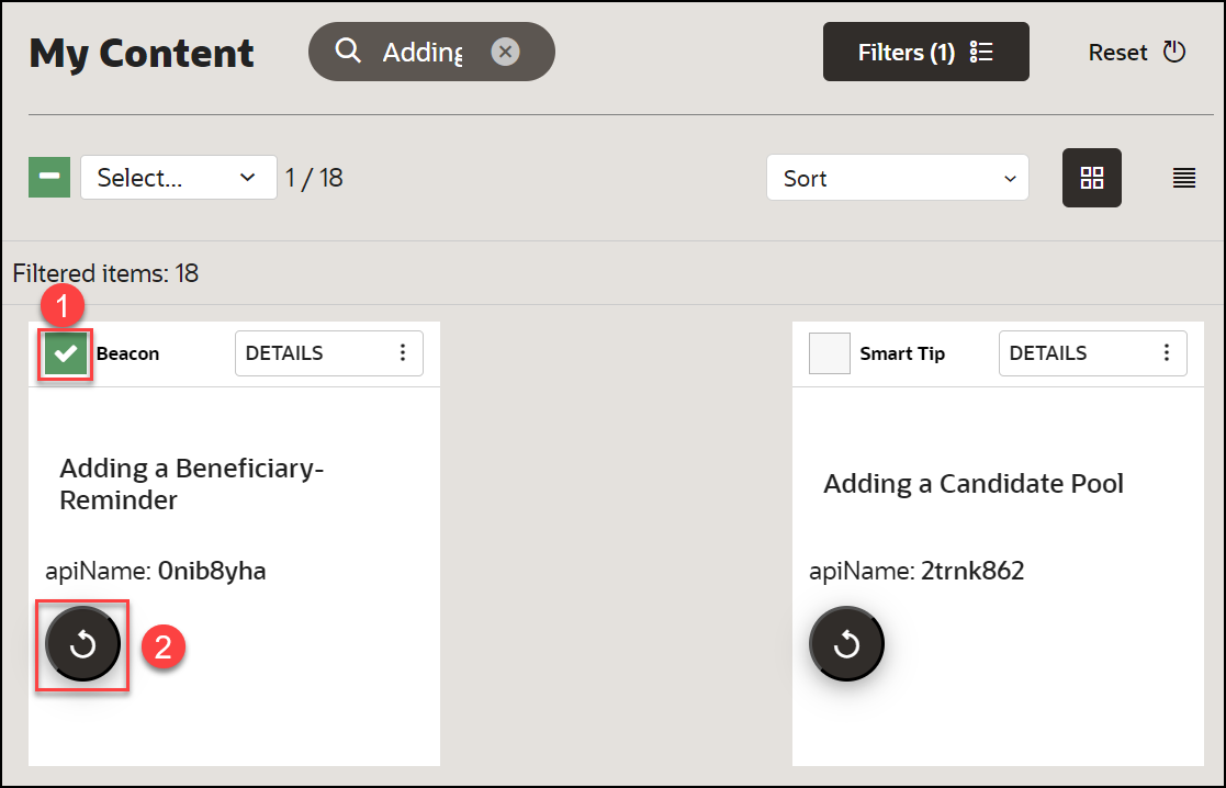
Note:
You will get a "recovered successfully" message as a result.PDF Export
You can Print or Email the document with the help of Job Aid. It contains the text of each step along with a screenshot of the application where the step takes place.
- To generate a Job Aid, select More
 for the target guide.
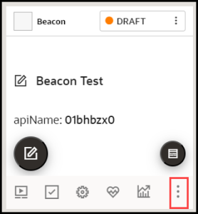
- Select Job Aid.
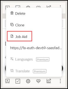
- Select the option to Print or Email and click Done.

Permalinks
Permalinks provide end users with quick access to launch a guide without having to go through the Launch Widget. These links can be embedded into an email message, knowledge base article, or LMS asset to allow end users to quickly launch a guide simply clicking the link. This link, when opened, automatically launches the guide in the host application, providing more efficiency and flexibility in distributing OGL content to end-users.
Note:
For more information about Permalinks, refer to this OGL Knowledge Article: https://docs.oracle.com/en/education/customer-success/guided-learning/ogl-faq/tips-tricks.html#GUID0C732461-4044-4220-A010-9A85E1BB0FD0
With OGL 25B, this console enhancement allows developers to quickly view and copy a Permalink for a guide for each specified domain from within the More Actions menu on the guide tile.
Permalinks can be obtained via the modal for the following supported guide types:
- Message
- Process
- Survey
Accessing the Permalink
- From the My Content page, locate the guide from which to copy the Permalink.
- Select the More
 button in the bottom-right of the guide tile.

- In the More Actions menu, select Permalink.
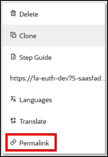
4. The Permalink modal will appear providing the Domain Name, Environment, and URL of each available Permalink.
Note:
A separate, unique Permalink will be listed for each available Domain.Select the Copy (
 ) button to copy the Permalink to your clipboard or select the URL
to open the Permalink.
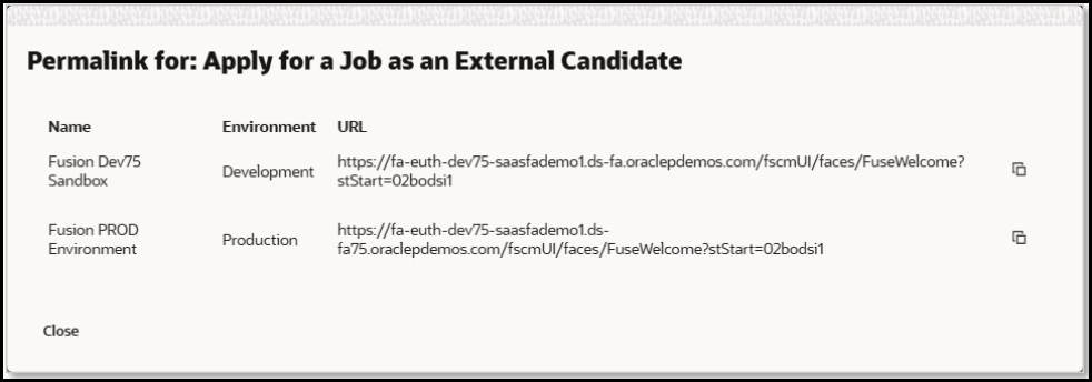
5. You can now paste the Permalink into your source documentation (e.g., email template, knowledge article/document, LMS content link, etc.).
Known Issues/Expected BehaviorNote:
For the Permalink functionality to work properly, OGL must first be deployed to your host application (i.e., Fusion) and you must have your OGL Domains setup for your DEV and/or PROD environments. Permalinks areunique and specific to each guide (apiName) and domain.Expected behavior:
- Signing into the Host Application:
- For Fusion applications, when an end user clicks a Permalink, they will be redirected to sign in with their Fusion login credentials before launching the guide (if the user is not already logged in).
- For Non-Fusion applications, the Permalink may or may not launch the guide depending upon the server configuration. As a best practice, end users should sign into the host application before attempting to access the Permalink.
- Permalinks do not recognize activation conditions assigned to the guide and can be opened by any user who opens the link, provided that they have access to the host application.
- For the Permalink to work properly, the guide must be Active and in Draft or Published status.
- Permalinks can only be obtained via the modal from the following
supported guide types:
- Message
- Process
- Survey
- In Fusion applications, Permalinks can only launch a guide from the home page and cannot launch to specific pages or deep links.
- For non-Fusion applications, Permalinks are dependent on the host application configuration and we recommend that you thoroughly test Permalinks in both the DEV and/or PROD environments before deploying them to end-users.
- Signing into the Host Application:
![]()
