3 Working with the Editors
The OGL Editor
The OGL Editor serves as the primary tool for creating various guides and formatting content.
Important:
- To use the OGL Editor, it is necessary for your browser to have the OGL Extension installed.
-
In order to access the OGL Editor, your profile must have Developer Rights/Permissions enabled.
Learn more about User Management.
Use the OGL editor to create process guides, Smart Tips, messages, and other OGL items. You can access the OGL editor by creating a new guide or from an existing guide. Guide creation is covered later in this document.
To access the OGL Editor (To Create a New Guide):
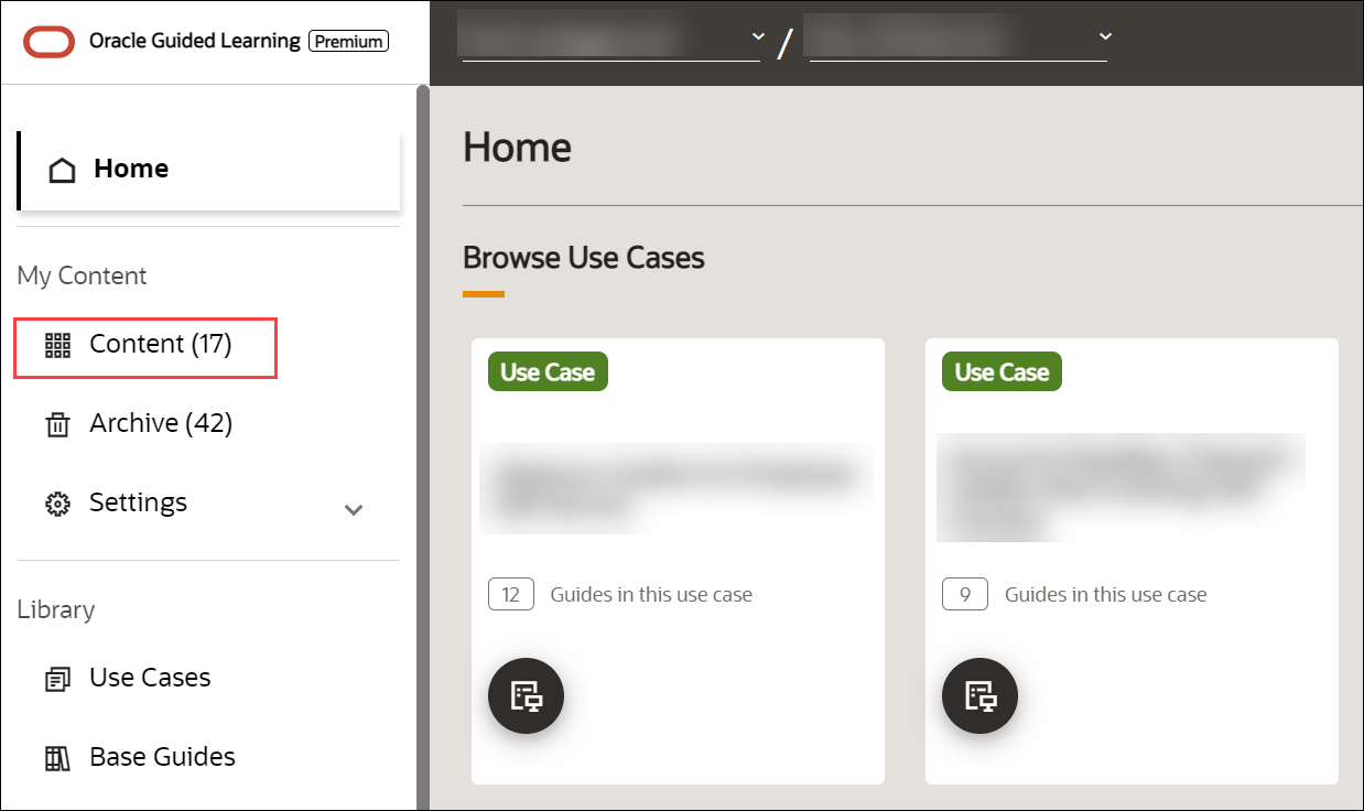
- On the Main Navigation Panel, select Content.
- On the My Content screen, select the
 button.

The New Content modal window appears.
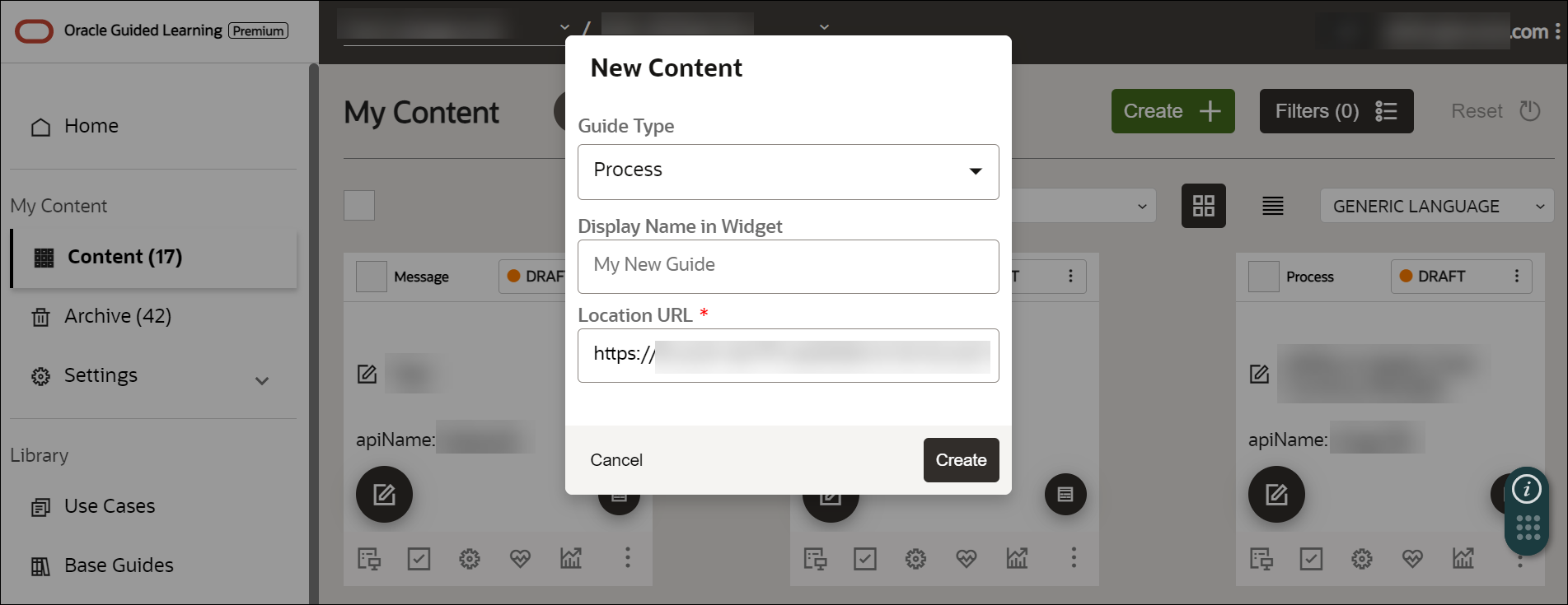
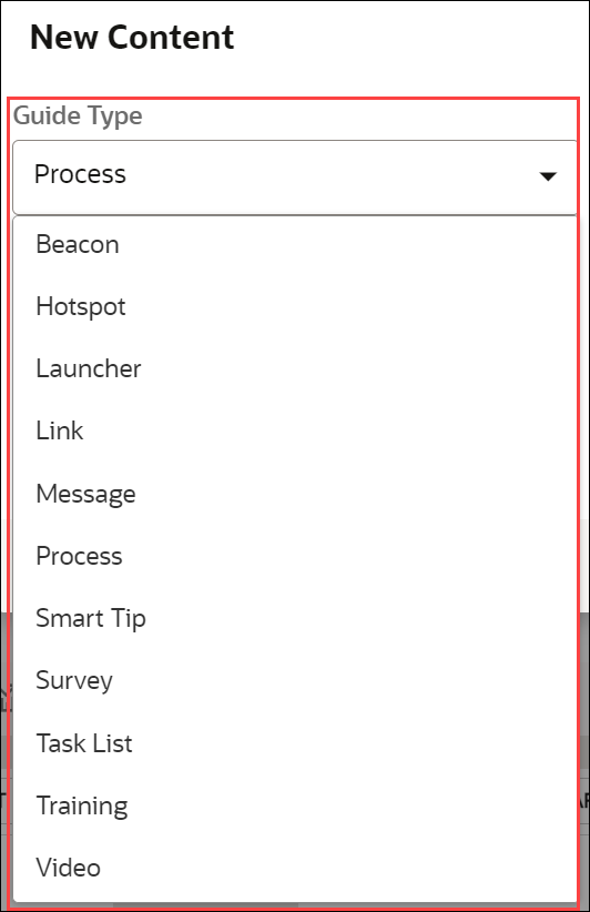
- Select the guide type from the Guide Type dropdown.
- Enter the desired display name of the new guide.
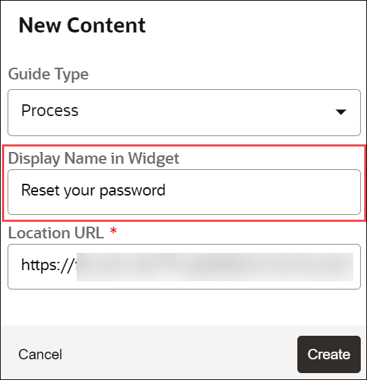
- Enter your application’s URL in the Location URL field.
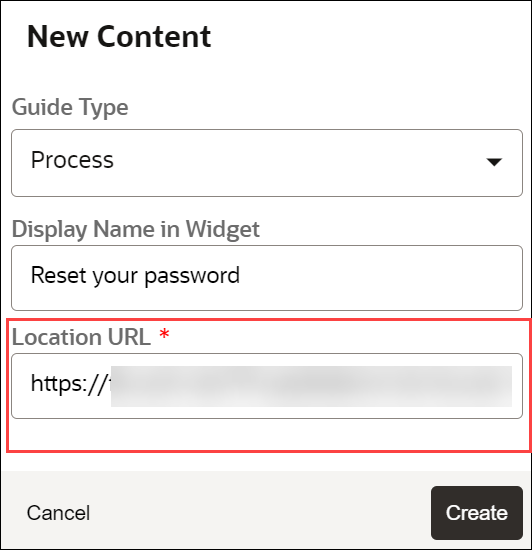
- Select Create.
The Guide Editor launches.
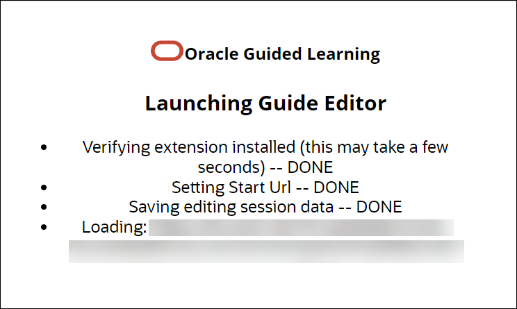
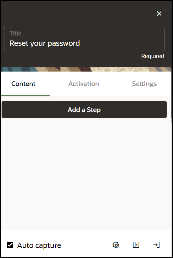
The OGL Editor opens in a new tab. The editor appears as an overlay on your application.

To access the OGL Editor (To Update an Existing Guide):
- Select the Editor icon (
 ) on the guide you want to edit.
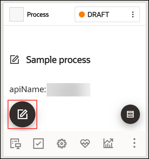
The OGL Editor opens in a new tab. The editor appears as an overlay on your application.
To learn more about creating guides, kindly access the link "Creating OGL Content".
The Content Editor
The Content Editor enables you to make simple text edits to guides without the need to access the OGL Editor. OGL administrators can provide you access to the Content Editor only (if required) for reviewing and simple updates. All users can make the following changes to a Guide from the Content Editor:
- Edit guide step text.
- Translate guide step text in a connected guide.
- Add links to a guide step.
Important:
In order to access the Content Editor, your profile must have Editor Rights/Permissions enabled.
Learn more about User Management.
To access the Content Editor:
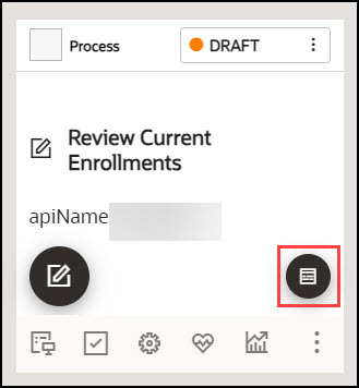
- Select the Content Editor (
 ) icon on the guide tile.
The Content Editor dialog is now displayed.
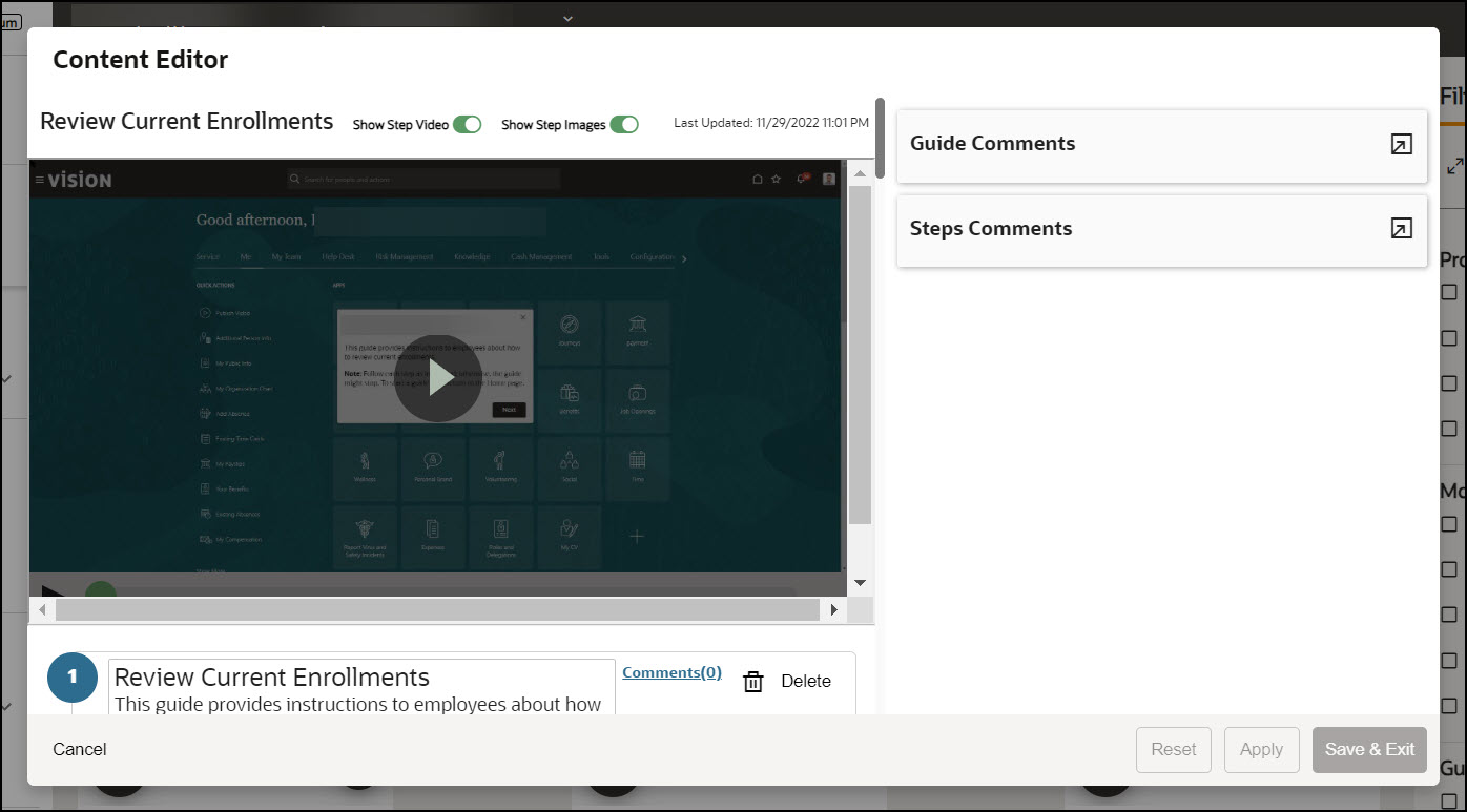
To learn more about the Content Editor and its usage, kindly access the links "The Content Editor" and "Editing Guide Content".
Screenshot Masking
OGL developers often need to capture screenshots of their guides for various purposes, including documentation. Sometimes fields containing sensitive information or data may be visible in these screenshots posing a privacy risk. To address this concern and to enhance user privacy, we have added a new feature and functionality to the OGL Content Editor that allows users to quickly mask sensitive fields and make other visual manipulations to guide screenshots.
New in OGL 25B, the OGL Content Editor now features a screenshot masking tool that allows users to quickly blur sensitive areas of the screenshot to better safeguard data and enhance privacy. This feature includes additional functionality that allows users to draw, edit, and reposition element selectors to improve visibility of the target element. With this feature, developers can also upload, download, and save screenshots which adds more efficient options for content management.
Accessing the Screenshot Masking Tool
- From the My Content page, select the Content Editor button on the guide
tile.

- In the Content Editor modal, select the Step options… (
 ) button next to the guide step you wish to edit to
open the Step Options menu.
- Select Edit Screenshot from the menu.

Note:
To edit a screenshot, you can also select the Enlarge Screenshot ( ) button in the top-right corner of a screenshot preview to expand
the screenshot to full screen.

- Select the Edit (

) button in the top-right corner of the screenshot to open the editing toolbar.

A screenshot editing toolbar opens on the right side of the screen.

Using the Blur Tool
To mask or blur an area of the screenshot, select the Blur (
) button in the toolbar, then click and drag a box around the area or element you wish to blur.

The selected area will now be blurred. The default value of the blurring effect is set at 6. To adjust the amount of blurring, select the blurred element to open the Blur slider. Click and drag the slider to adjust the amount of blurring effect.

Note:
To blur other elements on the page, simply click and drag a box around the desired element and adjust the settings, as needed.Draw/Edit Selector
To draw or edit the border around the
selector, select the Draw Selector (![]() ) button in the Screenshot Editor toolbar. If applicable, blue border will
appear around the current element selector. You can move the position or adjust the
size of the selector border by clicking and dragging the blue border.
) button in the Screenshot Editor toolbar. If applicable, blue border will
appear around the current element selector. You can move the position or adjust the
size of the selector border by clicking and dragging the blue border.

Saving or Reverting the Screenshot
Once you’ve made the necessary changes to your screenshot, you can save your changes or reset the screenshot to its previously saved state.
To save your
changes, select the Save ( ![]() ) button on the toolbar. This will replace the previous screenshot with the
newly updated screenshot. This will also save a new version of the guide in the
Version History.
) button on the toolbar. This will replace the previous screenshot with the
newly updated screenshot. This will also save a new version of the guide in the
Version History.
To discard your changes and revert the screenshot to its
previously saved version, select the Reset (![]() ) button on the toolbar.
) button on the toolbar.
Note:
The Reset button does not function as an “Undo” action. For example, if you have applied 2 blurred areas to a screenshot without saving, selecting Reset will remove both blurred areas and restore the screenshot to its previous version.
Downloading or Uploading the Screenshot
To download a copy
of the screenshot to your file system as a JPG image file, select the Download
(![]() ) button. The file will be downloaded to your default Downloads folder.To
upload a screenshot image, select the Upload (
) button. The file will be downloaded to your default Downloads folder.To
upload a screenshot image, select the Upload (![]() ) button on the toolbar and browse to and select the image
file.
) button on the toolbar and browse to and select the image
file.

Known Issues/Expected Behavior
- Download/Save functionality:
If developers attempt to download/edit an image from a different server (such as collections, Use Case library, Base Guide library, or imported guides from one tenancy to another), the action will be blocked, and an error message will appear, indicating that the image must be recaptured. Therefore, developers will need to recapture the screenshot before they are able to download or save it.
- Upload functionality:
The maximum file size of the screenshot image is 1MB (this is subject change). If the developers attempt to upload an image exceeding this file size limit, the upload will not be allowed, and the user will receive an error message.
Note:
File upload is currently supported only for jpg format.Screenshot Capturing for Translated Content
The screenshot capture functionality allows content developers to capture and/or upload screenshots for translated content and blur them as well. Allows developers and administrators to present screenshots in their translated languages, providing a more helpful experience for end-users consuming multi-language OGL content.
Previously, when OGL content was translated, screenshots would render only in the original Generic Language, which did not accommodate customers with specific language requirements. This enhancement to the OGL console now allows the Full Editor to be accessible from translated guides in the language folders, which enables content developers to manually re-capture step screenshots of translated guides, including any translated content. This enhancement also allows developers to use the screenshot editing tool in the Content Editor (first introduced in OGL 25B) to blur sensitive areas of the screenshot to better safeguard data and enhance privacy.
Capturing Screenshots for Translated Guides
- From the My Content page, select the Language drop-down menu and
select an available language that contains translated content items.

- Select the Editor button within a translated guide to open the guide in
the Full Editor.

- In the Editor, select the Edit Tip button.

- In the Edit Tip panel, select Screenshot to re-capture the screen with
the translated content displayed.Then select Save & Exit
Step.

- Repeat each step, as needed, to re-capture all necessary screenshots containing
translated content.
Blurring Screenshots for Translated Guide
- Select a translated guide from an available language within the Language folders.
- Select the Content Editor button on the guide.

- In the Content Editor modal, select the Step options… ( ) button next to
the step you wish to edit, then select Edit Screenshot.

Note:
You can also select the Enlarge Screenshot ( ) button in the top-right corner of a screenshot, then select the
Edit (
 ) button to open the editing toolbar.
- A screenshot editing toolbar opens on the right side of the screen.

- You can now utilize the Blur tool, Draw Selector tool, Download, and Upload options from the screenshot editing toolbar, as needed.
Known Issues/Expected Behavior
- Expected Behavior: For translated guides, each step screenshot will need to be manually re-captured in the Full Editor and/or uploaded via screenshot editing tool in the Content Editor.
- Hotspots and Launchers Not Retaining the Updated Selectors in the Flow Editor within the Language Revisions.
-
Download/Save functionality: If developers attempt to download/edit an image from a different server (such as collections, Use Case library, Base Guide library, or imported guides from one tenancy to another), the action will be blocked, and an error message will appear, indicating that the image must be recaptured. Therefore, developers will need to recapture the screenshot before they are able to download or save it.
-
Upload functionality: The maximum file size of the screenshot image is 1MB (this is subject change). If the developers attempt to upload an image exceeding this file size limit, the upload will not be allowed, and the user will receive an error message.
- File Format: File upload is currently supported only in jpg format.
Note:
While blurring screenshots may obscure sensitive areas of a screenshot, please note that previous versions of the guide may still exist in Version History, which may contain unblurred (unedited) screenshots. Please use caution when restoring previous versions of guides and apply any screenshot blurring, as needed, prior to publishing the guide.Editor Controls
Below is a brief explanation of Editor Controls.
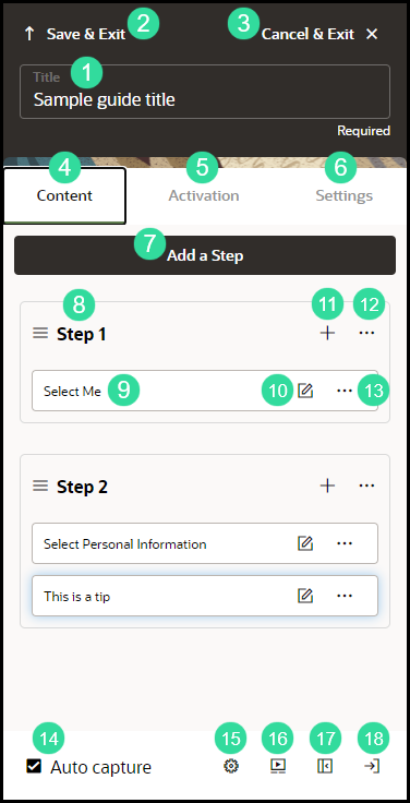
| Sl | Element | Description | Note |
|---|---|---|---|
| 1 | Title | Maximum of 100 characters | |
| 2 | Save & Exit | Save changes and close the guide editor. | |
| 3 | Cancel & Exit | Discard changes and close the guide editor | |
| 4 | Content | Content tab allows you to add, edit, and configure guide steps and tips | Settings and configuration options may vary based on guide type |
| 5 | Activation | Activation tab allows you to add, edit, and delete guide activation settings | See Guide Activation for more information Enabling Guide Activation Settings |
| 6 | Settings | Settings tab allows you to configure and manage guide-level settings | Guide settings can also be accessed from the guide tile in the OGL console |
| 7 | Add a step | Adds a new step to your guide | |
| 8 | Current step | Displays the guide step and all associated tips | |
| 9 | Add another tip to this step | Adds a new tip immediately after the selected step/tip | |
| 10 | Step Actions | Opens a step-level action menu that allows you to Clone, Move, or Delete the selected step | |
| 11 | Tip text | Displays an abbreviated preview of the text within the tip | |
| 12 | Edit Tip | Opens the tip editor to allow text edits, formatting, and other tip-level adjustments | |
| 13 | Tip Actions | Opens a tip-level action menu that allows you to adjust Tip Settings, Clone, Move, or Delete the selected Tip | |
| 14 | Auto capture | Automatically take a screen capture of a tip as you select it. Select the checkmark (bottom right) of the screen along with the check box. | Use the camera icon to capture screenshots of additional step tips if more than one is added to the step. |
| 15 | Element Selector Settings |
Opens a menu that allows you to adjust element selection preferences for this guide. Element selector options include:
|
Do not use Element Text or Element Title if capturing elements for multi-language deployment. Some HTML elements have an id attribute. If they do, they are good for capturing the element because they tend to be constant and are unique in a page. Unfortunately, some applications either do not conform to the uniqueness on a page or may dynamically change the id. For such applications, of which Oracle Fusion Applications is an example, do not use Id Attribute. |
| 16 | Preview | Launch a preview of your guide in a new browser tab | If you have already opened the preview, select this again to refresh the preview tab and relaunch the guide with your recent changes. |
| 17 | Minimize the editor panel | Minimizes/hides the guide editor panel | Use for maximum screen view. |
| 18 | Snap to Right or Left | Move the position of the editor to either the right or left side of the browser window. |
Step Control Basics
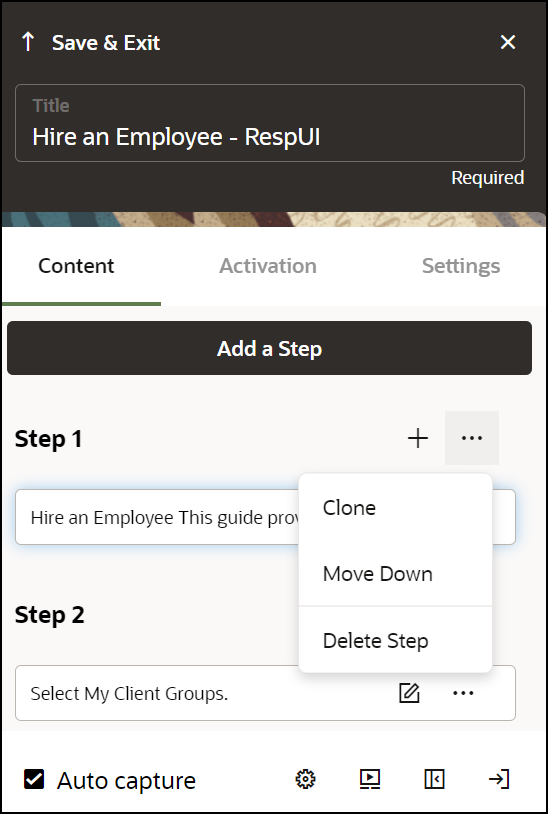
| Element | Description | Note |
|---|---|---|
| Clone | Copy step | If the step has multiple tips, this copies only the currently selected tip. |
| Move Up/Down | Move the step Up/Down to change the target. | |
| Delete Step | Delete step. | If the step has multiple tips, this deletes all tips. |
| Step Settings | Open Step Settings. | |
| Change Tip Placement | Change tip placement (above, below, left, right, and so on) relative to the target. | |
| Select / Change Tip Target | Select to change the target element. | |
| Edit Tip | Make edits to the existing tip. | |
| Save & Exit | Save changes and advance to next step. |
The Full Editor
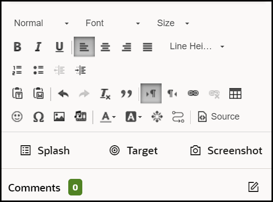
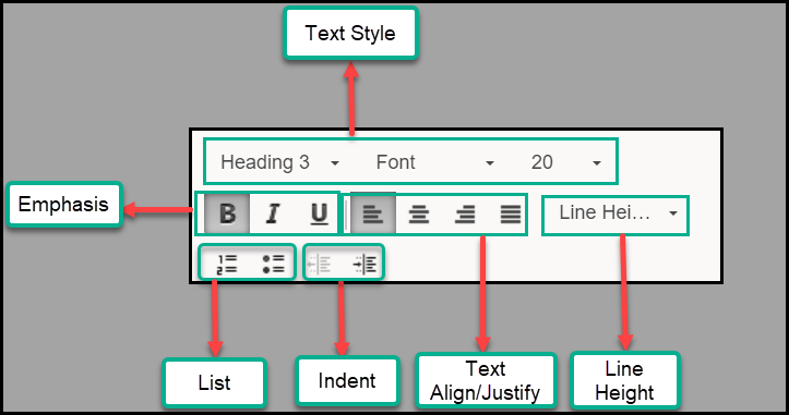
| Sl No. | Element | Description | Note |
|---|---|---|---|
| 1 | Text Style | Set the alignment for the currently selected paragraph to Left, Center, Right, or Justify. | |
| 2 | Emphasis | Set or unset Bold, Italic, or Underline emphasis on the currently selected text. | |
| 3 | List | Add numbered or bullet list. | Right click the list elements to open the list properties dialog, where you may choose numbered list type (Decimal, Latin numerals, Alpha etc.) or bullet list type (Circle, Disc or Square). |
| 4 | Indent | Increase and decrease text indentation level. | Increasing the indentation level of a list item creates a nested effect. |
| 5 | Text Align / Justify | Set the alignment for the currently selected paragraph to Left, Center, Right, or Justify. | |
| 6 | Line Height | Set the line height. |
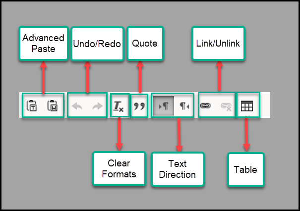
| Sl No. | Element | Description | Note |
|---|---|---|---|
| 1 | Advanced Paste | Paste rich content as plain text (without styling) or paste from Word and keep the content styles intact. | |
| 2 | Undo / Redo | Undo changes to the content or redo changes which were previously undone. | |
| 3 | Quote | Turn selected text into a quote element with its custom styling. | |
| 4 | Link / Unlink | Turn selected text into a link (anchor) or insert link at the current cursor position. | The Link dialog allows you to set the type of the link, its URL, and its target window (open in same/new tab or window) |
| 5 | Clear Formats | Remove all content styling, such as text color, background color, font size and type etc. | |
| 6 | Text Direction | Set the direction of the currently selected paragraph to Right or Left. | |
| 7 | Table | Add or modify a Table element. The Table Dialog lets you set table properties such as the number of rows and columns, table headers, border, width, and more. | You can also right-click a table in the content to open the table properties as well as cell and row level options. |
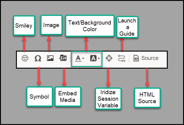
| Sl No. | Element | Description | Note |
|---|---|---|---|
| 1 | Smiley | Insert a Smiley | Make someone’s day better! |
| 2 | Image | Add or modify an image element. The Image dialog allows you to set image properties such as its URL, size, alignment, and whether it is a Captioned Image. | You can change the image's size both from the Image dialog or by the in-content drag-to-resize controls. For Captioned Images, the caption can be edited directly in the content. |
| 3 | Text / Background Color | Set the text and background colors of the currently selected text. The color selection dialog lets you choose a color from a list of preset colors or enter your own custom colors. | |
| 4 | Launch a guide | Insert a link or button to launch a guide from a specific step. | Increasing the indentation level of a list item creates a nested effect. |
| 5 | Symbol | Add a special symbol to the current cursor position. This is especially useful for adding currency symbols, such as Euro or Pound or Yen. | |
| 6 | Embed Media | Add or modify a video or slideshow from an external source. | While the main use of this option is to embed videos in guides and messages, supported services also includes audio, photo, and rich content sources. |
| 7 | Iridize Session Variable | - | |
| 8 | Source | View and edit the HTML source of the step's content directly. |
Step Settings Details
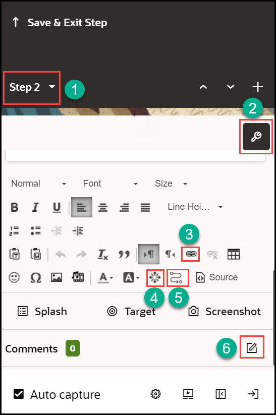
| Sl No. | Element | Description | Note |
|---|---|---|---|
| 1 | Show Step List | Displays the current step/tip being edited and allows you to jump to another step/tip. | |
| 2 | Step Settings | Opens the Step Settings panel for the current step/tip | Step Settings include Display Settings, Activation Settings, and Advanced Settings |
| 3 | Hyperlink | Select a part of the tip's content and select this button to convert it into a link. | |
| 4 | Session Variable | Select to add an Iridize Session Variable button. | Session Variable buttons can be used to create rich guide flows based on user choices. Selecting a session variable button dynamically sets a variable that can be used in step and branch conditions to control step activation and guide flow. The variable can also be persisted as a user field, which can be used in Guide Activation Conditions. |
| 5 | Launch Guide | Insert a link or button to launch a guide from a specific step. | |
| 6 | Step Comments | Displays the number of comments associated with the current step/tip | Use the Edit (pencil icon) to add comments to the current step/tip |
Note: Place the cursor near the elements and the names of those elements pop up for your reference.
Display Settings

Table 3-1 Display Settings Interface
| Setting Name | Description |
|---|---|
| 1. Highlight / Apply to all |
Adds a Border/Overlay/Border+Overlay around the selected element.
Click Apply to all to update all tips to the current setting. |
| 2. Change Next button text to: |
Allows you to change/update the text of the Next button. On the first tip of a guide, consider changing the text to something more engaging like “Let’s Go” or “Show Me”. For the last tip, try “That’s It” or “Got it!” or "Done". |
| 3. Change Next button text to: |
Allows you to change/update the text of the Next button. On the first tip of a guide, consider changing the text to something more engaging like “Let’s Go” or “Show Me”. For the last tip, try “That’s It” or “Got it!” or "Done". |
| 4. Hide Next button |
Determines if the Next button should be displayed or not. |
| 5.Hide Close button |
Determines whether the Close button is displayed on the tip for end users. Use this setting when launching a guide for first-time users or for Smart Tips that appear and disappear based on hover actions |
| 6.Show Back button |
Determines is the Back button is displayed on the tip for end users. When it is not possible to move back to prior pages in the host application, it is a best practice to hide the Back button. Never have the Back button on the first step of a guide. |
| 7. Current Step Number |
Sets the number in the field that you want to be assigned as the step number for this tip. When a step has multiple tips, but you want the step count functionality to be meaningful, assign a step number to the tip so that the user can better understand where they are in the process. |
|
8. Show Tip Arrow |
Determines whether the pointed tip arrowhead will be displayed. |
| 9.
Hide Step Count Hide / Show in all steps |
Toggles the display of the step counter at the bottom right corner of your tip. Depending on whether this option is selected or not, the link will display either Hide or Show in all steps. Use the link to update other steps in the guide with the same setting. Note: This setting is only available for Process guides and not Smart Tips, Beacons, or Message guides. |
| 10. Tip width |
Determines the tip width. Select the number in the text field to edit. The tip width can be set in pixels (350 = 350px) or as % of the screen area(50%). |
| 11. Tip height |
Determines the tip height. Select the number in the text field to edit. The tip height can be set in pixels (350 = 350px) or as % of the screen area (50%). Note: If tip height is set to a size that smaller than the amount of tip text displayed, scroll bars will automatically appear to allow end-users to scroll up/down to read through the tip text. |
| 12. Tip placement |
Use this setting to define the position of the tip in relation to the selected element. (i.e. Top/Bottom/Left/Right) |
| 13. Tip offset |
Determines the offset of the Tooltip relative to the selected element. 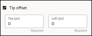 To offset the tooltip
|
| 14. Show help icon |
Enable a graphical help icon next to the target element.
|
| 15. Custom class |
Where applicable you can enter a custom CSS class that will apply to the tooltip. To add multiple custom classes, separate each class with a single whitespace. Note: This is an advanced feature that requires that the Design Kit to be updated with the required CSS. Refer to the Theme section of the user guide |
| 16. Show beacon |
Enable a flashing beacon associated with the target element to draw the end user's attention. |
| 17. Disable Element |
Blocks the user from interacting with the highlighted element. Use this option if you want to highlight a button and explain it while making sure the user cannot select it. |
| 18. Change Highlight Element |
While the tip will always point to the target element, you can choose to highlight a different element on the screen. This is commonly used in steps that require two actions. For example, consider a step that says “Enter criteria, then select Search.” The target is the search area, but the highlighted element is the Search button. |
Activation Settings
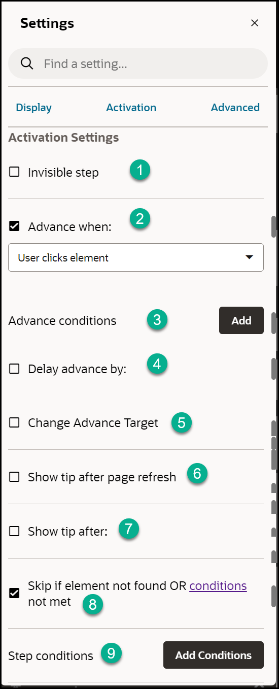
Table 3-2 Display Settings Elements and their Descriptions
| Element | Description | Note |
|---|---|---|
| 1. Invisible step | An invisible step has no visual representation. But it still behaves like a normal step and can wait for any type of user interaction. |
Use this setting in conjunction with the 'Immediately' setting for 'Advance when' for cases like the following:
|
| 2. Advance when |
Specify what user interaction advances the guide. The most common type is User clicks element.
|
Commonly used events include mouse events (click, double-click), keyboard events (keypress, tab) and page element events (gain/lose focus).
Note: In the Advance when: setting, choose the user action that you wish to be counted when the user interacts with the selected element. When a user clicks an element, there are two distinct events that can be counted:
Key Differences:
|
| 3. Advance conditions | Sets additional page conditions for when the user can advance to the next action. | For example: Use this if the page has a visible element or if a form field has a selected value. |
| 4. Delay advance by |
Sets a timed delay in milliseconds before advancing to the next step. If the step has an 'Advance when' event set, the delay period starts after that event occurs. If there is no 'Advance when' event set, the delay period starts as soon as the target element is found. Use the list of values to choose additional predefined durations and units (min, hour, etc.). |
For example: Use this in conjunction with the User enters test (keypress) setting for Advance when. The next tip will appear automatically x milliseconds after the user has started typing text. CAUTION: With this setting the guide does not advance to the next step before the delay period is over. Thus, a page refresh or navigation during the delay period will cancel the advancement to the next step. |
| 5. Change Advance Target | Use this setting when you want the tip to point to one target element and at the same time wait for the user to interact with another element. | |
| 6. Show tip after page refresh | This option can prevent tip flashing. | Use “Show tip after” as an alternative for “Show tip after page refresh” if you need to prevent a tip from flashing but there is not a page refresh. This can sometime happen when a partial page refresh occurs. |
| 7. Show tip after |
Sets a timed delay in milliseconds before showing the current tip. Use the list of values to choose additional pre-defined durations and units (min, hour, etc.). |
Use the edit (pencil) icon to modify defaults. |
| 8. Skip if element not found OR conditions not met | Tips are rendered as soon as their related element becomes visible. Choose this option to not wait for an element and simply skip to the next step in the guide if the element is not found or additional defined conditions are not met. | For example: If you want to create a guide on the Settings page of your application, your first tip should probably be: "Select Settings”. But what if the user launched the guide from the Settings page? The solution: set that first step to be optional. |
| 9. Step Conditions | Use this setting to add and edit a list of page conditions for the tip. The tip will only be shown when all the conditions are fulfilled and will be hidden as soon as any of the conditions becomes false. |
There are cases where you want to condition the showing of a specific tip in a step on the state of the page the guide is running on. For example, whether a page element, other than the target element of the tip, exists or is visible on the page. Another example can be to only show a tip on a specific page based on the page URL (and maybe skip the step on other pages). This setting is especially useful in cases where you have multiple tips in a step. It is especially useful for conditional branching of a guide, where the different tips in a step have different conditions and are set to launch different guides (or continue with the current guide). Another common use case is for optional navigation steps, that should only show if the user is not already on the page where the guide is built to run. Note: Step Conditions can also allow you to apply validation rules to form fields to ensure accurate data entry. To learn more about how to use Form Field Validation, refer to this Knowledge Article. |
Advanced Settings

| Element | Description |
|---|---|
| 1. Fixed Position | When using a splash tip, you can use this setting so that the tip will remain visible even if the user scrolls up or down the page. |
| 2. Allow changing number of targets | Use this setting when attaching a tip to multiple targets, where the number of targets may dynamically change while the tips are showing. |
| 3. Track target position |
If the element’s position moves dynamically (fixed positioning), this will ensure that the tip stays on the target element. This setting is useful when page contents or elements change dynamically on a screen. For example, an error message may appear as a banner on the top of the screen, moving all pages elements further down the screen. Turning on Track Target Position moves the OGL tip in line with the repositioned elements when this occurs. |
| 4. No scroll | By default, the OGL will scroll the page so that the tip and the highlighted element will be visible. This setting allows you to disable this behavior. |
| 5. Advanced visibility check |
On some applications, OGL might think that an element is visible while it is not. This can happen if the web application uses multiple layers and an element could be hidden behind another one that was added on top of it. This setting will run some extra checks against the element and options include:
|
| 6. Scroll parent container | If the target element is within an internal element with an internal scroll, this will enable us to scroll down to the target element. |
| 7. Scroll Parent Selector(If Scroll parent container is checked) | Use automatic scroll parent element detection. |
| 8. Scroll parent not scrollable | Scroll element when the parent container is not scrollable. Enable scroll option to target element when the parent element is not scrollable. |
| 9. Set target watch interval to | This is used to set the watchdog interval. The behavior is, when the target element disappears the tip should remain visible for the time set in the editor and then hide. |
| 10. Limit the wait on target to 'x' ms. | Guide tips wait indefinitely for the target element to appear. This setting sends an error message if the current target element does not appear within 'x' minutes, seconds, and milliseconds, so that we can notify you and fix the problem. |
| 11. Step Branches | This setting allows you to define one or more branches in the step, either jumping to another step in the current guide or launching a different guide. |
| 12. Next URL | Navigates the user to a new page when selecting the next button. (Note: This is especially useful if you want to create a site tour.) |
| 13. Change Highlight Stretch | Make the highlighted section of the screen smaller or bigger using pixel precision. This is especially useful if the section you want to highlight does not have a corresponding HTML container like highlighting a column in a table. |
| 14. Only display one tooltip | When you setup a tip in OGL, you must target a selector as a way to identify the element on the page that the tip should point to. Sometimes, that selector will match multiple elements on the screen. In order to avoid displaying the same tooltip multiple times, this setting is turned on by default. |
| 15. Monitor selector | This is a default setting that tells OGL to keep searching for the element on the page even if it has found a match for it. This is important because sometimes elements (e.g. menu items) on the page disappear and reappear, and we want the tooltip to attach to them in these situations. However, if you selected "Skip if element not found" in the Activation, then deselect the Monitor selector. |
| 16. Autofocus on tip (Accessibility) | Auto focus is used to automatically get the browser focus on tooltips, if not enabled the focus will be on the target element. |
The Full Editor
Open the OGL Full Editor
When creating or editing a guide, the OGL Full Editor will open in the host application and will be docked on the left side of the page, by default, like this:
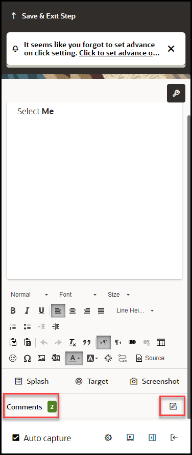
Moving the OGL Editor panel
The OGL Editor may cover parts of the application that you need to work with. To reposition the editor panel, you can move it to the left or right side of the screen or minimize it entirely by using the buttons at the bottom of the editor panel.

To dock the OGL Editor to the right or left side of the screen, select the Snap to right or Snap to left buttons.

To minimize the OGL Editor entirely, select the Minimize the editor panel button.

Select Add a Step to add a new step to your guide and open the editing tools.

OGL Full Editor Controls
The editor panel is comprised of several sections, each with different settings and tools that you can use to configure your guide steps and tips.

Formatting Tools
The formatting tools section of the editor provides various options to format your tip text, such as text style, font, size, color, etc. Refer to the diagrams below for a description of each tool button.


| Sl No | Element | Description | Note |
|---|---|---|---|
| 1 | Text Style | Set or modify the selected text's style (such as Heading 1-6 or Paragraph), font type and font size using these dropdowns. | |
| 2 | Emphasis | Set or unset Bold, Italic, or Underline emphasis on the currently selected text. | |
| 3 | List | Add numbered or bullet list. | Right click the list elements to open the list properties dialog, where you may choose numbered list type (Decimal, Latin numerals, Alpha etc.) or bullet list type (Circle, Disc or Square). |
| 4 | Indent | Increase and decrease text indentation level. | Increasing the indentation level of a list item creates a nested effect. |
| 5 | Text Align / Justify | Set the alignment for the currently selected paragraph to Left, Center, Right, or Justify. | |
| 6 | Line Height | Set the line height. |

| Sl No. | Element | Description | Note |
|---|---|---|---|
| 1 | Advanced Paste | Paste rich content as plain text (without styling) or paste from Word and keep the content styles intact. | |
| 2 | Undo / Redo | Undo changes to the content or redo changes which were previously undone. | |
| 3 | Quote | Turn selected text into a quote element with its custom styling. | |
| 4 | Link / Unlink | Turn selected text into a link (anchor) or insert link at the current cursor position. | The Link dialog allows you to set the type of the link, its URL, and its target window (open in same/new tab or window) |
| 5 | Clear Formats | Remove all content styling, such as text color, background color, font size and type etc. | |
| 6 | Text Direction | Set the direction of the currently selected paragraph to Right or Left. | |
| 7 | Table | Add or modify a Table element. The Table Dialog lets you set table properties such as the number of rows and columns, table headers, border, width, and more. | You can also right-click a table in the content to open the table properties as well as cell and row level options. |

| Sl No. | Element | Description | Note |
|---|---|---|---|
| 1 | Smiley | Insert a Smiley | Make someone’s day better! |
| Image | Add or modify an image element. The Image dialog allows you to set image properties such as its URL, size, alignment, and whether it is a Captioned Image. | You can change the image's size both from the Image dialog or by the in-content drag-to-resize controls. For Captioned Images, the caption can be edited directly in the content. | |
| 2 | Text / Background Color | Set the text and background colors of the currently selected text. The color selection dialog lets you choose a color from a list of preset colors or enter your own custom colors. | |
| 3 | Launch a guide | Insert a link or button to launch a guide from a specific step. | |
| 4 | Symbol | Add a special symbol to the current cursor position. This is especially useful for adding currency symbols, such as Euro or Pound or Yen. | |
| 5 | Embed Media | Add or modify a video or slideshow from an external source. | While the main use of this option is to embed videos in guides and messages, supported services also includes audio, photo, and rich content sources. |
| 6 | Iridize Session Variable | ||
| 7 | Source | View and edit the HTML source of the step's content directly. |
