Activating the Expert Mode
Press "e" to toggle the Expert mode, or use the right-click pop-up menu, and then select "Expert". The probe status timelines change their appearance, and an additional "Expert" tab appears. Only the target timeline stays unchanged.
In the Expert mode, timelines of probes contain now an overlapping display of three values:
- Time series for the expected (or predicted) value displayed as light blue lines from 0 to its value.
- Time series for the observed value. Plotted on top of the predicted values in green or in red to indicate the state.
- State of the probe marked in green or red of the observed value plot. Figure 6-27: Activating Expert Mode
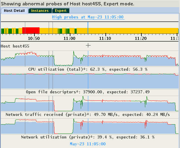
This display helps to evaluate how well the existing model aligns the actual observed values with the predicted values. If the observed values are consistently and significantly different from predicted values, then it is likely that the model is not well-calibrated to a particular workload. Performing a CHA calibration based on this workload should be considered.
The histograms of the probes are dynamically self-adaptive to the range of values of each metric predicted or observed value. This might cause that parts of the visible time series appear "flat". The predicted and observed values might be so similar to each other that the differences between them would be barely visible. See the "Open file descriptors" in the above image. In such cases, you might prefer to see a plot of a difference between the observed and predicted values, called a "residual". Select "Display Residuals" on the floating menu, or press "r" to toggle between the display of residuals or of the pair predicted/observed. The time series shown originally in Figure 13-27 changes to what is shown in Figure 13-28.
Figure 6-28: Activating Expert Mode
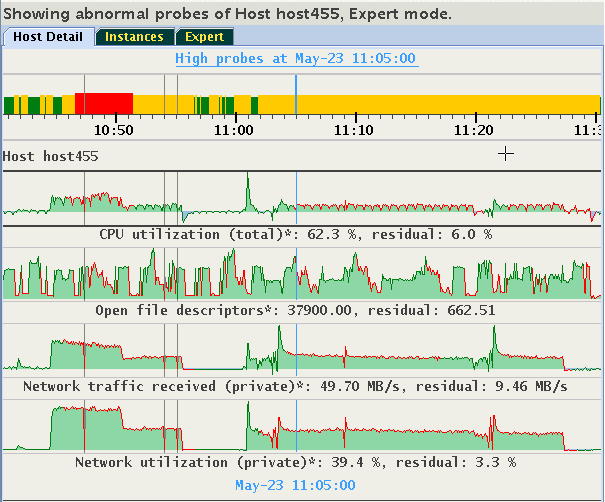
Note how the differences in values of "Open file descriptors" become visible. Positive residuals are displayed as "green hills" (observed value is greater than the predicted), and negative residuals are displayed as "blue pools" (observed value less than predicted).
This display will be meaningful only for probes for which CHA provides both expected and observed values. Otherwise, they will appear empty. Consider the following example, in which the metric "Network used bandwidth" does not have expected values.
Figure 6-29: Activating Expert Mode
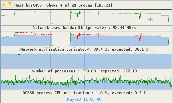
Display of residuals for this metric is empty. The display for "Network utilization" and "Number of processes" provide good visualization of differences between their expected and observed values.
Figure 6-30: Activating Expert Mode
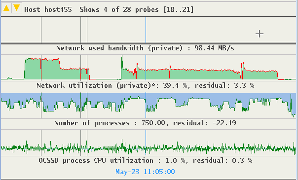
The time series of "OCSSD process CPU utilization" suggest a good similarity between the observed and predicted values.