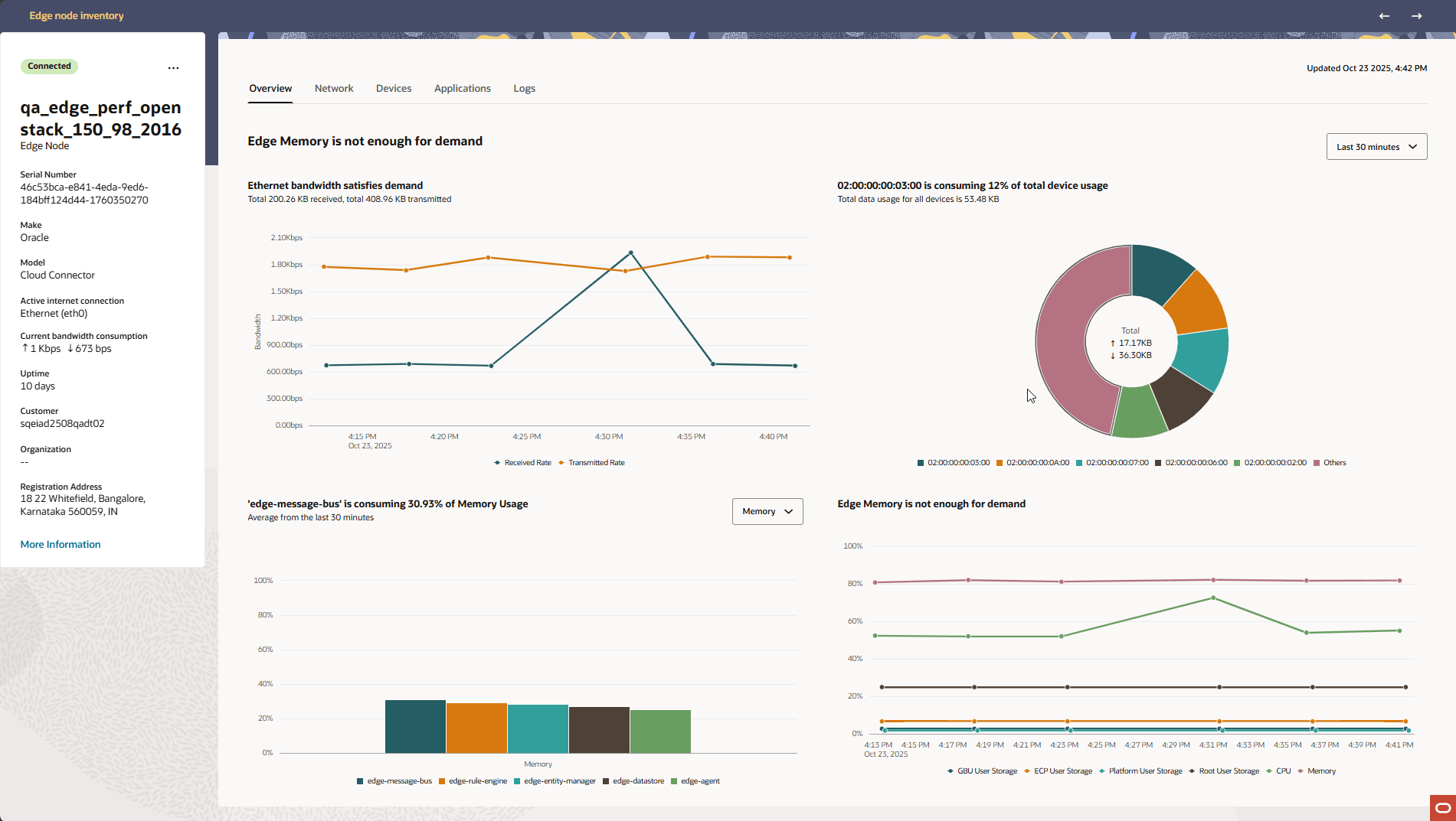
Edge Nodes Details Page - Overview Tab
The Overview tab displays a consolidated view of the resource and bandwidth utilization for the selected Cloud Connector. This information aids field operators and IT administrators in monitoring system health and identifying resource constraints. The pane includes four primary graphs, each summarized by an interpretation headline.
The Overview Tab includes four graphs as follows:
WAN Bandwidth Usage
- Received Rate (Rx) and Transmitted Rate (Tx) are plotted to help determine current network load and identify periods of high activity.
- The chart title contextualizes the current state. This is useful for assessing if external network connectivity is a limiting factor for the Cloud Connector’s operations.
Top 5 Attached Devices by Bandwidth Usage
- Devices are labeled by their onboarded Device name, hostname, or MAC address in that order of preference as available.
- The chart segments show each device’s proportional data usage, and the center totals provide overall received and transmitted traffic for this group.
- The graph title summarizes the key finding (e.g., which device is consuming the most bandwidth).
Top 5 Local Applications by Resource Usage
- Use the drop-down menu to switch between Memory, CPU Usage, or Network Usage.
- The graph displays the 5 applications with the highest usage in the selected category, alongside percentages for clarity.
- The chart title identifies the most demanding application.
Resource Demand Trend (Storage, CPU, Memory)
- Root User Storage
- Platform User Storage
- GBU User Storage
- ECP User Storage
- CPU Usage
- Memory Usage
- The interpretation headline reflects the system’s overall state, such as whether memory or storage is nearing capacity.
Interpreting the Graph Titles
Each graph headline briefly interprets the data, highlighting any notable loads, constraints, or points of interest for rapid awareness. These tools offer an at-a-glance dashboard for users managing Cloud Connectors in the field, providing actionable insight into system and network performance.
Choosing a time scale for graphs
- Last 30 Minutes
- Last 1 Hour
- Last 24 Hours
- Last 7 Days
- Last 30 Days