User Interface Enhancements
7.2 GA introduces a new and improved user interface, including a new landing dashboard and updated navigation. The new dashboard and all statistics screens are responsive for easier viewing on varying screen sizes.
Navigation menus have been moved to the sidebar, and reorganized into logical groupings to make the navigation experience more intuitive. Additionally, users may quickly locate any navigation link using the Search bar at the top of the navigation sidebar.
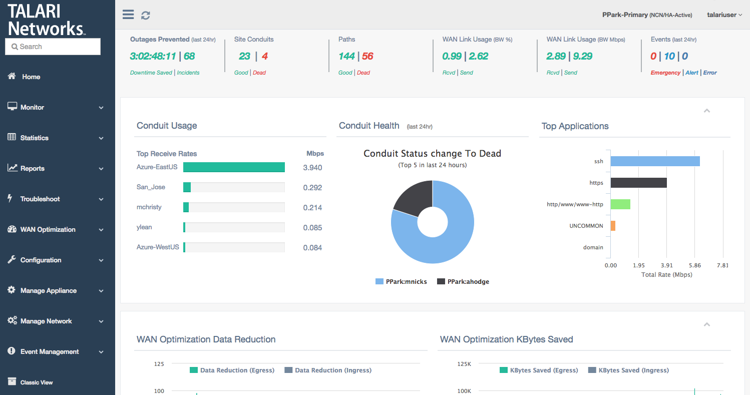
Landing Dashboard Components
The top bar will be visible on every page of the new User Interface:

Toggle visibility of the navigation menu and refresh the current page using the buttons on the left-hand side of the top bar. On the right-hand side, the site name and logged-in username are displayed.
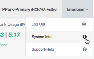
Click on the username to display a dropdown menu with links for logout, system information, and support:
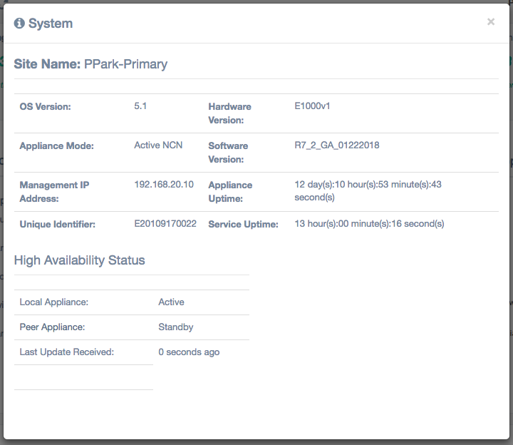
Click System Info in the dropdown to display the system status information, including OS Version, Hardware Version, Software Version, and Management IP:
Appliance alerts will also be shown in the top bar, if any exist:
![]()
Click the alert icon to display a popup listing all appliance alerts.
The first section of the new dashboard presents summary information about the health of the site:

Outages Prevented (Last 24 hours): The amount of downtime saved (calculated as time when Paths went dead but the Conduits stayed up) and number of incidents (times Paths went dead) detected in the last 24 hours. Links to Reports > Availability.
Site Conduits: The number of Good and Dead Conduits for the site. Each number links to Statistics > WAN > Conduits, filtered by the appropriate state.
Paths: The number of Good and Dead paths for the site. Each number links to Statistics > WAN > Paths (Summary), filtered by the appropriate state. Any Bad paths are included in the count of Good paths, as this is a transitory path state.
WAN Link Usage (BW %): The local WAN Link Usage by percentage of total permitted rate, for receive (download) and send (upload). Links to Statistics > WAN > WAN Link Usage.
WAN Link Usage (Mbps): The local WAN Link Usage by Mbps, for receive (download) and send (upload). Links to Statistics > WAN > WAN Link Usage.
Events (Last 24 hours): The number of emergency/alert/critical-level severity events in the last 24 hours. Links to Event Management > Insert/View Events.
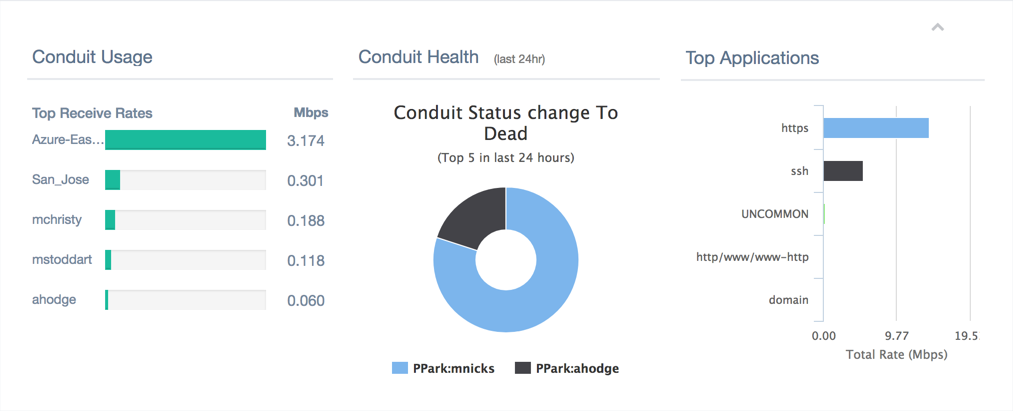
The second section of the dashboard provides information about Conduit health:
Note:
This section and all of the following sections can be collapsed and expanded using the ^ button in the upper right corner.Conduit Usage: The top five receive rates in Mbps for the local site, sorted in descending order. The report title links to Statistics > WAN > Conduits.
Conduit Health: The five Conduits which have gone dead the most in the last 24 hours. If fewer than five Conduits have gone dead in the last 24 hours, only those which have gone dead will be shown. Users may hover over each section of the graph to see total state changes for that site within the last 24 hours. The report title links to Statistics > WAN > Conduits.
Top Applications: The top five observed protocols and the total rate for each. The report title links to Statistics > QOS > Observed Protocols.
The third section of the dashboard provides at-a-glance information about WAN Optimization, and will only be displayed on appliances that support WAN Optimization:

WAN Optimization Data Reduction: Report displaying data reduction percentages for WAN Egress and WAN Ingress WANOp traffic at the site on a per-minute basis. Users may hover over a point on the chart to display detailed data. Select the legend headers to turn data points off or on. The report title links to WAN Optimization > Statistics, with the data reduction report displayed.
WAN Optimization Kbytes Saved: Report displaying kilobytes saved using WAN Optimization for WAN Egress and WAN Ingress. Users may hover over a point on the chart to display detailed data. Select the legend headers to turn data points off or on. The report title links to WAN Optimization > Statistics, with the Kbytes Saved report displayed.
Note:
Data is only displayed if WAN Optimization is enabled. Otherwise, the section will report “No Data to Display”.The fourth section of the dashboard presents site bandwidth reports:

Total WAN Ingress (Upload): Report displaying total WAN Ingress bandwidth usage for Conduit, Intranet, and Internet services for the last 24 hours. Users may hover over a point on the chart to display detailed data. Select the legend headers to turn data points off or on. The report title links to Reports > Usage, with WAN Ingress pre-selected in the direction dropdown.
Total WAN Egress (Download): Report displaying total WAN Egress bandwidth usage for Conduit, Intranet, and Internet services for the last 24 hours. Users may hover over a point on the chart to display detailed data. Select the legend headers to turn data points off or on. The report title links to Reports > Usage, with WAN Egress pre-selected in the direction dropdown.
The fifth and final section displays Conduit status information:
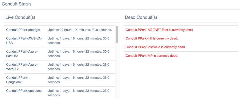
Live Conduits: A list of all live Conduits at the site. On the NCN, live conduits link to the remote site.
Dead Conduits: A list of all dead Conduits at the site. Dead Conduits link to Statistics > WAN > Conduits, filtered for dead conduits.