Universal Topology User Guide
This guide will lead the user through the process of building a graph, reading the result, and interacting with the graph.
Topology Form
The form is the same for the "Adhoc Graph Dashboard" and the "Topology Graph" dashboard panel in the dashboard editor. The form fields are as follows.
Panel Name
- Title for the topology view panel.
Graph Settings
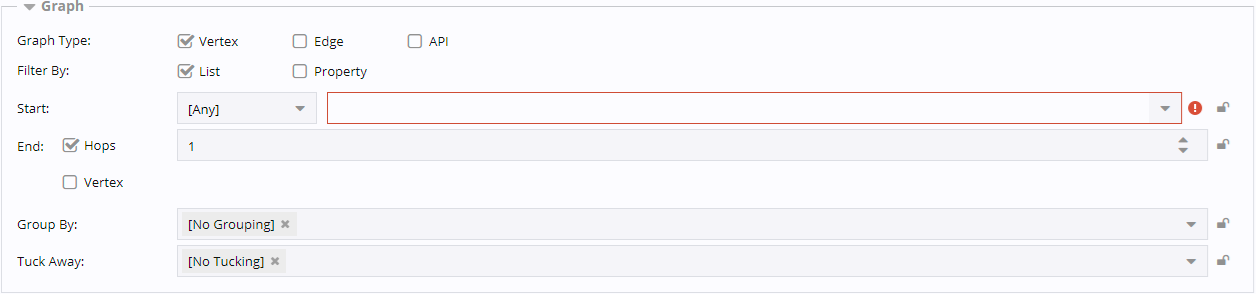
Description of illustration topology-graph-dashboard-panel-form-graph-settings.png
Graph Type
-
Vertex: The graph is dependent on a particular vertex. The graph will focus on this vertex. Other options will determine how the graph is laid out, but this vertex is where everything begins.
-
Edge: The graph is dependent on edge properties. This is useful if you want to graph a particular path based on edge properties such as circuit, ticket, or customer.
-
API: The graph is dependent on a custom API instead of the default Assure1 graph API.
Filter By
-
List: This option is currently only applicable when the Graph Type is set to "Vertex". It indicates the graph will either be rendered out to a certain number of hops, or to an end vertex.
-
Property: This option is applicable when the Graph Type is set to "Vertex" or "Edge". It indicates the graph should be dependent on the chosen property rather than a particular route.
Options for: Graph Type = Vertex, Filter By = List
Start
The first dropdown list filters the second dropdown list. The default selection is "Any", but you should choose a vertex type if possible. This will greatly enhance the graph load time. Typical values are "Device" or "Service", but all vertex types are in the list.
The second dropdown list is the actual vertices. This selection will determine where the topology graph begins.
End
The "Hops" or "Vertex" checkbox determines if the graph will go out X hops from the start vertex in every direction or just go directly to the chosen end vertex by the most direct route possible.
If "Hops" is checked, then a number of hops must be set. Every edge is considered a "hop". For example, DeviceA -> Interface1DeviceA -> Interface1DeviceB -> DeviceB would be 3 hops.
If "Vertex" is checked, an end vertex must be selected in the same fashion as the start vertex. You can restrict the list by vertex type, then choose the actual vertex. An empty graph will be presented if no path exists between the chosen start and end vertices.
Group By
This determines how vertices are nested. If you choose a group by vertex type, then everything that is connected to that type will be nested inside of it. This option is almost always left to the default value of "No Grouping". An example would be if you only wanted to see your networks at the top level, you could set Group By to "Network". The graph would only show network vertices. Everything else would be nested inside of the network vertices. This is not a commonly desired scenario. Here is an example with no Group By set:
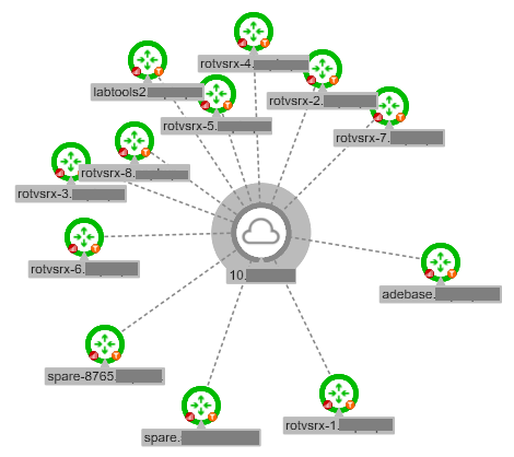
Description of illustration topology-graph-dashboard-panel-form-group-by-no-grouping.png
If we rerun the same selection, but set Group By to Network, all of the associated devices will be nested inside of the network vertex.
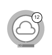
Description of illustration topology-graph-dashboard-panel-form-group-by-network-collapsed.png
Note the "12" in the top right corner that indicates there are now 12 vertices inside of this one. When the network vertex is double-clicked, we can see the 12 devices again.
Description of illustration topology-graph-dashboard-panel-form-group-by-network-expanded.png
Tuck Away
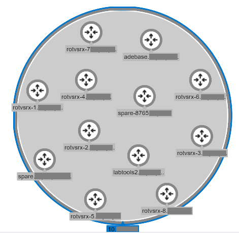
This also determines how vertices are nested. The chosen vertex type will be nested inside of the parent vertex if one can be determined. A common use is tucking interfaces inside of the parent device. Here is an example:
Description of illustration topology-graph-dashboard-panel-form-tuck-away-no-tucking.png
This graph is so busy with interfaces that it becomes almost impossible to see any details. When the interfaces are tucked away, it becomes much easier to discern items of interest.
Description of illustration topology-graph-dashboard-panel-form-tuck-away-interfaces-collapsed.png
This is the same graph, but now the interfaces are all tucked away inside of the devices. We can still see the interfaces by double-clicking a device.
Description of illustration topology-graph-dashboard-panel-form-tuck-away-interfaces-expanded.png
The zoom and/or search features can be used find specific information and see labels.
Options for: Graph Type = Vertex, Filter By = Property
Vertex Types
The vertex type(s) to include in the graph.
Property
The vertex property that must exist for the vertex to be included in the graph.
Property Value
The specific property value that must match for the vertex to be included in the graph.
Note:
The Group By and Tuck Away options are explained above.
Options for: Graph Type = Edge, Filter By = Property
Edge Types
The edge type(s) to include in the graph.
Property
The edge property that must exist for the edge to be included in the graph.
Property Value
The specific property value that must match for the edge to be included in the graph.
Note:
The Group By and Tuck Away options are explained above.
Options for: Graph Type = API
A custom API can be used in place of the default Assure1 Graph API. Contact support for more information about creating custom API's.
Data Source
This field is the path to the API file on the presentation server. The field is made up of 1) the path to the API file, 2) the function to call in the API, and 3) any parameters to pass to the API. The path is processed by the Assure1 router. Beginning the path with api/myPackage/ will look in the base Assure1 directory, www, packages, myPackage, src, api directory. For example, api/customTopology/customAPI/readTopology would look for the file $A1BASEDIR/www/packages/customTopology/src/api/customAPI.php and would try to run the function "readTopology".
If there are parameters to pass, they should be provided after the function call, like this:
api/customTopology/customAPI/readTopology?StartVertexName=<StartVertexName>&Hops=<Hops>&GraphType=<GraphType>
When the dashboard is loaded, it will expect StartVertexName, Hops, and GraphType to be passed in as parameters for the API to use. The custom API will determine what to do if proper values are not passed to the API.
View Settings
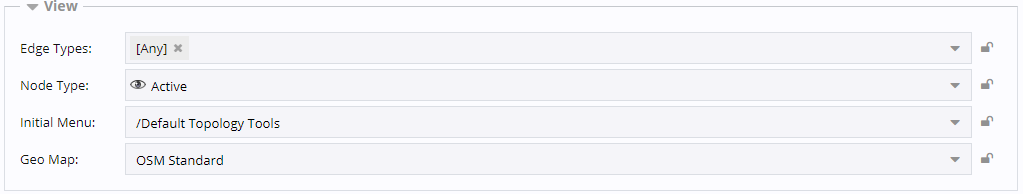
Description of illustration topology-graph-dashboard-panel-form-view-settings.png
Vertex Types
Some Graph Types allow the limitation of vertex types in the graph. Adding one or more Vertex Types will limit the graph to just those vertex types. Setting Vertex Types to "Any" will include all vertex types.
Edge Types
Some Graph Types allow the limitation of edge types in the graph. Adding one or more Edge Types will limit the graph to just those edge types. Setting Edge Types to "Any" will include all edge types.
Node Type
The node type is either "Basic" which means it will just load the graph and no state information (event and metric badges as well as node availability), or "Active" which will load the details.
Description of illustration topology-graph-dashboard-panel-form-node-type.png
Initial Menu
This allows the root context menu for the graph to be changed.
Geo Map
This allows you to switch from the default map tile server to a custom tile server
Tile Server
If Geo Map is set to "Custom", then this field allows you to give the URL for a custom tile server.
Layout Settings
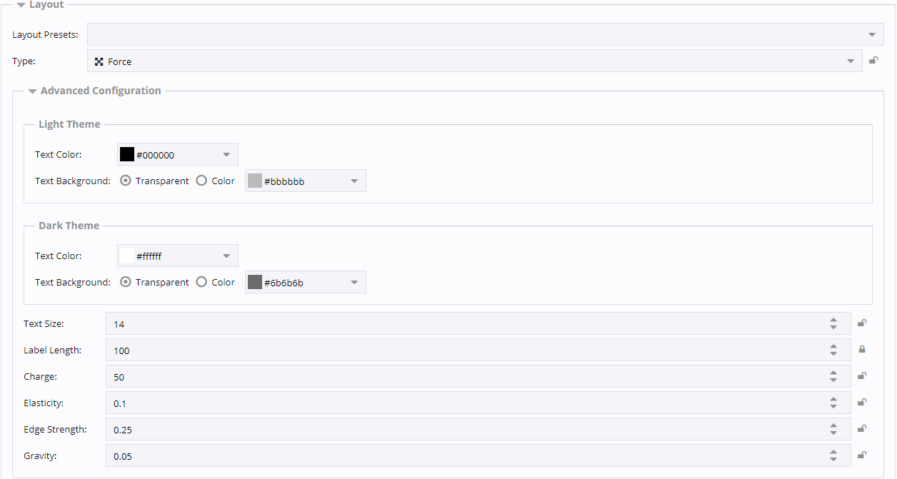
Description of illustration topology-graph-dashboard-panel-form-layout-settings.png
Layout Presets
This drop down allows you to select from a list of customized layout Type and Advanced Configuration values. The presets try to cover the basic topology layouts, but are not comprehensive for every situation. They can be used as a starting point on various layouts and tweaked as necessary for specific applications.
-
Circuit: a "Force" layout with a very linear set of nodes, and linear means there is a clear path from the beginning to end without many branches off of the main path.
-
Large Network: a "Force" layout that spreads clusters of tightly interconnected nodes away from each other.
-
Service: a "Hierarchy" layout designed to spread nodes evenly both vertically (siblings) and horizontally (parent to child).
-
Small Network: a "Force" layout to evenly spread a small number of nodes with an even distribution of edges.
-
Whole Network: a "Force" layout designed to maximize space between nodes with any number nodes and edges.
Type
This dropdown allows you to select a layout type. The possible types are Concentric, Force, Grid, Hierarchy, Radial, and Geographic Map. All of these layouts share some common Advanced Configuration options, but may also have unique options.
-
Common Advanced Configuration
-
Text Color: The color of the node and edge text. There are separate colors for light and dark themes.
-
Text Background: The node label background may be set to transparent or a specific color. There are separate colors for light and dark themes.
-
Text Size: The size of the node and edge text in pixels.
-
Label Length: The number of characters a vertex label will display by default. Anything beyond that length will be truncated unless the node is selected.
-
-
Concentric: This layout takes a base node as parameter and organizes the graph so the nodes close to the selected node are arranged in a circle around it. Each hop forms another circle.
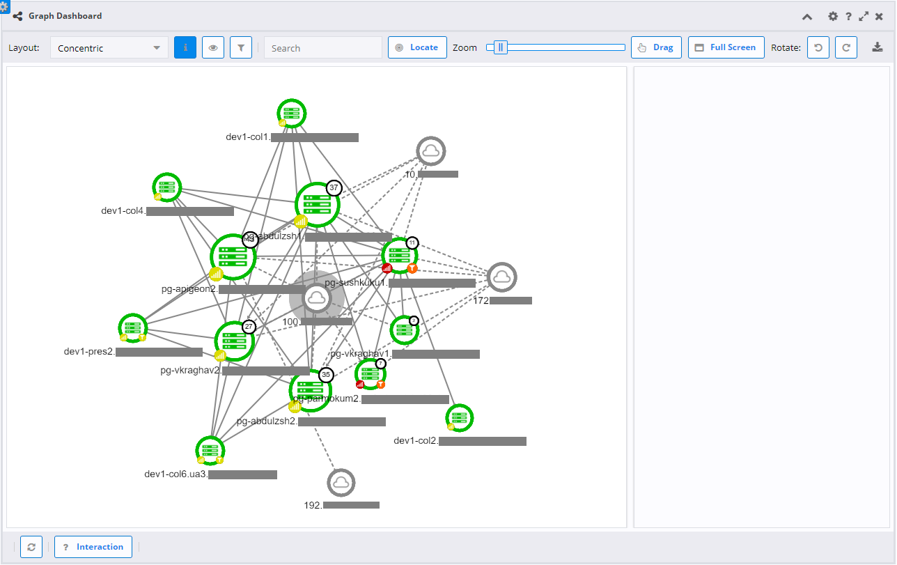
Description of illustration topology-graph-dashboard-panel-form-layout-concentric.png
-
Force: This layout uses defined forces to attract or repel vertices from each other. The advanced configuration options will greatly affect the outcome, but the general layout will be spread out with the Gravity, Edge Strength, and Charge pushing the nodes apart.
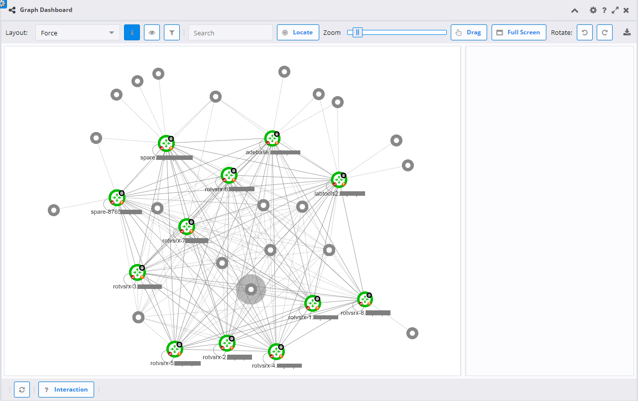
Description of illustration topology-graph-dashboard-panel-form-layout-force.png
-
Advanced Configuration
-
Charge: Distance factor between nodes. A greater value increases the distance.
-
Elasticity: Node collision elasticity. Smaller values may result in incomplete node overlap removal. Passing 0 will skip that algorithm pass altogether.
-
Edge Strength: Attraction strength. Higher values make edges' attractive force stronger.
-
Gravity: Force that attracts nodes to the center of the graph. Center is either the mass center of the graph or the value defined by cx and cy. Greater value makes the layout more compact.
-
-
-
Grid: This layout arranges the vertices in a grid of rows and columns.
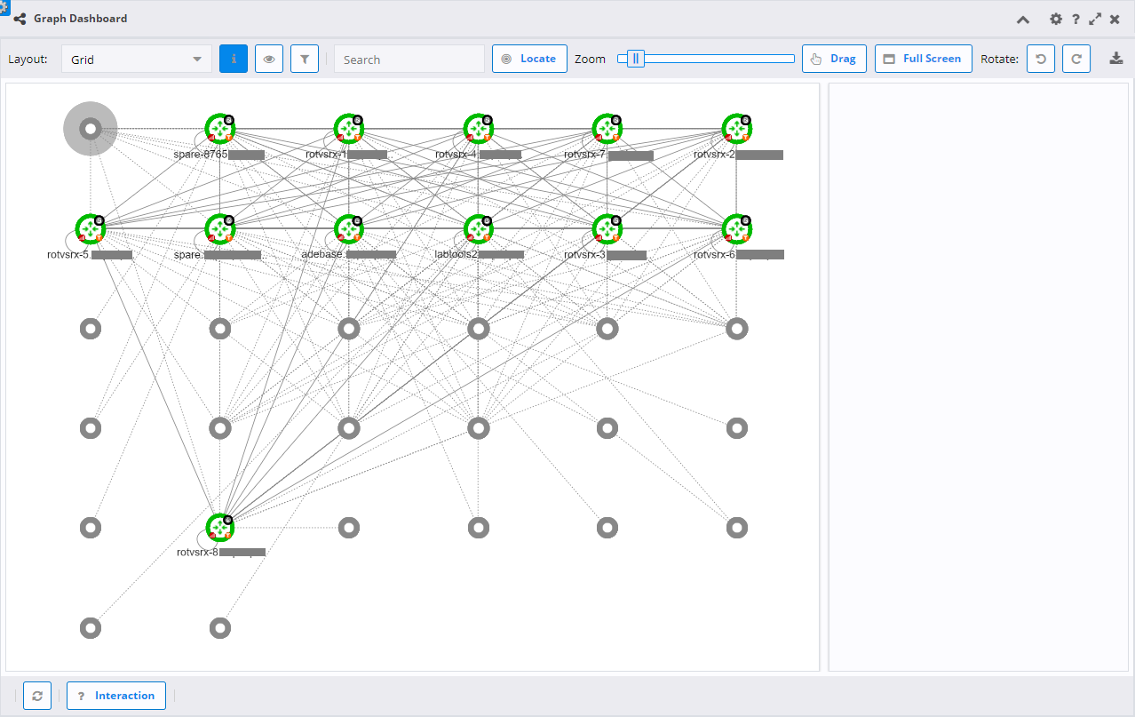
Description of illustration topology-graph-dashboard-panel-form-layout-grid.png
-
Hierarchy: This layout positions nodes starting from a root node downwards generating a visual hierarchy based on connectivity.
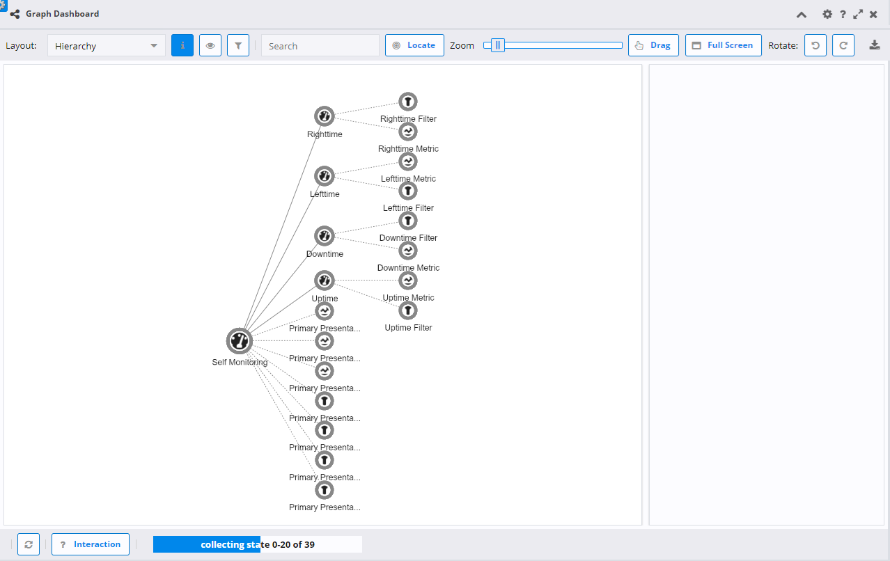
Description of illustration topology-graph-dashboard-panel-form-layout-hierarchy.png
-
Advanced Configuration
-
Direction: The direction the graph will flow (top to bottom, left to right, etc).
-
Level Distance: Desired distance between the layers of layout.
-
Node Distance: Desired distance between the nodes on one layer.
-
-
-
Radial: This layout positions nodes around the selected one based on their graph-theoretical distance (the shortest path in the graph, connecting them). If there are sub-graphs or nodes not reachable from the central node, they will be pushed outwards, but still placed around the layout in a readable way.
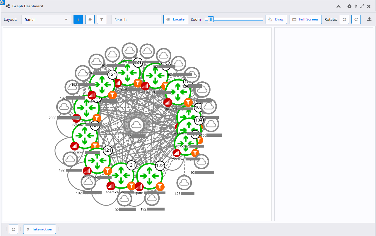
Description of illustration topology-graph-dashboard-panel-form-layout-radial.png
-
Advanced Configuration
- Repulsion: Increase or decrease the repulsion force between the nodes on the same levels. Values smaller than 1 will result in more compact placement along the layers.
-
-
Geographic Map: This layout uses a geographic map as the background and places the nodes at their specified latitude and longitude.
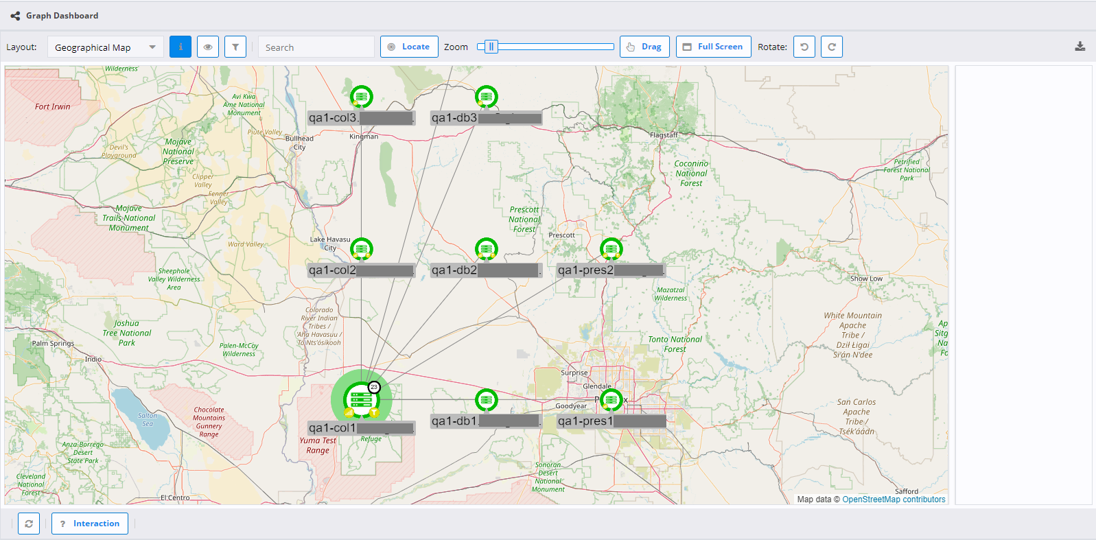
Description of illustration topology-graph-dashboard-panel-form-layout-geographic-map.png
Background Image Settings
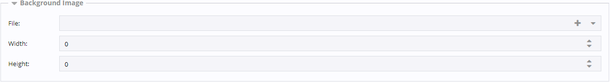
Description of illustration topology-graph-dashboard-panel-form-background-image-settings.png
File
An image file can be selected that will be displayed in the background of the topological view.
Width
After an image has been selected, the width of the file will be set here. The width can then be overridden to be larger or smaller as necessary.
Height
After an image has been selected, the height of the file will be set here. The height can then be overridden to be larger or smaller as necessary.
Display Settings
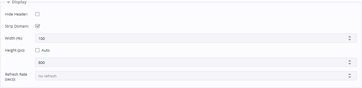
Description of illustration topology-graph-dashboard-panel-form-display-settings.png
Hide Header
This checkbox hides or displays the panel header when the panel is rendered. This is most useful for reports or if screen real estate is limited.
Strip Domain
This checkbox hides or shows the domain name on vertices. This is useful if there is only a single domain name so it is repetitive information, or the domain names are extremely long and make the node labels difficult to read.
Width
This indicates what percentage of the available screen width should be used for the panel.
Height
"Auto" will adjust the panel height as the content changes. This setting is generally not suggested for the topology because the graph will adjust the zoom to the height of the panel. "Auto" will default to 400px. If you want a different height, un-check "Auto" and set the desired height in pixels in the number field below the checkbox.
Refresh Rate
This allows the refresh rate to be set in seconds. This refresh rate determines how often the vertex details are updated. If no refresh rate is specified, the state will only load a single time when the graph is loaded.
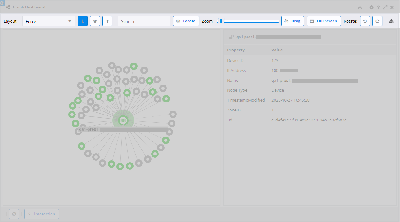
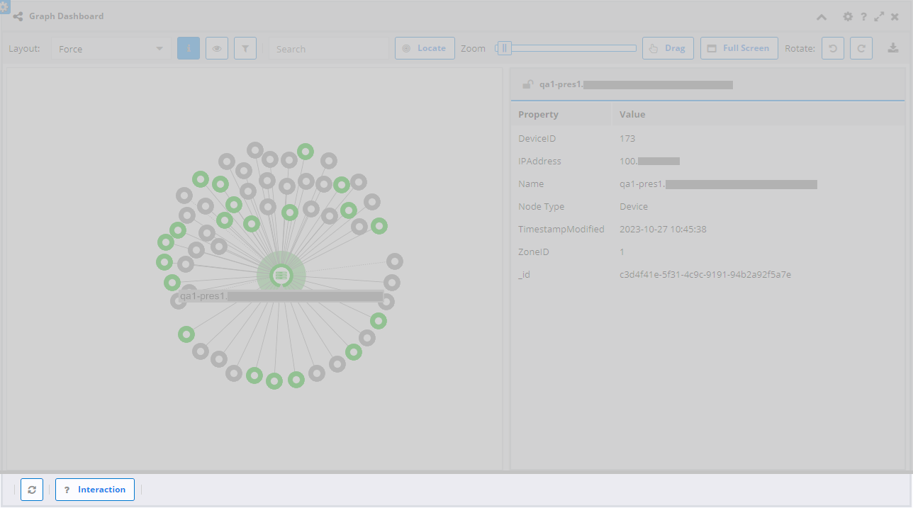
Topology Graph
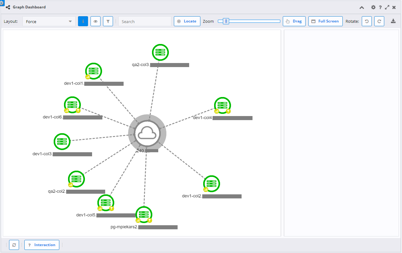
The topology graph is the end result of the chosen selections. It consists of several different areas.
Toolbar
The toolbar is on the top of the graph containing various controls to modify the graph.
Description of illustration topology-graph-dashboard-panel-view-toolbar.png
-
Layout
- This allows you to change the layout (Force, Hierarchy, etc) on the fly.
-
Toggle Selection Information
-
This allows you to toggle the information pane (the grid on the right side) on and off.
When the pane is turned off, moving the mouse over a vertex or edge will show the information in a pop-up window near the mouse cursor.
When the pane is turned on, the information stays in the same place on the right side.
If the pane is turned on and a node or edge is selected, the information will stay visible even if the mouse is moved away. This is ideal for selecting information of interest from the pane.
-
-
Dynamic Advanced Configuration
- This toggle will show a subset of the advanced configuration options from the main form. The options available depend on the current layout. This allows you to see your changes in real time so you know exactly how the values will affect the layout.
-
Filter Graph
-
This toggle will show additional options to remove extraneous vertices from the graph. Click on the "Filter Graph" button on the toolbar to open the "Graph Filters" window.
-
Click the "Add Filter" button to expand the menu of available filters. Options include:
-
Name: Filter the graph by the node name. Filter options (like, not like, regular expression, not regular expression, equal, not equal) are on the left, and the string to filter on is to the right.
-
Vertex Type: Filter out all of the nodes of the selected vertex type.
-
Vertex Property: Filter out nodes with a property matching the search string. Filter options (like, not like, regular expression, not regular expression, equal, not equal) are on the left, and the string is to the right. The string is comprised of the property and property value separated by a colon, for example
CircuitID:12345. -
Status: Filter out nodes with the selected status.
-
Dead Ends: Filter out nodes of the selected vertex type that only have a single edge. This is most useful for removing interfaces or other types that do not connect anything so they just represent noise in the graph.
-
-
Each filter when initially added will start with three toggle buttons to the right:
-
Apply Filter (check mark): Activate the filter condition to hide the specified nodes, or deactivate the filter condition to show the nodes again.
-
Delete Filter ("x"): Remove the filter from the graph and from the Graph Filters window.
-
Link Filters (chain link): Combine the current filter and the one below it into a single filter with an "AND" operation. For example, if you link a "Name" filter with type "LIKE" and value "Gigabit", and a "Vertex Type" filter with value "Interface", the filter remove all interfaces with "Gigabit" in the name. If the filters are NOT linked, it would remove all vertices with "Gigabit" in the name and all interfaces.
-
-
Click the "Rerun Filters" button to apply all enabled filters to the graph again. This is useful if you have modified the graph by expanding/collapsing vertices or adding additional hops via the context menu.
-
Click the "Rerun Layout" button to apply the overall graph layout again. This is useful if you have applied filters and now there are large gaps in the graph, for example, you hide dead end interface, which removes 995 of the 1,000 interfaces on a device. Rerunning the layout will space the remaining 5 interfaces out evenly.
-
Multiple filters of the same type may be added, for example, add 2 "Name" filters, one for "Gigabit" and another for "eth0".
-
Closing the window will remove all filters.
-
-
-
Search
- Type in the "Search" field to highlight related nodes and/or edges quickly. Hit "Enter" to focus on just the related nodes and/or edges.
-
Locate
- Click Locate to focus on the "Search" values. If "Search" is empty, clicking this will bring the whole graph back into focus.
-
Zoom
- Use the slider to zoom in or out on the graph.
-
Drag/Select
-
The text on this button changes between "Drag" and "Select" when clicked. These two options allow you to move or rearrange the graph layout manually.
When it shows "Drag", you can click-and-drag the mouse on a node to move it or click-and-drag the background to move the whole graph.
When it shows "Select", click-and-drag the mouse to select multiple nodes and/or edges.
-
-
Full Screen
- Click this button to hide the UI and just show the graph. This is ideal for monitoring stations or analyzing the graph layout. Hit "Escape" to exit full screen.
-
Rotate
- Each time one of these buttons are clicked, the entire graph will be rotated 45 degrees left or right. Vertex labels will remain properly oriented.
-
Export
- The export button allows you to capture the graph in the chosen export format. The export will just capture the graph area without the toolbar, information pane, etc.
Footer
The footer bar below the graph is mainly informational but has some interactivity.
Description of illustration topology-graph-dashboard-panel-view-footer.png
-
Refresh
- The refresh button will reload the vertex detail information. This updates event counts, vertex availability, and metric threshold status.
-
Interaction
- This button opens a summary of how interactions with the graph work. Click anywhere off the summary pane to hide the information.
-
Update Status Bar
- When the vertices are being updated, it shows you a progress count. Once the update is complete, it will show "status update complete" for a few seconds before disappearing.
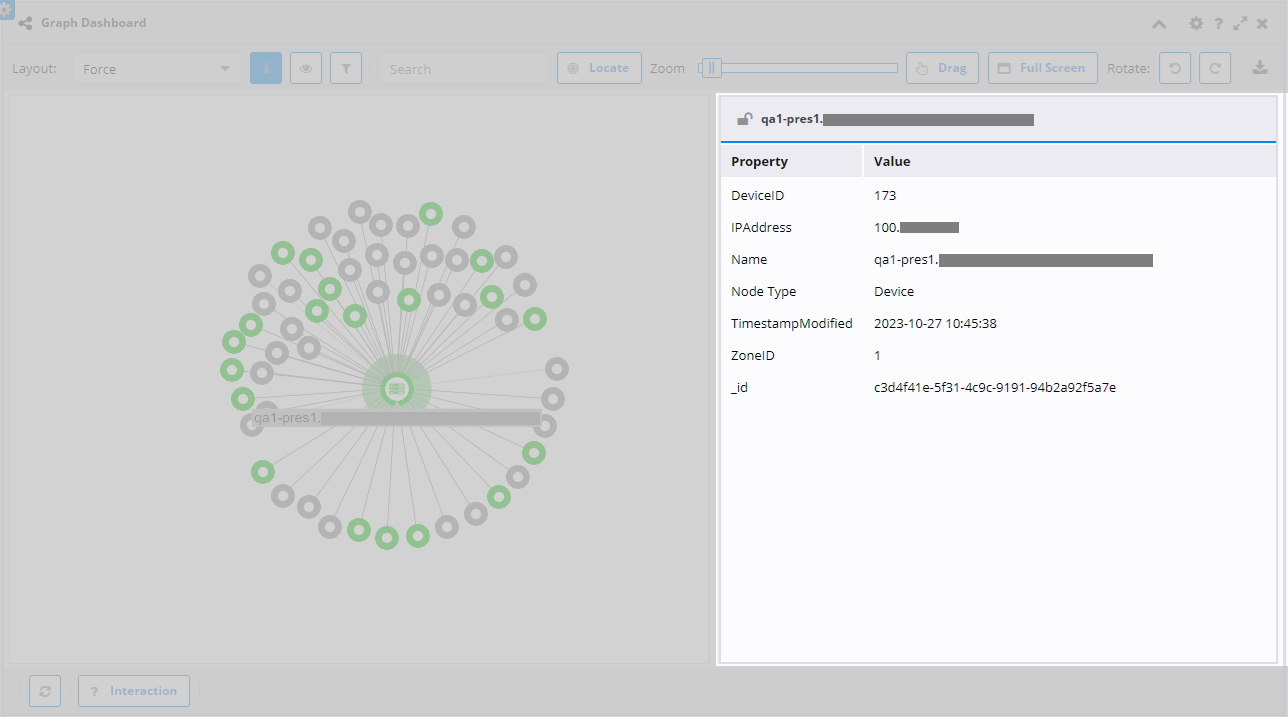
Information Pane
The information pane shows properties and values of the current target. You can drag the divider bar between the graph and the information pane to make it larger or smaller. Click the "Toggle Selection Information" button on the toolbar to completely hide it.
Description of illustration topology-graph-dashboard-panel-view-information-pane.png
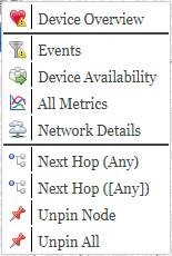
Context Menu
The context menu will be available while a vertex or edge is targeted. The options in the context menu will be dependent upon the menu selected while configuring the graph. Most of the default options are links to dashboards related to devices.
Description of illustration topology-graph-dashboard-panel-view-context-menu.png
-
Device Overview: Opens the Device Overview dashboard for the device associated with the target vertex.
-
Events: Opens an event list with the Node field matching the vertex name.
-
Device Availability: Opens the device Availability dashboard for the device associated with the target vertex.
-
All Metrics: Opens the All Metrics Overview dashboard for the device associated with the target vertex.
-
Network Details: Opens the Network Details dashboard for the device associated with the target vertex.
-
Next Hop: Adds any vertices and edges attached to the target vertex to the current graph.
-
Unpin Node: After any vertices are moved, the location they are dropped is saved. Using this tool removes the saved location and the vertex may then move based on other settings that get used.
-
Unpin All: After any vertices are moved, the location they are dropped is saved. Using this tool removes the saved locations for all vertices and they may then move based on other settings that get used.
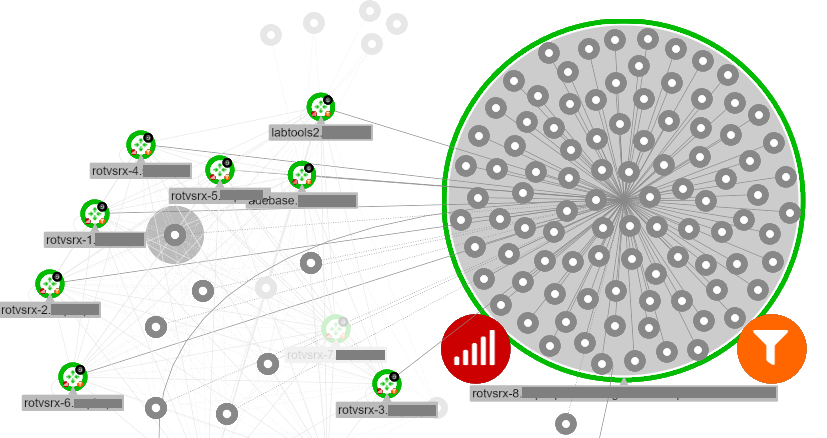
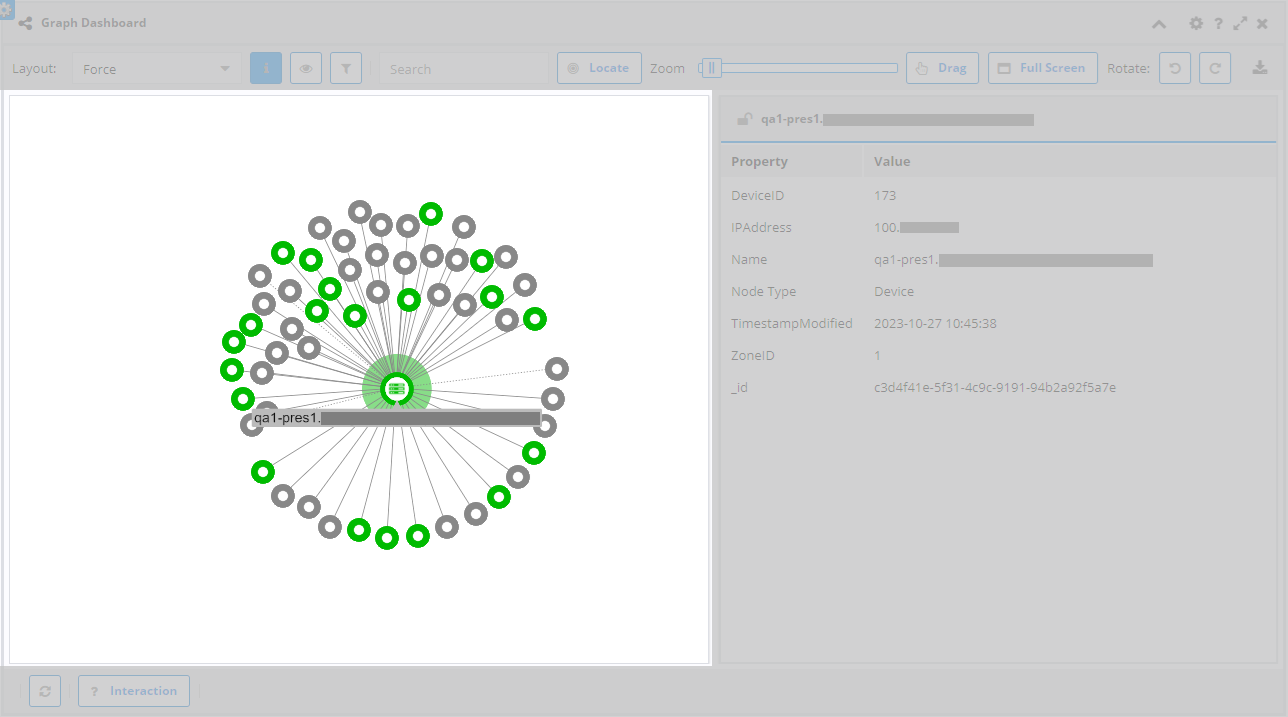
Graph Pane
There is a lot of information in the graph itself. This is a breakdown of the icon and color meanings.
Description of illustration topology-graph-dashboard-panel-view-graph-pane.png
-
Vertex
-
The large, central icon represents the vertex type, such as network, interface, or a device type. The color indicates the availability: red = 0%, green = 100%, and yellow is anything between.
-
The bottom left icon represents the metric threshold status. The color indicates the highest severity threshold breached.
-
The bottom right icon represents the event status. The color indicates the highest event severity.
-
The top right icon represents the number of vertices tucked away inside the vertex. If a number is present, double-click the vertex to expand it so the nested vertices are visible.
-
-
Edge
- The edge will typically be gray unless customized. The edge will have an arrow at one end to indicate the source/target relationship. Select an edge to highlight the edge and the nodes at either end. Selecting the edge also fills the information pane with the edge details.
Glossary
-
Badge: A small notation on a vertex or edge meant to relay some specific information at a glance.
-
Context Menu: A menu that pops up at the target location with options specific to the target. It can typically be accessed by either clicking the right mouse button or selecting the target and clicking the appropriate control key.
-
Edge: A connection between vertices showing information about the relationship. It is generally a simple line, but can be decorated with text, badges, or even animations.
-
Node: A node (or vertex, these terms can be used interchangeably) is an object that represents a source of interest in a graph. It is a circle with an icon and various badges on the graph. In the real world, it can be a physical object such as a device or an abstract concept such as a service.
-
Topology: A graph of vertices and edges representing the relationship between those objects and, ideally, current real-world status of those same objects. The graph is generally used to identify problems and what the scope of the problem's effects may be.
-
Vertex: A vertex (or node, these terms can be used interchangeably) is an object that represents a source of interest in a graph. It is a circle with an icon and various badges on the graph. In the real world, it can be a physical object such as a device or an abstract concept such as a service.
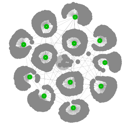
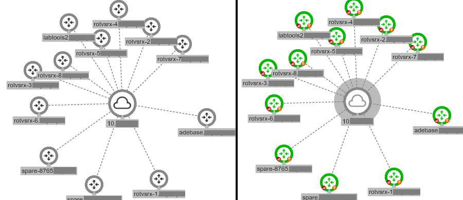
Example Process
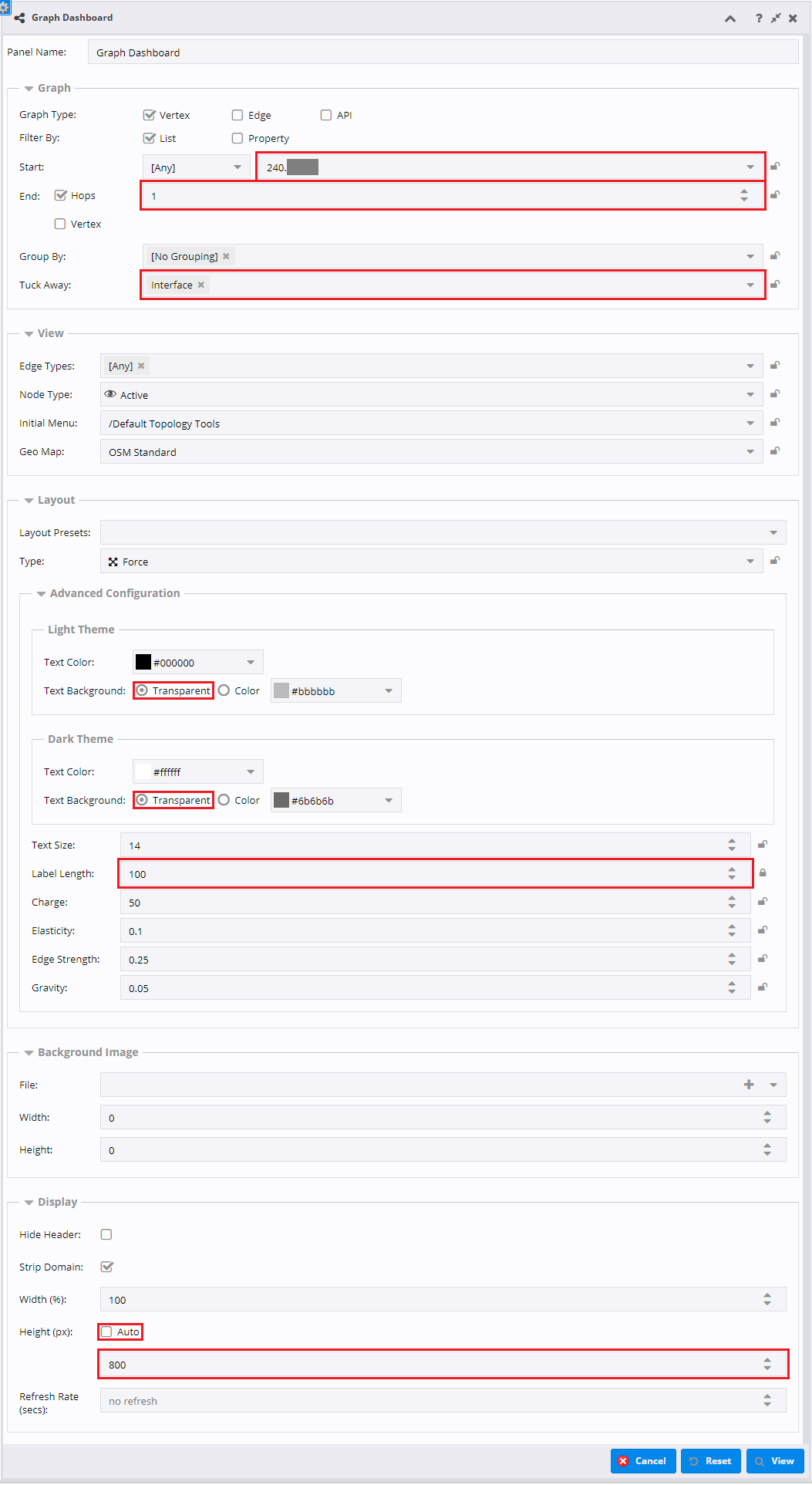
Description of illustration topology-graph-dashboard-panel-example-process-form.png
-
Select a Start Vertex.
-
Set the number of Hops.
-
Set the Tuck Away to Interface.
-
Set the Text Background to Transparent for both themes.
-
Set the Label Length to an appropriate value.
-
Un-check "Auto" height.
-
Set the Height value in pixels.
-
Click the "View" button.
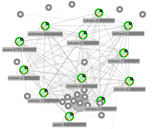
The result will look like this:
Description of illustration topology-graph-dashboard-panel-example-process-view.png