UI Overview
This guide explains the user interface and the different sections that it is comprised of.
Login Screen
The main Login screen for Unified Assurance is where you enter you login credentials.
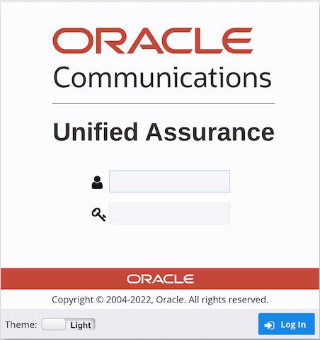
Description of illustration log-in.png
Unified Assurance also supports a dark theme. The following figure shows the login screen with dark mode enabled. You can toggle the theme from the login screen.
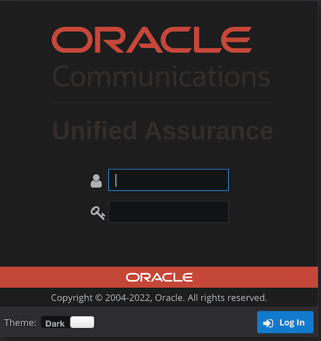
Description of illustration log-in-dark.png
Post Login Screen
The following figure shows the Unified Assurance's basic navigation menu.
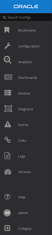
Description of illustration navigation_menu.png
As you navigate the UI, contextual submenus are displayed. The following figure shows you the options within the Configuration menu and the subsequent Metrics menu.
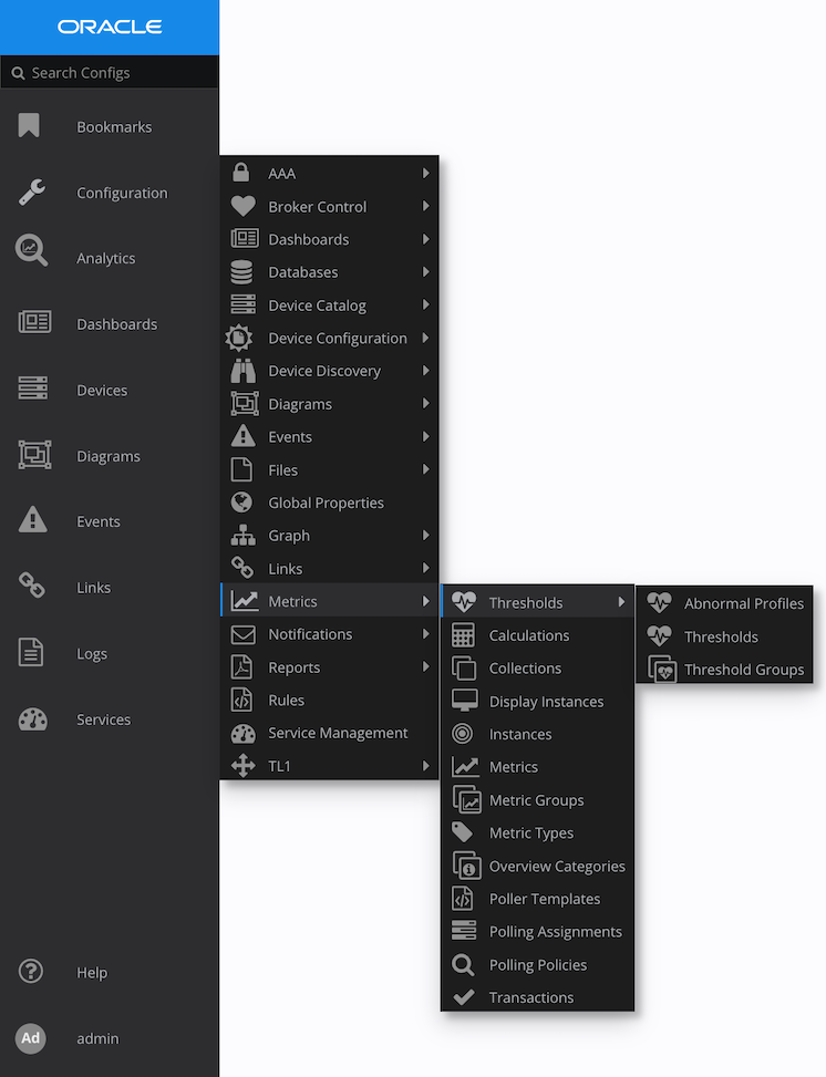
Description of illustration menu-expanded.png
In order to save space, the navigation menu can be collapsed. Click the arrow on the bottom of the navigation menu to expand or collapse the menu. The following figure shows the collapsed menu.

Description of illustration menu-collapsed.png
The following list shows you some of the other basic interactions that is possible through the UI.
-
Logo - Click the logo to refresh a session.
-
Help - Click Help to access product documentation.
-
Username - To sign out, hover over the user name and click Sign Out.
-
Collapse - As already noted, you can expand or collapse the navigation menu.
-
Main Grid - The main area of the interface shows the actual content of the interface.