Overload Map Panel
The Overload Map panel displays a selected transformer's overload percentage over time. The transformer rating is the highest value that is non-overloaded. The data can be viewed in chart (default) and grid formats.
Note: The Overload Map Panel is available through the Distribution Planning and Operations module when displaying transformer data.
- Chart view is the default view of the Overload Map panel data. The vertical axis (y-axis)
represents the hours during a day, and the horizontal axis (x-axis) represents calendar days.
Note: Boundary conditions can be configured.
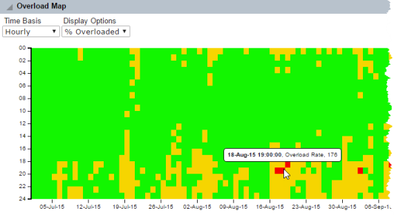
The transformer's calculated percentage overloaded values are charted throughout this graph using the following color sequence:
- Green: Not overloaded, or 0–100% of capacity.
- Yellow (Warning): Overloaded (101–165% of transformer rating).
- Red (Critical): Greatly overloaded (greater than 165% of transformer rating).
- White: Indicates missing data.
The value of the percentage overloaded along with the date and time appears when you hover the mouse over a cell.
Note: To view the chart data in a grid format from the chart view, click the grid view icon.
- Grid view displays Overload Map panel data in a table format.
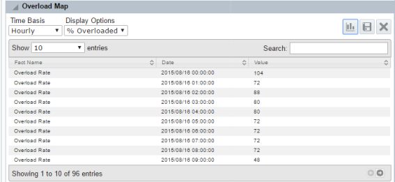
Columns include the following and can be sorted in ascending or descending order:
- Fact Name: The name of the data category, which is Overload Rate.
- Date: The timestamp for the calculated overload value.
- Value: The calculated overload percentage value, which corresponds to one hour block on the chart.
To change the Overload Map panel view, click the chart and grid icon located in the top right corner of the panel.
Options
The Transformer Overload Map panel provides the standard drop-down lists with default values.
- Time-Basis: Hourly
- Display Options: %Overloaded