Energy Costs View
The Energy Costs view of the Data Browser displays how much a business was billed for energy use, based on historical bill amounts. Business customers can view energy costs for each bill over a 13-month period. Daily and subdaily views are also available if there is enough data.
On this page:
Requirements
Same as listed in Data Browser.
Limitations
Same as listed in Data Browser.
User Experience
The Energy Costs view displays how much a business was billed for energy use over time. This section describes the user experience for businesses that have billing data and daily AMI data.
Fuel Menu
The fuel menu allows customers to select which fuel to view data for. By default, electricity is shown. An additional gas menu only appears for dual fuel customers.
A Combined view can be displayed, which combines electric and gas costs into a single number using a price-weighted index. When the Combined view is enabled, the data point tooltips also display combined totals.
Time Menu
Depending on what data is available, the Energy Costs view presents different kinds of trends and insights at varying levels of granularity over time.
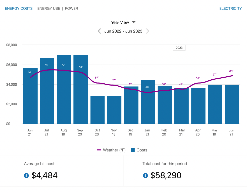
- Year view: Energy cost by each bill period in a year. Monthly, bi-monthly, and quarterly bills are supported.
- Bill view: Energy cost by each day in a bill period, as well as the day with the highest demand. AMI data is required for this view.
- Day view: Energy cost by each hour of a day, as well as the interval with the highest demand. AMI data is required for this view.
There are also forward and backward buttons that customers can select to display contiguous blocks of time. In the year view, for example, clicking the forward or backward button displays contiguous 13-month blocks of time for businesses on monthly billing.
Bar Graph
The bar graph uses a vertical axis (Y-axis) to show the cost, and a horizontal axis (X-axis) to show the time period. The bars use the "You" color, which is blue by default and commonly changed to the utility's brand color. See General Display Rules for details on how the graph behaves and how the data visualization can change depending on the selected view.
Weather Data
A line graph representing the average temperature during each time period is overlaid on the bar graph. This allows customers to see how their usage relates to local weather patterns. The weather data is based on data from the airport weather station closest to the location of the business. See Weather Data for details on how weather data is retrieved.
Rates Data
Rates or cost information be displayed in the daily and subdaily views of the Energy Costs view. However, in order for such insights to appear, the Rates Engagement cloud service must be purchased, and rates must be modeled. Assessment will be needed to determine if your business rate structure can be supported. Contact your Delivery Team for more information.
Tooltips
Tooltips are displayed when business customers interact with a data point on the graph. See Energy Tooltips for details on what the tooltips may include.
Cost Insights Bar
For each fuel type available in the Energy Costs graph, a bar is displayed beneath the graph to show additional cost insights. This bar is available for single fuel and dual fuel customers, and displays only in the Year view to show the average bill cost and total annual cost for the selected year. If the year is not yet complete, the average bill and total cost-to-date is shown.
Legend
A legend below the graph defines the elements displayed in the graph. If applicable, the legend includes an indicator for estimated bills.
Disclaimer
Disclaimer messages can be added to the Energy Costs view that are specific to the view. For example, if applicable, a disclaimer message can explain that the amounts shown do not include taxes and other fees. The disclaimer message can also include links to other resources where business customers can find more information.
User Experience Variations
Solar Data and Net Energy Metering
If a business customer has solar power and generates more energy than they consume, the Energy Costs view will show the customer's energy use as a credit. Short green bars are shown for negative values, and a tooltip denotes the negative cost value. This default experience can be configured to display in different ways. Utilities must coordinate with their Delivery Team to determine which display to use.