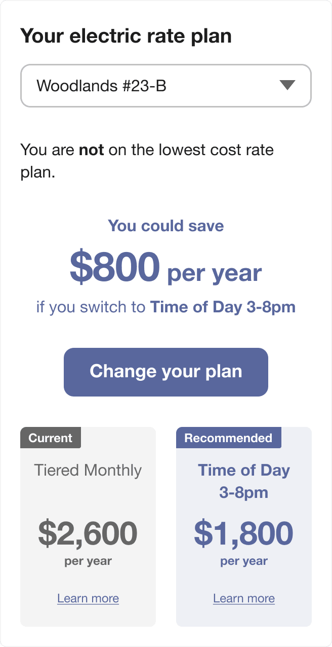
Rates Light
The Rates Light widget is a dashboard-friendly tool designed to help customers quickly view and compare utility rate plans. Customers can use the widget to understand at a glance whether they are on the best rate, and if not, which plan is recommended. The widget directs customers to the detailed Rate Comparison Feature for a more in-depth comparison.

Embedding Guidelines
Widget Name: widget-rates-light
- This widget is well-suited for embedding in dashboards alongside other widgets for a unified view of energy, billing, and rate plan information. Consider embedding it near or alongside other dashboard-friendly information, such as the customer’s current balance and usage trends that customers can explore.
- Embed this widget on highly visited areas of the utility website, such as an account overview dashboard. While the Rate Comparison tool is available to help customers determine if they are on the least expensive rate given their usage, many customers will not navigate far enough into the website to find this tool. Embedding the Rates Light widget in prominent dashboard locations helps ensure customers can quickly access rate comparison information when it is most relevant, and drives traffic to the Rate Comparison tool.
For more information, including details about the data requirements and the overall user experience, see the Rates Light Overview description in the Oracle Utilities Opower Rates Engagement Cloud Service Overview.