Self-Comparison
The Self-Comparison module offers customers a concise and personalized explanation for why a bill might be different or similar compared to a past bill. It includes a self-comparison that shows how the customer compares against their past energy use, rationale for the delta they might notice (for example, weather insights or bill period details), acknowledgment of improvement, and a moment of pride highlight. In the Solar Report, the Self-Comparison module includes solar-focused text and design variants of the comparison graph for the negative net energy and net zero energy states experienced by solar customers.
Appears in: Progress Report, Solar Progress Report
This image shows an example of the Self-Comparison module design for the Progress Report.

Header: The header sets the stage for a different type of comparison relative to the Efficiency Zone or Neighbor Comparison included on the front of the report.
Self-comparison bar chart: The bar chart shows a customer's energy use relative to their household in the past. The default state is a year-over-year comparison. If there is insufficient data for a year over year comparison, the module compares usage this bill to one’s most recent bill.
Explainer: The explainer helps the customer understand possible behaviors or events that could have caused their energy use to change or stay the same. Possible states include:
- Warmer weather and usage increase
- Colder weather and usage increase
- Other (any combination not covered by the other states)
Insight: The insight does the math for the customer, helping them understand in a quick take by how much their usage has changed compared to last time. It also relies on the established warning and success colors of orange and green respectively (as seen in the Benchmark) to send a signal to the customer that is either positive or negative, without requiring them to absorb the copy or number themselves.
Solar Report - Self Comparison
This image shows an example of the Self-Comparison module design for the Solar Report.
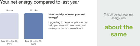
Header: The header identifies the module as a comparison of the customer's net energy compared to the previous year.
Self-comparison bar chart: The bar chart shows a customer's energy use relative to their household in the past.
Explainer: The explainer helps the customer understand possible behaviors or events that could have caused their energy use to change or stay the same. Possible solar states include:
- Usage Increased
- Usage Decreased
- Usage Same
Each state can accommodate all net negative, all net positive, net zero, and net positive and net negative in the same graph.
Insight: The insight does the math for the customer, helping them understand in a quick take by how much their usage has changed compared to last time. It also relies on the established warning and success colors of orange and green respectively (as seen in the Benchmark module) to send a signal to the customer that is either positive or negative, without requiring them to absorb the copy or number themselves.
Requirements and Limitations
Fuel:
- Progress Report: Electric-only, gas-only, dual fuel.
- Solar Report: Electric-only, dual fuel.
Data Required: Billing data.
Data History:
- A minimum of two historical bills to generate the bill period over the bill period self-comparison.
- A minimum of 12 months of historical bill data to generate the year over year self-comparison.
Billing Frequency: Monthly, bi-monthly, or quarterly.