Mini Time of Use Reminder
Positioned in the top right of the progress version of the Peak Focused Report, the Mini Time of Use Reminder module is a customer's first point of reference for understanding peak electricity cost periods based on their Time of Use plan. The module clearly displays the multiplier for high-cost periods and their specific timings., provides a color-coded timeline that highlights peak times in for easy identification, and adapts to different utility peak times and billing structures, such as demand charges.
On this page:
Requirements
Utility Requirements
|
Category |
Description |
|---|---|
|
Required Cloud Service |
Energy Efficiency Cloud Service |
|
Scale |
Less than 100,000 per week. |
Customer Requirements
|
Category |
Description |
|---|---|
|
Billing Frequency |
Monthly or bi-monthly. |
|
Data Delivery Frequency |
Monthly, bi-monthly, or quarterly. |
|
Data Requirements |
|
|
Data History |
A minimum of one historical bill. |
|
Data Coverage |
Not applicable. |
|
Supported Fuels |
Electric-only. |
Limitations
- Peak Focused Report Only: This module is only available as part of the Peak Focused Report.
- Time of Use: Customers must be on a Time of Use Rate plan.
User Experience
This section describes the user experience for a customer with three peak times.
Header: The header informs the customers what the multiplier in cost will be during the peak period and what times the period will occur:
- Weekday price ratio: The multiplier of cost during the peak period.
- High cost period label: Rate plan-specific name for the high cost period. For example, peak period or on-peak.
- Weekday high cost period start time: The time the peak period will start. For example, 4pm.
- Weekday high cost period end time: The time the peak period will end. For example, 7pm.
Cost period bar: The cost period bar provides a visual representation of the cost periods.
- High Cost Period: The high cost period displays the most expensive time range, and is indicated by a warning-color. It is dynamically rendered based on the customer's rate plan details. For example, "On-peak hours ($$$)."
- Medium Cost Period: The medium cost period label identifies the time range that is neither the most or least expensive, and is indicated by a medium warm color. It is dynamically rendered based on rate plan details. For example, "Partial-peak hours ($$)."
- Low Cost Period: The low cost period label identifies the least expensive time range, and is indicated by a light cool color. It is dynamically rendered based on rate plan details. For example, "Off-peak hours ($)."
Cost start and end times: The cost period start time and end time are noted on the bar.
Cost period legend: The cost period legend identifies the cost periods represented in the cost period bar.
User Experience Variations
Data States
The data states of the module are based on how many peak times the utility has, and whether the utility has a demand charge.
Two Peak Times
This image is an example of the Mini Time of Use Reminder module for two peak periods.

Cost period bar: The cost period bar provides a visual representation of the high cost period.
- High Cost Period: The high cost period displays the most expensive time range, and is indicated by a warning-color. It is dynamically rendered based on the customer's rate plan details. For example, "On-peak hours ($$$)."
- Low Cost Period: The low cost period label identifies the least expensive time range, and is indicated by a light cool color. It is dynamically rendered based on rate plan details. For example, "Off-peak hours ($)."
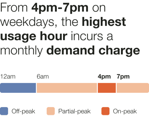
Demand Charge
This image is an example of the Mini Time of Use Reminder module for a customer with demand charge rate in addition to the Time of Use plan.

If the customer has demand charging, then the user experience varies as follows.
Header: The header informs the customers when the demand charge occurs.
Weekday high cost period start time: The time the peak period will start. For example, 4pm.
- Weekday high cost period end time: The time the peak period will end. For example, 8pm.
- Cost period bar: The cost period bar provides a visual representation of the high cost period.
Cost period colors: The cost period provide the customer with a visual cue to draw their attention to the most crucial times to save every during peak events.
- High Cost Period: The high cost period displays the most expensive time range, and is indicated by a warning-color. It is dynamically rendered based on the customer's rate plan details. For example, "On-peak hours ($$$)."
- Medium Cost Period: The medium cost period label identifies the time range that is neither the most or least expensive, and is indicated by a medium warm color. It is dynamically rendered based on rate plan details. For example, "Partial-peak hours ($$)."
- Low Cost Period: The low cost period label identifies the least expensive time range, and is indicated by a light cool color. It is dynamically rendered based on rate plan details. For example, "Off-peak hours ($)."
Cost period legend: The cost period legend defines which colors represent cost periods in the cost period bar.