Time of Day Hourly Insight
The Time of Day Hourly Insight provides the customer with additional details about when a customer is consuming electricity and how they compare to their nearest comparison group. The module displays the customer’s average hourly electricity use on weekdays, the highest cost period (peak) hours, non-peak hours, and an insight to highlight to the customer in which high cost period hour they are consuming the most energy. A URL is provided to direct customers to where they can learn more about their Time of Day rate plan.
On this page:
Requirements
Utility Requirements
|
Category |
Description |
|---|---|
|
Required Cloud Service |
Energy Efficiency Cloud Service |
|
Scale |
Not applicable. |
Customer Requirements
|
Category |
Description |
|---|---|
|
Billing Frequency |
Monthly, bi-monthly, or quarterly. |
|
Data Delivery Frequency |
Monthly, bi-monthly, or quarterly. |
|
Data Requirements |
|
|
Data History |
A minimum of one historical bill. |
|
Data Coverage |
Not applicable. |
|
Supported Fuels |
Electric-only. |
Limitations
- Peak Focused Report: This modules is only available as part of the Peak Focused Report.
- Time of Use Rate Plan: This module is only available to customers on Time of Use rate plans.
- No Rate Data: The no rate data variation of the module may be included in other report types.
User Experience
This section describes the user experience for a customer with two peak periods.

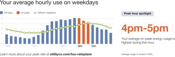
Heading: The heading draws the customer's attention to the module's focus on average hourly usage during weekdays.
Time of Day Graph: The graph helps the customer identify key times for energy savings by highlighting their average use during weekdays with a focus on the high-cost peak hours.
- Cost Period Labels: Provides a key to the graph elements. For example, "Off-peak," "On-peak," and "Average neighbors."
- Hourly Bar Graph: Defines the customer's hourly off peak and on-peak usage. High-cost peak hours are indicated in the same color as the High Consumption Time Period.
- Comparison Group Usage Line: Indicates the comparison group’s average hourly usage. If the state is fair then average neighbors data is used for the line data on the chart.
- Cost Period Start Times: Defines the hourly usage increments of the bar graph.
- Learn More: Text encouraging the customer to learn more about their peak rates and a URL where they can find more information.
Insight Heading: Reinforces the purpose of the module as a focus on the customer's peak hour usage.
- Highest Consumption Time Period: Identified the period during which the customer's average on-peak energy use was the highest. This element is dynamic by rate plan.
- Insight Description: Explains that the High Consumption Time Period is the period during which the customer's average on-peak energy use was the highest.
- Usage Measurement: Defines the measurement used in the graph.
User Experience Variations
Three Peak Periods
If there are three peak periods, three peak distinct periods appear in the graph and are identified in the cost period labels.

Hourly Bar Graph: The graph includes the customer's high ("on-peak"), medium ("partial-peak"), and low ("off-peak") cost periods. The colors used in the graph are designed to draw attention to the distinct cost periods:
- High Cost Period: A warning-color identifies the most expensive time range. It is dynamically rendered based on the customer's rate plan details.
- Medium Cost Period: A medium warm color identifies the time range that is neither the most or least expensive. It is dynamically rendered based on rate plan details.
- Low Cost Period: A cool color identifies the least expensive time range. It is dynamically rendered based on rate plan details.
Cost period labels: Identifies the table elements and their associated colors.
Comparison Group Usage Line Data
The type of data used for the line data on the chart varies depending on the customer's usage state:
- If the usage state is fair then average neighbors data is used for the line data on the chart.
- If the usage state is good or great then efficient homes data is used for the line data on the chart.
The module varies in the following ways:
- Comparison Group Usage Line: Indicates the comparison group’s average hourly usage. If customers in a good or great usage state, the line is green.
- Cost Period Labels: The graph elements labels indicate the line data used:
- Good or great: "Efficient neighbors"
- Fair: "Average neighbors"
Demand Charge

If the customer has demand charges, module varies in the following ways:
- Demand Charge Icon: A demand charge dollar icon appears at the max usage hour during the on-peak period in a bill period. The chart displays average usage for hours in the bill period.
- Insight Heading: Reinforces the purpose of the module as a focus on the customer's demand charge usage.
- Highest Consumption Time Period: Identifies the period during which the customer's demand charge occurred for the period. This element is dynamic by rate plan.
- Insight Description: Explains that the demand charge occurred in the period identified, and encourages the customer to learn more to save more.
- Learn More Link: Redirects the customer to the web portal where they can learn more about their demand charges.
No Rate Data
When there is no available rate data, or if the module is used in another report besides the Peak Focused Report, the module shows an hourly normative comparison and emphasizes the highest average usage hour.
Note: The no rate version of the Time of Day Hourly Insight module may be included in other report types for utilities that meet additional data requirements. Contact your Delivery Team for information.

The module varies in the following ways:
Time of Day Graph: The graph helps the customer identify key times for energy savings by highlighting their average use during weekdays. Peak hours are omitted.
- Cost Period Labels: Provides a key to the graph elements. Only "Your use" and "Average neighbors" are included.
- Hourly Bar Graph: Defines the customer's hourly usage. The highest use hour is indicated in the same color as the High Consumption Time Period. The graph displays 12am, 6am, 12pm and 6pm by default on the x-axis.
- Comparison Group Usage Line: Indicates the comparison group’s average hourly usage. The line data varies depending on the customer's usage state.
- Highest Consumption Time Period: Identifies the period during which the customer's energy use was the highest. This element is dynamic by rate plan.
Missing or No Data
If data is missing or not available, then the module indicates the periods for which there is missing or no data. The following image is an example is of the Time of Day Hourly Insight module for a demand charge customer with missing data.
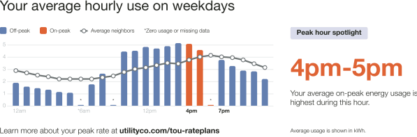
The module varies in the following ways:
- Asterisk: An asterisk is located above the graph period for which there is no data.
- Cost Period Labels: A cost period label identifies the asterisk as " Zero usage or missing data."