Displaying the Map
By default, the Map is displayed as a new tab in your browser. You can tear off the tab and display it as a standalone window if required. This enables you to display the map and the Events and Crews side by side, if required.
To display the Map:
• From the Workspace Tool Selector, select Map.
• To view the location of an outage event on the Map, select an event then click the Focus button ( ).
).
Note: The Map displays in a new browser tab, but, if desired, you can drag the browser tab outside of the browser window to display the Map side‑by‑side with your Events and Crews tool.
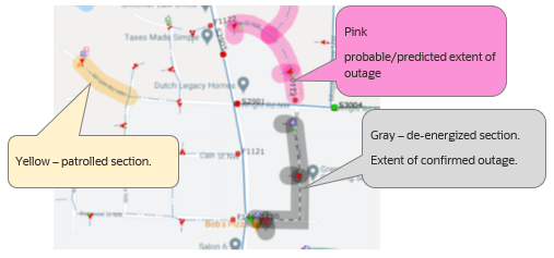
The Map provides visual cues and symbols to represent devices, events, and conditions. For example, the following screen capture depicts an area of the network with conductor segments highlighted for different conditions: patrolled, probable/predicted outage extent, de-energized section showing the extent of the confirmed outage. You can view conductor and condition coloring settings by viewing the Map Legend.
