Post Bill Comparison Module
The Post Bill Comparison module provides customers with an at-a-glance look at their energy costs or usage this period compared to the previous period. Using icons and bar charts, this module is graphic and simple, making it easy to understand whether the customer did better or worse than the previous period. If the customer receives the cost version, a dollar amount is associated with each bar chart. If the customer receives the usage version, their energy usage is displayed in kWh for electricity and therms for gas.
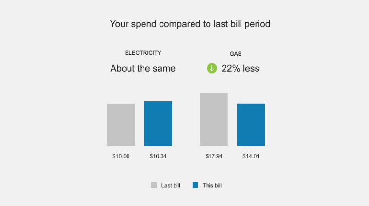
Design
The image below is an example of the Post Bill Comparison module:
Configuration Options
For each element listed in the table, indicate the desired configuration in the Input Value column. If you do not provide an input for optional configurations, the default will be used.
|
Configuration Option |
Input Value |
|---|---|
|
Header The header statement explains what the data in the chart is referring to. Default: Your spend compared to last bill period
|
Optional Choose one of the following: Use the default statement. Use the following statement: |
|
Chart Colors The bar chart colors can be configured to use the utility's color palette. |
Optional Work with your Delivery Team to customize the colors. |
|
Period Names in Chart Utilities can configure the names of the billing periods. Default: This Period, Last Period |
Optional Choose one of the following: Use the default statement. Use the following statement: |
User Experience Variations
The user experience varies for customers depending upon their service types, available data, costs, and locale. Note that the following list indicates the primary user experience variations, not all possible variations.
Header Variations
In a dual fuel version of the module, the header statement is static, and reads as follows, depending on whether the email displays cost or usage:
- Cost: Your spend compared to last bill period
- Usage: Your usage compared to last bill period
In a single fuel version of the email, the header statement is also used as the insight statement and varies depending on:
- Whether cost or usage is displayed
- Which fuel is included in the email
- Whether the customer spent more, less, or about the same this period as the previous period. This controls which icon is displayed before the statement, as follows:
- Gray exclamation icon: Displays when the customer spends or uses more this period compared to last period.
- Green check mark icon: Displays when the customer spends or uses less this period compared to last period.
- No icon: No icon is displayed when the customer spends or uses about the same amount this period compared to last period.
Single Fuel
If the email includes only one fuel (gas or electricity) only a single horizontal bar chart is displayed. The labels on the left of the bars take the place of the legend, and the usage or cost is displayed to the right of the bars. The header statement also can vary as previously described.
Usage Variation
If the module is set up to display usage instead of cost, the values in the chart are displayed as percentages instead of monetary amounts.