45.1.1 Experience Builder - Create
This topic describes the systematic instruction to Experience Builder - Create option.
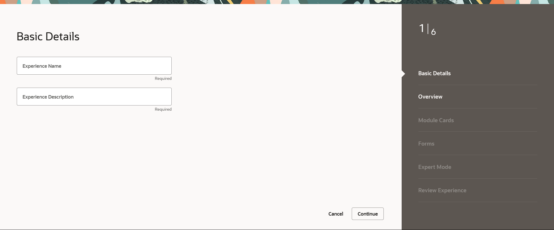
To create a experience:
Figure 45-3 Experience Builder – Create -Overview - Step 2 Note:
For more information on fields, refer to the field description table.
Table 45-3 Experience Builder – Create - Overview - Step 2 - Field Description
| Field Name | Description |
|---|---|
| Upload Your Logo |
Upload a logo file for the experience. Note: The allowed format for logo is svg. |
| Navigation Header Colour | Specify the colour for the navigation header from the colour palette. |
| Brand Colour | Specify the colour for the brand from the colour palette. |
| Secondary Brand Colour | Specify the secondary brand colour from the colour palette. |
| Error Message Colour | Specify the colour for the error message from the colour palette. |
| Warning Message Colour | Specify the colour for the warning message from the colour palette. |
| Success Message Colour | Specify the colour for the success message from the colour palette. |
| Information Message Colour | Specify the colour for the information message from the colour palette. |
| Font Family | The name of the base font family that is to be applied for creating the experience. |
| Font Family Source (URL) | The URL for the base font that is to be used in the experience. |
| Page Header Background Colour | Enable or disable the switch to add or remove background colour to page header. |
| Apply Glass Morphism | Enable or disable the switch to activate or deactivate the glass morphism effect in experience. |
| Dashboard Tabs | Enable or disable the switch to add or remove dashboard tabs. |
| Strip Colour |
Specify the strip colour you wish to set. The options are:
|
| Main Content Background Colour |
Specify the main content background colour you wish to set. The options are:
|
| Body Background Colour |
Specify the background colour you wish to set for the body. The options are:
|
| Header Height |
The height of the experience header. The options are:
|
| Header Padding |
Specify the space between header content and border. The options are:
|
| Body Strip Colour | Specify whether you wish to show or hide the body strip colour. |
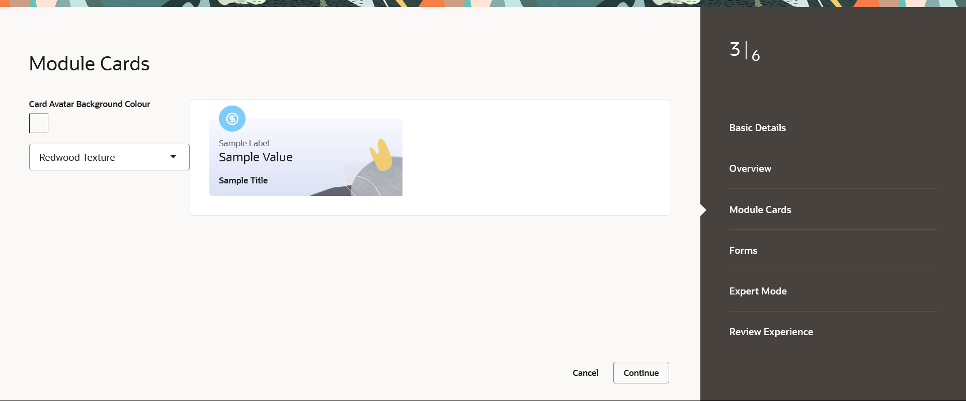
Figure 45-4 Experience Builder – Create -Module Cards -Step 3 Note:
For more information on fields, refer to the field description table.
Table 45-4 Experience Builder – Create - Module Cards -Step 3 - Field Description
| Field Name | Description |
|---|---|
| Card Avatar Background Colour | The card avatar background colour you wish to set. |
| Card Avatar Background Texture |
Specify the background texture for the cards. The options are:
|
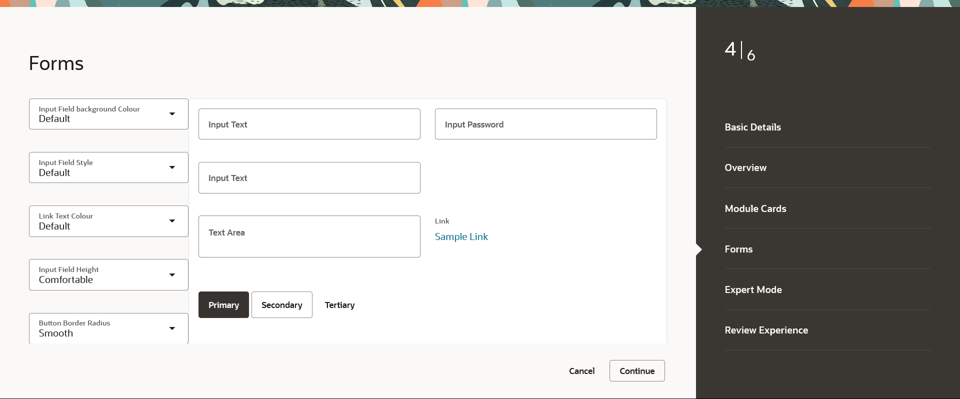
Figure 45-5 Experience Builder – Create -Forms -Step 4 Note:
For more information on fields, refer to the field description table.
Table 45-5 Experience Builder – Create - Forms -Step 4 - Field Description
| Field Name | Description |
|---|---|
| Input Field Background Colour |
Specify the background colour for the input field. The options are:
|
| Input Field Style |
Specify the typography weight for the input field. The options are:
|
| Link Text Colour |
Specify the colour for the link text. The options are:
|
| Input Field Height |
Specify the typoghraphy height for the input field. The options are:
|
| Button Border Radius |
Specify the button border style for the button. The options are:
|
| Button Colour |
Specify the colour for the button.
|
| Label Position |
Specify the label position. The options are:
|
| Direction |
Specify the page layout direction. The options are:
|
| Maximum Columns |
Specify the maximum columns permitted in the page layout. The options are:
|
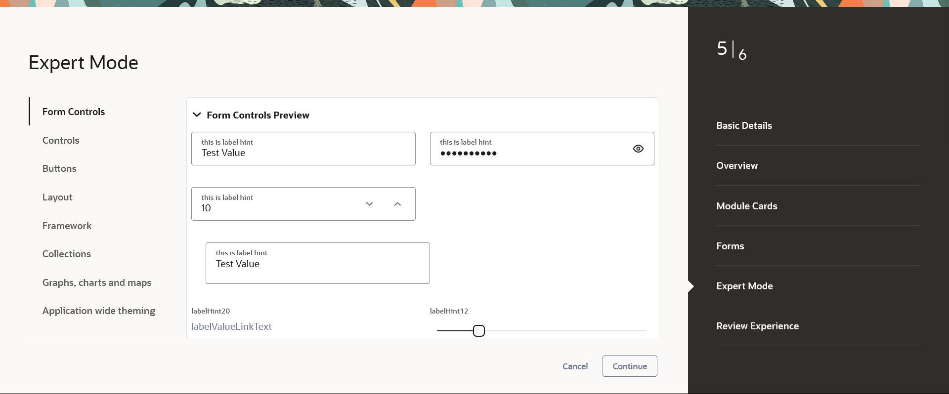
Figure 45-6 Experience Builder – Create -Expert Mode -Step 5 Note:
For more information on fields, refer to the field description table.
Table 45-6 Experience Builder – Create - Expert Mode -Step 5 - Field Description
| Field Name | Description |
|---|---|
| Form Controls |
A structural representation of user related input fields is known as a form for example Input Text, Drop-Down list, Links, Password Label, Slider, Switch Buttons, Toggle Buttons, Checkboxes etc. The application form related attributes are defined in this section. The Forms related variables are listed here, which are editable. A preview of how the form will be displayed, based on brand definition is focused and appears on the right-hand side of the screen. |
| Controls |
Displays the variables for the controls likeHeadings, Links, Menu buttons, Action list, Navigation. This is editable. The typography colour, font size and weight are defined here.
|
| Buttons |
An element that allows the user to take actions with a single tap and interact with them is known as the button. The application buttons like Toggle buttons, Switch buttons related attributes are defined in this section. The Buttons related variables are listed here, which are editable. A preview of how the buttons will be displayed, based on brand definition is focused and appears on the right-hand side of the screen. |
| Layout | The layout section comprises of the various layout components available throughout the application, such as Navigation List, Tab Bar, Panel, and Dialog. This section also provides control over the current Masonry Layout in the application. |
| Framework |
The framework preview shows the user, all the possible font hierarchies in the system, along with badges for different types of messages in the applications.
|
| Collections |
The collections preview displays the various types of collection components available in the application, such as List View and Table. Note: The collections components can be referred from the Oracle Jet Library. |
| Graphs, Charts and Maps |
The different types of visualizations available in the application such as rating gauge, charts are defined and can be modified in this section. Note: The visualization components can be referred from the Oracle Jet Library. |
| Application wide theming | This section consists mainly of the different variables available to be edited by the admin which will affect application wide classes, such as color palettes, scrollbar properties and more. |
Parent topic: Experience


