2.4 User Interface Elements
The user interface elements used in the application are as described below.
A list displays values configured in the application from which you can select the desired value. For example, to select a supervisory group code, click ![]() in the Supervisory Group field.
in the Supervisory Group field.
A display field displays information in read-only mode and you cannot edit the same.
An entry field is an element in which you can type or enter information. This information can be textual, numeric, or alphanumeric in nature.
Note:
Fields marked as Required are mandatory.An option button provides choices that are mutually exclusive. You can select only one choice from the given options.
A check box indicates whether a condition is enabled or disabled. It also indicates selection of items. If multiple check boxes are presented, you can select one or more of them.
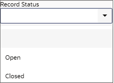
A list box displays a fixed list of available options. If there are more options than what can be displayed at a given time, a scroll bar appears in the list box. You can select only one option from the given list.

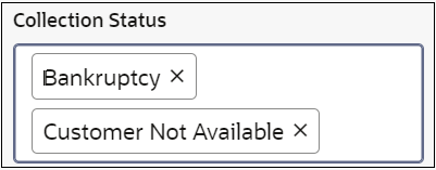
A Multiple-Selection List field allows you to select multiple options for a field from a list of values.

The pagination feature helps you to search for required record from the search results.
A table displays list of records in row and column format.

The date field helps you to set the date. You can either enter the date manually or select it using the calendar.
- Click
 to select a date.
The calendar appears with the current month and year in context with calendar date highlighted by default.
Note:
If you want to view all the months for a year and select the required month, click the <month name> in context. If you want to view list of years and select the required year, click the <year> in context. You can click and
and  to navigate back and forth, respectively.
- Select the relevant date.
The selected date gets populated in the date field.
Table 2-1 Field Description: Audit
| Field Name | Description |
|---|---|
| Modification No | Displays the modification number of the record. |
| Authorization Status | Displays the authorization status of the record. |
| Record Status | Displays the status of the record. |
| Maker | Displays the user name of the maker who modified the record. |
| Maker Remarks | Displays the remarks given by the maker on modification of the record. |
| Checker | Displays the user name of the checker who modified the record. |
| Checker Remarks | Displays the remarks given by the checker on authorization of the record. |
Table 2-2 Buttons
| Click | To |
|---|---|
| Save | Save the details. |
| Cancel | Cancel an operation. |
| Search | View the search results on a page based on specified search criteria. |
| Reset | Reset a page. |
| Clear | Clear the search parameters entered. |
| Audit | View audit details of the record. |
Table 2-3 Icons
| Click | To |
|---|---|
| View sub menus. | |
| Expand a section. | |
| Collapse a page | |
| Maximize a page. | |
| Close a page. | |
| View expanded section of a widget. | |
| Create a record. | |
| View calendar and select date. | |
| Add a row in a table. | |
| Delete a row. | |
| View actions available for a record. | |
| Search records. | |
| Toggle to turn on the switch. | |
| Toggle to turn off the switch. | |
| View records in list view. | |
| View records in tile view. | |
| Expand a row in a table to view additional details. |
Parent topic: User Interface of the Application