5.2.5 Display Type
Display Type
Pre-defined values are available in the select box for this field. Value can be selected on requirement. This specifies the HTML display pattern for the field. Available options are:
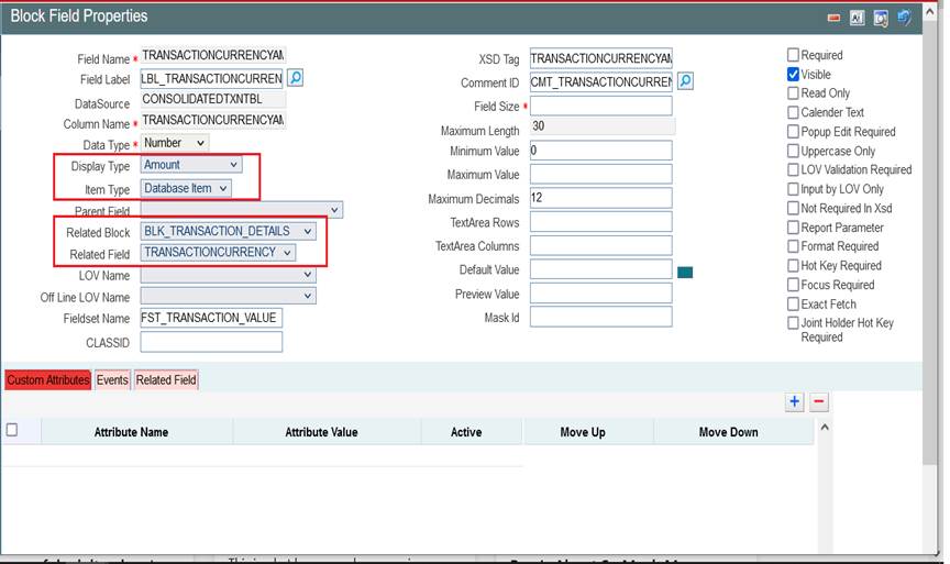
- Amount: The display type can be defined as Amount if it displays an amount. The field will be formatted based on the currency which it picks from related block and Related Field. Related block and Related Field values have to be mandatorily provided for Amount fields. Related Field should come above the amount field in the screen and it should hold the currency value for the amount.
Figure 5-9 Defining an Amount Data Block Field
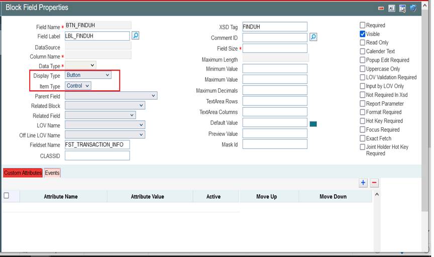
- Button: If the display type for the field is a button, display type has to be selected as button. Action to be performed on clicking the button should be provided in the events tab Button can launch a sub screen, launch form, call form or invoke a user defined JavaScript function.
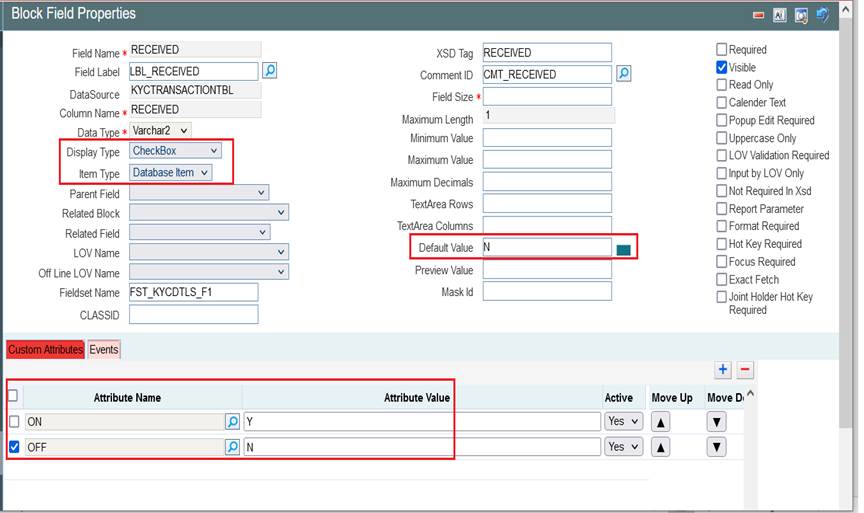
- Checkbox: Checkbox is used for displaying checkboxes. Attribute Name will be ON and OFF. Attribute values can be provided as per design In the figure shown below: ON (checked) corresponds to Y in table and OFF to N Default value is selected as N.
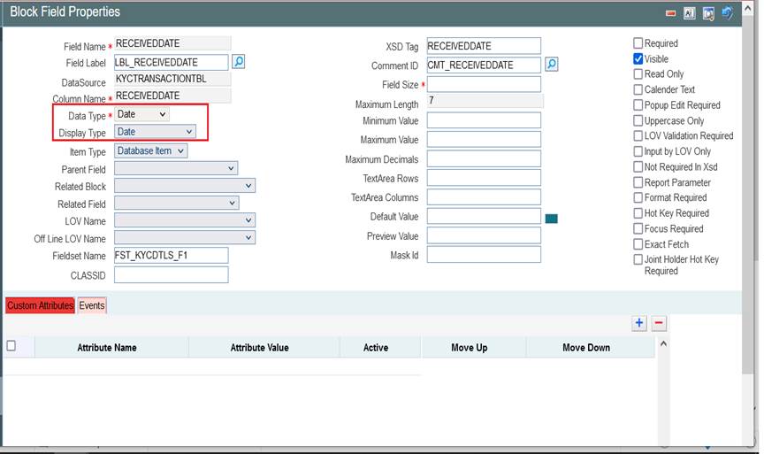
- Date: If the field is of date type display type can be selected as Date.
- Date Time:If the field displays both date and time, it can be selected as Date Time.
- File: If browser option is required for the field, then field has to be selected as file type. Example: If an excel sheet from the local machine needs to be selected, browser button has to be provided, so that user can browse the folders and select the file required.
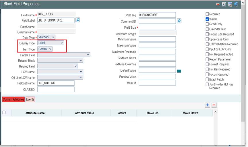
- Label: If the field is required only for displaying image or Label, it can be selected as Label. Normally UI fields are used for label display purpose.
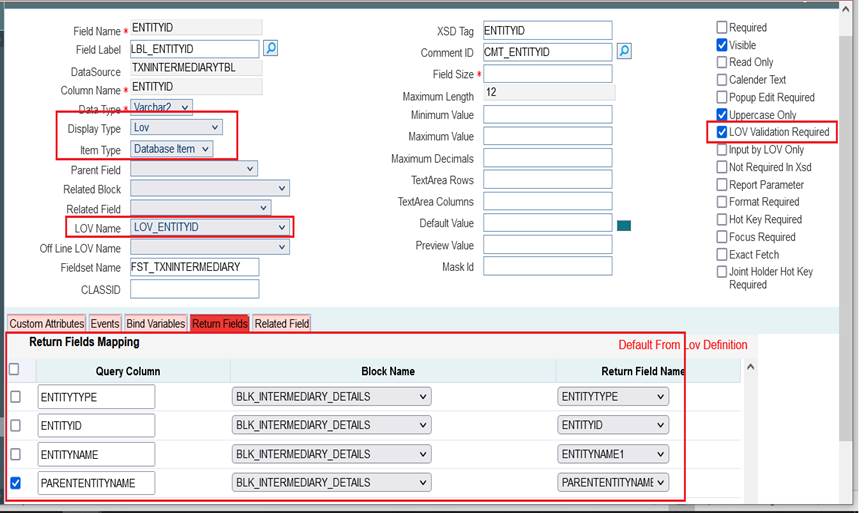
- LOV: If field value has to be selected through a LOV, display type has to be selected as LOV. LOV’s have to be defined as explained in respective section. LOV which has to be linked to the field has to be selected from the LOV Name select list. Return Fields and Bind Variables has to be mapped as shown in the figure below If input to field has to be done only through LOV, Input By LOV Only fields can be checked. If validation for the value entered by the user is required in server, (validating whether the value selected is part of the values fetched by LOV); LOV validation Reqd can be checked. For branch screens, Offline LOV Name can also be attached.
- Mask: If the field has to be masked on tab out, then the display type can be selected as Mask Mask ID has to be selected which identifies the pattern of the mask applied.
- Password: If the display type has to be in Password form, display type can be selected as Password.
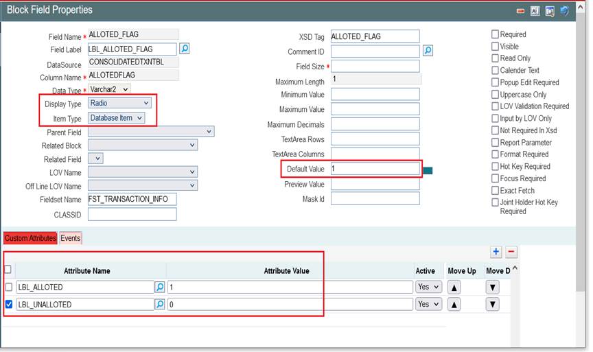
- Radio If the display type has to be radio button, it can be selected as Radio. All the options for the Radio button have to be provided in the Custom Attributes. Label which should be displayed in the screen should be provided in attribute name and its corresponding storage value to attribute value. Default Value can also be provided.
Figure 5-15 Defining Field as Radio button
- Read Only Select: This is similar to Select Field; but the field will be non-editable to the user. Select options will be defaulted based on the developer’s code.
- Restricted Text: This is similar to normal Text field but special characters (non-alpha numeric) won’t be allowed to be input in a restricted Text field.
- Text: For a normal text field, display type can be selected as Text .This is the default display type.
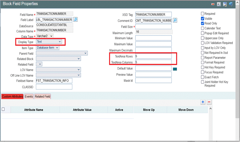
- Text Area: If data to be entered for the field is large (>100 characters); It can be defined as Text Area type. Number of rows and columns required for the text area can be specified in Text Area Rows and Text Area Cols.
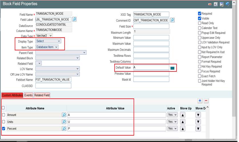
- Select: If a select list is required for field, display type can be selected as Select. All the options for the Select List have to be provided in the Custom Attributes. Label which should be displayed in the screen should be provided in attribute name and its corresponding storage value to attribute value.
Parent topic: Data Block Fields
