12 Summary
This topic describes the summary.
Summary screen can be designed using ODT if applicable.
Table 12-1 Designing Summary Screen
| Field Name | Description |
|---|---|
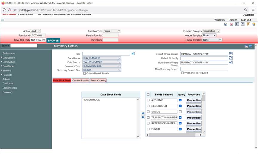
| Title | Summary screen title can be maintained here using a label code, and label code can be selected from the list of values attached to the field. |
| Data Block | A block has to be selected as Summary Block. This block can be either one of the Single record blocks of the function or a block of type Summary. In most cases Master Block itself can be used for Summary also and if the requirement is to show some other information a new summary type block can be created and can be used. |
| Data Source | Captures the data source name of the summary, on which query should happen for summary. This will also be the data source attached to the summary data block. |
| Summary Type | Summary Type can be of:
|
| Summary Screen Size | Captures the size of the summary screen. |
| Default Where Clause | This field captures the default where clause for summary query. |
| Default Order By | This field captures the default order by clause for summary query. |
| Multi Branch Where Clause | This screen is applicable only if multi branch access is checked for the screen in Preferences node. This field captures the summary where clause for multi branch screens. |
| Main Summary Screen | Specifies the main form to be launched on clicking on a record from Summary Result. This is applicable only for Dashboard screens. |
| Summary Web Services Required | Specifies whether a web service for summary screen is required. SUMMARYQUERY action in Actions screen has to be selected as well for enabling web services for summary screen |
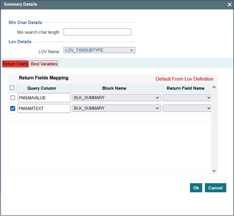
| Data Block Fields | All the block fields present in the summary data block will appear in the text area to the left. Developer can select the block fields required in the summary screen and move it to the right.
|
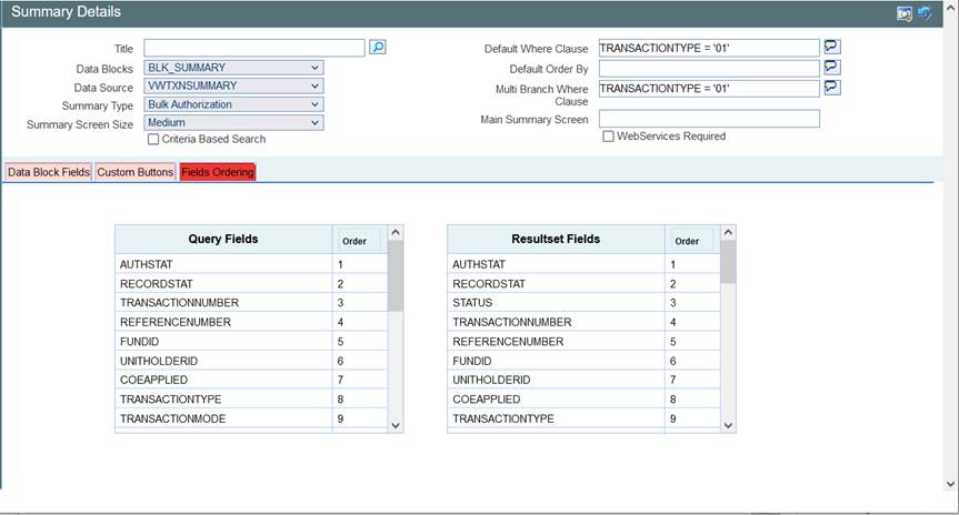
| Fields Ordering | Order of the fields in the summary screen can be rearranged. Here all the query fields will be shown to the developer in one table while all the fields in result set will be shown in another table. Order of fields in both tables can be changed by the developer as per requirement. |
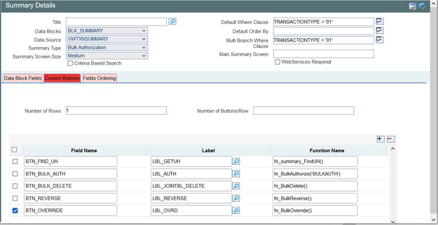
| Custom Buttons | Buttons can be added to summary screen using “Custom Buttons” Tab of the summary screen of Oracle FLEXCUBE Enterprise Limits and Collateral Management Development Workbench, same is shown below:
|
Figure 12-4 Adding Custom buttons to a Screen
This topic has the following sub-topic:
- Guidelines and Best Practices
This topic describes about the guidelines and best practices.


