Understanding the Graph Display
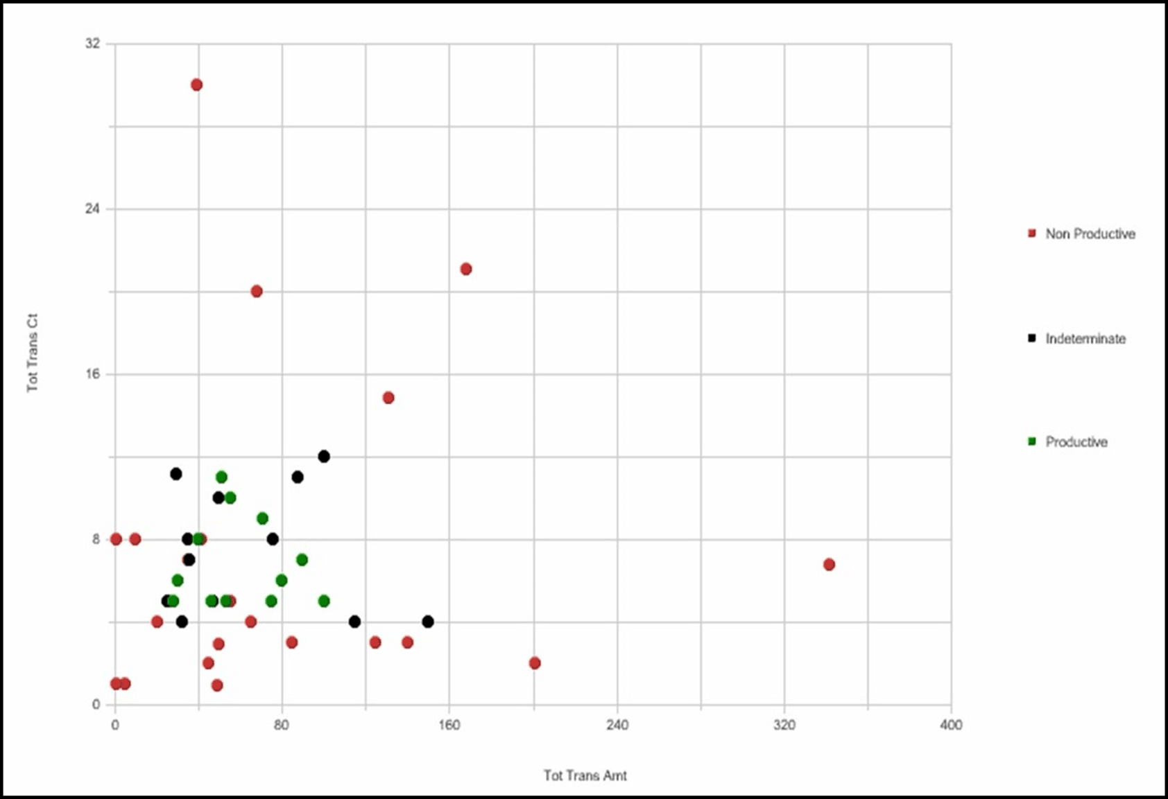
The scatter graph uses dots of differing colors to represent the quality rating of individual matches.
Each dot on the graph represents a match. By definition a match is the collection of records that satisfy the logic and criteria of a scenario pattern. An alert is generated during post-processing and is defined as one or more matches packaged and presented on the Oracle Financial Services application user interface for analysis and action. If multiple matches are found that are closely related for the same focus (that is, instances of the similar behaviors by the same entity), the matches can be combined to create a single alert, called a multi-match alert. So a single alert may be represented by multiple dots (matches) on the graph if that alert was a multi-match alert.
The scatter graph uses dots of differing colors to represent the quality rating of individual matches. By default, Scenario Tuning uses three categories of quality rating. By default, match quality rating is classified based upon the closing classification associated with a closing action on the alert, where possible classifications include Productive, Non Productive, and Indeterminate. For a multi-match alert, the closing classification for that alert is applied to each match that is part of that alert. Each match is plotted positionally on the graph based upon the match's actual binding value that is associated with the binding variables represented by the X and Y axis.
For example, if the X axis is the variable Tot Trans Amt and the Y axis is the variable Tot Trans Ct, the match is displayed on the graph relative to the TotTrans Amt and the TotTrans Ct actually involved in, and bound by, the match. The following figure shows an example of a scatter graph.
How to Interpret Results
There are three types of alerts:
- Productive: green dots on the graph show the alerts that are Productive
- Non-Productive: red dots on the graph show the alerts that are Non-Productive
- Indeterminate: black dots on the graph show the alerts that have been closed with a reason considered to be Indeterminate (action does not indicate definitively whether the alert was of quality or a false positive)
The location and concentration of the Productive, Indeterminate, and Non-Productive alerts on the scatter graph can represent at what value ranges or boundaries the thresholds associated with the X and Y axis variables are most effective. Refreshing the graph using various combinations of axis variables can provide a comprehensive view of what settings are likely to produce the most effective and quality alerts.
For example, using the graph results shown in the Scatter Graph, you can review the results and draw the following conclusions:
- Productive alerts for this scenario have a total transaction count between 5 and 11
- Productive alerts for this scenario have a total transaction amount between approximately $20K and $100K
- You can eliminate false positives without losing any Productive or Indeterminate alerts by raising the Min Total Trans Amt threshold for this scenario to $15K
- You can eliminate false positives without losing any Productive or Indeterminate alerts by raising the Min Total Trans Ct threshold for this scenario to 4
- You can use scoring to reflect that the alerts with an amount > $100K are less likely to be Productive
- You can use scoring to reflect that alerts with a count > 12 are less likely to be productive
Understanding Report Statistics
The Report Statistics section shows two sets of matrices and graphs. The first set of statistics displays the percentage of alerts returned by your search as they breakdown across the quality rating categories. The second set of statistics displays the minimum, maximum, median, and average values across certain binding variables associated with the scenario and the alerts returned as a result of your search.
Summary Counts
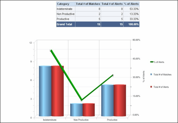
The summary counts display results in a tabular and line-bar combo graph. The tabular report shows the total number of matches, total number of alerts, and the percentage of the total number of alerts that is represented in each quality category. The Grand Total is calculated as the sum of matches across all categories and the sum of alerts across all quality categories. The sums returned are irrespective of the axis variables used and represent primarily a count of alerts/matches by quality category. The percentage of alerts represented in each category is calculated by the formula:
(Total count of alerts for individual category / Grand Total of alerts) ×
                    100
In the line-bar combo graph shown below, the clustered bar graph shows the total number of matches in blue and total number of alerts in red over the three default quality categories - productive, non-productive, and indeterminate. The green colored line shows the percentage of alerts distributed over each category.
These statistics should provide you a high level understanding of how your alerts have been ranking, in terms of quality.
Understanding the Minimum, Maximum, Average and Median Statistics
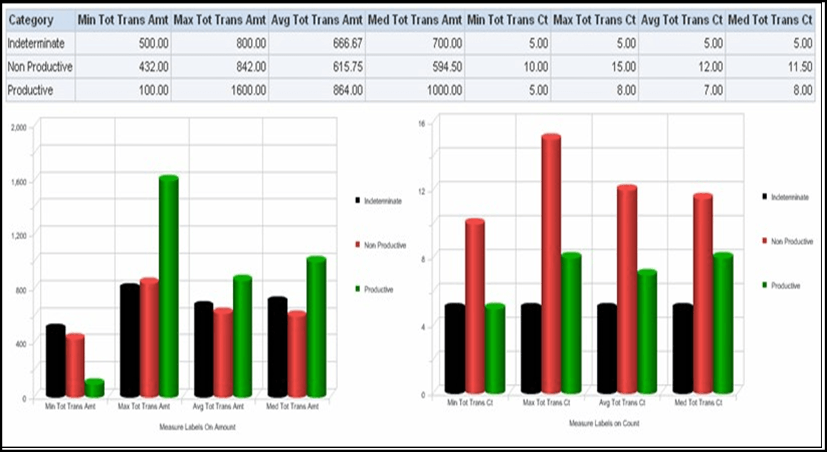
This statistical graph shows minimum, maximum, average, and median value of certain binding variables for each category of alerts. The binding variables represented in the report statistics are pre-defined based upon the current scenario being analyzed and are not driven by the X and Y axis variables selected for the scatter graph. These variables may differ from scenario to scenario and are meant to represent those variables likely to be most influential in the generation of an alert. Understanding the minimum and maximum values represented in the results, as well as the average and median values being returned for bindings representing some of the more impactful thresholds, provides a better view of the alerts represented in the search results and gives greater context to your analysis.
In the report, Minimum columns show the minimum value of the relevant binding variable returned for all alerts in the current search, by quality category. Maximum columns show the highest value of the relevant binding variable returned for all alerts in the current search, by quality category. Average columns show the average amount of the relevant binding variable returned for all alerts in the current search, by quality category. Median columns show the middle value of the relevant binding variable returned for all alerts in the current search, by quality category.
Figure 7-8 Minimum, Maximum, Average, and Median Statistics
Note:
All scenarios may not report on two distinct sets of bindings. As available binding variables may vary based on the selected scenario, this statistical graph also varies scenario to scenario and is based on pre-defined columns for each scenario. The results refresh only with application of new static filters. It is independent of additional filter as well as graph axis filter. For those scenarios the report may only display one graph.

