A.3 Using Data Visualizations

This topic describes data visualizations that are available in the Notebook Server.

Graph Visualization

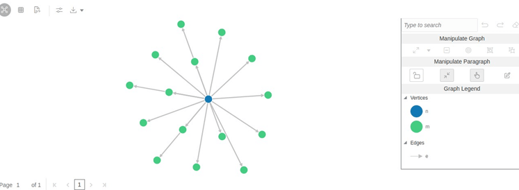
The Notebook Server allows visualizing data in the form of a Graph Visualization. All actions of the graph visualization are collected inside a panel. The panel can be re-sized and includes two states, default and minimized panel. These panels enable you to manipulate paragraphs and graphs and provide options to customize your graph.

Table

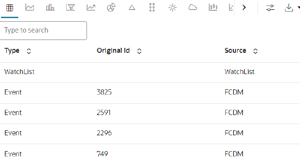
The Notebook Server allows you to visualize your data in the form of a Table Diagram. The table can be sorted by column in ascending or descending order. Additionally, the table can be filtered for a specific search term. Rows that do not contain this term are hidden from view, and the remaining rows highlight the location of the search term within the row.

HTML or Markdown

The Notebook Server allows you to visualize your data in the form of HTML or Markdown text.

Text

The Notebook Server allows you to visualize your data in structured and presented text for you to customize the data.

Area Chart

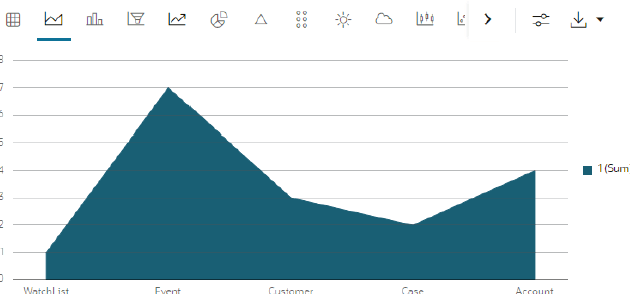
The Notebook Server allows you to visualize your data in the form of an Area Chart.

Bar Chart

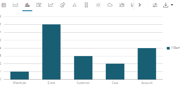
The Notebook Server allows you to visualize your data in the form of a Bar Chart.

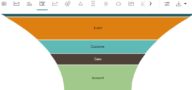
Funnel Chart

The Notebook Server allows you to visualize your data in the form of a Funnel Chart.

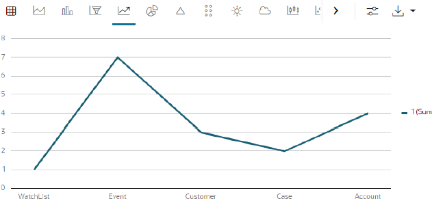
Line Chart

The Notebook Server allows you to visualize your data in the form of a Line Chart.

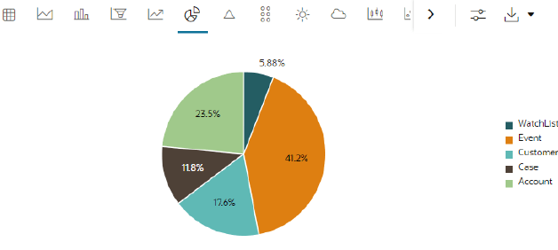
Pie Chart

The Notebook Server allows you to visualize your data in the form of a Pie Chart.

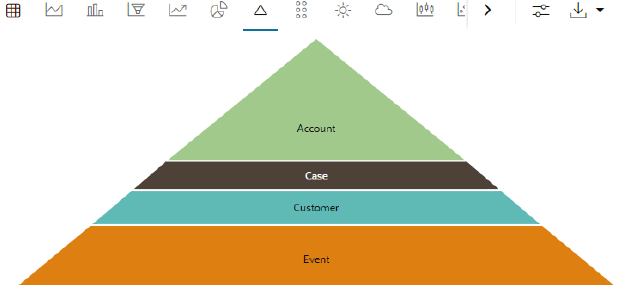
Pyramid Chart

The Notebook Server allows you to visualize your data in the form of a Pyramid Chart.

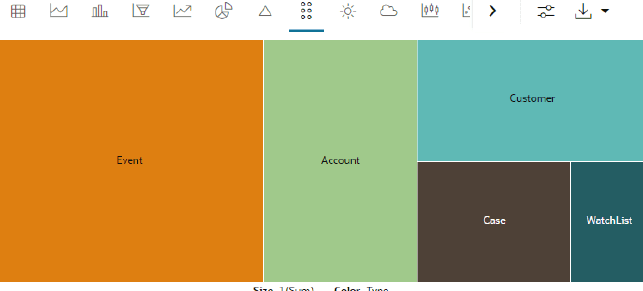
TreeMap Diagram

The Notebook Server allows you to visualize your data in the form of a Tree Map Diagram.

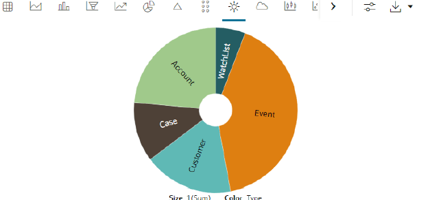
Sunburst Diagram

The Notebook Server allows you to visualize your data in the form of a Sunburst Diagram.

Tag Cloud

The Notebook Server allows you to visualize your data in the form of tags. The tag cloud operation is used to identify the spots where there are more flags.

Box Plot

The Notebook Server allows you to visualize your data in the form of a Box Plot.

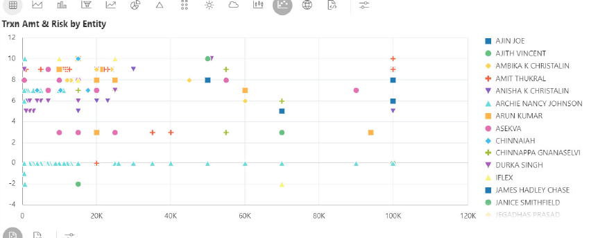
Scatter Plot

The Notebook Server allows you to visualize your data in the form of a Scatter Plot.

Map Visualizer

The Notebook Server allows you to visualize your data on top of a Map.

Setting up the Visualizations

The visualization settings offer several ways of configuration, which are split into three tabs: General, Visualization, and Text. To set the configuration for your table view, click Settings.

These tabs in the Settings window allow you to customize the properties of the text, graphs, and visuals and view the visuals in various orientations. For example, you can view the Bar Chart to change the colors, bar type, and 360-degree view of the visuals. The Settings window is displayed and contains the following category:
  • General
  • Visualization
  • Text

Download As

The displayed visuals can be downloaded using the Download As option. The available download formats are RAW, SVG, and PNG.
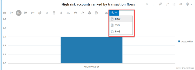
Description of download-option.png follows
Description of the illustration download-option.png