Use the Discrepancy Dashboard
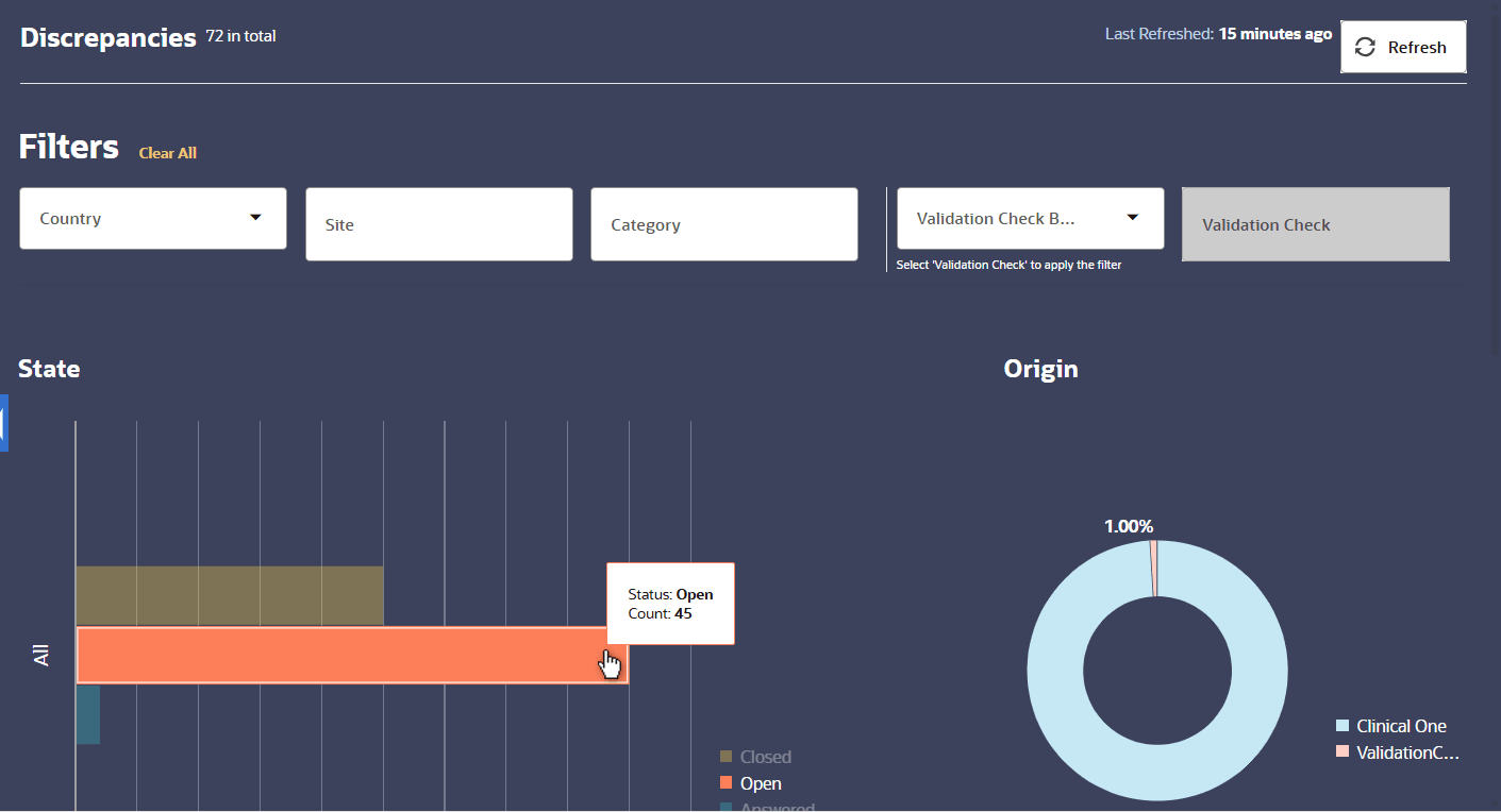
The discrepancy dashboard is an interactive, graphic overview of the study's discrepancies, beneficial to data managers who need a quick, at-a-glance summary of a study's progress. Selecting a study from the left navigational panel displays the study's discrepancy dashboard in the center section of the page.
Note:
For details on selecting a study, see Select a study from the Home page.The dashboard initially displays discrepancies across all countries and sites in a selected study. The total number of discrepancies within the study is shown in the right corner of the section, under Refresh. The discrepancies in the study are displayed as four different graphs: State, Origin, Site, and Age.
- Country: This drop down list displays all countries associated with the study.
- Site: Selecting this field displays a drop down list with all sites associated with the study.
- Category: Displays all categories your
organization has created for discrepancies.
Note:
Administrators can refer to Create categories for flags, discrepancies, and validation checks in the Oracle DMW Administration Guide for more information about categories and discrepancies. - Validation Check Batch: To filter the discrepancies on the dashboard by validation check, you need to select a validation check batch from this drop down list. The dashboard will not refresh until you proceed to select a validation check in the associated Validation Check filter field.
- Validation Check: This field is disabled until you select a Validation Check Batch. The Validation Checks listed here are filtered based on your previous Validation Check Batch selection.
Figure 1-1 Discrepancy Dashboard Initial View

Description of "Figure 1-1 Discrepancy Dashboard Initial View"
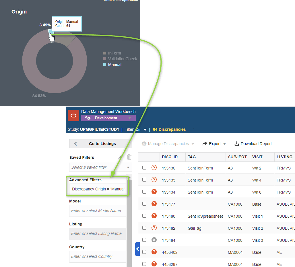
Figure 1-2 Dashboard to Discrepancies Interface with One Click

Description of "Figure 1-2 Dashboard to Discrepancies Interface with One Click"
The time stamp in the upper right corner of the section shows when
the data was last refreshed. If multiple users are actively working on a
study or if your session has been idle, you may want to manually refresh the
page by clicking ![]() .
.
Note:
Clicking Refresh triggers a job to update the data in the background. There may be a delay in displaying the refreshed data on the dashboard while the job processes.For additional details about each graph, please see the topics below:
- Discrepancies by State
This bar graph on the dashboard shows the discrepancies within the selected study and splits them up into the five available statuses: Answered, Candidate, Closed, Open, Cancelled. The number of discrepancies in this graph may be refined by Country or Site if any of those filters have been applied to the dashboard. - Discrepancies by Origin graph
The Origin donut graph is divided into sections that represent where the discrepancies were created. Discrepancy origins can include those created by queries in InForm or another external source, by a Validation Check, and/or by Manual production in Oracle DMW. - Discrepancies by Site graph
Each plot in the scatter chart on the dashboard is a different site within the study. The y-axis always represents the number of open discrepancies but the x-axis can display any of the different states, depending on which status you choose from the drop down menu below the chart. - Discrepancies by Age graph
In the Age graph, each bar represents a site and the colors within the bar represent the age range of the discrepancies.
Parent topic: Basics