9 Milestone Prediction Dashboard
Workbook synopsis
- Milestone Predictions
- Prediction Analysis
Dashboards and sheets
Milestone Predictions
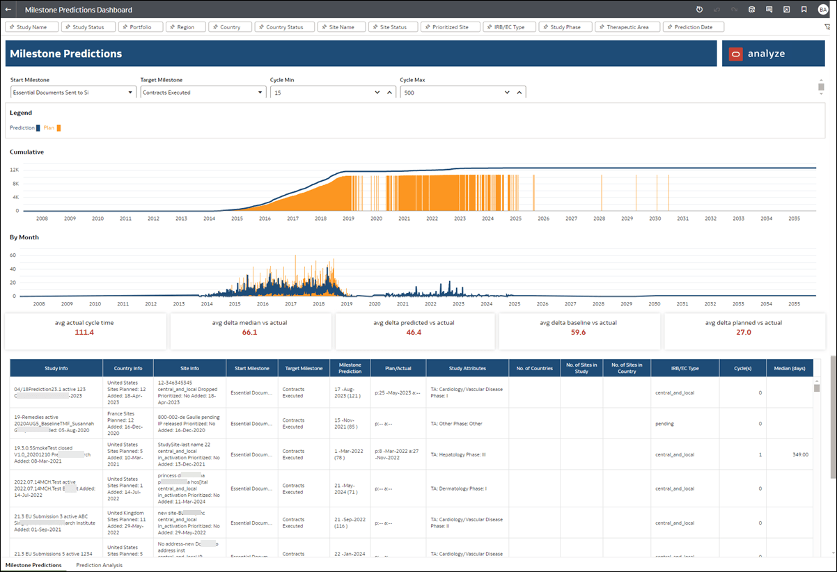
As with all Oracle Site Analyze reports, a wide variety of filters displayed above the worksheet allow you to subset data to your preferred view. Please note that when you select any filter, the filter's value can change the cycle count and median days displayed in the worksheet.
At the upper left of the Milestone Predictions dashboard, you can choose a Start Milestone (Essential Documents Sent to Site or Initial Protocol Received/Sent) for a cycle time and evaluate different prediction cycles against actual milestone completed dates in the report’s trend graphs and table.
Then, choose a Target Milestone (IP Release Ready or Contracts Executed) and view the prediction data in the dashboard's trend graphs and table. You can also specify minimum and maximum cycles using the controls at the top of the dashboard.
The trend graphs at the top of the dashboard helps you visualize dates. A blue line represents milestone predicted dates, while an orange bar represents milestone planned dates.
- Average actual cycle time: Shows how long this cycle typically takes on average.
- Average delta – median vs. actual: Shows the variance between actual cycle time and median cycle time. This represents the error between median and actual cycle time.
- Average delta – predicted vs. actual: Shows the variance between actual cycle time and predicted cycle time. This represents the error between predicted and actual cycle time.
- Average delta – baseline vs. actual: Shows the variance between actual cycle time and baseline cycle time. This represents the error between baseline and actual cycle time.
- Average delta – planned vs. actual: Shows the variance between actual cycle time and planned cycle time. This represents the error between planned and actual cycle time.
- Study Information
- Country Information
- Site Information
- Start Milestone
- Target Milestone
- Milestone Prediction
- Planned/Actual Dates
- Study Attributes
- Number of Countries
- Number of Sites in Study
- Number of Sites in Country
- IRB/EC Type
- Cycle(s)
- Median (days)

Prediction Analysis
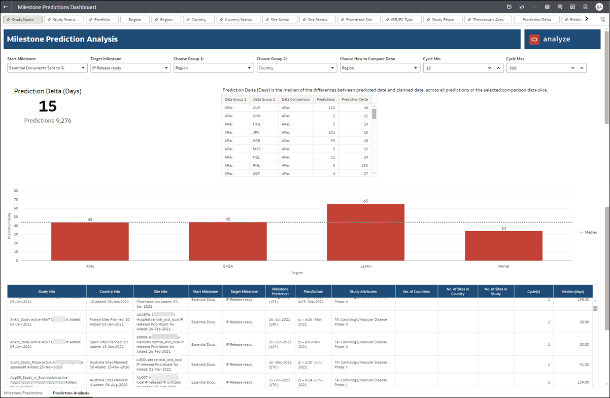
The Prediction Analysis sheet helps you understand the machine learning model's historical performance and allows you to evaluate the areas where predictions are most and least accurate. The worksheet provides tabular and bar chart visualizations; you have multiple options at the top of the worksheet to manipulate the dimensions and aggregations.
First, use the "Start milestone" filter to select either "Initial Protocol Received/Sent" or "Essential Documents Sent to Site" as the milestone you want to visualize. Then, use the Target Milestone filter to select either "IP Release ready" or "Contracts Executed" as applicable. Use the remaining filters and controls at the top of the worksheet to specify grouping, comparison, and Min/Max Cycle values as preferred.
- Study Information
- Country Information
- Site Information
- Start Milestone
- Target Milestone
- Milestone Prediction
- Plan/Actual (dates)
- Study Attributes
- Number of Countries
- Number of Sites in Country
- Number of Sites in Study
- Cycle(s)
- Median (days)
