Review Output
The user can view the optimization results by clicking Complete against the scenario. A new window opens, displaying the results.
The Results window displays the name of the scenario with a summary containing scenario details and a table with the output. The results provide the three best options for Highest Growth, Lowest Risk, and Optimal Result in tile format.
-
Select the tile to view the details of the output. By default, the results are displayed in table format.
-
You can view the results in graphical format by clicking the ‘chart’ icon on the screen.
Figure 13-8 Results View - Table
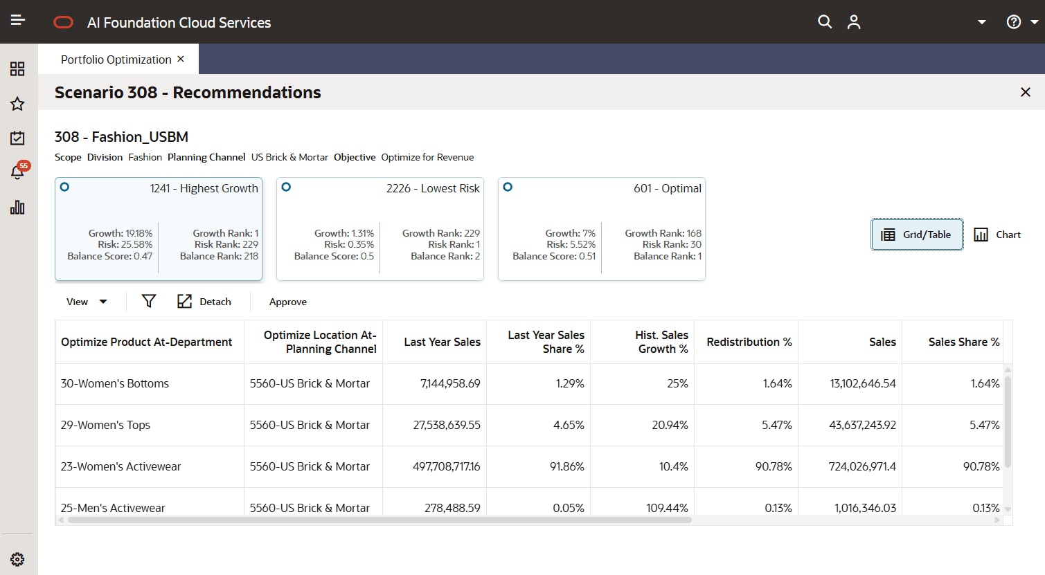
| Output | Description |
|---|---|
| Sim ID | Simulation ID that is system-generated for each output. |
| Product Scope | Displays the product scope selected for the scenario creation. |
| Optimize Product At | Displays the product positions optimized. |
| Location Scope | Displays the location scope selected for the scenario creation. |
| Last Year Sales | Displays the sales amount for the last year for the product and location. The sales amount can be net or gross, depending on the sales measure selected for the Portfolio Optimization Type. |
| Last Year Sales Share % | Displays the percentage of last year sales share across the scope. |
| Historical Sales Growth % | Displays the percentage difference (that is, growth) between the simulated sales and last year sales for each product and location. |
| Redistribution % | Displays the redistribution of sales contribution at the optimized level returned by the optimization algorithm. |
| Sales | Displays the simulated sales amount based on the redistribution and historical sales growth and LY sales distribution. |
| Sales Share % | Displays the percentage of simulated sales share across the scope. |
| Sales Growth % | Displays the sales growth percentage against the last year sales. |
| Sharpe Sales % | Displays the normalized sales growth based on the ratio between the sales growth percent and the sales growth standard deviation. |
| Change in Sales % | Display the difference between last year sales share percent and the simulated sales share percent. |
| Portfolio Growth % | Displays the percent growth across the portfolio based on the historical sales and simulated sales. |
| Portfolio Risk % | Displays the percent risk across portfolios based on the simulated sales |
| Balance Score | Displays the balanced score of Portfolio Growth and Risk. |
| Risk Rank | Displays the lowest risk rank across the output. |
| Growth Rank | Displays the highest growth rank across the output. |
| Balance Rank | Displays the lowest balance rank across the output |
Graphical View of Results
The following five charts display results that can be used to analyze the output recommendations for the selected product/location scope:
-
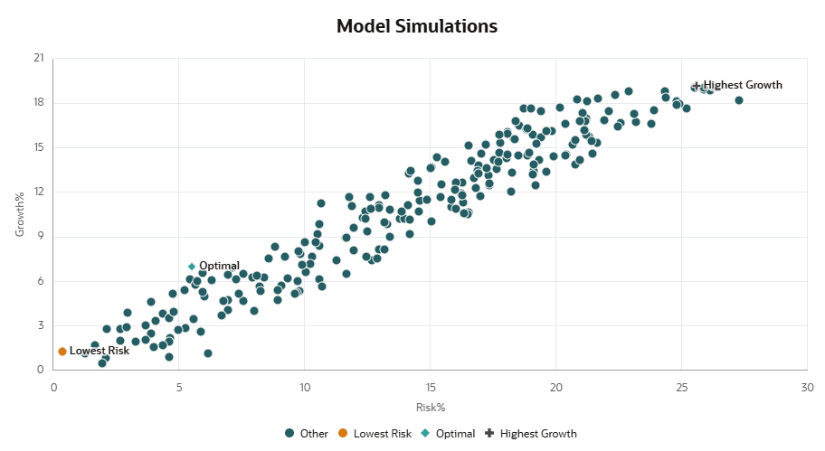
Chart 1: Model Simulation - It visualizes the Growth% vs Risk% for the scenario to identify highest growth, lowest risk, and optimal.
Figure 13-9 Model Simulation Chart
-
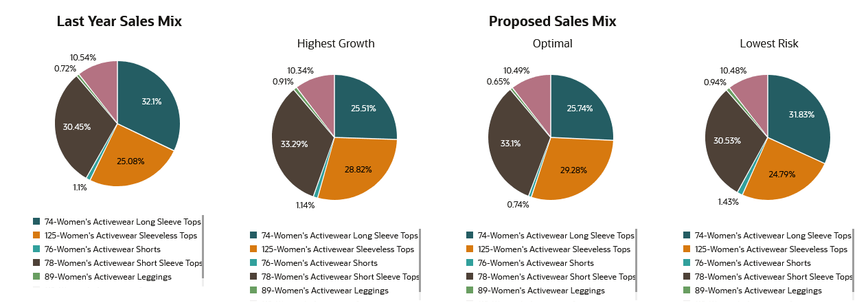
Chart 2: LY sales share% vs Proposed Sales share % - It visualizes the product wise sales share % for all three outputs (Highest Growth, Lowest Risk, Balance Rank) against last year to compare and analyze the important product areas from revenue perspective.
Figure 13-10 LY vs Proposed Sales Share% Chart
-
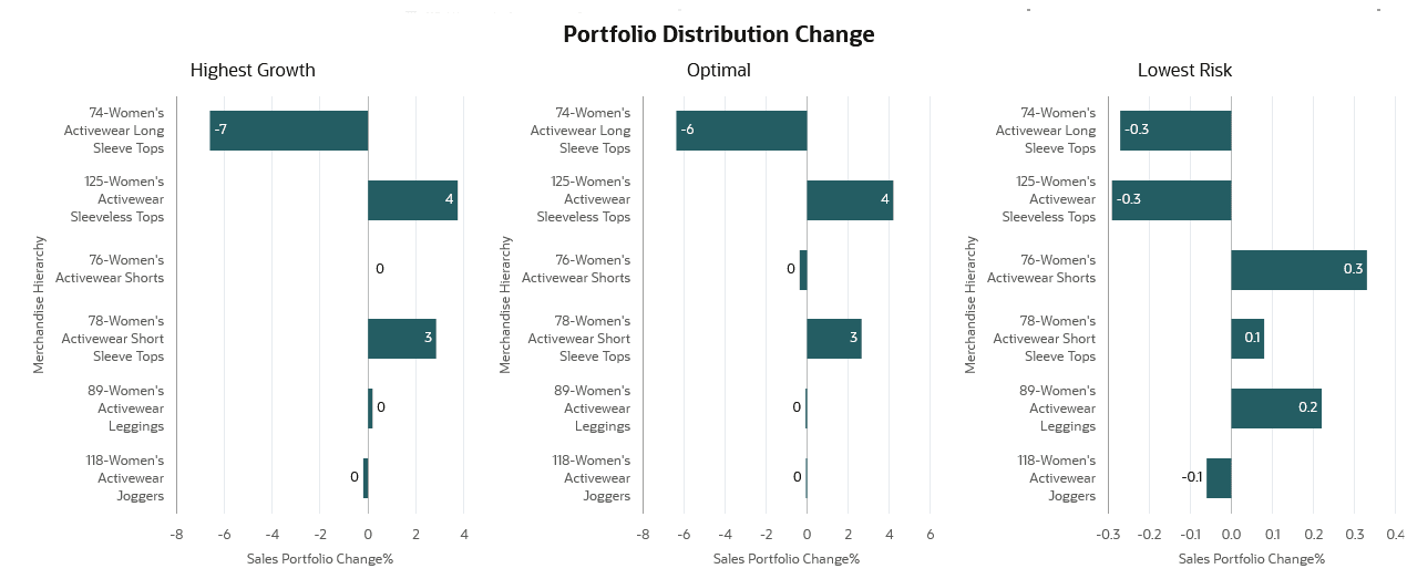
Chart 3: Portfolio Distribution Change % - It visualizes product wise portfolio distribute change for the three outputs. The portfolio distribution change is the difference between sales share % and last year sales share %.
Figure 13-11 Portfolio Distribution Change % Chart
-
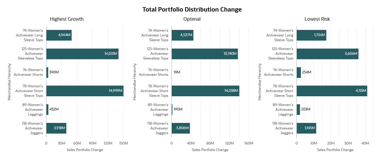
Chart 4: Total Portfolio Distribution Change - It presents total portfolio distribution across products for the three outputs. Total portfolio distribution change is the difference between sales and last year sales values.
Figure 13-12 Portfolio Distribution Change Chart
-
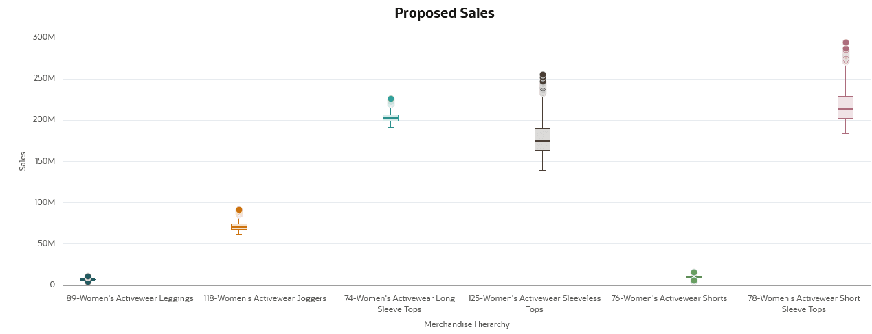
Chart 5: Proposed Sales Share - It represents the proposed sales share for the scenarios using a box plot.
Figure 13-13 Proposed Sales Share by Merchandise
