3 Reporting
Reporting tools are system that takes in raw data from various sources and convert it into knowledge. These tools provide reporting, decision making and business capabilities. These tools allow you to infer data in form of tables, charts, visual presentations. These tools help users to create, visualize various reports and then analyze data at any scale for any time period. There are various reporting tools which can help you analyze data across planning process at different levels such as Retail Home, Dashboard, Data Visualization Cloud Services and charts in application. Retail Home is all about having a comprehensive view of the health of your business across multiple applications. Dashboard provides you the reports in planning application which are important for you. Data Visualization helps you to combine various data and drill down to analyze various patterns. Charts views is all about the performance data which is available during planning process in the application.
Retail Home
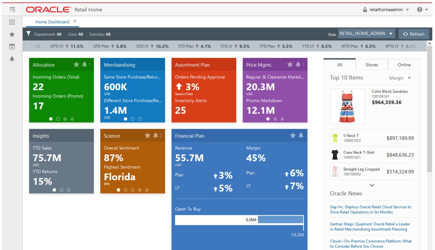
Retail Home is a portal-type application for the RGBU enterprise. The user interface consists of a tile-based configurable dashboard that highlights important metrics and Key Performance Indicators (KPIs) across RGBU applications. It’s one entry point to get in the system and a link to all the applications. You can surface any KPIs you want and look at KPI’s that are on priority such as reviewing OTB. For example: As a planner, I start my day by logging in Retail Home. I can quickly take a look at the sales trends using RH tiles that give me a quick glance of the real time analysis. I can see the month to date sales metric against my plan and then act quickly to take action to meet my targets. I can directly log into the Assortment Planning application from the Retail Home dashboard and make required changes. As a financial planner, I start my day by logging in Retail Home. MFPCS tiles in the RH dashboard give me a quick snapshot of the BOP inventory against the receipt. Based on the KPI trend, I can act quickly and make changes to plan. For more details on Retail Home, refer to the Oracle Retail Home User Guide. For more details on Retail Home configuration, refer to the Oracle Retail Predictive Application Server Cloud Edition Administration Guide.
Figure 3-1 Retail Home Dashboard

RPASCE Dashboard
RPASCE Dashboard is the central page providing a great snapshot of business as well as notifying alerts. It can be used for data analysis and examine the data for various profiles. The dashboard can be used to open your most recently used workspaces with a single click.
For example: I am a buyer and it is Monday morning. My manager wants me to give a review of the past week's performance in two hours. I can use the dashboard as my starting point of where I want to start. I see a visual graph to help me quickly see how my business performed. I navigate to the dashboard tiles to see different KPIs that will give me a quick snapshot of sales units, sales retail, margin, sell-through. From there, I can move to trend analysis (in-season item planning Assortment Planning) and work on my Monday morning reporting and ensure that there is enough inventory for my strong sellers and create exit strategy such as promotions and markdowns for slow movers. As a buyer, I’m working on my in-season plans. My sales team is upset that we do not have enough inventory in the stores. Our customers have suddenly started buying more casual clothing since the pandemic. I need to quickly identify the styles that are running out of stock and work with supply chain to replenish them. I log into the Assortment Planning dashboard and view alerts. The alert navigation quickly takes me to all of the sell through warnings and identify all my styles that need to be replenished immediately.
For more details on the Dashboard, refer to the Oracle Retail Predictive Application Server Cloud Edition User Guide, Chapter 3 – Dashboard.
Figure 3-2 RPASCE Dashboard
Data Visualization Cloud Services
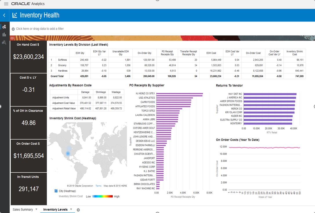
Oracle Data Visualization Cloud Service is a web-based tool that enables you to visually explore analytical data to get instant clarity. It is an easy-to-use tool that provides a self-service option to create reports and dashboards. It allows the planner to review the information in graphical form. With DV, you can drag and drop data to see your data visualized automatically. Benefits of Data Visualization Cloud Service:
-
Rich insights using data that spans multiple applications including planning, Retail Insights, and Retail Science (access depends on what is included with your subscription).
-
Inclusion of high value data in analysis such as customer segments.
-
Rapid extension of analysis and strategic decision making without requiring extension of the planning solution.
-
Executive and cross-functional role visibility to planning data.
For example: I am planner and I need to provide an overall sale, revenue and inventory report across products and location for a review with management team. I can log in to DV and combine sales, revenue and inventory data across product location and then generate reports to analyze the business.
I am a VP for buying. We are launching our new clothing range and I need to work with my marketing teams in creating an effective marketing campaign. Marketing wants to know where my target customers live so that they can identify areas where to put billboards. I log in to DV to see where my customer (age/gender) lives in each city and by zip code. I can easily see it visually on a map and I tell the marketing team where exactly we want to advertise more to create awareness and spend our marketing budget.
I am buyer for women’s category, and I am going to start working on my assortment plan for next season. Before I start creating the plan, I want to look at the previous two seasons product performance and understand the trend of sales across locations. I can log in to DV and pull the sales data for generating reports. I can easily create visual charts which gives me clarity on the sales of product across location and product sold with discounts. This will help me plan the right product mix for right location.
I am planner and as I start to work on my plans, I need to check the sales trend with other categories across organization. I can log in to DV and take a quick look at the bottoms sales and analyze the trend to plan for shirts assortments and make right combinations.
You can view example reports of Sales/Margin and Inventory to get the initial view on the DV report. Import these two reports in the DV tool for reference:
-
MFP Sales Test
report.dva -
MFP inventory
report.dva
Access these two DV reports from the Oracle Retail Predictive Application Server (RPAS) Cloud for Planning and Optimization / Supply Chain Cloud Services Documentation Library (Doc ID 2492295.1) located on My Oracle Support. For more details on creating reports or importing reports, refer to Visualize Data within Oracle Analytics Cloud.
For more details on the Data Visualization Set Up, refer to the Oracle Retail Predictive Application Server Cloud Edition Administrator Guide. For more details on the Data Visualization Configuration Set up, refer to the Oracle Retail Predictive Application Server Cloud Edition Configuration Tool Guide.
You can also link Data Visualization Reports to the Planning application. This enables you to launch DV reports directly from the Planning application into a separate browser tab. For more details on linking DV reports with the Planning application, refer to the Oracle Retail Predictive Application Server Cloud Edition Administration Guide.
Figure 3-3 Data Visualization

Charts
RPASCE Charts use the charting feature to generate a visual representation of the data in the form of charts. You can: .
-
Quickly pull the data and do an immediate analysis
-
Create charts in multiple views option to analyze data side by side
-
Edit the data in charts form for quick decision making
For Example: I’m a buyer and I have not even started planning yet. I want to quickly see the LY performance to gain insight about which product category has an opportunity to grow. I quickly log into Assortment Planning and go to Review history. There is too much data and it is hard for me to quickly identify the opportunities. I create a visual chart and view it side by side with my LY review report. I quickly find out that knit tops are a big opportunity for my business. I decide that I will need to talk to my design team in advance to create more designs for knits for the next line architecture meeting.
I am a planner, and I am working on my financial plan for next season. I need to take a quick a look at variance of sales against last year / forecast and make changes to my data to meet the target. I can view my data in chart and make quick edits right from the charts.
For more details on Dashboard, refer to Oracle Retail Predictive Application Server Cloud Edition User Guide, Chapter 9 – Charts.
Figure 3-4 RPASCE Charts