Form Contents
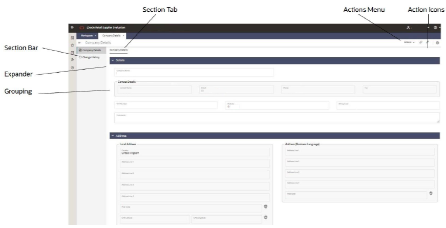
The form structure is based on grouping a record’s fields within sections and pages in a way that the user can access the data in a logical manner appropriate to the typical usage of the type of record. Consistency across forms means a familiar and predictable user experience.
When a record is presented for maintenance or workflow progression, the available actions follow a standard pattern, with the options being dynamic to the state of the record (and form), and the user’s access rights.

Sections
The contents of a form are presented in one or more sections, which are listed in the left-hand Section Bar. Each section has an icon, which is consistent across forms where they have a similar purpose. The section bar can be collapsed to just show the icons.Section Tabs
Within a section, the contents may be split over multiple pages, each with an identifying section tab.Expanders/Blocks
Like field sets in the Classic UI, sets of related fields may be grouped together, either within a static block (with or without a title), or within an expander, which can be collapsed to just show its title.Fields
The individual fields correspond to the data types used in the Classic UI, with some enhanced with new Display Types. A new design style is used. Related fields may be placed within in a Grouping (with or without a title).
The Display Types include the typical field types such as Text, Number, and Selector, extended to cover specific usages, for example Email address, Comments, and GPS coordinates. This allows the presentation, behavior, and validation specific to a type of field to be applied consistently across all forms.