Fields
Read Mode
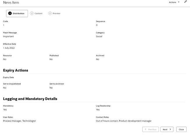
In read or print mode, fields are typically presented in one or two columns, with the values beneath the field labels.
Figure A-4 Form Read Mode

Edit Mode
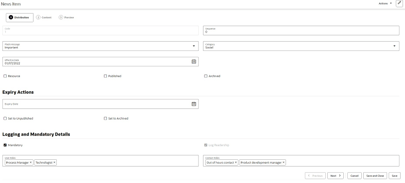
In edit mode, the field labels appear within the field input area.
Figure A-5 Form in Edit Mode

Read only fields are greyed out.
Pick lists are populated by clicking the input area to open the list of available values, or using the type-ahead text filter. If multiple selections are permitted, the selected values are shown in the input area; they are deselected by clicking the X control.
Date fields present a date picker; the selected date is shown in the format according to the user’s locale. Dates may also be keyed in.
Numeric integer fields may have controls to increment and decrement the number.
Rich text fields include options to apply bold, italics, and underline formatting, to insert a hyperlink, and to undo or redo edits.
Mandatory fields are indicated by the text Required beneath the field. Guidance text may appear beneath the field to indicate the expected content.
Validation
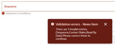
Validation is applied when the record is saved. Errors, such as missing mandatory fields, are indicated within the form.
Figure A-6 Validation Error

Field Alignment
The different types of fields are aligned as follows.
| Field Type | Alignment |
|---|---|
|
Number/integer/count |
Far |
|
Multi checkbox |
Near |
|
Boolean/switch/yes-no |
Center |
|
Text/rich text/phone/email/hyperlink/image and so on |
Near |
|
Dates and times |
Near |
|
Other (blob/complex) |
Center |
Images and Files
Depending on the usage, images may be shown as full size, reduced scale, or a thumbnail.
If an image or file cannot be found, a placeholder icon indicating the file type extension is shown instead.