Hourly Usage Module
This module educates customers about how much electricity they use during peak hours, and encourages them to shift tasks to off-peak hours to save money. The module supports partial-peak periods, multiple peak periods in a day, and weekday and weekend breakdowns.
This module was designed to be used in conjunction with the TOU 101 module. The colors and charts for these modules must match and be aligned to show the customer the visual connection between each hour's price and the customer's usage during each hour.
Design
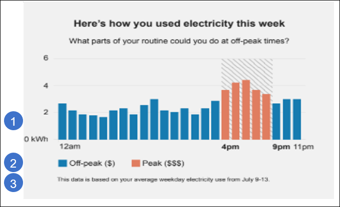
This image shows an example of the Hourly Usage module followed by the available configuration options.
Configuration Options
For each element listed in the table, indicate the desired configuration in the Input Value column. If you do not provide an input for optional configurations, the default will be used.
| Image Number | Configuration Option | Input Value |
|---|---|---|
|
1 |
Peak Time Hours The bar chart displays the times associated with the peak period. For example, electricity might be more expensive from 4pm-9pm. Note that this value, and the Peak Time Hours value in the TOU 101 module must be the same. |
Required Specify the peak hours: |
|
1 |
Bar Chart Colors Colors in the bar graph for Off-peak, Partial peak, and Peak can match the utility’s color palette, if desired. The colors shown are the default colors. Research has shown that using a bright color to identify the peak periods is the most successful. Attention to contrast and accessibility guidelines should be considered if changing the default colors. Note that the colors used here must be the same as the colors used in the TOU 101 module. |
Optional Choose one of the following: Use the default colors. Work with your Delivery Team to specify other colors. |
|
2 |
Peak Time Names You can designate the name of peak and off-peak ranges in the legend. Default values include:
Note that the values used here should be the same as the values used in the TOU 101 module. |
Optional Choose from the following: Use the default values. Use this name for off-peak periods:
Use this name for partial peak periods:
Use this name for peak periods:
|
|
3 |
Data Basis Statement This statement identifies the data that is used to generate the graph. Default: This data is based on your average weekday electricity use from [date range]. |
Optional Choose one of the following: Use the default statement. Use this statement:
|
To see how this module fits into the overall user experience, see Design and Configuration: Time of Use Coach Emails.
User Experience Variations
This section discusses the user experience variations in the Hourly Usage module.
Partial Peak Periods
For utility companies with partial-peak periods, the module displays off-peak, partial-peak, and peak hours using different colors within the bar chart.
Multiple Peak Periods
For utility companies with multiple peak periods each day, the module displays all peak periods in the chart.
Weekday and Weekend Breakdowns with Different Pricing
If a customer’s rate plan has different weekday and weekend pricing breakdowns, then the TOU Coach Hourly Usage and TOU 101 modules should be separated so that weekdays are discussed first (with the accompanying TOU 101 module sliding scale) and the weekend modules appear next.
Note that the introduction statement above the graph changes to reflect whether the chart is displaying weekday or weekend usage.
Weekday and Weekend Breakdowns with Same Pricing
If a customer’s rate plan has peak hours on the weekdays and weekends, but the pricing scheme is the same during both the weekdays and weekends, then the TOU 101 module should only appear once, followed by two separate TOU Coach Hourly Usage modules that show the usage patterns of weekdays and weekends separately. Weekday and weekend usage patterns are typically consistently different, and separating them gives the customer an opportunity to better envision their behaviors.
Note that the introduction statement above the graph changes to reflect whether the chart is displaying weekday or weekend usage.