Peak Usage Summary Module
This module educates customers about how their electricity costs during peak hours changed throughout the month. The module highlights the difference between the lowest peak usage week and the highest peak usage week over the previous four weeks. The module provides customers with a view of how they’ve progressed in changing their peak usage over the past four weeks, and displays data in dollar amounts, illustrating cost savings over time.
Design
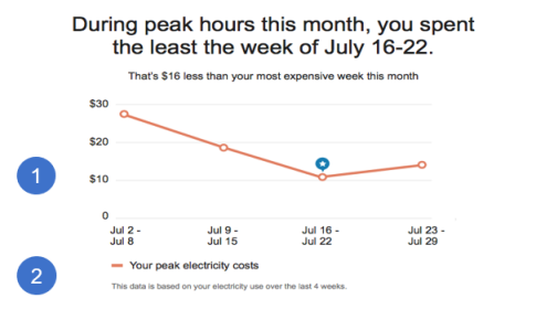
The following image shows an example of the Peak Usage Summary module followed by the available configuration options.
Configuration Options
For each element listed in the table, indicate the desired configuration in the Input Value column. If you do not provide an input for optional configurations, the default will be used.
| Image Number | Configuration Option | Input Value |
|---|---|---|
|
1 |
Graph Colors Colors in the line graph and the star can match the utility’s color palette. The colors in the example represent the default colors. |
Optional Choose one of the following: Use the default colors. Work with your Delivery Team to specify other colors. |
|
2 |
Date Range Disclaimer A statement below the graph identifies the dates used to determine the usage data for the chart. The statement changes based on whether TOU pricing is in effect every day, or on weekdays only. The default statements are:
|
Optional Choose one of the following: Use the default statements. Use the following statements: |
To see how this module fits into the overall user experience, see Design and Configuration: Time of Use Coach Emails.
User Experience Variations
This section discusses the user experience variations in the Peak Usage Summary module.
Customer Has Multiple Lowest-Cost Weeks
If customers have two or three lowest-cost weeks, the TOU Coach Peak Summary module displays the following:
- Heading: During peak hours this month, you spent the least on [2/3] different weeks.
- Line Graph: The graph does not display a visual indicator to show the lowest-cost week.
Customer Has Multiple Lowest-Cost and Highest-Cost Weeks
If customers have multiple lowest-cost weeks and multiple highest-cost weeks, the TOU Coach Peak Summary module displays the following:
- Heading: During peak hours this month, you spent the least on [2/3] different weeks.
- Insight Statement: That's [$X] less than your most expensive weeks.
- Line Graph: The graph does not display a visual indicator to show the lowest-cost week.
Customer Spends About the Same Each Week
If customers spend about the same during peak hours each week, the TOU Coach Peak Summary module displays the following:
- Heading: During peak hours this month, you spent about the same each week.
- Insight Statement: You spent an average of [$X] those weeks.
- Line Graph: The graph does not display a visual indicator to show the lowest-cost week.