Demand Heat Map
The Demand Heatmap displays a business customer's demand data in a color-coded grid, and indicates the level of energy demand during specific times, days, and weeks of the year. Business customers can use filters to view demand during operating and non-operating hours, and focus on either category to identify demand outside normal business operations. This allows business customers to see when they draw the most energy from the grid, to identify any anomalies, and to consider if and how to lower their demand during those times in the future.
Note:
Demand refers to the rate at which a business consumes electricity, not the actual amount of electricity consumed. Demand data is expressed in kilowatts (kW) rather than kilowatt-hours (kWh). For more information on the difference, see Demand Versus Energy Use.Requirements
Customer Requirements
| Category | Description |
|---|---|
| Billing Frequency | Monthly, bi-monthly, and quarterly. |
| Data Delivery Frequency | Daily. |
| Data Requirements |
Usage Period Data: Usage period data from the Oracle Utilities Opower Billing Data Transfer specification is required. Specifically, the Interval Data: Subdaily electric interval data in kWh is required. Data can be sent in whichever subdaily resolution is available. For information on providing interval data, see the Oracle Utilities Opower Interval Data Transfer specification. Premise Data: Premise data for the business is required. See the Oracle Utilities Opower Premise Data Transfer specification for more information. |
| Data History | A minimum of one historical bill and one day of AMI data. |
| Data Coverage | Not applicable. By default, the heatmap displays any data that is available, even if some reads are missing. |
| Supported Fuels | Electricity. Demand data for gas cannot be shown. |
Limitations
Calculated Demand Data: The feature does not use or support demand rates data. Demand data is calculated based on interval data provided by the utility in kWhs, and is then displayed in kWs.
User Experience
This section describes the user experience of the Demand Heatmap for business customers who have electric interval AMI data and operating hours information. The image below is an example of the Demand Heatmap for a specific bill period.
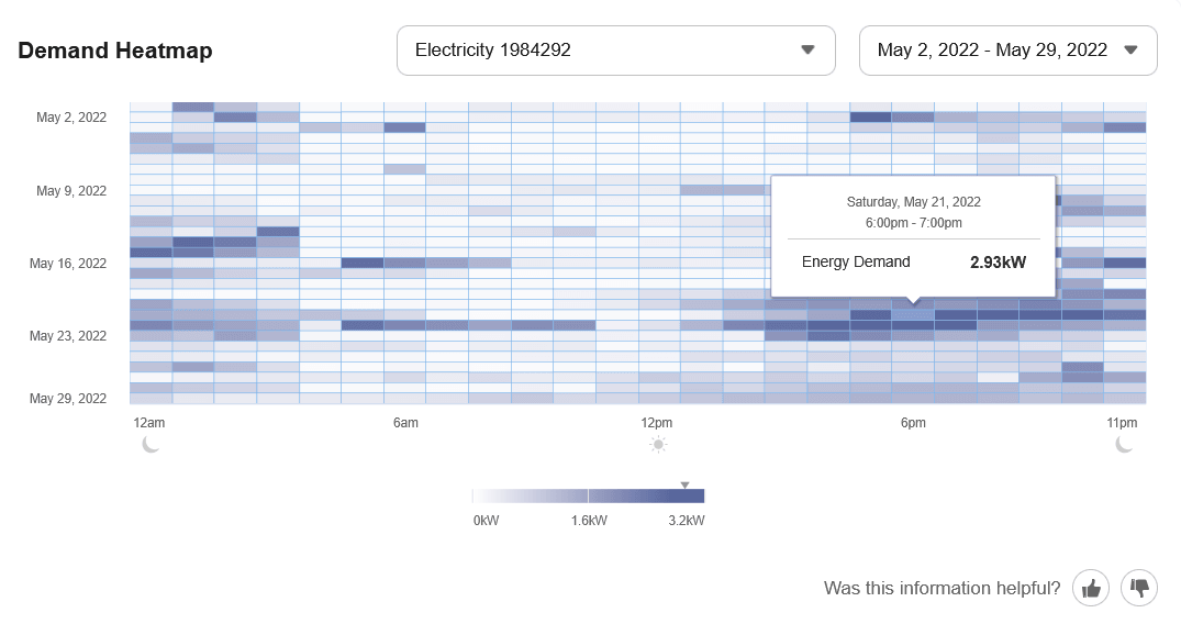
Service Point Selector: A service point selector menu may display above the heatmap for businesses that have multiple service points of the same fuel type at a premise. If a business customer has added custom meter names, each name is displayed with its service point identifier to help distinguish the available service points. For more information, see Custom Meter Names.
Date and Time Menu: The date and time menu allows business customers to select the bill period for which to view demand data. The menu is limited to displaying options for the last 12-13 months.
Depending on the customer's billing cycle, the menu shows different date ranges for different bill periods. For example, a customer on a monthly billing cycle would see menu options with month-long date ranges, while a customer on a bi-monthly billing cycle would see menu options with bi-monthly date ranges.
Operating Hours Filters: For business customers who have completed the operating hours section of their Business Profile, a set of three filters appears: All Hours, Operating Hours, and Non-Operating Hours.
These filters allow customers to focus on their demand during different times of day, and to better understand how their energy usage is related to the times when they are open and closed for business. The selected hours remain fully visible while the other hours are de-emphasized in the view. By default, the All Hours filter is displayed. If business customers haven’t provided details about their operating hours, the filters are not displayed, and a call-to-action appears above the grid to prompt the customer to add the information.
Demand Grid: The demand data is shown in a color-coded grid view. By default, a single color gradient is used so that the colors are more accessible to colorblind customers.
- X-Y Axis: The y-axis represents the days and weeks of the selected time period. The x-axis represents the time of the day, broken down into 24 hours.
- Panels: The panels in the grid represent different time intervals (such as one hour) depending on the resolution of the customer's data. Each panel in the grid is color-coded to indicate how much energy was in demand at that point in time.
- Rows: The number of rows in the demand grid varies depending on the customer's billing cycle. For example, a customer with monthly billing would see a grid containing data for about four weeks, while a customer with bi-monthly or quarterly billing would see a grid containing data for additional weeks.
- Highest Demand Interval: An icon is displayed in the panel when demand was at its peak. Demand refers to the rate at which a business consumes electricity, not the actual amount that is consumed. This means that the interval with the peak demand icon may not always be the same as the interval with the highest amount of energy use. See Demand Versus Energy Use for more information about the difference. The icon remains fully visible and interactive when its underlying panel is de-emphasized by an operating-hours filter.
Note:
Any data that is available will be displayed. If some reads are missing (for example, if a customer's meter malfunctioned or was unable to send data reads to the utility for some reason), the corresponding panels in the grid will appear empty.Tooltips: A tooltip is displayed when a business customer interacts with a data point in the Demand Heatmap. The tooltip includes the following elements.
- Time Period: The time period for the selected data point or panel in the grid, including the month, day, year, and time interval.
- Energy Demand: The energy demand for the selected time period, expressed in kilowatts (kWs).
- Operating Status: When operating hours have been provided, the tooltip indicates whether the selected interval is within or outside the business's operating hours.
Legend: Below the demand grid is a legend displayed in the form of a color-coded scale. The color on the left side indicates the low end of demand (usually 0 kWs), and then gradually changes as the scale moves to the right where the high end of demand is indicated.
The scale is dynamic and ends at whatever is the highest demand for the selected time period. For example, if the highest demand during the selected time period was 4 kWs, then the right side of the scale would indicate 4 kWs. This number may change when the customer selects a different time period.
When a customer interacts with the Demand Heatmap and selects (or hovers over) a panel in the grid, an upside-down triangle icon appears above the scale at the appropriate point that corresponds with the demand represented by the selected panel.