Redwood User Experience
The Redwood user experience option may be enabled system wide via a feature configuration. Additionally, the user menu allows individual users to toggle between the Redwood user experience and the classic user experience.
When enabled, the following illustrates a typical portal page layout.
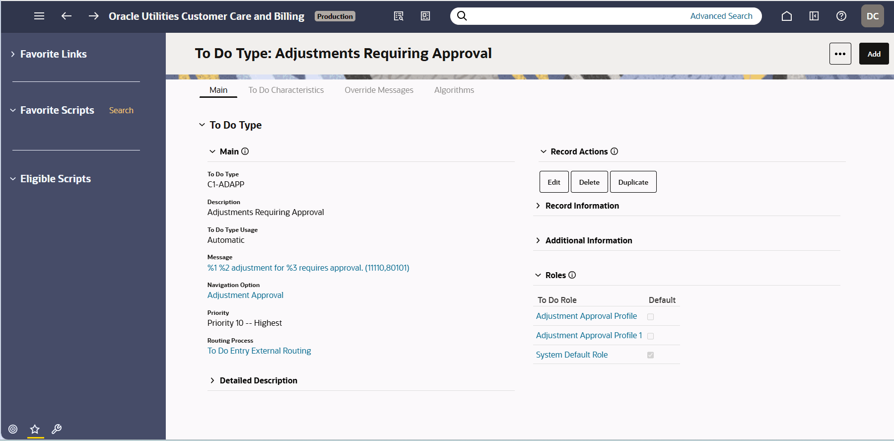
The following points highlight differences in the behavior and appearance of pages in the application when enabling this experience:
-
A colored theme is used for the application toolbar and the sidebar.
-
Portal based pages follow the standard of the Label over the Field rather than before it.
-
Some icons are different.
-
The expand / collapse control for a zone or section is moved to the left (or right for a right-to-left language).
-
All input dialogues for portal based pages are displayed as a Drawer.
- When there are more than two page action buttons, one button is visible directly and the rest are grouped in an 'overflow' button (with three dots). This change applies to both portal based pages and fixed pages
-
The spacing of elements is adjusted.
Parent topic: Page Components