Email Three Bar Chart
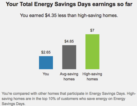
This module shows how much a customer has saved throughout the summer and compares those savings to average- and high-savings homes in the program. This gives the customer a clear, easy-to-understand visual representation of how their savings compare to other customers enrolled in the program. The information displayed in the graph varies based upon how much the customer has earned over the summer. The values shown in the graph represent cumulative savings for the entire summer.
This module is available for customers on the Money Comparison track. See About Tracks for Peak Time Rebates for information about what Tracks and Study Groups are, why they are used, and how they work.