Input Field with Search
If an input field is related to an object in the system that uses a search to find a valid value, a search button appears, using the magnifying glass icon.
The position of the magnifying glass depends on the type of page you are on and configuration. If it is a fixed page, the search icon is adjacent to the input field. This is also where the icon appears in portal based input pages if the Auto-filtering option is turned off.

On a portal based page, if the Auto-filtering option is turned on in your environment, the search icon is embedded in the beginning of the input field.

When the auto-filtering is turned on and the search is configured to enable auto-filtering functionality, the search also includes a down arrow.

Note:
See below for more information about the auto-filtering functionality.-
Enter a value in the search field and press Enter while the cursor is in the search field. The system assumes you want to search for the value entered and pre-populates it in the search window's search criteria. If a unique match can be found, the system automatically populates the field with details corresponding to the record found. If a unique match cannot be found (either no matches or multiple matches), a search page opens containing selectable items.
-
Click the Search button without entering a criteria. This will typically cause a pop-up search window to appear so that you can further refine your search.
-
Enter a value and tab out of the search field. The system looks for a value that exactly matches what you entered. If it cannot find such a value, the search dialog will not be presented.
When an item is selected in the search page, the search page closes and the input field is populated with the value selected.
Note:
Sorting columns within the search grid. You may click on the column heading of columns in a search grid to cause the contents of the grid to be sorted. Refer to Sorting Functionality for more information.Auto-filtering
If your environment has turned on the Auto-filtering functionality, then if the search for an input field is configured for auto-filtering, the user can click the down arrow to open the filter area.
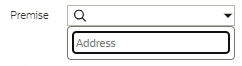
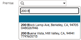
Start typing in the filter area to see results that match the entered text. The search may be configured to display up to three rows of information for you to choose the correct record. The text that matches what you typed is highlighted in bold.
Note:
Whether the text you type is matched only at the beginning of the string or at the middle of the string depends on how the filter is configured in the underlying search. Most search filters are configured to match text at the beginning of the string.Parent topic: Object Display Area