Format the containers for different screen sizes
Introduction
In this tutorial, you will learn how to customize an Oracle JET web app to support different screen sizes by using Oracle JET helper classes.
You can use Oracle JET helper classes to set conditions for various screen sizes. In a flex layout, an item in a container grows or shrinks to fill the container space. Oracle JET provides style classes for small, medium, large, and extra-large screen sizes. You can set the minimum screen width allocated for content by specifying the number of logical columns from 1 to 12 that the content should use for the selected screen size. If you choose a screen size while specifying the keyword only in the condition, then the condition applies only to that screen size. If you choose a screen size but omit a larger screen-size condition, then the condition applies to the selected screen size and to all the subsequent larger screen sizes. By using helper classes in your app, you can control the display and alignment of text and elements, customize padding around panels, and set columns for different screen sizes.

Objectives
In this tutorial, you will add helper classes to your Oracle JET web app to specify text alignment, add padding to panels, and set columns for different screen sizes.
Prerequisites
- A development environment set up to create Oracle JET web apps that includes an installation of Node.js
- Access to the Oracle JET Developer Cookbook
- Completion of the previous tutorial in this learning path, Add Containers to the Oracle JET Web Application
Task 1: Add Helper Classes for Content Alignment
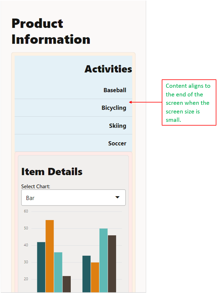
Modify the alignment of content in the Oracle JET web app’s layout by specifying helper classes for different screen sizes in the div element.
-
Open the Oracle JET Cookbook and click Framework in the menu bar. Then click CSS Utilities, click Layout, and select the Text End demo in the sidebar.
-
In the Oracle JET Cookbook demo for Text End, learn how you can implement the
oj-sm-only-text-align-endstyling class to align text content to the end of a small screen. To demo a small screen, click the Phone Portrait icon and view the responsive behavior for S align end. -
Navigate to the
JET_Web_Application/src/ts/viewsdirectory and open thedashboard.htmlfile in an editor. -
Find the
divelement whereid="activitiesContainer", before the Activities heading, and then add theoj-sm-only-text-align-endOracle JET responsive helper style class.<!-- The responsive helper style class aligns the Activities container text to the end of the screen when the screen size is small --> <div id="activitiesContainer" class="oj-flex-item oj-bg-info-30 oj-sm-only-text-align-end" > <h3 id="activitiesHeader">Activities</h3> </div>The
oj-sm-only-text-align-endstyle class aligns the contents in the container to the end of the screen width only if the screen size is small. -
Save the
dashboard.htmlfile.Your code should look similar to content-alignment-dashboard-html.txt.
Task 2: Add Helper Classes for Padding
Add padding to the content by using the Oracle JET responsive spacing style classes. When you specify the responsive spacing class on the parent div element, the padding is applied to all child div elements of that parent.
-
Find the
divelement whereid="parentContainer2"and add theoj-lg-padding-pad-6xOracle JET responsive spacing style class.<!-- The style class is specified in the parent div element --> <div id="parentContainer2" class="oj-flex oj-flex-item oj-panel oj-bg-danger-30 oj-lg-padding-6x" ></div> -
Save the
dashboard.htmlfile.Your code should look similar to padding-dashboard-html.txt.
Task 3: Set Columns for Different Screen Sizes
In the Oracle JET web app, specify the sizing style classes in the div element. These Oracle JET style classes allow you to set the minimum column width that is allocated for the specified screen size.
-
Find the
divelement whereid="activitiesContainer", before the Activities heading, and add the style classes that specify the minimum number of columns for different screen sizes.<!-- The oj-md-4 and oj-sm-12 style classes specify the column width for small and medium screen sizes --> <div id="activitiesContainer" class="oj-flex-item oj-bg-info-30 oj-sm-only-text-align-end oj-md-4 oj-sm-12" > <h3 id="activitiesHeader">Activities</h3> </div>The style class
oj-sm-12makes thedivcontainer 12 columns wide in a small screen, andoj-md-4makes thedivcontainer four columns wide when in medium or above screen sizes. -
Find the
divelements surrounding the Item Details heading, which haveidattributes with the valuesparentContainer2,activityItemsContainer, anditemDetailsContainer. Then add the following style classes to them to specify their minimum column width for different screen sizes.<!-- The style class in the div elements specifies the column width for different screen sizes --> <div id="parentContainer2" class="oj-flex oj-flex-item oj-panel oj-bg-danger-30 oj-lg-padding-6x oj-md-8 oj-sm-12" > <div id="activityItemsContainer" class="oj-flex-item oj-md-6 oj-sm-12" ></div> <div id="itemDetailsContainer" class="oj-flex-item oj-panel oj-bg-neutral-30 oj-md-6 oj-sm-12" ></div> </div> -
Save the
dashboard.htmlfile. Your code should look similar to final-columns-dashboard-html.txt.
Task 4: Run the Web App
-
In the terminal window, change to the
JET_Web_Applicationdirectory and run the app.npx ojet serveOracle JET tooling runs your web app in your local web browser, where you can view the Dashboard contents. Right-click the page, and select Inspect to bring up the page view in the developer tools. Then select a device with a small screen size, such as Pixel 7, from the Dimensions dropdown menu to verify the content alignment changes of the Activities list items.

-
Close the browser window or tab that displays your running web app.
-
In the terminal window, press Ctrl+C, and if prompted, enter
yto exit the Oracle JET tooling batch job.
Next Step
Proceed to the next tutorial in this module.
This tutorial is part of the module Responsive Design.
- Add Containers to the Oracle JET Web Application.
- Format the Containers for Different Screen Sizes
- Show or Hide Content in the Oracle JET Web Application
- Test the Oracle JET Web Application on Different Screen Sizes
You can return to the learning path’s main page to access all the modules on building web apps.
More Learning Resources
Explore other labs on docs.oracle.com/learn or access more free learning content on the Oracle Learning YouTube channel. Additionally, visit education.oracle.com/learning-explorer to become an Oracle Learning Explorer.
For product documentation, visit Oracle Help Center.
Format the containers for different screen sizes
F11843-08