Show or hide content in the Oracle JET virtual DOM app
Introduction
Oracle JavaScript Extension Toolkit (Oracle JET) includes a ResponsiveUtils module that contains utilities for working with responsive screen widths and ranges. For example, a specific screen width or range is described by a framework query key, which can be passed into the method getFrameworkQuery() to produce a framework media query string.
The Window interface contains the window variable that represents the window in which your virtual DOM app is running. Passing the framework media query into the window.matchmedia() method returns an object with properties that you can use to check whether the screen width of the window in which your virtual DOM app is running matches your specified width or range.
With this object and use of Preact hooks, state, and event listeners, you can monitor the size of the screen your virtual DOM app is running in and responsively display different content when the screen size changes.
Objectives
In this tutorial, you will learn how to use Preact hooks and the Oracle JET ResponsiveUtils module to monitor changes in the size of the window that your virtual DOM app is running in. Then you will adjust the Activity Item Container component of your app to responsively load different content when using medium or smaller screens.
Prerequisites
- A development environment set up to create virtual DOM apps that includes an installation of Node.js
- Google Chrome web browser installed and set as the default web browser
- Access to the Oracle JET Developer Cookbook
- Completion of the previous tutorial in this learning path: Format the Component Containers for Different Screen Sizes
- The completed app jet-virtual-dom-app-responsive-design-final.zip optionally downloaded
Task 1: Monitor the Screen Width and Responsively Display Conditional Content
Use Preact hooks and the Oracle JET ResponsiveUtils module to find the browser window’s screen width and monitor when the size changes to medium or smaller. Then use state to keep track of the screen size in the ActivityItemContainer component and render a recolored Activity Items container with an abbreviated list of items for medium or smaller screens.
-
Open the Oracle JET Cookbook and navigate to the Cookbook home page. Click Framework in the menu bar, then click Responsive Behaviors, and then click Responsive Loading.
-
There you can access the API documentation for the
ResponsiveUtilsnamespace. Scroll to the Methods section and read about thegetFrameworkQuerymethod. -
Navigate to the
JET-Virtual-DOM-app/src/components/ActivityItemdirectory and open theActivityItemContainer.tsxfile in an editor. -
At the top of the file, add
importstatements for theuseRef,useState, anduseEffecthooks, as well as the Oracle JETResponsiveUtilsmodule.import { useRef, useState, useEffect } from "preact/hooks"; import * as ResponsiveUtils from "ojs/ojresponsiveutils"; -
Above the
ActivityItemContainerfunction, add thesm_md_viewvariable to hold the content that the container will display when the screen is a medium or smaller size, rather than a large or extra-large size.// Display this content for medium and narrower screen widths const sm_md_view = <div id="sm_md" class="oj-flex-item oj-sm-padding-4x-start oj-md-6 oj-sm-12" style="background-color:lightcyan; padding: 10px; font-size: 10px"> <h3 id="activityDetailsHeader">Activity Details</h3> <div class="item-display no-wrap"> <ul> <li class="li-item">SureCatch Baseball Glove</li> <li class="li-item">Western R16 Helmet</li> <li class="li-item">Western C1 Helmet</li> <li class="li-item">Western Bat</li> </ul> </div> </div>;Note: As a best practice, we recommend that you define CSS styles in a separate file, not inline as they are here.
-
Before the
returnstatement of theActivityItemContainerfunction, add the following code to make use of the imported Preact hooks andResponsiveUtilsmodule.const ActivityItemContainer = () => { const mediaQueryRef = useRef<MediaQueryList>(window.matchMedia(ResponsiveUtils.getFrameworkQuery("md-down")!)); const [isSmallMediumWidth, setIsSmallMediumWidth] = useState(mediaQueryRef.current.matches); useEffect(() => { mediaQueryRef.current.addEventListener("change", handleMediaQueryChange); return (() => mediaQueryRef.current.removeEventListener("change", handleMediaQueryChange)); }, [mediaQueryRef]); -
Under the
useEffecthook, add the following two functions.function handleMediaQueryChange(e: MediaQueryListEvent) { setIsSmallMediumWidth(e.matches); } function getDisplayType() { return isSmallMediumWidth ? false : true; } -
Finally, modify the
ActivityItemContainerfunction’sreturnstatement to either render the current Activity Items content, if using a large or extra-large screen size, or render the content in thesm_md_viewvariable, if using a medium or smaller screen size.return getDisplayType() ? ( <div id="activityItemsContainer" class="oj-flex-item oj-bg-success-20 oj-sm-padding-4x-start oj-md-6 oj-sm-12"> <div id="container" class="item-display no-wrap"> <h3>Activity Items</h3> <ul> <li class="li-item">Louisville Slugger Bat</li> <li class="li-item">SureCatch Baseball Glove</li> <li class="li-item">Baseball</li> <li class="li-item">Western R16 Helmet</li> <li class="li-item">Western C1 Helmet</li> <li class="li-item">Sure Fire Ball (Set of 4)</li> </ul> </div> </div> ) : sm_md_view; -
Save and close the file.
Your code should look similar to
responsive-screen-activity-items.txt.
Task 2: Run the Virtual DOM App
-
In the terminal window, change to the
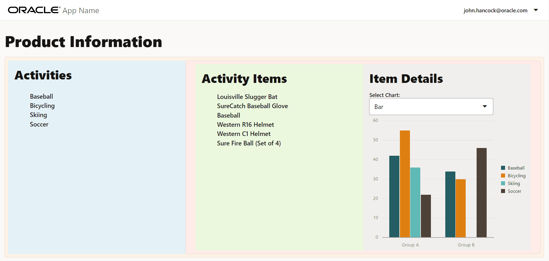
JET-Virtual-DOM-appdirectory and run the virtual DOM app.npx ojet serveOracle JET tooling runs the virtual DOM app in your local web browser. Viewing the content on a large screen shows the same content as displayed at the end of the previous tutorial.

-
To display the contents in the
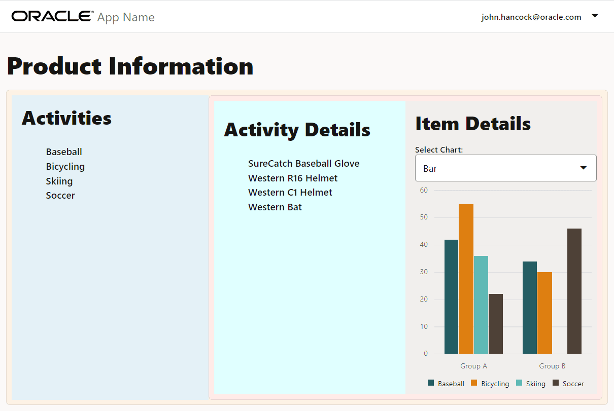
sm_md_viewvariable, drag the edge of the browser window until it is a medium size. In the Activity Items Container, note the abbreviated activity item list under a new Activity Details heading, as well as the container’s new light cyan color.
-
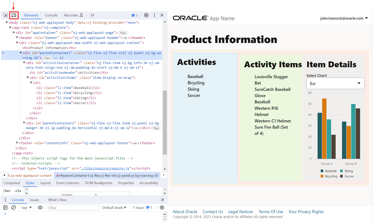
Next, view the virtual DOM app in a small screen size by using the Chrome DevTools. Maximize the screen, then right-click the page and select Inspect to bring up the page view in the developer tools.
-
In the Chrome DevTools toolbar, click
 to switch to the device mode.
-
Click the Dimensions dropdown menu in the device mode’s screen emulator.

-
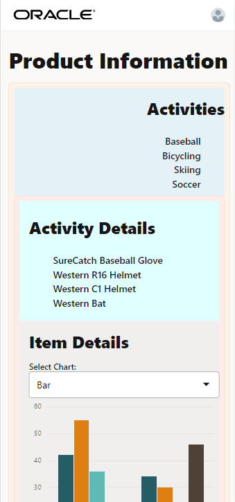
From the dropdown menu, select a device with a small screen size, such as the Pixel 7, to verify the content changes in the screen emulator.

In the small screen size, the orientation and layout of the app changes and a shortened list of items is visible under the Activity Details heading. The container is colored light cyan.
-
In the terminal window, press Ctrl+C, and if prompted, enter
yto exit the Oracle JET tooling batch job. -
Close the browser window or tab.
-
Your completed virtual DOM app with responsive design functionality should look similar to
jet-virtual-dom-app-responsive-design-final.zip.
Task 3: (Optional) Run a Virtual DOM App from a Restored App
If you want to run the completed Oracle JET virtual DOM app from the supplied code, you can restore the app from the downloaded archive file. To work with a stripped and zipped Oracle JET virtual DOM app, you must restore project dependencies, including Oracle JET tooling and the required libraries and modules, within the extracted app.
-
Download the
jet-virtual-dom-app-responsive-design-final.zipfile and extract the contents of the completed app to theJET-Virtual-DOM-appfolder. -
In the terminal window, navigate to the
JET-Virtual-DOM-appfolder and restore the Oracle JET virtual DOM app.npm install -
Wait for confirmation.
Success: Restore completeThe app is ready to run.
-
Run the app and test it in the browser.
npx ojet serve -
Close the browser window or tab that displays your running app.
-
In the terminal window, press Ctrl+C, and if prompted, enter
yto exit the Oracle JET tooling batch job.
Next Step
Proceed to the next tutorial in this module.
This tutorial is part of the module Responsive Design.
- Add Containers to the Oracle JET Virtual DOM App
- Format the Containers for the Oracle JET Virtual DOM App
- Show or Hide Content in the Oracle JET Virtual DOM App
- Test the Oracle JET Virtual DOM App on Different Screen Sizes
You can return to the virtual DOM learning path’s main page to access all the modules on building virtual DOM apps.
More Learning Resources
Explore other labs on docs.oracle.com/learn or access more free learning content on the Oracle Learning YouTube channel. Additionally, visit education.oracle.com/learning-explorer to become an Oracle Learning Explorer.
For product documentation, visit Oracle Help Center.
Show or hide content in the Oracle JET virtual DOM app
F72923-04