Use Dashboard Filters
This section describes how you can add dashboard filters to your canvases.
Add Dashboard Filters
Use dashboard filters to provide filter selectors on an individual canvas. Dashboard filters allow users to select and change the values that they want to see in the visualizations on the canvas.
When you add a dashboard filter, Oracle Analytics assigns default properties based on the column you chose to create the filter. You can modify the filter's properties to better suit the data and improve the user experience.
- On the Home page, hover over a workbook, click Actions, then select Open.
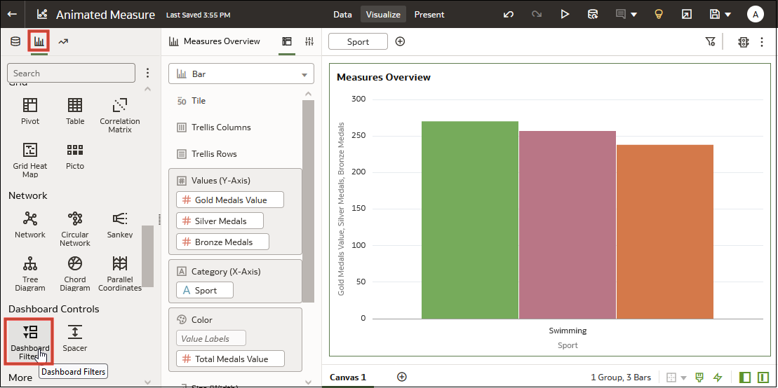
- In the Data Panel, click Visualizations, scroll to Dashboard Controls, and drag Dashboard Filters to the canvas.
- In the Data Panel, click Data and drag one or more columns to the new dashboard filter visualization to create the dashboard filters.
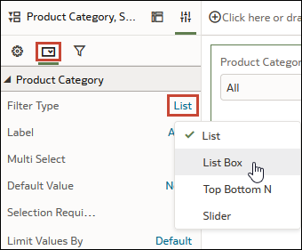
- In the Dashboard Filters visualization, click a filter to select it. In the Properties pane, click Properties, then click Filter Controls.
- Click the Filter Type field and select the type of
filter you want to include on the workbook.

- In Filter Controls, specify the filter's properties, for example, allow multi-select, limit values, label name, and so on.
- Click Filters to specify how you want the filter to
interact with the other filters on the workbook and which visualizations on the
canvas to apply the filter to.

- Click Save.
Modify the Dashboard Filters Visualization Properties
Specifying the Dashboard Filters visualization's properties allows you to design the filter visualization interface best suited for canvas' data and the best way for users to filter it. For example, you can provide a title, specify the placement of the filter labels, and add Reset and Apply buttons.
- On the Home page, hover over a workbook, click Actions, then select Open.
- Navigate to a canvas, and display the Visualize pane.
- In the Properties pane, click Properties and then click General.
- Locate and change the visualization's properties.
- Click Save.
Change the Orientation of Dashboard Filters
Where you add a Dashboard Filters visualization to the canvas determines if the filters selectors are displayed horizontally or vertically.
- On the Home page, hover over a workbook, click Actions, then select Open.
- Click the Dashboard Filters visualization to select it.
- Click Properties to open the Properties pane, and then click General.
- Click the Orientation field and select an orientation.
- Click Save.
Change the Dashboard Filter Style
You can choose how you want the filter selectors in the Dashboard Filters visualization to display to provide a canvas layout and the filter experience that works best for your users.
-
Standard - Displays the name of the filtered data element above the filter interface. For example, if the filter type is List Box, the label is displayed above the filter and an arrow is provided to access and select filter values.
-
Filter Chip - Displays dashboard filters in a compact style where the filter interface is hidden. This option merges the filtered data element name into the filter control and provides a count of any selected values. You can also set the Show Values property to show or hide the selected values in the filter label. Choose this option when you need canvas space and the list of available values for the data element is small.
- On the Home page, hover over a workbook, click Actions, then select Open.
- Click the Dashboard Filters visualization.
- In the Properties pane on the General tab, click the Filter Style field and select a style.
- Click Save.
Modify an Individual Dashboard Filter's Properties
You can modify the properties of any individual filter located in a Dashboard Filters visualization. Modifying properties helps you design the best interface for users to filter the data on the canvas.
- On the Home page, hover over a workbook, click Actions, then select Open.
- Click the Dashboard Filters visualization to select it.
- Locate and change the filter's properties. The filter type
determines the location of the properties.
- For all filter types, in the Properties pane, click Properties, then click Filter Controls. Locate and expand the filter to modify its properties.
- For list, top bottom N, range, date range, and relative time filter, in addition to using Filter Controls, go to the Dashboard Filters visualization, click the filter, and on the Filter dialog modify the properties.
- Click Save.
Specify How Dashboard Filters Limit Other Filters
You can specify how a dashboard filter gets its selection values, for example from the workbook filter bar, workbook filters, or other dashboard filters.
- Default - Uses the Limit Values By setting from the filter bar. Or if the canvas contains a workbook filter and dashboard filter that use the same column, the default uses the workbook filter's Limit Values setting.
- Auto - Limits the filter selection by the other dashboard and workbook filter selections.
- None - Doesn't limit filter selection value by the other dashboard and workbook filter selections.
- <Filter Name> - Uses the selected dashboard filter or workbook filter's selections to limit selection values. You can choose more than one filter.
- On the Home page, hover over a workbook, click Actions, then select Open.
- Click the Dashboard Filters visualization to select it.
- Click Properties to open the Properties panel, then click Filter Controls. Locate and expand the filter you want to set the limit by for.
- Click the Limit Values By field and select how you want
to limit the filter's selection values.
- Click Save.
Filter a Dashboard Filter Visualization by Other Filters
When you add a dashboard filter, Oracle Analytics applies all of the workbook's dashboard and workbook filters to it. You can specify which of the filters you want to apply to the dashboard filter.
- On the Home page, hover over a workbook, click Actions, then select Open.
- Click the Dashboard Filters visualization to select it.
- Click Properties to open the Properties panel, and then click Filters.
- Go to the Filter This Viz By section and clear or select the filters you want to apply to the dashboard filter.
- Click Save.
Apply a Dashboard Filter to Visualizations on the Canvas
When you add a dashboard filter, Oracle Analytics applies it to all visualizations on the dashboard. You can specify which of the canvas' visualizations you want to apply the dashboard filter to.
- On the Home page, hover over a workbook, click Actions, then select Open.
- Navigate to a canvas, and display the Visualize pane.
- Click the Dashboard Filters visualization to select it.
- In the Properties pane, click Properties, and then click Filters.
- Go to the Apply This Filter To section and clear or select the visualizations that you want the filter to apply to.
- Click Save.
Filter and Animate Visualizations using a Slider Dashboard Filter
You can add a slider dashboard filter to a workbook canvas and animate visualizations to show how the data changes over a specified period.
- On the Home page, hover over a workbook, click Actions, then select Open.
- In the Data Panel, click Visualizations, and under Dashboard
Controls, drag Dashboard
Filters to the canvas.
- In the Data panel, click Data, and drag a dimension-based data element onto the new dashboard filter.
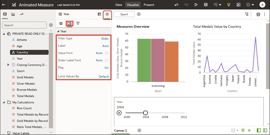
- Click Properties, click Filter Controls, click
List in Filter
Type, and select Slider. You
see the measure values displayed in the dashboard filter.
- In the properties panel, click Filter Controls and click Play option to turn auto-play off or on.
- If you enabled play, click Play in the Slider Dashboard Prompt to see how your visualizations play with the default settings.


