Understand Visualizations Generated by Contextual Insights
The Contextual Insights algorithm generates many types of visualizations to render various insights, ranked by level of interest.
To rank these insights, the algorithm runs various analyses leveraging the related columns, and selects the ones where data shows a valuable contrast between your selection and the rest of the data. The order in which the insights are displayed depends on the data. In each insight, your selection appears in orange while rest of data appears in blue.
Breakdown by attribute
Contextual Insights presents three types of breakdown visualizations. The overall shape of the distributions helps you quickly see which members in your selection contrast significantly with the rest of the data.
A breakdown can be represented as a dual-axis bar chart where the bars represent the breakdown of your selected data and the line represents the breakdown of all the remaining data. The members are sorted from highest to lowest based on the rest of the data.
For example, this insight breaks down sales by product container. The description provided indicates that in the case of the Small Box product container, the selected data has significantly lower sales when compared to the rest of the data. It also points out that the Jumbo Drum and Jumbo Box product containers for the selected data have much higher sales than the rest of the data.
Description of the illustration ci_breakdown_example.png
A dimensional breakdown can also be represented as a dual-axis scatter plot where each dot represents the breakdown of the selected data, and the line represents the breakdown of the remaining data. The members are sorted from highest to lowest based on the rest of the data.
For example, this insight breaks down profit by product sub-category. The selected data for Profit shows significant differences for the Product Sub Categories such as Telephones and Communication, Binders and Binder Accessories, and Chairs & Chairmats.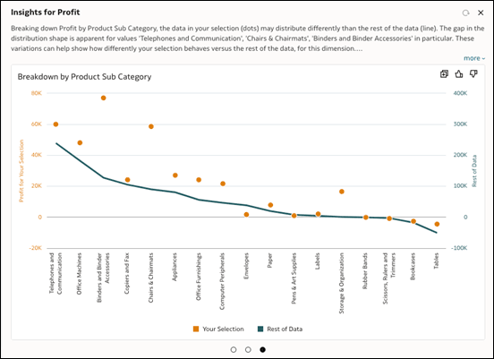
Description of the illustration ci_breakdown_example_2.png
A breakdown can also be represented as a radar line chart where the breakdown of the selected data line and the rest of the data line are indexed to a normalized scale.
For example, this insight breaks down Sales by Ship Mode. The shapes of the selected data and the rest of the data indicate significant differences for the Delivery Truck and Regular Air shipping modes.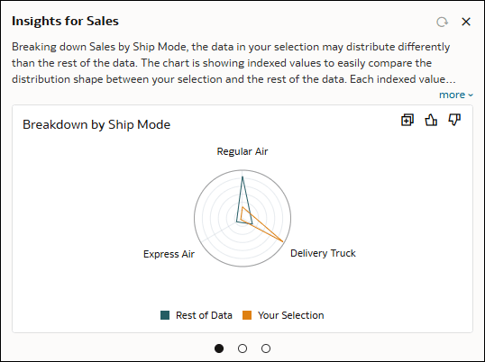
Description of the illustration ci_breakdown_example_3.png
Trending
Trending visualizations compare the relative growth of a metric over time for your selection and the rest of the data using lines to show the evolution of each. The algorithm uses the first date column that appears in the Related Columns section of the Grammar pane.
Each line starts with a base index value of 1.00 set at the initial time period. The evolution of the metric over time shows the relative value in the following periods compared to the index value of 1.00 in the initial period. When looking at absolute values for the metric, discrepancies in values make it difficult to properly compare any growth or decline over time.
For example, this insight shows the trend in sales by ship date. The description provides additional insights about the overall performance of sales over time. The description also highlights the intervals in the data where there's a significant difference in the trend between your selection and rest of the data, in this case, 2014 to 2015.
Description of the illustration ci_trending_example.png
Value Trending
This type of trending visualization shows the trending of a metric by derived Date or Time columns. While trending charts are indexed at the starting values, value trending charts are non-indexed dual-axis charts. Value trending charts are useful in identifying differences between your selected data and the rest of the data over the selected derived date or time column.
For example, this insight shows the value trend of Profit over a derived date column called Ship Date (Month of Year).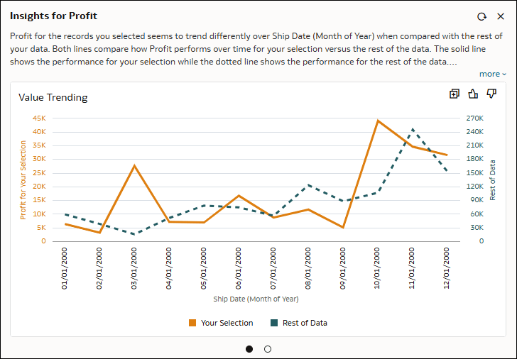
Description of the illustration ci_value_trending_example.png
Correlation
This type of chart visualizes how different metrics correlate with another specific metric by comparing the selected data with the rest of the data. By displaying the correlations side by side, this visualization highlights any notable similarities and differences between the two groups of data. Correlation visualizations are only available when at least one metric shows a meaningful difference in correlation between the selected data and the rest of the data. Correlations for these metrics are computed at the most granular level of data for your source visualization.
For example, this insight shows the correlation patterns between Sales and other available business metrics called Profit, Quantity Ordered, Shipping Cost, and Gross Unit Price.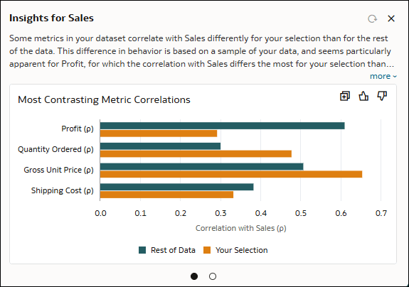
Description of the illustration ci_metric_correlation_example.png
Top Differences
This is a type of breakdown chart. It compares a metric's patterns between the selected data and the rest of the data, focusing on the top 10 cases with the largest differences. When dealing with attributes that have high cardinality, for example, cities or products, this chart highlights the most significant variations in the metric.
For example, this insight displays the ten cities where sales diverge the most (whether higher or lower) between the selected data and the rest of the data.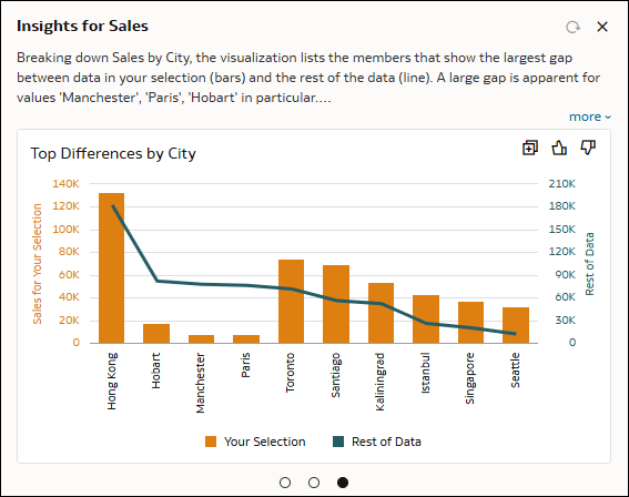
Description of the illustration ci_top_differences_example.png
80/20
This type of visualization shows what proportion of your metric value consists of the top 20% of the records and what proportion consists of the bottom 80% of the records when data is ordered by your metric. The visualization also shows the same for the rest of the data. This is computed at the most granular level of data in your source visualization.
For example, this insight shows the 80/20 proportions, sorted by sales, using two bars: the first for the rest of the data and the second for your selection. The description highlights the fact that the proportion is noticeably different between the two.
Description of the illustration ci_80_20_example.png