Screen Shot(s)
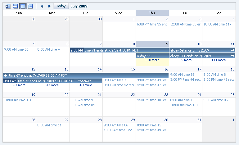
Month view of the calendar component.
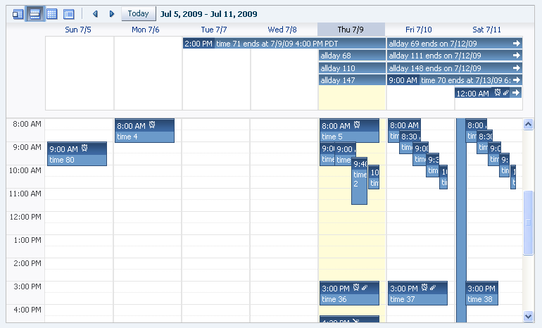
Week view of the calendar component.
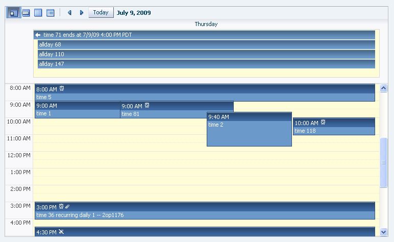
Day view of the calendar component.
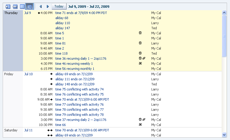
List view of the calendar component.
|
Oracle Fusion Middleware Tag Reference for Oracle ADF Faces 12c (12.2.1.4.0) E81455-02 |
UIComponent class: oracle.adf.view.rich.component.rich.data.RichCalendar
Component type: oracle.adf.RichCalendar
Naming container:
Yes. When referring to children of this component ("partialTriggers", findComponent(), etc.), you must prefix the child's ID with this component's ID and a colon (':')
Unsupported agents: pda
The calendar component provides the user the ability to view a user's activities by day, week, month, or list or flexList. The 'view' attribute controls whether day, week, month, or list is shown.
The 'activeDay' attribute drives the display range shown. For example to display the month of June 2008 in 'month' view, the activeDay must be a day in June 2008. The activeDay is also the specific date that will be shown in 'day' view.
The value attribute of the calendar component binds to an oracle.adf.view.rich.model.CalendarModel which contains oracle.adf.view.rich.model.CalendarActivity model objects, and the calendar knows how to render a calendarActivity. The public static method CalendarModel.isActivityInRange is provided as a convenience. You should use it when you need to decide if a CalendarActivity is in a certain date range, e.g., from your implementation of CalendarModel's method getTimeActivities.
The calendar does not control how activities are created, edited, or deleted, but it does fire events to allow you to wire up creating, editing, and deleting activities. As a convenience the calendar supports several facets, all of which should contain popups. There is more specific documentation about the facets in the "Supported Facets" section.
The activityStyles attribute can be used to customize the look of an acitivty instance. The activityStyles attribute type is Map<Set<String>, InstanceStyles>. The InstanceStyles object in the map can return per activity styles. Please see the javadoc on InstanceStyles and CalendarActivityRamp for information on those classes.
So how do we set up the activityStyles attribute so that it returns the appropriate InstanceStyles object for a given activity? Let's say we have 3 providers, "Me", "Larry", and "Ted", and we want to show the activities for these as red, orange, and blue respectively. You would create a map with the following key/value pairs and bind it to the activityStyles attribute:
| Key(String Set) | Value (InstanceStyles Object) |
|---|---|
| {"Me"} | CalendarActivityRamp.getActivityRamp(CalendarActivityRamp.RampKey.RED) |
| {"Larry"} | CalendarActivityRamp.getActivityRamp(CalendarActivityRamp.RampKey.ORANGE) |
| {"Ted"} | CalendarActivityRamp.getActivityRamp(CalendarActivityRamp.RampKey.BLUE) |
Additionally you would set up the activities such that the string set returned from the getTags method matches the string set keys in the activityStyles map, for example:
During calendar rendering for each activity the renderer calls CalendarActivity.getTags to get a string set. The string set is then passed to the activityStyles map and an InstanceStyles object is returned (keep in mind that CalendarActivityRamp is a subclass of InstanceStyles), so in our example:
The calendar supports 2 types of dragging.
The calendar does not fire "high level" events, for example it does not fire specific events for edit, delete, create, context menu, etc. Instead calendar fires the "low level" Calendar and CalendarActivity events.
Let's take a calendarActivity. A calendarActivityEvent will be queued if the user does any of the following on a calendarActivity
Even though a calendarActivityEvent is queued for all these, you can tell these apart because keyboard, mouse, and triggerType information will also be available in the event.
Although you are free to wire up your own ui response (for example showing a popup) to an event, for convenience the component has several facets that have been wired to show for common ui gestures. See the "Supported Facets" section for details.
<af:calendar id="calendar1"
             value="#{calBean.calendarModel}"
             timeZone="#{calBean.timeZone}"
             activityStyles="#{calBean.activityStyles}"
             calendarDisplayChangeListener="#{calBean.displayChangeListener}"
             calendarActivityListener="#{calBean.activityListener}"
             calendarActivityDurationChangeListener="#{calBean.activityDurationChangeListener}"
             calendarListener="#{calBean.calendarListener}">
   <af:calendarDropTarget actions="MOVE"
                          dropListener="#{calBean.handleDrop}"/>
   <f:facet name="activityContextMenu">
      <af:popup id="p1">
         <af:menu id="m1">
            ...
         </af:menu>
      </af:popup>
   </f:facet>
   <f:facet name="contextMenu">
      <af:popup id="p2">
         <af:menu id="m2">
            ...
         </af:menu>
      </af:popup>
   </f:facet>
   <f:facet name="activityDelete">
      <af:popup id="delete" contentDelivery="lazyUncached">
         <!-- don't render if the activity is null -->
         <af:dialog dialogListener="#{calBean.deleteListener}"
                    affirmativeTextAndAccessKey="Yes"
                    cancelTextAndAccessKey="No"
                    rendered="#{calBean.currActivity != null}"
                    id="d2">
            ...
         </af:dialog>
      </af:popup>
   </f:facet>
   <f:facet name="activityHover">
      <af:popup contentDelivery="lazyUncached" id="p3">
         <!-- don't render if the activity is null -->
         <af:noteWindow inlineStyle="width:300px"
                        rendered="#{calBean.currActivity != null}"
                        id="nw1">
            ...
         </af:noteWindow>
      </af:popup>
   </f:facet>
   <f:facet name="activityDetail">
      <af:popup id="edit" contentDelivery="lazyUncached">
         <af:dialog rendered="#{calBean.currActivity == null}"
                    id="d3">
            ...
         </af:dialog>
         <!-- don't render if the activity is null -->
         <af:dialog title="#{calBean.currActivity.title}"
                    type="okCancel"
                    dialogListener="#{calBean.editDialogListener}"
                    rendered="#{calBean.currActivity != null}"
                    id="d4">
            ...
         </af:dialog>
      </af:popup>
   </f:facet>
   <f:facet name="create">
      <af:popup id="create"
                contentDelivery="lazyUncached"
                popupFetchListener="#{calBean.createPopupListener}">
         <af:dialog title="Create New Activity"
                    type="okCancel"
                    dialogListener="#{calBean.createDialogListener}"
                    id="d5">
            ...
         </af:dialog>
      </af:popup>
   </f:facet>
</af:calendar>
| Type | Phases | Description |
|---|---|---|
| oracle.adf.view.rich.event.CalendarActivityEvent | Invoke Application | The calendarActivity event is delivered when the user acts on a
calendar activity, for example clicks on an activity.
PPR behavior: In general the calendar doesn't know if anything visible will change when this event is handled, for example if the start time is changed then the calendar needs to be ppr'ed, but if the description changes, then it does not need to be ppr'ed. Therefore in general the calendar does not add itself as a ppr target, the app developer must therefore PPR the calendar if it is needed. There is one exception when the calendar will add itself as a ppr target, which is if the CalendarActivity cannot be found in the model. For example let's say 2 users are looking at the same data. User A deletes activity 1, then User B clicks on activity 1, but the activity has been deleted, so CalendarModel.getActivity will return null. In this case the calendar will add itself as a ppr target since the end user is trying to interact with an activity that is no longer available. |
| oracle.adf.view.rich.event.CalendarDisplayChangeEvent | Invoke Application | The calendarDisplayChange event is delivered when the calendar component
changes the value of an attribute on the calendar. For example the view
attribute may be changed from month to day if the user hits the day button
in the toolbar. Another example is the next button in the toolbar
is pressed, which causes the calendar to update the activeDay.
Note that when these attributes are set by the calendar they are only set locally on the component, and the component no longer pulls the value from the EL expression. This is common practice, for example when you click on the +/- on a showDetail, disclosed is being set locally on the component to true/false by the framework. In order to save these local values you must use the change management framework. PPR behavior: Generally, if a calendarDisplayChange event is fired then the calendar will add itself as a ppr target. This is because if the calendar changes the value of activeDate or view, there is no doubt that the calendar will need to be re-rendered. |
| oracle.adf.view.rich.event.CalendarEvent | Invoke Application | The Calendar event is delivered when the user acts on
non-activity, non-toolbar space in the calendar.
PPR behavior: The calendar does not get PPR'd automatically when this event is fired since the calendar doesn't know if anything visible will change when this event is handled. You must PPR the calendar in the event listener if the calendar needs to be re-rendered to show any visible changes, like if a new activity was created. |
| oracle.adf.view.rich.event.CalendarActivityDurationChangeEvent | Invoke Application | The calendarActivityDurationChange event is delivered when the user changes the duration of a calendar activity by resizing it. |
| org.apache.myfaces.trinidad.event.AttributeChangeEvent | Invoke Application, Apply Request Values |
Event delivered to describe an attribute change. Attribute change events are not delivered for any programmatic change to a property. They are only delivered when a renderer changes a property without the application's specific request. An example of an attribute change event might include the width of a column that supported client-side resizing. |
| Name | Description |
|---|---|
| activityContextMenu | the activityContextMenu facet is opened when you right click on an activity.
This facet should contain a popup, and the child of the popup should be a menu. If the content of the menu depends on the activity in some way then the popup should have the 'contentDelivery' attribute set to 'lazyUncached' so that cached values are not shown. If this facet is specified a calendarActivityEvent will be sent to the server for the right click. If this facet is not specified, no event will be sent to the server for the right click. There is no built in context menu functionality provided, all menu items should be added by the developer. |
| activityDelete | The activityDelete facet is opened if the activity has focus and delete is pressed.
This facet should contain a popup, and the child of the popup should be a dialog. If the content of the popup depends on the activity in some way then the popup should have the 'contentDelivery' attribute set to 'lazyUncached' so that cached values are not shown. If you don't want to launch a popup when the user hits delete, then don't use this facet. If no facet is present a calendarActivityEvent will still be sent to the server and you can listen for a it and respond appropriately. |
| activityDetail | The activityDetail facet is opened when you click on an activity.
It is also opened if the activity has focus and enter is pressed.
This facet should contain a popup, and the child of the popup should be a dialog. The popup should have the 'contentDelivery' attribute set to 'lazyUncached' so that cached values are not shown. If you don't want to launch a popup for click/enter, then don't use this facet. If no facet is present, a calendarActivityEvent would still be sent to the server that you can listen to and respond appropriately. |
| activityHover | the activityHover facet is opened when you hover over an activity.
This facet should contain a popup, and the child of the popup should be a noteWindow.
The popup should have the 'contentDelivery' attribute set to 'lazyUncached' so that
cached values are not shown.
If this facet is not present, then no calendarActivityEvent will be sent when the user hovers over an activity. There will be a delay before this popup is opened such that it doesn't show up when the user quickly mouses in and back out of the activity. |
| contextMenu | The contextMenu facet is opened when you right click on the calendar, except if you
are in the toolbar or on an activity.
This facet should contain a popup, and the child of the popup should be a menu. If this facet is specified a calendarEvent will be sent to the server for the right click. If this facet is not specified, no event will be sent to the server for the right click. There is no built in context menu functionality provided, all menu items should be added by the developer. This facet can only be triggered by mouse clicks, therefore you must add custom toolbar buttons that trigger the same functionality if the calendar needs to be keyboard accessible. If this facet is not present, then no calendarEvent will be sent for a right click in a free space area. |
| create | The create facet is brought up when you click or double click on free space
(not on an activity) on the calendar.
This facet should contain a popup, and the child of the popup should be a dialog. The popup should have the 'contentDelivery' attribute set to 'lazyUncached' so that cached values are not shown. If you don't want to launch a popup when you click or double click free space, then don't use this facet. If no facet is present a calendarEvent will still be sent to the server and you can listen for a it and respond appropriately. This facet can only be triggered by mouse clicks, therefore you must add custom toolbar buttons that trigger the same functionality if the calendar needs to be keyboard accessible. |
| dateHeaderStamp | The dateHeaderStamp facet is rendered in the header of every date.
This facet should contain read-only, stateless components which display miscellaneous information about a date. For example, if a date is color coded using DateCustomizer's getInlineStyle(), this facet can be used to display an image with alt. text that describes the meaning of the color coding; thus the color coding information will be accessible to screen reader users. To obtain information about the current date and view being rendered, use the 'dateVar' and 'dateVarStatus' attributes and evalute in EL: #{dateVar}: A Calendar set to the date, timezone and locale rendered. #{dateVarStatus}: A map with the following values set: "view" : Calendar view |
| providerDetail | The providerDetail facet is rendered in the day and week views in place of the time axis.
The facet should contain one child (any depth) with rendered attribute set to true. The facet controls the layout of the day and week views. If implemented, the activities in day and week views are grouped by their provider and is presented as a stacked list of activities. If the facet is not implemented, or in case the first child of the facet returns false for the rendered test, the day and week views will present the default time axis based activity disctribution. |
| providerHeader | The providerHeader facet is rendered in the day and week views as header for the provider detail column which replaces the time axis.
The facet should contain one child (any depth) with rendered attribute set to true. The facet would be rendered in the calendar day and week view as header for the provider detail column. |
| Name | Type | Supports EL? | Description |
|---|---|---|---|
| activeDay | java.util.Date | Yes |
The activeDay drives the display range shown, and must be changed in order to show a
new display range. For example to display the month of June 2008 in month view, the activeDay
must be a day in June 2008. The activeDay is also the specific date that will be shown in day view.
When the arrows in the toolbar are used, the activeDay will be changed. For example if the arrow is pressed when the activeDay is June 8, 2009 and the view is 'month' then the activeDay will change to July 8, 2009. |
| activityStyles | java.util.Map | Yes |
Allows per activity instance style customization. The type is Map<Set<String>, InstanceStyle>.
The Set<String> being used for the map key will come from getTags() on CalendarActivity. The value is an
instanceStyles object. Calendar skinning keys will be passed to the instanceStyle object and per
activity styles returned.
For built in color ramps see CalendarActivityRamp.getActivityRamp, which returns a CalendarActivityRamp object, a subclass of InstanceStyles |
| allDayActivityOrder | java.util.List | Yes | Specifies the order in which all day activities are displayed. The allDayActivityOrder attribute specifies a List of String values that will be used to order the display of all day activities, according to the activity's tag occurrence in the attribute. For example, if allDayActivityOrder = "holiday absence", activities tagged "holiday" will display on top, followed by activities tagged "absence", then followed by other all day activities (activities with different tags, or untagged activities). If there are no activities tagged "absence", the other activities will display immediately after activities tagged "holiday", i.e. there is no space reserved. |
| attributeChangeListener | javax.el.MethodExpression | Only EL | a method reference to an attribute change listener. Attribute change events are not delivered for any programmatic change to a property. They are only delivered when a renderer changes a property without the application's specific request. An example of an attribute change events might include the width of a column that supported client-side resizing. |
| availableViews | java.util.List | Yes |
Available calendar views. The built-in strings recognized are a combination of:
|
| binding | oracle.adf.view.rich.component.rich.data.RichCalendar | Only EL | an EL reference that will store the component instance on a bean. This can be used to give programmatic access to a component from a backing bean, or to move creation of the component to a backing bean. |
| calendarActivityDurationChangeListener | javax.el.MethodExpression | Only EL | a method reference to a calendarActivityDurationChange listener. |
| calendarActivityListener | javax.el.MethodExpression | Only EL | a method reference to a calendarActivity listener. |
| calendarDisplayChangeListener | javax.el.MethodExpression | Only EL | a method reference to a calendarDisplayChange listener. |
| calendarListener | javax.el.MethodExpression | Only EL | a method reference to a calendar event listener. |
| clientComponent | boolean | Yes |
Default Value: false whether a client-side component will be generated. A component may be generated whether or not this flag is set, but if client Javascript requires the component object, this must be set to true to guarantee the component's presence. Client component objects that are generated today by default may not be present in the future; setting this flag is the only way to guarantee a component's presence, and clients cannot rely on implicit behavior. However, there is a performance cost to setting this flag, so clients should avoid turning on client components unless absolutely necessary. For the components outputText and outputFormatted, setting the clientComponent to true will render id attribute for the html DOM. This ID attribute can alternatively be generated by setting oracle.adf.view.rich.SUPPRESS_IDS to "auto" in web.xml. |
| customizationId | String | Yes | This attribute is deprecated. The 'id' attribute should be used when applying persistent customizations. This attribute will be removed in the next release. |
| dateCustomizer | oracle.adf.view.rich.util.DateCustomizer | Yes |
DateCustomizer allows for per date customizations such as string formatting.
Keys passed to the DateCustomizer.format method are
|
| dateVar | String | No |
Default Value: dateVar Name of the EL variable used to reference the current date being rendered in the Calendar. Once this component has completed rendering, this variable is removed (or reverted back to its previous value). If unspecified, the variable name defaults to 'dateVar'. |
| dateVarStatus | String | No |
Default Value: dateVarStatus Name of the EL variable used to reference information about the current date being rendered. Once this component has completed rendering, this variable is removed (or reverted back to its previous value). If unspecified, the variable name defaults to 'dateVarStatus'. The dateVarStatus provides contextual information about the state of the component to EL expressions. Its properties include:
|
| dontPersist | String[] | Yes | a list of attributes whose changes are NOT to be persisted by FilteredPersistenceChangeManager via the "Persistent Change Manager" registered in adf-config.xml. The token 'ALL' can be used in the list here to indicate that all attribute changes that the component implicitly persists should be excluded. If there is a conflict of values, "dontPersist" always precedes "persist". |
| hourZoom | String | Yes |
Default Value: 1 Zoom factor for time cell. Zoom applies to the height of the hour in day and week views. Accepted values are "auto" or a non-zero positive number (including fractions). When hourZoom is set to 1 or null, the calendar will not attempt to scale and will render in its true dimensions. A value > 1 will scale up the calendar by the specified factor. For Example: Zoom value of 2 will scale up the calendar by 200%. Zoom value 0.5f will scale down the calendar by 50%. When set to "auto", the calendar will scale by an optimal factor for best viewing. "auto" ensures that tightly scheduled non-overlapping activities will not overlay on each other for lack of vertical space. hourZoom will default to "1" if no value or null is specified. |
| id | String | No |
the identifier for the component. Every component may be named by a component identifier that must conform to the following rules:
|
| inlineStyle | String | Yes | the CSS styles to use for this component. This is intended for basic style changes. The inlineStyle is a set of CSS styles that are applied to the root DOM element of the component. Be aware that because of browser CSS precedence rules, CSS rendered on a DOM element takes precedence over external stylesheets like the skin file. Therefore skins will not be able to override what you set on this attribute. If the inlineStyle's CSS properties do not affect the DOM element you want affected, then you will have to create a skin and use the skinning keys which are meant to target particular DOM elements, like ::label or ::icon-style. |
| listCount | int | Yes |
Default Value: 14 This is the number of days to show in list view (list and flexList) when the listType is dayCount. The default is 14. |
| listType | String | Yes |
Valid Values: day, week, month, dayCount Default Value: dayCount Drives which activities are displayed in list view (list and flexList).
|
| partialTriggers | String[] | Yes | the IDs of the components that should trigger a partial update. This component will listen on the trigger components. If one of the trigger components receives an event that will cause it to update in some way, this component will request to be updated too. Identifiers are relative to the source component (this component), and must account for NamingContainers. If your component is already inside of a naming container, you can use a single colon to start the search from the root of the page, or multiple colons to move up through the NamingContainers - "::" will pop out of the component's naming container (or itself if the component is a naming container) and begin the search from there, ":::" will pop out of two naming containers (including itself if the component is a naming container) and begin the search from there, etc. |
| persist | String[] | Yes | a list of attributes whose changes are to be persisted by FilteredPersistenceChangeManager via the "Persistent Change Manager" registered in adf-config.xml. The token 'ALL' can be used in the list here to indicate that all attribute changes that the component implicitly persists should be included. |
| providerComparator | oracle.adf.view.rich.util.ProviderComparator | Yes | Comparator implementation to define the presentation order for calendar providers in case of multiple providers. This comparator will be utilised to sort activities by their provider in day and week views when presenting activities grouped by their provider. |
| rendered | boolean | Yes |
Default Value: true whether the component is rendered. When set to false, no output will be delivered for this component (the component will not in any way be rendered, and cannot be made visible on the client). If you want to change a component's rendered attribute from false to true using PPR, set the partialTrigger attribute of its parent component so the parent refreshes and in turn will render this component. |
| shortDesc | String | Yes |
the short description of the component. The shortDesc text may be used in two different
ways, depending on the component.
For components with images, the shortDesc is often used to render an HTML alt attribute for the image. Please see the accessibility guidelines section for correct alt text usage of the shortDesc attribute. shortDesc is also commonly used to render an HTML title attribute, which is used by user agents to display tooltip help text. In this case the behavior for the tooltip is controlled by the user agent, e.g. Firefox 2 truncates long tooltips. For form components, the shortDesc is displayed in a note window. For components that support the helpTopicId attribute and are not using the shortDesc as image alt text, it is recommended that helpTopicId is used instead of shortDesc as it is more flexible and provides more accessible descriptive text than the use of the title attribute. |
| showActivityTypes | String[] | Yes |
Valid Values: allday, duration, time Specifies the activity types to be displayed. Accepted values are "allday", "time", "duration", or any combination of thereof. For example, if showActivityTypes = "allday time", only all-day and timed activities are displayed, duration activities if any are not displayed. showActivityTypes="duration" only displays duration activites. showActivityTypes also controls the display of all-day, time activities region and the splitter. For example showActivityTypes="allDay" : Calendar displays only the all-day grid, splitter and timed activities grid will be hidden. showActivityTypes="time" : Calendar displays only the time grid, splitter and all-day activities grid will be hidden. showActivityTypes="duration" : Calendar will display only the duration grid in place of time grid, splitter and all-day activities grid will be hidden. showActivityTypes="allDay time" : Calendar displays all-day and timed activities grid, separated by a splitter. showActivityTypes="allDay duration" : Calendar displays all-day grid and duration grid (in place of time grid), separated by a splitter. showActivityTypes="time duration" : Calendar displays all-day grid and timed activities grid separated by a splitter. Duration activities will be shown in all-day grid. showActivityTypes="allDay time duration" : Calendar displays all-day grid and timed activities grid separated by a splitter. Duration activities will be shown in all-day grid alongside all-day and multi-day activities. The attribute defaults to "allday duration time". |
| splitterCollapsed | boolean | Yes |
Default Value: false whether the calendar splitter is in a collapsed state in day view and week view of the calendar. When the splitter is collapsed (splitterCollapsed="true"), the all-day activities area is hidden such that timed activities area stretches to fill all available vertical space. By default splitterCollapsed is "false", which means that both all-day and timed activities area are displayed. The attribute has no effect in month and list views. |
| splitterPosition | String | Yes |
Default Value: auto the initial position of the calendar splitter. The splitter separates the all-day and timed activities area in day view and week view of the calendar. This attribute specifies the initial height in pixels of the all-day activities area and timed activities area gets the remaining space. Possible values are: "auto" (default) or any positive number. When splitterPosition="auto", the calendar will automatically adjust the splitter for optimum space sharing between all-day and timed activities region. The user may drag this separator to adjust how much space is allocated for each area. The attribute has no effect in month, list and flexList views. |
| startDayOfWeek | String | Yes |
Valid Values: sun, mon, tue, wed, thu, fri, sat Returns the start day of the week in week or month view. When not set this will default based on the locale, for example it may be Sunday in the U.S., but Monday in France. |
| startHour | int | Yes |
Default Value: 8 The start hour that is scrolled into view. Valid values are 0-23. The default startHour is 8. |
| styleClass | String | Yes | a CSS style class to use for this component. The style class can be defined in your jspx page or in a skinning CSS file, for example, or you can use one of our public style classes, like 'AFInstructionText'. |
| timeSlotsPerHour | String | Yes |
Default Value: auto Number of minor divisions per hour. A minor division is a dotted line splitting the hour into shorter intervals. Accepted values are "auto" or a non-zero positive number. timeSlotsPerHour applies to day and week view only. When set to "auto", the calendar will fallback to the skin property "-tr-time-slots-per-hour". In case "-tr-time-slots-per-hour" is not defined the calendar will render one minor division tick at 30 minutes past the hour. For example: If the active skin specifies 2 for -tr-time-slots-per-hour and timeSlotsPerHour is set to "auto", the calendar will render 2 time slots per hour by drawing a minor division at 30 minutes past the hour. Time slot value 4 will render 4 time slots per hour, measuring 15 minutes each. timeSlotsPerHour will default to "auto" if no value or null is specified. |
| timeZone | java.util.TimeZone | Yes | The timezone to use for this instance. If not set, the timezone is pulled from the AdfFacesContext which defaults to the time-zone parameter in trinidad-config.xml (if set), or TimeZone.getDefault() otherwise. |
| toolboxLayout | String[] | Yes |
Allows control over the layout of the toolbar.
The built in strings the component recognizes are:
Custom toolbox content: when the calendar encounters a string in toolboxLayout that it doesn't recognize, like 'customToolbarXyz', it looks for a facet of that name and renders the content if it finds it. In the future new facets may be added to calendar. In order to avoid future name clashes strings starting with the word 'custom' should be used for custom facets. We make no guarantees for other names. The toolboxLayout attribute allows the user to
|
| unsecure | java.util.Set | Yes | A whitespace separated list of attributes whose values ordinarily can be set only on the server, but need to be settable on the client. Currently, this is supported only for the "disabled" attribute. Note that when you are able to set a property on the client, you will be allowed to by using the the .setProperty('attribute', newValue) method, but not the .setXXXAttribute(newValue) method. For example, if you have unsecure="disabled", then on the client you can use the method .setProperty('disabled', false), while the method .setDisabled(false) will not work and will provide a javascript error that setDisabled is not a function. |
| value | oracle.adf.view.rich.model.CalendarModel | Yes | the model providing activity data - must be of type oracle.adf.view.rich.model.CalendarModel |
| view | String | Yes |
Valid Values: day, week, month, list Default Value: month calendar view: day, week, month, or list. The default is month. |
| visible | boolean | Yes |
Default Value: true the visibility of the component. If it is "false", the component will be hidden on the client. Unlike "rendered", this does not affect the lifecycle on the server - the component may have its bindings executed, etc. - and the visibility of the component can be toggled on and off on the client, or toggled with PPR. When "rendered" is false, the component will not in any way be rendered, and cannot be made visible on the client. In most cases, use the "rendered" property instead of the "visible" property. Not supported on the following renderkits: org.apache.myfaces.trinidad.core |