Screen Shot(s)
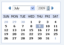
A chooseDate component.
|
Oracle Fusion Middleware Tag Reference for Oracle ADF Faces 12c (12.2.1.4.0) E81455-02 |
UIComponent class: oracle.adf.view.rich.component.rich.input.RichChooseDate
Component type: oracle.adf.RichChooseDate
The chooseDate component is used in conjunction with a inputDate to allow the user to quickly select a date value without having to navigate to a secondary window. The chooseDate is typically used for tasks where selecting a date value is a critical part of the task flow. Instead of requiring the user to select the date from a secondary window, a chooseDate can be displayed inline in the page contents. Users can then select a date directly within the chooseDate, which will cause the currently focused inputDate to be updated with the selected date.
In order to indicate that a particular inputDate should be updated in response to chooseDate selection changes, the inputDate's "chooseId" attribute must be set to the id of the associated chooseDate component.
<af:chooseDate id="cd1"/>
<af:inputDate chooseId="cd1"
              value="#{demoInput.date}"
              label="Date: "
              id="id1"/>
| Type | Phases | Description |
|---|---|---|
| org.apache.myfaces.trinidad.event.AttributeChangeEvent | Invoke Application, Apply Request Values |
Event delivered to describe an attribute change. Attribute change events are not delivered for any programmatic change to a property. They are only delivered when a renderer changes a property without the application's specific request. An example of an attribute change event might include the width of a column that supported client-side resizing. |
| Name | Type | Supports EL? | Description |
|---|---|---|---|
| attributeChangeListener | javax.el.MethodExpression | Only EL | a method reference to an attribute change listener. Attribute change events are not delivered for any programmatic change to a property. They are only delivered when a renderer changes a property without the application's specific request. An example of an attribute change events might include the width of a column that supported client-side resizing. |
| binding | oracle.adf.view.rich.component.rich.input.RichChooseDate | Only EL | an EL reference that will store the component instance on a bean. This can be used to give programmatic access to a component from a backing bean, or to move creation of the component to a backing bean. |
| clientComponent | boolean | Yes |
Default Value: false whether a client-side component will be generated. A component may be generated whether or not this flag is set, but if client Javascript requires the component object, this must be set to true to guarantee the component's presence. Client component objects that are generated today by default may not be present in the future; setting this flag is the only way to guarantee a component's presence, and clients cannot rely on implicit behavior. However, there is a performance cost to setting this flag, so clients should avoid turning on client components unless absolutely necessary. For the components outputText and outputFormatted, setting the clientComponent to true will render id attribute for the html DOM. This ID attribute can alternatively be generated by setting oracle.adf.view.rich.SUPPRESS_IDS to "auto" in web.xml. |
| customizationId | String | Yes | This attribute is deprecated. The 'id' attribute should be used when applying persistent customizations. This attribute will be removed in the next release. |
| defaultValue | java.util.Date | Yes | the default date would be used only when the picker is launched on an empty DateTime input field. When set to a literal value, this will be parsed as "yyyy-MM-dd hh:mm:ss" or "yyyy-MM-dd". In case the time part is not specified, the time components (hours, minutes, seconds, milliseconds) will be zeroed-out. The created Date object will be in the application's timezone. |
| disabledDays | org.apache.myfaces.trinidad.model.DateListProvider | Yes | a binding to an implementation of the org.apache.myfaces.trinidad.model.DateListProvider interface. The getDateList method should generate a List of individual java.util.Date objects which will be rendered as disabled. The Dates must be in the context of the given base Calendar. Note: this binding requires periodic roundtrips. If you just want to disable certain weekdays (e.g. Saturday and Sunday), use the disabledDaysOfWeek attribute! |
| disabledDaysOfWeek | java.util.Set | Yes | a whitespace delimited list of weekdays that should be rendered as disabled in every week. The list should consist of one or more of the following abbreviations: sun, mon, tue, wed, thu, fri, sat. By default all days are enabled. |
| disabledMonths | java.util.Set | Yes | a whitespace delimited list of months that should be rendered as disabled in every year. The list should consist of one or more of the following abbreviations: jan, feb, mar, apr, may, jun, jul, aug, sep, oct, nov, dec. By default all months are enabled. |
| id | String | No |
the identifier for the component. Every component may be named by a component identifier that must conform to the following rules:
|
| inlineStyle | String | Yes | the CSS styles to use for this component. This is intended for basic style changes. The inlineStyle is a set of CSS styles that are applied to the root DOM element of the component. Be aware that because of browser CSS precedence rules, CSS rendered on a DOM element takes precedence over external stylesheets like the skin file. Therefore skins will not be able to override what you set on this attribute. If the inlineStyle's CSS properties do not affect the DOM element you want affected, then you will have to create a skin and use the skinning keys which are meant to target particular DOM elements, like ::label or ::icon-style. |
| layout | String[] | Yes |
Allows fine control over layout and ordering of various sections of the wall calendar. The sections may be combined in any order to create a layout that makes best sense for the given use case. Allowed values are: navigator, compactNavigator, date. Each section has a specific purpose as described below.
The skin exposes a skin-property named "-tr-layout" to configure the fallback values for layout if none is configured on the component. |
| maxValue | java.util.Date | Yes | the maximum value allowed for the Date value. When set to a fixed value on a tag, this will be parsed as an ISO 8601 date. ISO 8601 dates are of the form "yyyy-MM-dd" (for example: 2002-02-15) and the created Date object will be in the application's timezone, with the time components (hours, minutes, seconds, milliseconds) maximized. All other uses require java.util.Date objects.When binding to Date objects, it is advised to create the Date object with maximum value for any date-time components that aren't displayed (usually hours, minutes, seconds, milliseconds) to allow the largest range of values to be accepted. |
| minValue | java.util.Date | Yes | the minimum value allowed for the Date value. When set to a fixed value on a tag, this will be parsed as an ISO 8601 date. ISO 8601 dates are of the form "yyyy-MM-dd" (for example: 2002-02-15) and the created Date object will be in the application's timezone, with the time components (hours, minutes, seconds, milliseconds) zeroed-out. All other uses require java.util.Date objects.When binding to Date objects, it is advised to create the Date object with zeroed-out values for any date-time components that aren't displayed (usually hours, minutes, seconds, milliseconds) to allow the largest range of values to be accepted. |
| months | int | Yes | Number of months to be shown at once in the date picker. If more than one month is configured, the additional months will be rendered side by side with the selected month centered. If not specified, the attribute value is defaulted based on the skin property -tr-months |
| partialTriggers | String[] | Yes | the IDs of the components that should trigger a partial update. This component will listen on the trigger components. If one of the trigger components receives an event that will cause it to update in some way, this component will request to be updated too. Identifiers are relative to the source component (this component), and must account for NamingContainers. If your component is already inside of a naming container, you can use a single colon to start the search from the root of the page, or multiple colons to move up through the NamingContainers - "::" will pop out of the component's naming container (or itself if the component is a naming container) and begin the search from there, ":::" will pop out of two naming containers (including itself if the component is a naming container) and begin the search from there, etc. |
| rendered | boolean | Yes |
Default Value: true whether the component is rendered. When set to false, no output will be delivered for this component (the component will not in any way be rendered, and cannot be made visible on the client). If you want to change a component's rendered attribute from false to true using PPR, set the partialTrigger attribute of its parent component so the parent refreshes and in turn will render this component. |
| shortDesc | String | Yes |
the short description of the component. The shortDesc text may be used in two different
ways, depending on the component.
For components with images, the shortDesc is often used to render an HTML alt attribute for the image. Please see the accessibility guidelines section for correct alt text usage of the shortDesc attribute. shortDesc is also commonly used to render an HTML title attribute, which is used by user agents to display tooltip help text. In this case the behavior for the tooltip is controlled by the user agent, e.g. Firefox 2 truncates long tooltips. For form components, the shortDesc is displayed in a note window. For components that support the helpTopicId attribute and are not using the shortDesc as image alt text, it is recommended that helpTopicId is used instead of shortDesc as it is more flexible and provides more accessible descriptive text than the use of the title attribute. |
| styleClass | String | Yes | a CSS style class to use for this component. The style class can be defined in your jspx page or in a skinning CSS file, for example, or you can use one of our public style classes, like 'AFInstructionText'. |
| unsecure | java.util.Set | Yes | A whitespace separated list of attributes whose values ordinarily can be set only on the server, but need to be settable on the client. Currently, this is supported only for the "disabled" attribute. Note that when you are able to set a property on the client, you will be allowed to by using the the .setProperty('attribute', newValue) method, but not the .setXXXAttribute(newValue) method. For example, if you have unsecure="disabled", then on the client you can use the method .setProperty('disabled', false), while the method .setDisabled(false) will not work and will provide a javascript error that setDisabled is not a function. |
| visible | boolean | Yes |
Default Value: true the visibility of the component. If it is "false", the component will be hidden on the client. Unlike "rendered", this does not affect the lifecycle on the server - the component may have its bindings executed, etc. - and the visibility of the component can be toggled on and off on the client, or toggled with PPR. When "rendered" is false, the component will not in any way be rendered, and cannot be made visible on the client. In most cases, use the "rendered" property instead of the "visible" property. Not supported on the following renderkits: org.apache.myfaces.trinidad.core |