Screen Shot(s)

Suggestions displayed in list format.
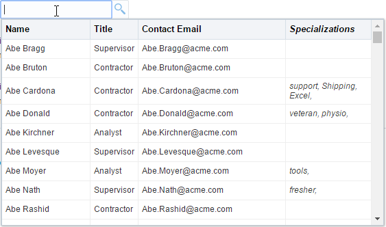
Suggestions displayed in tabular format.
|
Oracle Fusion Middleware Tag Reference for Oracle ADF Faces 12c (12.2.1.4.0) E81455-02 |
UIComponent class: oracle.adf.view.rich.component.rich.input.RichInputSearch
Component type: oracle.adf.RichInputSearch
The inputSearch component uses REST service to fetch the list of suggestions. The component filters and displays the suggestions, highlighting the matched portion of each suggestion. The component allows usage of client side templating to customize the presentation of the suggestions.
The rendering of the component and submission of value happens through the JSF lifecycle. Only the suggestion list is fetched using the REST service.
The REST endpoint URL to be used for fetching the list of suggestions is to be specified on the nested af:searchSection component tag.
Mustache is the templating system supported by the component. The template is to be provided using the contentStamp facet. Mustache tags are evaluated for each suggestion object and the expanded template is rendered as a suggestion item in the suggestions panel.
Usage Guide:Sample inputSearch tag usage
<af:inputSearch id="search"
                          label="Select a person from the list"
                          valueAttribute="id"
                          displayAttributes="fName lName"
                          filterAttributes="fName lName"
                          rowCount="10"
                          value="#{inputSearchDemo.employeesSet}">
                  <f:validator validatorId="oracle.adfdemo.InputSearchDemoValidator" />
              <af:searchSection type="default" dataUrl="/rest/employees" />
            </af:inputSearch>
InputSearch with client side templating for presentation of suggestions
<af:inputSearch id="search"
                        label="Select a person from the list"
                        valueAttribute="id"
                        displayAttributes="fName lName"
                        contentMode="table">
            <af:searchSection type="default" dataUrl="/rest/employees" />
            <f:facet name="contentStamp">
              <af:sanitized>
                <td>{{fName}} {{lName}}</td>
                <td>{{jobTitle}}</td>
                <td>{{email}}</td>
                <td><span style="font-style: italic;">{{tags}}</span></td>
              </af:sanitized>
            </f:facet>
          </af:inputSearch>
| Type | Phases | Description |
|---|---|---|
| javax.faces.event.ValueChangeEvent | Process Validations, Apply Request Values |
The valueChange event is delivered when the value attribute is changed. |
| org.apache.myfaces.trinidad.event.AttributeChangeEvent | Invoke Application, Apply Request Values |
Event delivered to describe an attribute change. Attribute change events are not delivered for any programmatic change to a property. They are only delivered when a renderer changes a property without the application's specific request. An example of an attribute change event might include the width of a column that supported client-side resizing. |
| Name | Description | ||||
|---|---|---|---|---|---|
| contentHeader | HTML Template to be used as a header of the suggestion list in
the inputSearch suggestions panel. Relevant only for table display.
Mustache is the templating system supported by the component.
Example header template:
Ensure the column names is locale translated text either by providing the entire template using value attribute of af:sanitized or by using immediate EL expressions at relevant places to retrieve the translated text in inline af:sanitized content. |
||||
| contentStamp | HTML Template for rendering each suggestion in the inputSearch
suggestions panel. Mustache is the templating system supported by the component.
Mustache tags are evaluated for each suggestion object and the expanded template
is rendered as a suggestion item in the suggestions panel.
In table mode, the template should have td tags for each column needed in the UI. The template should have th scope="row" tag if there is a need for a row header. The list mode templates don't have any such restriction. |
||||
| context | Location for contextual information. A contextInfo component is expected. | ||||
| toolbar | A facet for placing custom controls in the inputSearch suggestions panel. |
| Name | Type | Supports EL? | Description |
|---|---|---|---|
| accessKey | char | Yes |
a character used to gain quick access to
the form element specified by the
This attribute is sometimes referred to as the "mnemonic". Note that the accessKey is triggered by browser-specific and platform-specific modifier keys. It even has browser-specific meaning. For example, Internet Explorer will set focus when you press Alt+<accessKey>. Firefox sets focus on some operating systems when you press Alt+Shift+<accessKey>. Firefox on other operating systems sets focus when you press Control+<accessKey>. Refer to your browser's documentation for how it treats access keys. |
| attributeChangeListener | javax.el.MethodExpression | Only EL | a method reference to an attribute change listener. Attribute change events are not delivered for any programmatic change to a property. They are only delivered when a renderer changes a property without the application's specific request. An example of an attribute change events might include the width of a column that supported client-side resizing. |
| autoSubmit | boolean | Yes |
Default Value: false an attribute which if set to TRUE on a form element, the component will automatically submit when an appropriate action takes place (a click, text change, etc.). Since autoSubmit is a partial submit, also submitted and re-rendered are any other components with partialTriggers pointing to this component. |
| binding | oracle.adf.view.rich.component.rich.input.RichInputSearch | Only EL | an EL reference that will store the component instance on a bean. This can be used to give programmatic access to a component from a backing bean, or to move creation of the component to a backing bean. |
| changed | boolean | Yes |
Default Value: false an attribute which if set to true, the changed indicator icon will be displayed on the component. |
| changedDesc | String | Yes | the text commonly used by user agents to display tooltip text on the changed indicator icon. Default value is "Changed". The behavior of the tooltip is controlled by the user agent, e.g. Firefox 2 truncates long tooltips. |
| clientComponent | boolean | Yes |
Default Value: false whether a client-side component will be generated. A component may be generated whether or not this flag is set, but if client Javascript requires the component object, this must be set to true to guarantee the component's presence. Client component objects that are generated today by default may not be present in the future; setting this flag is the only way to guarantee a component's presence, and clients cannot rely on implicit behavior. However, there is a performance cost to setting this flag, so clients should avoid turning on client components unless absolutely necessary. For the components outputText and outputFormatted, setting the clientComponent to true will render id attribute for the html DOM. This ID attribute can alternatively be generated by setting oracle.adf.view.rich.SUPPRESS_IDS to "auto" in web.xml. |
| columns | int | Yes | The size of the text control specified by the number of characters shown. The number of columns is estimated based on the default font size of the browser. |
| contentMode | oracle.adf.view.rich.component.rich.input.RichInputSearch.ContentMode | Yes |
Default Value: LIST Indicates the rendering mode of contentStamp facet. Valid values to be used in tag: list, table. For programmatic usage, use the enumerated constants from RichInputSearch.ContentMode. |
| contentStyle | String | Yes | the style of the content piece of the component. You can style width by setting this attribute like this: width: 100px. Be aware that because of browser CSS precedence rules, CSS rendered on a DOM element takes precedence over external stylesheets like the skin file. Therefore skins will not be able to override what you set on this attribute. |
| converter | javax.faces.convert.Converter | Yes | a converter object |
| criteria | oracle.adf.view.rich.component.rich.input.RichInputSearch.Criteria | Yes |
Default Value: AUTO Indicates the search criteria. Valid Values to be used in the tag:
|
| customizationId | String | Yes | This attribute is deprecated. The 'id' attribute should be used when applying persistent customizations. This attribute will be removed in the next release. |
| disabled | boolean | Yes |
Default Value: false whether the element is disabled. Unlike a readonly component, a disabled component is unable to receive focus. If the component has the potential to have a scrollbar, and you want the user to be able to scroll through the component's text or values, use the 'readOnly' attribute, not the 'disabled' attribute. |
| displayAttributes | java.util.List | Yes | The collection item properties from the REST response data whose values represent the selection. This attribute decides the value to be displayed in the input field on selection. If displayAttributes isn't specified, it defaults to valueAttribute. |
| editable | String | Yes |
Valid Values: inherit, always, onAccess Default Value: inherit the editable look and feel to use for input components. 'always' indicates that the input component should always look editable. 'onAccess' indicates that the input will only look editable when accessed (hover, focus). 'inherit' indicates that we want to use the component parent's setting. None of the ancestor components define 'always' or 'onAccess', then 'always' will be used. |
| filter | String | Yes |
This attribute holds the name of the JS callback that would
perform Array.filter operation on the collection returned from the REST response.
The JS callback is to be used to filter the suggestions list based on any conditions,
and display only a subset of suggestions in the suggestions popup.
The component instance will be set as context during JS callback invocation.
The row object passed to the callback will have the structure below
{
          'EmpNo': 1234,
          'Ename': 'Somename'
        }
the object passed to this method will be of format {
'data': {
'EmpNo': 1234,
'Ename': 'Somename'
},
'index': 24,
'key': 1234
}
Sample JS method: function dependencyFiltering(rowObj, rowIndex)
{
return rowObj.data['dependentAttribute'] == parentComponentValue;
}
Note: This method is not invoked when attempting server filtering. This filtering of collection is expected to be done on the server during server filtering |
| filterAttributes | java.util.List | Yes | The collection item properties from the REST response data to be used for filtering suggestions. If filterAttributes isn't specified, it defaults to displayAttributes. In the case where contentStamp facet isn't provided, the values displayed in the suggestions popup is also decided by this attribute. Note: While it is legal to specify an attribute that is NOT displayed in the suggestions panel as a filterable attribute, it could be confusing for the end user to see the suggestions being filtered based on such an attribute. |
| helpTopicId | String | Yes | the id used to look up a topic in a helpProvider. |
| id | String | No |
the identifier for the component. Every component may be named by a component identifier that must conform to the following rules:
|
| immediate | boolean | Yes |
Default Value: false whether the value is converted and validated immediately in the Apply Request Values phase, or is handled in the Process Validators phase, the default. By default, values are converted and validated together in the Process Validators phase. However, if you need access to the value of a component during Apply Request Values - for example, if you need to get the value from an actionListener on an immediate commandButton - then setting this to "immediate" makes that possible. |
| inlineStyle | String | Yes | the CSS styles to use for this component. This is intended for basic style changes. The inlineStyle is a set of CSS styles that are applied to the root DOM element of the component. Be aware that because of browser CSS precedence rules, CSS rendered on a DOM element takes precedence over external stylesheets like the skin file. Therefore skins will not be able to override what you set on this attribute. If the inlineStyle's CSS properties do not affect the DOM element you want affected, then you will have to create a skin and use the skinning keys which are meant to target particular DOM elements, like ::label or ::icon-style. |
| label | String | Yes | the label of the component. If you want the label to appear above the control, use a panelFormLayout. |
| labelAndAccessKey | String | Yes |
An attribute that will simultaneously set both the "label"
and "accessKey" attributes from a single value, using
conventional ampersand ('&') notation.
For example, setting this attribute to "L&abel" will set the label to "Label" and the access key to 'a'. |
| labelStyle | String | Yes | the CSS styles to use for the label of this component. The labelStyle is a set of CSS styles that are applied to the label DOM element of the component. This allows a label to be styled without requiring a new skin definition. |
| partialTriggers | String[] | Yes | the IDs of the components that should trigger a partial update. This component will listen on the trigger components. If one of the trigger components receives an event that will cause it to update in some way, this component will request to be updated too. Identifiers are relative to the source component (this component), and must account for NamingContainers. If your component is already inside of a naming container, you can use a single colon to start the search from the root of the page, or multiple colons to move up through the NamingContainers - "::" will pop out of the component's naming container (or itself if the component is a naming container) and begin the search from there, ":::" will pop out of two naming containers (including itself if the component is a naming container) and begin the search from there, etc. |
| placeholder | String | Yes | Text to be displayed in the input component when a value is not present. |
| protectionKey | String | Yes | protection key for this component |
| readOnly | boolean | Yes |
Default Value: false whether the control is displayed as an editable field or as an output-style text control. Unlike a disabled component, a readonly component is able to receive focus. |
| rendered | boolean | Yes |
Default Value: true whether the component is rendered. When set to false, no output will be delivered for this component (the component will not in any way be rendered, and cannot be made visible on the client). If you want to change a component's rendered attribute from false to true using PPR, set the partialTrigger attribute of its parent component so the parent refreshes and in turn will render this component. |
| required | boolean | Yes |
Default Value: false whether a non-null, non-empty value must be entered. If false, required validation logic will not be executed when the value is null or empty. |
| requiredMessageDetail | String | Yes |
the message to be displayed, if 'required' validation fails.
Parameters:
|
| rowCount | int | Yes |
Default Value: -1 Max number of rows shown in the suggestion panel before scrolling. If -1 is the value, the row count is determined by the ADF skin property -tr-row-count |
| selectionConverter | javax.el.MethodExpression | Only EL | A method reference to convert the members of the Map object returned by getSelection() method. The method should convert both the key and value (value is a Map, so the members of the value Map should also be converted) returned by getSelection() method to the appropriate Java types. |
| selectionMode | oracle.adf.view.rich.component.rich.input.RichInputSearch.SelectionMode | Yes |
Default Value: SINGLE Indicates whether the component should support only single selections or multiple selections. Valid values to be used in tag: single, multiple. For programmatic usage, use the enumerated constants from RichInputSearch.SelectionMode. Note: If the suggestions list is too long and will be paged, then filterParameters attribute will have to be configured on default searchSection with criteria type AdfRichInputSearch.CRITERIA_VALUE_EQUALS to obtain the full suggestion objects for the initial selected values. |
| shortDesc | String | Yes |
the short description of the component. The shortDesc text may be used in two different
ways, depending on the component.
For components with images, the shortDesc is often used to render an HTML alt attribute for the image. Please see the accessibility guidelines section for correct alt text usage of the shortDesc attribute. shortDesc is also commonly used to render an HTML title attribute, which is used by user agents to display tooltip help text. In this case the behavior for the tooltip is controlled by the user agent, e.g. Firefox 2 truncates long tooltips. For form components, the shortDesc is displayed in a note window. For components that support the helpTopicId attribute and are not using the shortDesc as image alt text, it is recommended that helpTopicId is used instead of shortDesc as it is more flexible and provides more accessible descriptive text than the use of the title attribute. |
| showRequired | boolean | Yes |
Default Value: false whether the associated control displays a visual indication of required user input. If a "required" attribute is also present, both the "required" attribute and the "showRequired" attribute must be false for the visual indication not to be displayed. An example of when it can be desirable to use the showRequired property is if you have a field that is initially empty and is required only if some other field on the page is touched. |
| simple | boolean | Yes |
Default Value: false a boolean value that controls whether the component provides label support; when set to "true", the component will not display the label (these may be ignored: label, labelAndAccessKey, accessKey, showRequired, help facet) and may use simpler layout primitives. One of the usecases can be when the component is used in repeatable elements like in table, for-each etc., where label is not required. |
| styleClass | String | Yes | a CSS style class to use for this component. The style class can be defined in your jspx page or in a skinning CSS file, for example, or you can use one of our public style classes, like 'AFInstructionText'. |
| unsecure | java.util.Set | Yes | A whitespace separated list of attributes whose values ordinarily can be set only on the server, but need to be settable on the client. Currently, this is supported only for the "disabled" attribute. Note that when you are able to set a property on the client, you will be allowed to by using the the .setProperty('attribute', newValue) method, but not the .setXXXAttribute(newValue) method. For example, if you have unsecure="disabled", then on the client you can use the method .setProperty('disabled', false), while the method .setDisabled(false) will not work and will provide a javascript error that setDisabled is not a function. |
| usage | String | Yes |
Valid Values: auto, text, search Default Value: auto The usage attribute will set the type of the input to allow for different html types (such as search, email, tel etc). Currently, auto will default to text but may in the future conditionally default to some other type. Html types with strict input validation rules (ex: date, number) should be avoided or used with discretion, since they can potentially interfere with the normal functioning of the component and converter. |
| validator | javax.faces.el.MethodBinding | Only EL | a method reference to a validator method |
| value | Object | Yes | the value of the component. If the EL binding for the "value" points to a bean property with a getter but no setter, and this is an editable component, the component will be rendered in read-only mode. |
| valueAttribute | String | Yes |
The collection item property in REST response data on which the component is defined on.
The values of this attribute should be unique.
e.g. If the component is being used for displaying (and filtering) employee details, Employee Number is a good candidate to be chosen as value attribute. |
| valueChangeListener | javax.faces.el.MethodBinding | Only EL | a method reference to a value change listener |
| visible | boolean | Yes |
Default Value: true the visibility of the component. If it is "false", the component will be hidden on the client. Unlike "rendered", this does not affect the lifecycle on the server - the component may have its bindings executed, etc. - and the visibility of the component can be toggled on and off on the client, or toggled with PPR. When "rendered" is false, the component will not in any way be rendered, and cannot be made visible on the client. In most cases, use the "rendered" property instead of the "visible" property. Not supported on the following renderkits: org.apache.myfaces.trinidad.core |