Screen Shot(s)

An inputText component in a simple form.
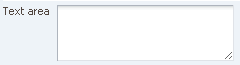
A multi-row inputText component in a simple form.
|
Oracle Fusion Middleware Tag Reference for Oracle ADF Faces 12c (12.2.1.4.0) E81455-02 |
UIComponent class: oracle.adf.view.rich.component.rich.input.RichInputText
Component type: oracle.adf.RichInputText
The inputText component creates a browser input text widget. Depending on the value of "rows", this component either maps to a single-row text field or a multi-row text area.It also supports displaying a label, text, and messages.
If the input should be hidden from the user while displayed, such as for passwords, the secret property should be set to "true".
If the input has readOnly=true, it will display like an outputText, i.e. no borders.
Simple text input box with some default text and a label.
<af:form>
  <af:inputText label="Input:"
                value="Some text"/>
</af:form>
A slightly more interesting example showing a text box twenty five characters in length with hidden input text.
<af:inputText label="Password:"
              columns="25"
              required="no"
              secret="true"/>
A text input box which will display three rows of wrapped input text, with a vertical scrollbar.
<af:inputText label="Alert:"
              rows="3"
              wrap="soft"/>
| Type | Phases | Description |
|---|---|---|
| javax.faces.event.ValueChangeEvent | Process Validations, Apply Request Values |
The valueChange event is delivered when the value attribute is changed. |
| org.apache.myfaces.trinidad.event.AttributeChangeEvent | Invoke Application, Apply Request Values |
Event delivered to describe an attribute change. Attribute change events are not delivered for any programmatic change to a property. They are only delivered when a renderer changes a property without the application's specific request. An example of an attribute change event might include the width of a column that supported client-side resizing. |
| Name | Description |
|---|---|
| context | Location for contextual information. A contextInfo component is expected. |
| help | This facet is deprecated, helpTopicId should be used for providing help. This is a no-op for form components. |
| Name | Type | Supports EL? | Description |
|---|---|---|---|
| accessKey | char | Yes |
a character used to gain quick access to
the form element specified by the
This attribute is sometimes referred to as the "mnemonic". Note that the accessKey is triggered by browser-specific and platform-specific modifier keys. It even has browser-specific meaning. For example, Internet Explorer will set focus when you press Alt+<accessKey>. Firefox sets focus on some operating systems when you press Alt+Shift+<accessKey>. Firefox on other operating systems sets focus when you press Control+<accessKey>. Refer to your browser's documentation for how it treats access keys. |
| attributeChangeListener | javax.el.MethodExpression | Only EL | a method reference to an attribute change listener. Attribute change events are not delivered for any programmatic change to a property. They are only delivered when a renderer changes a property without the application's specific request. An example of an attribute change events might include the width of a column that supported client-side resizing. |
| autoComplete | String | Yes |
Valid Values: on, off Default Value: off whether previous values of text fields in the form should be remembered and offered for auto completion. |
| autoSubmit | boolean | Yes |
Default Value: false an attribute which if set to TRUE on a form element, the component will automatically submit when an appropriate action takes place (a click, text change, etc.). Since autoSubmit is a partial submit, also submitted and re-rendered are any other components with partialTriggers pointing to this component. |
| autoTab | boolean | Yes |
Default Value: false whether focus will automatically move to the next tabstop when the maximum length for the current component is reached. Currently, this feature is not supported for mobile Safari. |
| binding | oracle.adf.view.rich.component.rich.input.RichInputText | Only EL | an EL reference that will store the component instance on a bean. This can be used to give programmatic access to a component from a backing bean, or to move creation of the component to a backing bean. |
| changed | boolean | Yes |
Default Value: false an attribute which if set to true, the changed indicator icon will be displayed on the component. |
| changedDesc | String | Yes | the text commonly used by user agents to display tooltip text on the changed indicator icon. Default value is "Changed". The behavior of the tooltip is controlled by the user agent, e.g. Firefox 2 truncates long tooltips. |
| characterCountBy | String | Yes | the method to count surrogate pair characters. codeUnit counts surrogate pair characters as 2 logical characters. codePoint counts surrogate pair characters as 1 logical character. This is used for determining if a value exceeds the maximumLength attribute. |
| clientComponent | boolean | Yes |
Default Value: false whether a client-side component will be generated. A component may be generated whether or not this flag is set, but if client Javascript requires the component object, this must be set to true to guarantee the component's presence. Client component objects that are generated today by default may not be present in the future; setting this flag is the only way to guarantee a component's presence, and clients cannot rely on implicit behavior. However, there is a performance cost to setting this flag, so clients should avoid turning on client components unless absolutely necessary. For the components outputText and outputFormatted, setting the clientComponent to true will render id attribute for the html DOM. This ID attribute can alternatively be generated by setting oracle.adf.view.rich.SUPPRESS_IDS to "auto" in web.xml. |
| columns | int | Yes | the size of the text control specified by the number of characters shown. The number of columns is estimated based on the default font size of the browser. |
| contentStyle | String | Yes | the style of the content piece of the component. You can style width by setting this attribute like this: width: 100px. Be aware that because of browser CSS precedence rules, CSS rendered on a DOM element takes precedence over external stylesheets like the skin file. Therefore skins will not be able to override what you set on this attribute. |
| converter | javax.faces.convert.Converter | Yes | a converter object |
| customizationId | String | Yes | This attribute is deprecated. The 'id' attribute should be used when applying persistent customizations. This attribute will be removed in the next release. |
| dimensionsFrom | String | Yes |
Valid Values: auto, content, parent Default Value: content determines how the component will handle geometry management (when the simple attribute is true). This specifies where the dimensions of the inputText come from:
|
| disabled | boolean | Yes |
Default Value: false whether the element is disabled. Unlike a readonly component, a disabled component is unable to receive focus. If the component has the potential to have a scrollbar, and you want the user to be able to scroll through the component's text or values, use the 'readOnly' attribute, not the 'disabled' attribute. |
| editable | String | Yes |
Valid Values: inherit, always, onAccess Default Value: inherit the editable look and feel to use for input components. 'always' indicates that the input component should always look editable. 'onAccess' indicates that the input will only look editable when accessed (hover, focus). 'inherit' indicates that we want to use the component parent's setting. None of the ancestor components define 'always' or 'onAccess', then 'always' will be used. |
| helpTopicId | String | Yes | the id used to look up a topic in a helpProvider. |
| id | String | No |
the identifier for the component. Every component may be named by a component identifier that must conform to the following rules:
|
| immediate | boolean | Yes |
Default Value: false whether the value is converted and validated immediately in the Apply Request Values phase, or is handled in the Process Validators phase, the default. By default, values are converted and validated together in the Process Validators phase. However, if you need access to the value of a component during Apply Request Values - for example, if you need to get the value from an actionListener on an immediate commandButton - then setting this to "immediate" makes that possible. |
| inlineStyle | String | Yes | the CSS styles to use for this component. This is intended for basic style changes; you should use the skinning mechanism if you require any complex style changes. The inlineStyle is a set of CSS styles that are applied to the root DOM element of the component. Be aware that because of browser CSS precedence rules, CSS rendered on a DOM element takes precedence over external stylesheets like the skin file. Therefore skins will not be able to override what you set on this attribute. Many components are composed of several DOM elements which may have their own styles applied to them. Defining a style in the inlineStyle may not always give you what you want. For example, if one of the inner DOM elements for this component has a background color specified for it in the skin, setting a background color in the inlineStyle may not provide any visible change (at least for where that inner DOM element exists) because the inner DOM element's background color will win (since that DOM element is essentially layered on top of the root element). In cases like this, you can use a different skin (or define your own) that defines a skinning key for that inner DOM element where its background color is inhibited (e.g. with -tr-inhibit: background-color) or otherwise set to the color you want. |
| label | String | Yes | the label of the component. If you want the label to appear above the control, use a panelFormLayout. |
| labelAndAccessKey | String | Yes |
an attribute that will simultaneously set both the "label" and "accessKey" attributes from a single value, using conventional ampersand ('&') notation. For example, setting this attribute to "L&abel" will set the label to "Label" and the access key to 'a'. |
| labelStyle | String | Yes | the CSS styles to use for the label of this component. The labelStyle is a set of CSS styles that are applied to the label DOM element of the component. This allows a label to be styled without requiring a new skin definition. |
| maximumLength | int | Yes |
the maximum number of characters that can be entered into the text control. This includes the characters representing the new line. If set to 0 or less, the maximumLength is ignored. Note that in some browsers like IE new line is treated as two characters. |
| partialTriggers | String[] | Yes | the IDs of the components that should trigger a partial update. This component will listen on the trigger components. If one of the trigger components receives an event that will cause it to update in some way, this component will request to be updated too. Identifiers are relative to the source component (this component), and must account for NamingContainers. If your component is already inside of a naming container, you can use a single colon to start the search from the root of the page, or multiple colons to move up through the NamingContainers - "::" will pop out of the component's naming container (or itself if the component is a naming container) and begin the search from there, ":::" will pop out of two naming containers (including itself if the component is a naming container) and begin the search from there, etc. |
| placeholder | String | Yes | Text to be displayed in the input component when a value is not present. |
| protectionKey | String | Yes | protection key for this component |
| readOnly | boolean | Yes |
Default Value: false whether the control is displayed as an editable field or as an output-style text control. Unlike a disabled component, a readonly component is able to receive focus. |
| rendered | boolean | Yes |
Default Value: true whether the component is rendered. When set to false, no output will be delivered for this component (the component will not in any way be rendered, and cannot be made visible on the client). If you want to change a component's rendered attribute from false to true using PPR, set the partialTrigger attribute of its parent component so the parent refreshes and in turn will render this component. |
| required | boolean | Yes |
Default Value: false whether a non-null, non-empty value must be entered. If false, required validation logic will not be executed when the value is null or empty. |
| requiredMessageDetail | String | Yes |
the message to be displayed, if 'required' validation fails.
Parameters:
|
| rows | int | Yes |
Default Value: 1 the height of the text control specified by the number of characters shown. The default value is 1, which generates a one-row input field. The number of rows is estimated based on the default font size of the browser. |
| secret | boolean | Yes |
Default Value: false a boolean value that only applies to single line text controls. When set to "true", it hides the actual value of the text from the user, and will prevent the actual "value" from being shown to the user. When the user manually enters a value, each character will appear as an *. After the value is posted to the server, the value (if not null) will always appear (and be sent to the client) as "******", or whichever value is defined in UIConstants.SECRET_FIELD_DEFAULT_VALUE. If secret is set to true, be sure to not use a converter or validator tag with this inputText which would expose the value the user entered via its messages. |
| shortDesc | String | Yes |
the short description of the component. The shortDesc text may be used in two different
ways, depending on the component.
For components with images, the shortDesc is often used to render an HTML alt attribute for the image. Please see the accessibility guidelines section for correct alt text usage of the shortDesc attribute. shortDesc is also commonly used to render an HTML title attribute, which is used by user agents to display tooltip help text. In this case the behavior for the tooltip is controlled by the user agent, e.g. Firefox 2 truncates long tooltips. For form components, the shortDesc is displayed in a note window. For components that support the helpTopicId attribute and are not using the shortDesc as image alt text, it is recommended that helpTopicId is used instead of shortDesc as it is more flexible and provides more accessible descriptive text than the use of the title attribute. |
| showRequired | boolean | Yes |
Default Value: false whether the associated control displays a visual indication of required user input. If a "required" attribute is also present, both the "required" attribute and the "showRequired" attribute must be false for the visual indication not to be displayed. An example of when it can be desirable to use the showRequired property is if you have a field that is initially empty and is required only if some other field on the page is touched. |
| simple | boolean | Yes |
Default Value: false a boolean value that controls whether the component provides label support; when set to "true", the component will not display the label (these may be ignored: label, labelAndAccessKey, accessKey, showRequired, help facet) and may use simpler layout primitives. One of the usecases can be when the component is used in repeatable elements like in table, for-each etc., where label is not required. |
| spellCheck | String | Yes |
Valid Values: on, off, default Default Value: default determines if the inputText will highlight misspelled words.
|
| styleClass | String | Yes |
a CSS style class to use for this component. The styleClass attribute value is rendered on the root dom element. We provide some public style classes you can set the styleClass to that will affect only the 'content' piece of the component. These are: AFAddressFieldTextMarker, AFPostalCodeFieldTextMarker, AFPhoneFieldTextMarker, AFFieldNumberMarker, AFFieldTextLTRMarker, AFFieldTextMarker, AFFieldNumberMarker. In LTR languages, these styles have no effect by default, other than AFFieldNumberMarker which right aligns the text. They have more styling in RTL mode. If needed, you can skin the public style definitions for these marker style classes (e.g., AFAddressFieldText, AFPostalCodeFieldText, etc.) and it will be picked up by using these "Marker" style class because in our base skin implementation we map to the public style by doing this: af|inputText.AFFieldNumberMarker af|inputText::content {-tr-rule-ref:selector(".AFFieldNumber")}. We recommend that you do not add style properties to the "Marker" style classes, since they are used solely in the CSS descendant selector to point to the content pseudo-element. |
| unsecure | java.util.Set | Yes | A whitespace separated list of attributes whose values ordinarily can be set only on the server, but need to be settable on the client. Currently, this is supported only for the "disabled" attribute. Note that when you are able to set a property on the client, you will be allowed to by using the the .setProperty('attribute', newValue) method, but not the .setXXXAttribute(newValue) method. For example, if you have unsecure="disabled", then on the client you can use the method .setProperty('disabled', false), while the method .setDisabled(false) will not work and will provide a javascript error that setDisabled is not a function. |
| usage | String | Yes |
Valid Values: auto, text, search Default Value: auto The usage attribute will set the type of the input to allow for different html types (such as search). Currently only auto, text and search are valid. auto is the default. Currently, auto will default to text but may in the future conditionally default to some other type. This attribute is ignored for rows > 1. |
| validator | javax.faces.el.MethodBinding | Only EL | a method reference to a validator method |
| value | Object | Yes | the value of the component. If the EL binding for the "value" points to a bean property with a getter but no setter, and this is an editable component, the component will be rendered in read-only mode. |
| valueChangeListener | javax.faces.el.MethodBinding | Only EL | a method reference to a value change listener |
| visible | boolean | Yes |
Default Value: true the visibility of the component. If it is "false", the component will be hidden on the client. Unlike "rendered", this does not affect the lifecycle on the server - the component may have its bindings executed, etc. - and the visibility of the component can be toggled on and off on the client, or toggled with PPR. When "rendered" is false, the component will not in any way be rendered, and cannot be made visible on the client. In most cases, use the "rendered" property instead of the "visible" property. Not supported on the following renderkits: org.apache.myfaces.trinidad.core |
| wrap | String | Yes |
Valid Values: soft, hard, off the type of text wrapping to be used in a multi-row text control. This attribute is ignored for single row inputText. By default (or "soft"), multirow text wraps visually, but does not include carriage returns in the submitted value. Setting this to "off" will disable wrapping; the multirow text will scroll horizontally. Setting it to "hard" specifies that the value of the text should include any carriage returns needed to wrap the lines. |