Screen Shot(s)
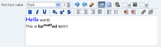
RichTextEditor component.
|
Oracle Fusion Middleware Tag Reference for Oracle ADF Faces 12c (12.2.1.4.0) E81455-02 |
UIComponent class: oracle.adf.view.rich.component.rich.input.RichTextEditor
Component type: oracle.adf.RichTextEditor
The richTextEditor component creates an input widget for rich text formatting. It also supports displaying a label, text, and messages. As a convenience the richTextEditor component supports footer facets. There is more specific documentation about the facets in the "Supported Facets" section.
The supported features are:
The value is a well-formed XHTML-fragment. Due to browser limitations, the value may be altered. If there are tags or styles that are not editable in a particular browser, we transform the tags/styles into something that the specific browser can edit. Also, for security reasons, some features such as script-related tags and attributes will be removed.
There are no guarantees that this component only records the minimal changes made by the user. As a result of editing an XHTML document, this component might change:
Only html 4 tags are supported, with the exception of those listed below
We do support tags that pull in content such as applet, iframe, img, and a. For iframe in particular the browsers only allow interactions with content from the same domain, so the content in these should not be able to interact with the rest of the page. However be aware that this portion of the page is not under the control of the application. For example the content of an iframe may have content asking for a password.
"Font Size" only works with the font sizes 1-7 as described in the HTML specification for the <font>-element. There is no support for other units such as px or em.
On the client, there is no support for getValue / setValue.
We can not guarantee that the value is the same as the value on the server (see Format
of the value). Due to this, there is also no support for client-side converters and
validators. Server-side converters and validators will still work as usual.
To make the rich text editor component's width 100%, set simple to true, inlineStyle to "width: 100%" and contentStyle to "width: 100%" too.
              <af:richTextEditor
                simple="true"
                inlineStyle="width: 100%;"
                contentStyle="width: 100%;"/>
Note: This only works reliably when contained in geometry-managing parents; if placed in a flowing layout container such as a panelFormLayout or a panelGroupLayout, 100% widths may not work reliably.
Simple input box with the some default text and a label.
<af:form id="f1">
  <af:richTextEditor label="Input:" value="#{myBean.value}" id="rte1"/>
</af:form>
| Type | Phases | Description |
|---|---|---|
| javax.faces.event.ValueChangeEvent | Process Validations, Apply Request Values |
The valueChange event is delivered when the value attribute is changed. |
| org.apache.myfaces.trinidad.event.AttributeChangeEvent | Invoke Application, Apply Request Values |
Event delivered to describe an attribute change. Attribute change events are not delivered for any programmatic change to a property. They are only delivered when a renderer changes a property without the application's specific request. An example of an attribute change event might include the width of a column that supported client-side resizing. |
| Name | Description |
|---|---|
| footer | Content to be rendered as a footer. |
| help | This facet is deprecated, helpTopicId should be used for providing help. This is a no-op for form components. |
| Name | Type | Supports EL? | Description |
|---|---|---|---|
| accessKey | char | Yes |
a character used to gain quick access to
the form element specified by the
This attribute is sometimes referred to as the "mnemonic". Note that the accessKey is triggered by browser-specific and platform-specific modifier keys. It even has browser-specific meaning. For example, Internet Explorer will set focus when you press Alt+<accessKey>. Firefox sets focus on some operating systems when you press Alt+Shift+<accessKey>. Firefox on other operating systems sets focus when you press Control+<accessKey>. Refer to your browser's documentation for how it treats access keys. |
| attributeChangeListener | javax.el.MethodExpression | Only EL | a method reference to an attribute change listener. Attribute change events are not delivered for any programmatic change to a property. They are only delivered when a renderer changes a property without the application's specific request. An example of an attribute change events might include the width of a column that supported client-side resizing. |
| autoSubmit | boolean | Yes |
Default Value: false an attribute which if set to TRUE on a form element, the component will automatically submit when an appropriate action takes place (a click, text change, etc.). Since autoSubmit is a partial submit, also submitted and re-rendered are any other components with partialTriggers pointing to this component. |
| binding | oracle.adf.view.rich.component.rich.input.RichTextEditor | Only EL | an EL reference that will store the component instance on a bean. This can be used to give programmatic access to a component from a backing bean, or to move creation of the component to a backing bean. |
| changed | boolean | Yes |
Default Value: false an attribute which if set to true, the changed indicator icon will be displayed on the component. |
| changedDesc | String | Yes | the text commonly used by user agents to display tooltip text on the changed indicator icon. Default value is "Changed". The behavior of the tooltip is controlled by the user agent, e.g. Firefox 2 truncates long tooltips. |
| clientComponent | boolean | Yes |
Default Value: false whether a client-side component will be generated. A component may be generated whether or not this flag is set, but if client Javascript requires the component object, this must be set to true to guarantee the component's presence. Client component objects that are generated today by default may not be present in the future; setting this flag is the only way to guarantee a component's presence, and clients cannot rely on implicit behavior. However, there is a performance cost to setting this flag, so clients should avoid turning on client components unless absolutely necessary. For the components outputText and outputFormatted, setting the clientComponent to true will render id attribute for the html DOM. This ID attribute can alternatively be generated by setting oracle.adf.view.rich.SUPPRESS_IDS to "auto" in web.xml. |
| columns | int | Yes | the width of the text control specified by the approximate number of characters shown. |
| contentDelivery | String | Yes |
Valid Values: immediate, lazy Default Value: immediate whether content should be fetched when the component is rendered initially. When contentDelivery is "immediate", data is fetched and inlined into the component chrome. If contentDelivery is "lazy", content will be fetched and delivered to the client during a subsequent request. |
| contentStyle | String | Yes | the style of the content piece of the component. You can style width by setting this attribute like this: width: 100px. Be aware that because of browser CSS precedence rules, CSS rendered on a DOM element takes precedence over external stylesheets like the skin file. Therefore skins will not be able to override what you set on this attribute. |
| converter | javax.faces.convert.Converter | Yes | a converter object |
| customizationId | String | Yes | This attribute is deprecated. The 'id' attribute should be used when applying persistent customizations. This attribute will be removed in the next release. |
| dimensionsFrom | String | Yes |
Valid Values: auto, content, parent Default Value: content determines how the component will handle geometry management. This specifies where the dimensions of the RTE come from:
|
| disabled | boolean | Yes |
Default Value: false whether the element is disabled. Unlike a readonly component, a disabled component is unable to receive focus. If the component has the potential to have a scrollbar, and you want the user to be able to scroll through the component's text or values, use the 'readOnly' attribute, not the 'disabled' attribute. |
| dontPersist | String[] | Yes | a list of attributes whose changes are NOT to be persisted by FilteredPersistenceChangeManager via the "Persistent Change Manager" registered in adf-config.xml. The token 'ALL' can be used in the list here to indicate that all attribute changes that the component implicitly persists should be excluded. If there is a conflict of values, "dontPersist" always precedes "persist". |
| editMode | String | Yes |
Valid Values: wysiwyg, source the initial editing mode. Use "wysiwyg" for the what-you-see-is-what-you-get mode. Use "source" for the source code editing mode. The attribute defaults to "wysiwyg".phone and tablet agents do not support this attribute and are always in "source" mode. It is very important to note that source mode is not plain text editing. There are no guarantees that this component only records the minimal changes made by the user. This component might change non-meaningful whitespace (new line characters in the source are not preserved), element minimization, element types, order of attributes, or use of character entities. Not supported on the following agents: tablet |
| extraPlugins | java.util.List | Yes | List of extra plugins to be loaded for ckeditor. This will be used only when layout is 'ckeditor'. Default value is 'auto'. Plugins as a feature needs to be opted-in by the container via "oracle.adf.view.rich.component.input.RichTextEditor.ENABLE_EXTRA_PLUGINS" init parameter in the app's web.xml |
| helpTopicId | String | Yes | the id used to look up a topic in a helpProvider. |
| id | String | No |
the identifier for the component. Every component may be named by a component identifier that must conform to the following rules:
|
| immediate | boolean | Yes |
Default Value: false whether the value is converted and validated immediately in the Apply Request Values phase, or is handled in the Process Validators phase, the default. By default, values are converted and validated together in the Process Validators phase. However, if you need access to the value of a component during Apply Request Values - for example, if you need to get the value from an actionListener on an immediate commandButton - then setting this to "immediate" makes that possible. |
| inlineStyle | String | Yes | the CSS styles to use for this component. This is intended for basic style changes. The inlineStyle is a set of CSS styles that are applied to the root DOM element of the component. Be aware that because of browser CSS precedence rules, CSS rendered on a DOM element takes precedence over external stylesheets like the skin file. Therefore skins will not be able to override what you set on this attribute. If the inlineStyle's CSS properties do not affect the DOM element you want affected, then you will have to create a skin and use the skinning keys which are meant to target particular DOM elements, like ::label or ::icon-style. |
| label | String | Yes | the label of the component. If you want the label to appear above the control, use a panelFormLayout. |
| labelAndAccessKey | String | Yes |
an attribute that will simultaneously set both the "label"
and "accessKey" attributes from a single value, using
conventional ampersand ('&') notation.
For example, setting this attribute to "L&abel" will set the label to "Label" and the access key to 'a'. |
| labelStyle | String | Yes | the CSS styles to use for the label of this component. The labelStyle is a set of CSS styles that are applied to the label DOM element of the component. This allows a label to be styled without requiring a new skin definition. |
| layout | String | Yes |
Valid Values: legacy, ckeditor Default Value: legacy Which Rich Text Editor to be shown. Allowed values are legacy or ckeditor. If 'legacy' value is provided, ADF version of RichTextEditor will be used. If 'ckeditor' is provided, RichTextEditor will editor based on third party library 'ckeditor'. Please refer 'https://ckeditor.com/ckeditor-4/' for more details on ckeditor. Current version of ckeditor in use can be found out by product documentation or through browser's console. Find version by checking value of "CKEDITOR4.version" in browser's console. |
| partialTriggers | String[] | Yes | the IDs of the components that should trigger a partial update. This component will listen on the trigger components. If one of the trigger components receives an event that will cause it to update in some way, this component will request to be updated too. Identifiers are relative to the source component (this component), and must account for NamingContainers. If your component is already inside of a naming container, you can use a single colon to start the search from the root of the page, or multiple colons to move up through the NamingContainers - "::" will pop out of the component's naming container (or itself if the component is a naming container) and begin the search from there, ":::" will pop out of two naming containers (including itself if the component is a naming container) and begin the search from there, etc. |
| persist | String[] | Yes | a list of attributes whose changes are to be persisted by FilteredPersistenceChangeManager via the "Persistent Change Manager" registered in adf-config.xml. The token 'ALL' can be used in the list here to indicate that all attribute changes that the component implicitly persists should be included. |
| protectionKey | String | Yes | protection key for this component |
| readOnly | boolean | Yes |
Default Value: false whether the control is displayed as an editable field or as an output-style text control. Unlike a disabled component, a readonly component is able to receive focus. |
| rendered | boolean | Yes |
Default Value: true whether the component is rendered. When set to false, no output will be delivered for this component (the component will not in any way be rendered, and cannot be made visible on the client). If you want to change a component's rendered attribute from false to true using PPR, set the partialTrigger attribute of its parent component so the parent refreshes and in turn will render this component. |
| required | boolean | Yes |
Default Value: false whether a non-null, non-empty value must be entered. If false, required validation logic will not be executed when the value is null or empty. |
| requiredMessageDetail | String | Yes |
the message to be displayed, if 'required' validation fails.
Parameters:
|
| rows | int | Yes | the height of the text control specified by the approximate number of characters shown. |
| shortDesc | String | Yes |
the short description of the component. The shortDesc text may be used in two different
ways, depending on the component.
For components with images, the shortDesc is often used to render an HTML alt attribute for the image. Please see the accessibility guidelines section for correct alt text usage of the shortDesc attribute. shortDesc is also commonly used to render an HTML title attribute, which is used by user agents to display tooltip help text. In this case the behavior for the tooltip is controlled by the user agent, e.g. Firefox 2 truncates long tooltips. For form components, the shortDesc is displayed in a note window. For components that support the helpTopicId attribute and are not using the shortDesc as image alt text, it is recommended that helpTopicId is used instead of shortDesc as it is more flexible and provides more accessible descriptive text than the use of the title attribute. |
| showRequired | boolean | Yes |
Default Value: false whether the associated control displays a visual indication of required user input. If a "required" attribute is also present, both the "required" attribute and the "showRequired" attribute must be false for the visual indication not to be displayed. An example of when it can be desirable to use the showRequired property is if you have a field that is initially empty and is required only if some other field on the page is touched. |
| simple | boolean | Yes |
Default Value: false a boolean value that controls whether the component provides label support; when set to "true", the component will not display the label (these may be ignored: label, labelAndAccessKey, accessKey, showRequired, help facet) and may use simpler layout primitives. One of the usecases can be when the component is used in repeatable elements like in table, for-each etc., where label is not required. |
| styleClass | String | Yes | a CSS style class to use for this component. The style class can be defined in your jspx page or in a skinning CSS file, for example, or you can use one of our public style classes, like 'AFInstructionText'. |
| toolbarDisplay | String | Yes |
Valid Values: inline, popup Default Value: inline how the toolbar should be shown. Possible values are inline or popup. |
| toolboxLayout | String[] | Yes |
Allows control over the layout of the toolbar.
The built in strings the component recognizes are:
Custom toolbox content: when the richTextEditor encounters a string in toolboxLayout that it doesn't recognize, like 'customToolbarXyz', it looks for a facet of that name and renders the content if it finds it. In the future new facets may be added to the richTextEditor. In order to avoid future name clashes strings starting with the word 'custom' should be used for custom facets. We make no guarantees for other names. The toolboxLayout attribute allows the user to
|
| unsecure | java.util.Set | Yes | A whitespace separated list of attributes whose values ordinarily can be set only on the server, but need to be settable on the client. Currently, this is supported only for the "disabled" attribute. Note that when you are able to set a property on the client, you will be allowed to by using the the .setProperty('attribute', newValue) method, but not the .setXXXAttribute(newValue) method. For example, if you have unsecure="disabled", then on the client you can use the method .setProperty('disabled', false), while the method .setDisabled(false) will not work and will provide a javascript error that setDisabled is not a function. |
| validator | javax.faces.el.MethodBinding | Only EL | a method reference to a validator method |
| value | Object | Yes | the value of the component. If the EL binding for the "value" points to a bean property with a getter but no setter, and this is an editable component, the component will be rendered in read-only mode. |
| valueChangeListener | javax.faces.el.MethodBinding | Only EL | a method reference to a value change listener |
| visible | boolean | Yes |
Default Value: true the visibility of the component. If it is "false", the component will be hidden on the client. Unlike "rendered", this does not affect the lifecycle on the server - the component may have its bindings executed, etc. - and the visibility of the component can be toggled on and off on the client, or toggled with PPR. When "rendered" is false, the component will not in any way be rendered, and cannot be made visible on the client. In most cases, use the "rendered" property instead of the "visible" property. Not supported on the following renderkits: org.apache.myfaces.trinidad.core |