Using the Redwood User Interface of Oracle WebCenter Content
Learn about Oracle WebCenter Content’s Redwood UI (user interface), Redwood UI Viewer and Redwood UI Outlook Integration (available on Marketplace).
Introduction
The Redwood UI, Viewer and Outlook Integration introduce a modern interface for WebCenter Content, created with the Oracle Redwood design system. This general-purpose interface is available as an optional standalone client application, enabling users to upload, search, browse, and manage documents within the repository. Additionally, the Redwood UI Viewer allows users to view documents, interact with document properties, and annotate documents. Redwood UI Outlook Integration offer users the ability to interact with documents and folders via Microsoft Outlook.
There are three main entry points to access the Redwood UI features:
- The Redwood UI serves as the main application, offering a wide range of commonly used WebCenter Content features. Within this application, documents are viewed in a drawer.
- The Redwood UI Viewer is a standalone, embeddable version of the document viewer, providing direct URL access for viewing documents. This viewer occupies the entire browser window.
- The Redwood UI Outlook Integration is an add-in for Microsoft Outlook.
Installation
Both the Redwood UI and the Redwood UI Viewer are included in a WebCenter Content component named RedwoodUI. This component is enabled by default in WebCenter Content on Marketplace, but an administrator can enable or disable it using the Component Manager tool found under AdminServer. To verify that the Redwood UI is properly installed, open the Component Manager and ensure that RedwoodUI is enabled. Redwood UI Outlook Integration is included in a WebCenter Content component named WccOutlook listed under Advanced Component Manager in the WebCenter Content web app. This component is disabled by default.

Thumbnails
The Redwood UI leverages WebCenter Content thumbnail renditions, and these are especially prominent when documents are presented in the card layout. By default, WebCenter Content thumbnails are too small for the card presentation and will appear blurry on the screen. To correct this, it is recommended that you configure WebCenter content to generate larger thumbnail renditions. Optimally, the card view thumbnails need a minimum width of 220px and a minimum height of 113px.
WebCenter Content can either be configured to generate the thumbnails directly on the Content server, or thumbnail generation can be delegated to the Inbound Refinery Service Digital Asset Manager feature.
- Content Server Thumbnail Renditions - When Inbound Refinery is not in use, thumbnails can be generated by the WebCenter Content server itself. For this to occur, an administrator must select the Enable this server to create thumbnail images option on the Configuration Thumbnail Options page under Administration. To have the server generate larger thumbnails, set the following in the server config.cfg file.
  ThumbnailWidth=220
ThumbnailHeight=133- Digital Asset Manager - When Inbound Refinery is enabled and the Digital Media Graphics conversion is configured for the documents file type, the thumbnails generated are defined by the renditions set chosen for the document. The default renditions sets for the Digital Media Graphics conversion are ThumbnailOnly, BasicRenditions, and MultipleFormats. Custom rendition sets can also be defined. For clear thumbnails in the Redwood UI, the thumbnails for rendition set should be configured for a minimum width of 220px. This is done by defining the thumbnail rendition type for the set with values.
graphicwidthlimit=220, graphicheightlimit=0See Setting Up and Managing Image Conversions in the WebCenter Content documentation for full details on how to configure Digital Asset Manager rendition sets.
Note: Inbound Refinery thumbnail generation is an asynchronous process and may take several seconds to complete.
The Redwood UI will display a file icon as the thumbnail immediately after a file is uploaded and until the thumbnail generation process is complete.
The Redwood UI
The Redwood UI is a general-purpose user interface providing access to a broad range of WebCenter Content features. It requires minimal training because it is intuitive and simple. With it, you can easily store, secure, retrieve, and share any type of document.
The Redwood UI is accessed using IdcService=REDWOODUI.
.../cs/idcplg?IdcService=REDWOODUINavigation
The Redwood UI is divided into five separate functional areas, or views, each accessible from the navigation menu at the bottom of the screen.
Administrator Configuration
The Configuration drawer, accessed from the user avatar menu at the top right of the branding header, provides general configuration settings for the Redwood UI. These settings affect the experience for all users.

|

|
Custom Branding
You can set a custom logo, logo alt text, and custom branding text. Additionally, you can change the theme used by Redwood UI header to one of nine Oracle Redwood color themes: lilac, ocean, pebble, pine, plum (default), rose sienna, slate, or teal. Changing the theme changes the colors of the user avatar and the color stripe.

The Custom Branding Logo can be any image URL. An image with a height of 40px is recommended. While the image can come from anywhere, it can be convenient to simply use an image stored within WebCenter Content itself. To do this, first upload the image and ensure it is in a public security group. Then open the links properties tab for the image and copy the system generated download link to use in the branding logo configuration.
When the browser width is narrow the logo will be displayed as 40px by 40px, so longer width logos may appear distorted. It is recommended that you configure the Narrow Logo Url with separate logo image to use when when the browser width narrow. It not the Narrow Logo URL is not set, the Log Url value will be used for both.
Redwood UI Configuration
In this section you can configure the default behaviors of the Redwood UI.
Navigation Configuration
You can configure which tabs will be display in the navigation bar by checking tabs that should appear and uncheck those that should not. You must at least check the item that is set in the default navigation setting.
This Personal Folders configuration option determines whether the Personal Folder navigation bar tab is displayed. When displayed, selecting this tab will open the browse view navigated to the users personal folder (/Users/<userid>)
Default Navigation
You can change the default navigation bar tab that will be displayed when launching the the RedwoodUI with no routing parameters. You can choose between initially navigating to the Libraries tab (the default), the Browse tab, the Search tab, or the Personal Folders tab. The selected tab will be presented as the first tab in the navigation bar.
After launching into the default route, you can switch to other tabs manually using the navigation bar at the bottom of the interface. (Note that the default setting does not override the *ojr= *parameter on the URL. ).
Note:
When Libraries, Browse, or Personal Folders is selected, the configuration form will automatically enable the associated Navigation Configuration option.
Default Browse Path
This configuration option specifies how the Browse navigation bar tab behaves. If set to “Enterprise Libraries”, selecting this tab will open the browse view navigated to the “/Enterprise Libraries” folder. If “Root” is selected, then selecting the Browse navigation bar tab will open browse view navigated to the “/Root” folder.
If Custom Folder is selected, then you must additionally configure a custom folder path to be opened when the browse tab is selected.

Note:
When specifying a custom folder path, this path MUST be accessible to all users. Consider using a security group that gives all users at lease read access.
Show Item Counts
This configuration option deteremines whether Browse, Library, and Search view display results and selected item counts in the top left of the listing toolbar area.
Note:
The Show Items Counts option is enabled by default. In some cases where there are large number of results, this option may result in slower performance. In cases where performance is an issue, it is recommended that this option be disabled.
Custom Actions
The Custom Actions feature allows an administrator to extend the actions that are available for selected files and folders in the Oracle WebCenter Redwood UI. Custom Actions are configured with a url that, when the action is selected, will launch into a new browser window, a popup browser window, or an iframe hosted in a Redwood UI drawer. Additionally, metadata from the select file or folder can be interpolated into the the url, providing context to the application or service implementing the URL.
Custom Actions are configured by an administrator in the Custom Action section of the Configuration drawer. This section lists the actions that have been created. New actions can be added to the table and existing ones can be edited or deleted.
When adding or editing a custom action, the the Add/Edit Custom Action dialog is displayed.

| Field | Required | Description |
|---|---|---|
| Label | Yes | The label for the action used as the button label when presented in the toolbar and context menu. |
| URL | Yes | The url to launch when the action is selected. It may contain interpolation values enclosed in curly braces ({}). |
| Presentation | Yes |
window | popup | drawer Specificies how the action URL will be displayed.
|
| Popup width | No |
The popup width in pixels. Only displayed when presentation is popup. Defaults to 800px.
|
| Popup height | No |
The popup height in pixels. Only displayed when presentation is popup. Defaults to 600px.
|
| Drawer Title | No |
The title to use for the action drawer. Only displayed when presentation is drawer. If no title is provided, the action Label value is used.
|
| Drawer Size | No |
large | medium | small The size of the action drawer. Only displayed when presentation is drawer. A large drawer is 90% of the Redwood UI width, a medium drawer is 50% of the Redwood UI width, and a small drawer is a fixed 480px (the size of the Redwood UI sidebar). The default, if not provided, is large.
|
| Selection Mode | Yes |
single | multipleWhether the item is displayed for a single seleection or a multiple selection. (Note: interplated values are only passed for the first selected item.)
|
| Item Type | Yes |
folder | file | unfiled The item types that will display this action. Multiple values can be selected.
|
| Property Filter | No | A commna delimited set of conditions that evaluate against the selected item(s) to determine if the action should be available. See below. |
| Link | No |
disallowed | allowed Whether the action should appear on public links and applinks. Defaults to “disallowed”
|
Url Metadata Interpolation
The interpolation values for the URL field can be any custom fields defined in the system (eg field starting with x) as well as any system field defined in the FileItem and FolderItem API type. Additionaly, three values are supported to reference the currently logged in user.
Example 1: Maps the file dID into the action URL, so that the service could in turn make API calls back to WebCenter Content to perform some operation on the selected file. http://customdemoservice:123?uniqueId={dID}
Example 2: Map a custom field into the action URL. http://customdemoservice:123?externalId={xExternalID}
Example 3: Map a the currently logged in user login (dUser). http://customdemoservice:123?user={user.dUser}
The following table lists all system values that can be used for interpolation.
| File Fields | Folder Fields | User Fields |
|---|---|---|
key (dID), type(folder), fFileGUID, fParentGUID, fTargetGUID, fFileName, fPublishedFileName, fFileType, fIsInTrash, fRealItemGUID, fDocClass, fInhibitPropagation, dDocName, dRevisionID, dPublishedRevisionID, fApplication, fOwner, fCreator, fLastModifier, fCreateDate, fLastModifiedDate, fSecurityGroup, fDocAccount, fClbraUserList, fClbraAliasList, fClbraRoleList, fIsACLReadOnlyOnUI, dRevLabel, dDocTitle, dID, dDocAuthor, dDocType, dRevClassID, dIsCheckedOut, dCheckoutUser, dSecurityGroup, dCreateDate, dInDate, dOutDate, dStatus, dReleaseState, dFlag1, dWebExtension, dProcessingState, dMessage, dDocAccount, dReleaseDate, dRendition1, dRendition2, dIndexerState, dPublishType, dPublishState, dRevRank, dDocID, IsPrimary, dIsWebFormat, dLocation, dOriginalName, dFormat, dExtension, dFileSize, dLanguage, dCharacterSet, dIndexedID, dDocCreatedDate, dDocCreator, dDocLastModifiedDate, dDocLastModifier, dDocOwner, dDocFunction, dDocClass, fDisplayName, fIsInWorkflowQueue, fIsFavorite, xLibraryGUID, shortcutGUID, dWorkflowState, dWfName, dWfStepName, dWfStepType, fOwnerName, fCreatorName, fLastModifierName
|
key (fFolderGUID), type (folder), fFolderGUID, fParentGUID, fFolderName, fFolderType, fInhibitPropagation, fPromptForMetadata, fIsContribution, fIsInTrash, fRealItemGUID, fLibraryType, fIsLibrary, fDocClasses, fTargetGUID, fApplication, fOwner, fCreator, fLastModifier, fCreateDate, fLastModifiedDate, fSecurityGroup, fDocAccount, fClbraUserList, fClbraAliasList, fClbraRoleList, fFolderDescription, fChildFoldersCount, fChildFilesCount, fFolderSize, fAllocatedFolderSize, fAllocatorParentFolderGUID, fApplicationGUID, fIsReadOnly, fIsACLReadOnlyOnUI, fDisplayName, fDisplayDescription, fIsFavorite, xLibraryGUID
|
user.dUser, user.dFullName, user.dEmail
|
Property Filters
Property filters control when an action will display for a selected items based its metadata values. You can test whether a metadata has a specified value or whether the field has a value at all.
The syntax is defined as follows:
<negateOperator> attributeName <operator> value| attributeNameFormat of the filter: * attributeName: tests that an attribute has a value * <negateOperator> attributeName: tests that an attribute does not have a vlaue * attributeName <operator> value|attributeName: tests the value of an attribute, or compares 2 attributes * <negateOperator> attributeName <operator> value|attributeName: negates the test
Operators: * ! negative operator when placed at the begining of the filter * = equals * != not equals * ^= starts with * &= value contains attribute (value is a commas separated list in either brackets or parentheses: [A,B,C] * =& attribute contains value
Multiple comma seperated filters are logically joined with AND.
Example 1: Display the action only if the selected file is assigned the Invoice profile. xIdcProfile=Invoice
Example 2: Display the action only if the selected files xExternalId field has a value xExtneralId
Example 3: Display the action only if the selected files xExternalId field does NOT have a value !xExtneralId
Example 4: Display the action only if the selected file is assigned the Invoice profile AND the selected files xExternalId field has a value xIdcProfile=Invoice,xExtneralId
Example 5: Display the action only if xStatus value is either pending or inprogress xStatus&=[pending,inprogress]
User Preferences
The user preferences dialog, accessed from the user avatar menu at the top right in the branding header, provides per user preference settings, including user’s full name, email address, locale, and time zone. Before values can be changed, you first have to indicate that you want to “Override external user directory settings”. With this option checked, the fields in the dialog become editable.

The Locale field in the preferences dialog only lists Locale that have been enabled in the the Localization Adiminstration page in the WebCenter Content Administration UI. The languages that can be enabled are: Arabic, Chinese-Simplified, Chinese-Traditional, Czech, Dansk(Danish), Deutch(German), English-UK, English-US, Español(Spanish), Estonian, Français(French), Français-Canada (French-Canada), Greek, Hebrew, Italiano(Italian), Japanese, Korean, Lithuanian, Latvian, Magyar (Hungarian), Nederlands(Dutch), Norwegian, Polski(Polish), Português-Brasil (Portuguese-Brazil), Português-Portugal(Portuguese-Portugal), Russian, Suomi(Finnish), Svenska(Swedish), Thai, Türkçe(Turkish), and Romanian.
See “Configuring Interface Language” in the document Administering Oracle WebCenter Content for details on how to enable Locales.
Common User Interface Elements
While each view in the Redwood UI has a unique purpose, there are some user interface elements that are common across all views.

| Item | Description |
|---|---|
| 1 | In the branding header located at the top of the screen, you will find the Oracle logo on the left and the user menu on the right. |
| 2 | Use the search bar to filter the results shown in the content area. You can choose from predefined facets (which vary based on view) listed below the search bar, or you can manually enter keywords. The results in the content area will be filtered automatically as filter terms are added and removed. |
| 3 |
The items available to you based on the current view, permissions, and filter criteria are listed in this area of the screen. The results may include libraries, search results, child documents and folders, favorited items, or items in the trash, depending on the selected view. You can filter the results using the options in the search bar at the top of the screen. Depending on the chosen layout option, your results can be displayed as cards, list item rows, or a table. You can select items in the content area by clicking directly on the item (anywhere other than the title text) or by selecting the item’s check box. Multi-selection is possible by selecting multiple item check boxes or using shift/alt/command to select items. Perform actions on the selected items using the action toolbar above the content area. Clicking the title of an item will open or view it. |
| 4 | The navigation menu at the bottom of the screen is where you can switch to different areas of the Redwood UI. The currently opened view is highlighted, and you can navigate to any other view by selecting Libraries, Browse, Search, Favorites, or Trash. |
| 5 |
The user avatar displays the logged in user initials. Clicking this item will display the user menu, containing the following items:
|
| 6 | The Items in Workflow notification icon that provides a count of the number of workflow items that are currently assigned to you. The notification icon is not displayed when there are no workflow items assigned to you. |
| 7 |
The action menu displays the actions available for items in the current view. Actions that create new content in the view (such as Create Library, Upload, or Create Folder) are always present in the menu. Other actions that apply to items in the view will only appear when one or more items are selected. The actions available depend on several factors, including whether a single item or multiple items are selected, your permissions for the selected item(s), and the values of various fields on the items. If the browser window is too narrow to display all available actions for the selected items, any actions that do not fit will be “collapsed” into a More option. Clicking the More option will open a drop-down menu that provides access to all the actions that couldn’t be displayed in the main action menu area. |
| 8 | Choose the sort order for results in the content area. Generally, you can Sort by Name, Created Date, or Last Updated date and choose whether to sort Ascending or Descending. |
| 9 |
Select the layout for displayed results in the content area. Choose from Card ( ), List ( ), List ( ), and Table ( ), and Table ( ). See Layouts. ). See Layouts.
|
| 10 |
Configure the columns that will be presented in the table results. This control is only enabled when the Table () layout is active. See Column Configuration under Search View.
|
| 11 | Refresh results. This button refreshes the results displayed in the results area, synchronizing data with the server. It can be useful when you are expecting changes to the data that may have been caused by activity outside of the current session, or when real time updates to items already displayed may have been delayed for some reason. |
The Libraries View
The Libraries view is the default view presented by the WebCenter Redwood UI. You can access it at any time by selecting Libraries in the navigation menu at the bottom of the screen. In the Libraries view, you are presented with all the top-level Enterprise Libraries available to you as well as the predefined System Libraries.

| Item | Description | |||||||||
|---|---|---|---|---|---|---|---|---|---|---|
| 1 |
Enter filter criteria to narrow down the results shown in the content area. In the Libraries view, the term “Libraries” is always included in this control, restricting the results to only Libraries. (If the “Libraries” term is removed, the user interface will automatically switch to the Search view.) You can enter keywords and/or select from predefined facets. In the Libraries view, keywords search only the names of documents in the library or folder you are browsing, not any other metadata or full-text. Results will return matching any of the keywords entered. |
|||||||||
| 2 |
Select from the set of predefined facets to further filter the available results. When you select a facet, it will be added as a capsule in the filter input control. You can then click on the facet capsule to choose specific facet values. Some facets allow for multiple values. In the Libraries view, the available facets are:
|
|||||||||
| 3 |
The libraries available to you are listed in this area of the screen. The libraries presented may be filtered by options selected in the search bar at the top of the screen. Depending on the layout option chosen, your results may be presented as cards, list item rows, or as a table. Items in the content area can be selected either by clicking directly on the item (anywhere other than the name text) or by selecting the item’s check box. Multi-selection is possible either by selecting multiple item check boxes or shift/alt/command to select items. Perform actions on the selected item(s) in the action toolbar above the content area. Clicking the title of the item will perform the open/view action. |
|||||||||
| 4 | Displays the total count of items. If one or more items are selected, this will additionally display the number of items selected. | |||||||||
| 5 | Create a new library. Only available if you have permissions to create new libraries. When creating a new library, a dialog opens where you must provide a Name, optional Description, and Security Group for the new library. | |||||||||
| 6 | Select a library and then perform an action such as open, rename, and delete. The actions available in the menu will depend on the permissions you have to the selected library or libraries. When more than one library is selected, only actions that can be performed on all libraries in the selection are presented. |
Libraries Viewer vs Enterprise Libraries Folder
The Libraries View displays both top level user-defined Enterprise Libraries as well as System Libraries. System Libraries are system-defined virtual libraries that return results based on a query. Checkout-Out Content, Content In Workflow, Expired Content, and Work In Progress are examples of System Libraries.
There is also an Enterprise Libraries folder that is the parent folder of all user-defined Enterprise Libraries. It is possible to browse into this folder in the Browse View. While they look similar, the browsing into the Enterprise Libraries folder is different from the Libraries View in that System Libraries will not appear when browsing.
Library View Actions
The following table describes all of the actions that are available in the Library View action menu.
Container Actions
Container actions are not dependent on the selection and are always present (for users with appropriate permissions).
- Create Library
Selection Actions
- Open
- Delete
- Rename
- Create Shortcut
- Follow
- Propagate
- Properties
The Browse View
The Browse view provides access to documents filed in FrameworkFolder folders. You can access it at any time by selecting Browse in the navigation menu at the bottom of the screen.

| Item | Description | |||||||||
|---|---|---|---|---|---|---|---|---|---|---|
| 1 |
Enter filter criteria to limit the results presented in the content area. In the Browse view, the currently opened folder is the first term and is always present, scoping the displayed results to this folder. (If the scope folder term is removed, the user interface will automatically navigate to the Search view.) You can enter keywords and/or select from predefined facets. In the Browse view, keywords search only the names of documents in the library or folder you are browsing, not any other metadata or full-text, and the scope of the search is limited to items contained in the displayed folder and not from any child folders. Results will return matching any of the keywords entered. |
|||||||||
| 2 |
Select from the set of predefined facets to further filter the available results. When you select a facet, it will be added as a capsule in the filter input control. You can then click on the facet capsule to choose specific facet values. Some facets allow for multiple values. For Browse view, the available facets are:
|
|||||||||
| 3 |
Expand items in the folder tree to see the full folder hierarchy within the current library. Clicking on any folder in the tree will navigate the Browse view to that folder, but the folder tree will continue to display the hierarchy for the current library. In this way, you can quickly browse around the full hierarchy of the library. If you browse to a folder higher in the hierarchy than a library folder (either to the Enterprise Libraries folder or to the Root folder), then the root node of the tree will reset to that folder, reflecting the folder hierarchy at that level. If you re-enter a library folder at any time, the root node of the tree will change again to the library folder and remain as long as you are browsing within the library. |
|||||||||
| 4 | Select this button to expand or collapse to folder tree panel. | |||||||||
| 5 | Use the breadcrumb to navigate through the hierarchical path from the top-level library to the currently open folder. Click on any folder in the path to navigate directly to it. To access folders above the top-level library (Enterprise Libraries and Root), use the folder drop-down menu to the left of the path. If the browser window is too narrow to display the full path, some items in the path will be truncated and collapsed into a drop-down menu for easy access. | |||||||||
| 6 | Containing folder quick actions to favorite the current folder and option links and properties sidebar panels. | |||||||||
| 7 | Select this button to navigate to the current folder’s parent. | |||||||||
| 8 | The documents and folders contained within the open folder and available to you based on permissions are listed in this area of the screen. The items presented may be filtered by criteria selected in the search bar at the top of the screen. Depending on the layout option chosen, your results may be presented as cards, list item rows, or as a table. | |||||||||
| 9 | Displays the total count of items. If one or more items are selected, this will additionally display the number of items selected. | |||||||||
| 10 | Select this action to upload new documents into the current folder. This option is always available in the menu, even when no items are selected. Note that this action uploads new content into the currently open folder only, making the new folder a sibling of the items displayed in the content area. It does not upload content into a selected subfolder. To upload content into a subfolder, first select and open the subfolder, then perform the upload action from within it. | |||||||||
| 11 | Select this action to create a new subfolder within the current folder. This option is always available in the menu, even when no items are selected. Note that this action creates a subfolder only in the currently open folder, making it a sibling of the items displayed in the content area. It does not create a folder as a child of a selected subfolder. To create a folder inside a subfolder, first select and open the subfolder, then perform the create folder action from within it. | |||||||||
| 12 | The action menu displays the actions available for documents and folders selected in the current view. The actions available depend on several factors, including whether a single item or multiple items are selected, your permissions for the selected item(s), and the values of various fields on the items. | |||||||||
| 13 | Select this button to navigate to the Search View to search for items within this folder and optionally its child folders using the more comprehensive set of searching capabilities provided in the Search View. See Folder Scoped Search. |
Browse View Actions
The following table describes all of the actions that are available in the Browse View action menu.
Container Actions (always present)
- Upload
- Create Folder
- Export Search Results
Document Selection Actions
- View
- Move
- Copy
- Delete
- Get Link
- Rename
- Check In
- Check Out
- Download
- Unfile Document
- Create Shortcut
- Follow
- Properties
Folder Selection Actions
- Open
- Move
- Copy
- Delete
- Create Shortcut
- Follow / Unfollow
- Propagate
- Properties
The Search View
The Search view allows you to search for documents, folders, and libraries across the repository. You can access it at any time by selecting Search in the navigation menu at the bottom of the screen.

| Item | Description | |||||||||||||||
|---|---|---|---|---|---|---|---|---|---|---|---|---|---|---|---|---|
| 1 |
Enter search criteria to find content in the repository. Results are presented in the content area. You can enter keywords and/or select from predefined facets. Keyword search behavior is unique in the Search view in that results will return matching all terms. |
|||||||||||||||
| 2 |
Select from the set of predefined facets to further filter the available results. When you select a facet, it will be added as a capsule in the filter input control. You can then click on the facet capsule to choose specific facet values. Some facets allow for multiple values. For Browse, the available facets are:
|
|||||||||||||||
| 3 | Select from this drop-down menu to set the scope of the items to be searched. Select one of Files (the default), Folders, or Libraries. | |||||||||||||||
| 4 | Search results are displayed in this area. Depending on the layout option chosen, your results may be presented as cards, list item rows, or as a table. | |||||||||||||||
| 5 | Displays the total results count. If one or more items are selected, this will additionally display the number of items selected. | |||||||||||||||
| 6 | Select this action to upload new documents into the repository. This option is always available in the menu, even when no items are selected. Items uploaded in the Search screen are unfiled and not contained in a folder. | |||||||||||||||
| 7 | Select this action to create a query folder based on the current search criteria. You will be prompted to enter a name for the new query folder and choose its location. | |||||||||||||||
| 8 | Select this action to export the current search results to a Comma Separated Values (CSV) file. The CSV file will downloaded but the browser and can be imported into standard spreadsheet applications. | |||||||||||||||
| 9 | The action menu displays the actions available for documents and folders selected in the current search results. The actions available depend on several factors, including whether a single item or multiple items are selected, your permissions for the selected item(s), and the values of various fields on the items. | |||||||||||||||
| 10 | Select this button to open the Advanced Search drawer. See Advanced Search. |
Search View Actions
The following table describes all of the actions that are available in the Search View action menu.
Container Actions (always present)
- Upload
- Create Query Folder
- Export Search Results
Document Selection Actions
- View
- Move
- Copy
- Delete
- Get Link
- Rename
- Check In
- Check Out / Cancel Check Out
- Download
- File Document / Unfile Document
- Create Shortcut
- Follow / Unfollow
- Properties
Folder Selection Actions
- Open
- Move
- Copy
- Delete
- Create Shortcut
- Follow / Unfollow
- Properties
Library Selection Actions
- Open
- Move
- Copy
- Delete
- Rename
- Create Shortcut
- Follow / Unfollow
- Properties
Folder Scoped Search
The search bar in the Search View and the search bar in the Browse view differ in how they behave. Search in the browse view may be characterized as a filter limiting the listing of child items in the folder and keyword searching matches only with the name field. The search view is a true search returning results from the entire repository and matching a broader range of metadata fields. Folder Scoped Searching allows you to leverage the full range search functionality but also limit the results to being contained within a specified parent folder. Optionally, you can choose to return results either directly in the parent folder or also from any child folder of the parent.
To access Folder Scoped Search, select the Folder facet beneath the search criteria field. A _Folder Capsule will be added to the search criteria. Click this capsule to display a drop-down folder selector allowing you to select the scope folder. You can also choose whether to include Child Folder in the scope or not. (Child Folders are included by default.)

Once you have selected a scope folder, the capsule label will update to display the selected value. Additional search conditions can be added to further refine the results.
When folder scoped search is active, you can navigate to the Browse view for the selected folder by clicking the Browse “Folder” button ( ) above the search criteria field.
An alternative way to enter scoped folder mode is to first browse to the folder in which you would like to search and then click the Search “Folder” and child folders button ( ) above the filter criteria field. This will navigate to the Search View with the folder scope criterion already set.
Note:
The Folder Scoped Searching feature is only available with Oracle Text Search (SearchIndexerEngineName=ORACLETEXTSEARCH) and not when using only Metadata Search. Additionally, FoldersIndexParentFolderValues option must not be disabled (FoldersIndexParentFolderValues=true).
Advanced Search
Advanced search forms provide more flexibility for entering search criteria. To use an advanced search form, you select the Open Advanced Search Drawer button next to the search criteria field in the general header area. Advanced search forms are only available when searching in Search view. They include the standard form listing all metadata fields, or profile forms listing only those metadata fields used in a specific profile set up by your system administrator. Using an advanced search form, you can search for metadata, full-text if it is configured, or a combination of both on all available fields.

What is a metadata search?
With the advanced search form, you can search for document properties such as security group, author, title, or other defining criteria.
Note:
Searches built using an advanced search form separate the metadata fields with the <AND> operator, meaning that each value entered into each field must be met in order to find a document. For example, if you enter January into the Title field and presentation into the Type field, then a search finds content only if it has a presentation type and has January in the title.
How do I use an advanced search form?
To search using an advanced search form:
When searching, select a form from the Search Forms section of the search box menu.
Enter values in the fields you want to search and click Search. For example, you can search for a document title, security group, or if configured for full-text search, then for text in a document. For information on using wildcards to help search, see Supported wildcards. For information on how to use search operators, see Search Operators.
After clicking search, an “Advanced Search” capsule will appear in the search criteria control and results for the search will be displayed in the listing area. You can click on the “Advanced Search” capsule to re-open the advanced search form and edit the entered search criteria. Clicking the X on the capsule will remove the advanced search.

Additional facets and keywords can be added along with the Advanced Search capsule to further filter the results displayed in the listing area.
Supported Wildcards
The following wildcard behavior is supported in the search box and Advanced Search form:
| Wildcard | Behavior |
|---|---|
| * | Enter to represent an infinite number of unknown characters. |
| ? | Enter to represent a single unknown character. Enter multiple times to represent a specific number of unknown characters. |
Search operators
If you use an advanced search form rather than the search box, you can use search operators to refine the search criteria. These operators are listed as options in lists to the left of each field.
| Operator | Description | Example |
|---|---|---|
| Contains |
Finds content items with the specified whole word or phrase in the metadata field. This operator is available only for Oracle Text Search, or for Oracle Database and Microsoft SQL Server database with the optional DBSearchContainsOpSupport component enabled. For more information, contact your system administrator. |
If you enter form in the Title field, the search returns items with the whole word form in their title, but does not return items with the word performance, reform, or format.
|
| Matches | Finds items with the exact specified value in the metadata field. |
When you enter address change form in the Title field, the search returns items with the exact title of address change form. A query that uses the Matches operator on a non-optimized field behaves the same as a query that uses the Contains operator.
For example, if the |
| Has Word Prefix | Finds all content items with the specified prefix at the beginning of at least one word in the metadata field. |
If you enter |
Column Configuration
All standard views provide a default set of columns that are displayed in the results area when the Table() layout is active. (Note: The set of default columns displayed varies from view to view.) However, you can customize the display by reordering and/or hiding columns using the Columns button at the top right of the view. This button is only active when Table layout is selected. After clicking this button, you are presented with the Columns configuration dialog. In this dialog, you can deselect items to hide them from being displayed and use the drag handles to reorder them. At anytime, you can click Restore defaults to restore the default configuration for the view.

Standard column configuration is available in the Libraries, Browse, Favorites, and Trash views. However, the Search view offers a more advanced column configuration ability where you are not limited to only the default fields. In Search view, you can include nearly any document metadata field in the results area. Additionally, you can create named column configurations that are persisted and can be recalled at any time.
In Search view, the Columns button at the top left of the results area is presented as a combination button and drop-down menu. The columns drop-down menu allows you to select from the column configurations you have created. You can also choose Manage Configuration to create new configurations, edit existing ones, and remove ones you no longer need.
To create a new configuration:
Select Manage Configuration from the columns drop-down menu. The Columns Configuration Dialog is displayed listing your existing configurations.

Select New to create a new configuration. In the New Configuration dialog, give your new configuration a name and then click the Add Column ( ) icon to add columns. Next, in the Available Columns dialog, choose columns from the collapsible System, Standard, and Custom sections. Only columns that are not already in the configuration are listed. Click Add when ready.

|

|
Once columns have been added into the New Configuration dialog, you can reorder them and/or remove them from the configuration. You can use the Add Column () icon again to select additional columns. Once the configuration is defined the way you want it to be, click OK. Your configuration will be added to the New Configuration dialog.

You can click the edit icon ( ) to edit the configuration, click the delete icon (
 ) to delete the configuration, or click New again to create another configuration. When you have finished creating and editing configurations, click Done to close.

Once you have closed the Configuration dialog, your new configuration is available for selection in the Columns drop-down menu. Clicking the Columns button directly instead of the drop-down menu will directly open the Column configuration dialog for the currently active configuration.

The Favorites View
The Favorites view provides access to favorited documents, folders, and libraries. You can access it at any time by selecting Favorites in the navigation menu at the bottom of the screen.

| Item | Description |
|---|---|
| 1 |
Enter filter criteria to narrow down the results shown in the content area. In the Favorites view, the term “Favorites” is always included in this control, restricting the results to only Favorites Items. (If the “Favorites” term is removed, the user interface will automatically switch to the Search view.) You can enter keywords to further filter results. In the Favorites view, keywords search only the names of documents in the library or folder you are browsing, not any other metadata or full-text. Results will return matching any of the keywords entered. |
| 2 | The documents, folders, and libraries you have favorited are displayed in this area of the screen. The items presented may be filtered by criteria selected in the search bar at the top of the screen. Depending on the layout option chosen, your results may be presented as cards, list item rows, or as a table. |
| 3 |
The action menu will display actions that can be performed on the selected items in the current view. The Favorites view has a limited set of actions that may be performed. The actions are:
|
Favorites View Actions
The following table describes all of the actions that are available in the Search View action menu.
Folder and Library Selection Actions
- Open
- Properties
Document Selection Actions
- View
- Download
- Properties
The Trash View
The Trash view provides access to documents, folders, and libraries that have been deleted. You can access it at any time by selecting Trash in the navigation menu at the bottom of the screen.

| Item | Description | ||||||
|---|---|---|---|---|---|---|---|
| 1 |
Enter filter criteria to narrow down the results shown in the content area. In the Trash view, the term “Trash” is always included in this control, restricting the results to only item in the Trash. (If the “Trash” term is removed, the user interface will automatically switch to the Search view.) You can enter keywords and/or select from predefined facets. In the Trash view, keywords search only the names of documents in the library or folder you are browsing, not any other metadata or full-text. Results will return matching any of the keywords entered. |
||||||
| 2 |
Select from the set of predefined facets to further filter the available results. When you select a facet, it will be added as a capsule in the filter input control. You can then click on the facet capsule to choose specific facet values. For Trash, the available facets are:
|
||||||
| 3 |
The documents, folders, and libraries in your trash are displayed in this area of the screen. Depending on the layout option chosen, your results may be presented as cards, list item rows, or as a table. Documents and folders in the Trash view cannot be opened or viewed. The title of the item is presented as read-only text field and clicking on the title will not perform any action. Items must be restored to their original location to be opened or viewed. |
||||||
| 4 |
The action menu will display actions that can be performed on the selected items in the current view. The trash view has a restricted set of actions that are not based on the items type or attributes. Rather the actions are exclusive to the item being in Trash. The actions are:
|
Trash View Actions
The following table describes all of the actions that are available in the Trash View action menu.
Container Actions (always present)
- Empty
Selection Actions
- Permanently Delete
- Restore
Layouts
Card Layout
In the Card layout, result items in the content area are presented as cards arranged in a grid. This view prioritizes the visual representation of each item by displaying a large icon, making it easier to visually distinguish one item from another.

The card for each result displays the following elements.
- Thumbnail - The Document Thumbnail when a thumbnail is available or an icon based on the item type (a folder icon for a folder item).
- Name - The name of the item. Click this element to view or open the item (if permissions allow).
- File Size - Displayed for document items only.
- Download Action Icon - An instant action displayed for document items only. This performs the same operation as the Download action menu action, but it does not require that the item be selected first.
- Favorite Action Icon - An instant action that both indicates whether the item is favorited and allows you to mark or unmark the item as a favorite.
- Properties Action Icon - An instant action that displays the properties drawer for the item. This performs the same operation as the Properties menu action, but it does not require that the item be selected first.
List Layout
In the List layout, result items in the content area are presented as rows in a list. The icons are smaller than in card view, but more detail is presented for each item.

The list view row for each result displays the following elements.
- Thumbnail - The Document Thumbnail when a thumbnail is available or an icon based on the item type (a folder icon for a folder item).
- Name - The name of the item. Click this element to view or open the item (if permissions allow).
- Updated By - The username or ID of the user who last modified the item.
- Last Updated - The date that the item was last updated.
- File Size - Displayed for document items only.
- Revision - Displayed for document items only.
- Download Action Icon - An instant action displayed for document items only. This performs the same operation as the Download menu action, but it does not require that the item be selected first.
- Favorite Action Icon - An instant action that both indicates whether the item is favorited and allows you to mark or unmark the item as a favorite.
- Properties Action Icon - An instant action that displays the properties drawer for the item. This performs the same operation as the Properties menu action, but it does not require that the item be selected first.
Table Layout
The Table layout displays result items in a table format, offering more detail.

By default, the table view presents items with the following columns, in order from left to right:
- Name - Displays both a small icon and the name. Click the name to view or open the item (if permissions allow).
- Version - Populated only for documents.
- Size - Populated only for documents.
- Created Date - The date that the item was created.
- Created By - The username or ID of the user who created the item.
- Last Update - The date that the item was last updated.
- Updated By - The username or ID of the user who last updated the item.
- Actions - Action icons for performing instant actions without selecting the item.
The action column contains up to three action icons:
- Download Action Icon - An instant action displayed for document items only. This performs the same operation as the Download menu action, but it does not require that the item be selected first.
- Favorite Action Icon - An instant action that both indicates whether the item is favorited and allows you to mark or unmark the item as a favorite.
- Properties Action Icon - An instant action that displays the properties drawer for the item. This performs the same operation as the Properties menu action, but it does not require that the item be selected first.
Table Configuration
In the table view layout, columns can be reordered at any time by dragging the column headers left or right. Additionally, you can use the columns button next to the layout controls to open the Columns configuration dialog, where you can show or hide columns in the table (but note that the only exception is the Name column, which cannot be hidden and must always remain in the first position.) Column configuration changes are stored locally in your browser and will not be available if you log in from a different browser.
Properties Panel
The properties drawer displays comprehensive details about a selected library, folder, or file, and allows you to edit metadata, security settings, and other attributes. Properties is present in the results listing views (Libraries, Browse, Search, etc.) as a drawer that can be accessed from either the Properties action menu action or from the Properties instant action icon on the card, list row, or table row actions column. Properties is also available in the document viewer as a collapsible sidebar on the right.
Summary Tab |
|
|
The Summary tab displays general details about a document, folder, or library. The panel is divided into multiple sections.
|

|
Metadata Tab |
|
|
The metadata tab displays the metadata fields for a document, folder, or library. For documents, the metadata is shown according to the assigned profile, with the profile name labelled at the top of the panel. You can switch to viewing all standard fields using the Switch to Standard Fields link and return to the profile view with the Switch to {Profile Name} link. If you have permission to edit the metadata, click the Edit button at the bottom of the panel to enter edit mode. In edit mode, you can modify metadata values. To save your changes, click Save at the bottom of the screen, or click Cancel to exit edit mode without saving. |
 |
Security Tab |
The Security tabs display security-related attributes for documents, folders, and libraries. The specific fields displayed may be limited by the profile assigned to the document, but the Security tab will display the following information when the corresponding fields are present in the profile:
If you have permission to edit the metadata, click the Edit button at the bottom of the panel to enter edit mode. In edit mode, you can modify security attribute values. To save your changes, click Save at the bottom of the screen, or click Cancel to exit edit mode without saving. Note:
If Access Control List Security has been enabled and is subsequently disabled (for example, the RoleEntityACL component is disabled), the Role Access List field may continue to appear, but values entered into it will no longer persist. To hide this field, an administrator can uncheck “Enable on User Interface” in the Configuration manager for the ClbraRoleList field. Note:
|

|
Revisions Tab |
The Revisions tab lists revisions for a document. The per-item action menus allow you to:
|

|
Annotations Tab |
The Annotations Tab lists annotations for a document. When accessed in the sidebar of the document viewer, if annotations are currently being displayed on the document, selecting an annotation from the list will highlight that rendition in the document. |

|
Links Tab |
The Links tab provides access to various links associated with a document. The System Links section offers Preview and Download links for the latest version of the document. You can click these links to navigate directly to the content or use the Copy to Clipboard button to copy the URL for use in another application. The action menu to the right of the System Links section allows you to expand and view additional links. Here, you’ll find Preview and Download links for the specific revision currently being viewed in the document viewer (when accessing the Links tab from the document viewer sidebar). |

|
Workflow Tab |
The Workflow tab provides access to workflow actions for items currently active in a workflow. It displays detailed information about the current workflow status including the steps and outcomes for steps through which the item has progressed. You can also see the history of past work flows the item has already completed. See Workflow for more details on working with items in workflow. |

|
Metadata and Security Propagation
Metadata and security values will inherit a parents metadata value (or default metadat values) at the time a new content item is checked in. But after creation, an item’s metadata and security settings are independent of its parent, and later changes to the parent folder’s metadata data or security settings will not automatically apply to existing children. Propagation is used to apply a folders current or default metadata to its child items. For full details on content metadata and security value inheritance behavior, refer to Working with Content Folders.
Note:
Depending on the contents of a folder, propagation can change metadata values for a significant number of folders and content items. Before you begin, make sure you know what the consequences of propagation are.
In the Redwood UI, the Propagate operation is accessed by selecting a folder and choosing the Propagate toolbar action, which displays the Propagate dialog.
In the Propagate Dialog, you first choose options that will affect the overall behvior of propagate operation.
Options:
- Propagate to Folder Only - Propagates to folder only.
- Force Propagate - The Propagate operation will apply to all children that DO NOT have Inhibit Propagation enable. Selecting Force Propagate will attempt to overright the childs Inhibit Propagation setting.
- Initialize fields from folder default metadata - When disabled, the fields presented in the Propagation dialog are prepopulated with the currently selected folder’s metadata values. When enabled, the fields will be propuluated with the folder’s default metadata values.
Next you select individual fields that you would likke to propagate and provide a value (if different from the pre-populated value).

Note:
To propagate metadata to a folder children, you must have write access to the child items, either thought the security group applied to the item or through any access control list effective on the item.
#### Security Propagation
A special use case for propagation is propagation of security settings, such as security group and user, group, and role access control lists (ACLs). For example, when added a new user to a folder’s ACL, this will initially apply only to that specific folder and not grant any permissions to the folder’s children. To apply the security change to the children, you can propagate the security group or ACLs like any other metadata field.

Note:
Propagation of security values requires that you have adminisrator permissions on the children to which values are being propagated.
Document Upload Drawer
The document upload drawer is where you will upload new content to the repository and where you will check in new revisions of existing documents. You access this drawer by clicking the Upload action from Browse and Search Views or by clicking the Check In action for a selected document.

With the drawer open, you can select documents to upload from your computer by clicking the Add () button at the top or clicking the “Document Upload” prompt in the center of the drawer. Alternatively, you can drag files from your desktop in to the drop area.
After files are selected, you will see them listed in the drawer. You can repeat the above step by clicking the Add () button again to add more files, or you can click the “X” icon to the right of any item to remove it.

The list displays details about the items to be uploaded, including a small thumbnail (or a generic icon for non-image file types) and the file name. If there are required metadata fields that need to be provided before uploading, the Status column will show “Not Ready,” and the Upload button at the bottom will be disabled.
While entering metadata, you can select the profile that will be used when checking in the documents. All documents in the upload will use the same profile.
Once all upload requirements are met, the Status column will change to “Ready” and the Upload button at the bottom will become enabled, allowing you to start the upload process. As each file uploads, a progress bar will appear in the row for that item, and the Status will change to “Active”. Once the upload is complete, the Status will update to “Finished”. When all items in the list have a “Finished” status, the Cancel button will change to Close, which you can click to close the drawer.
Note:
Chunked upload is a feature that breaks large files into smaller chunks and sends each chunk to the server individually. Once all chunks have been sent to the server, a final request is made to assemble the chunks and check in the file. Chunked upload enables large files to be uploaded without exceeding server connection timeouts.
Chunked upload is not enabled by default. An administrator can enable chunked upload by ensuring that both FileChunk and BulkActions system components are enabled. An administrator must also set RUIEnableChunkUpload=true in the server config.cfg file.
Location Selection
When uploading a folder in the Browse view or when checking in a new version of an existing document, the folder location of the document is fixed to the currently open folder or the current document location respectively and cannot be changed. However, when uploading a new document from the Search View, you can optionally select a folder location for the new document. If no location is selected, the document will be uploaded in the unfiled state.

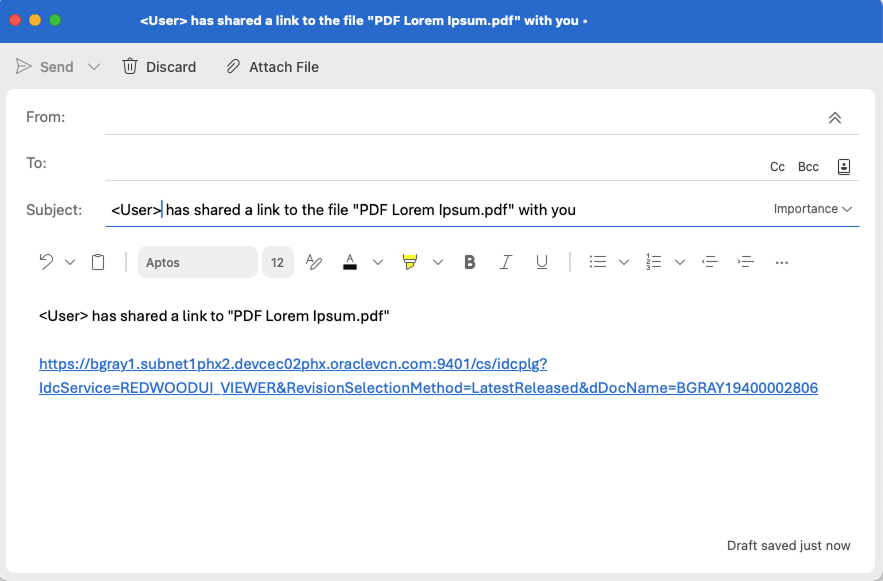
Emailing Links
Each of the links in the properties panel Links tab have a button to send the link to email reciepents. Clicking this button will open the users default desktop email client with the a predefined subject and body message define and the link url included in the messgae body. Within the desktop email client, the user must enter the recipients for the mail can also personalize the subject and body text.
This example shows the link as it might appear with Microsoft Outlook as the email client.
Workflow
About Workflows
A workflow specifies how to route content for review and approval before it is released to the system. The workflow notifies users by e-mail when they have a file to review, and by displaying a workflow notification icon in the banner next to their user name.
Workflow Types
From a workflow participant’s point of view, there are two types of workflows:
A basic workflow defines the review process for specific content items, and must be initiated manually.
In a criteria workflow, a file enters the workflow automatically upon check‐in when its metadata matches predefined criteria.
Entering a File to a Workflow
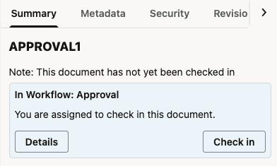
If you have been assigned as a contributor to a basic workflow, it notifies you that you have an item in the workflow by e-mail and a notification flag in the branding header next to the user menu.

To start the workflow, you must check in the designated files as the first step. To do so, click the Items in Workflow notification icon ( ) on the home page banner to display a listing of all the workflow items assigned to you. The notification icon provides a count of the number of workflow items that are currently assigned to you. The notification icon is not displayed when you there are no workflow items assigned to you.
Alternatively, you can open the Redwood UI to the Libraries view and open the Content In Workflow system library.
In either case, the resulting list displays all the content items assigned to you. Items requiring contribution will appear in the list with generic icons and opening the properties for the item will reveal a message banner indicating the item is waiting for you to check in a new document.

|

|
Do one of the following:
Right-click on the item in the result list to check in and select Check In from the contextual menu.
Select the item in the result list to check in and click the Check In action in the toolbar.
Select the item in the result list, click properties, and click Check In in the Summary properties panel.
Open the document in the Document to display the document properties and click Check In in the Summary properties panel.
Clicking the Check In button opens the Check In Workflow Content drawer, which is an instance of the standard Document Upload Drawer. In this, you are limited to selecting a single file for upload.
Select a profile and optionally choose the folder location for the document to be checked in. If no location is selected, the result to document will be added in unfiled state.
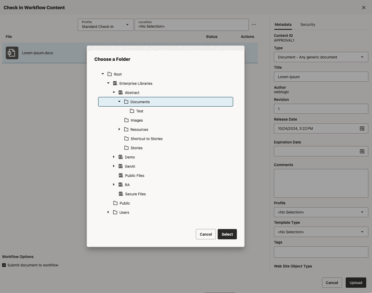
Select a file to check in and fill in the check-in form, then click Upload, noting the following:
By default, Submit document to workflow is enabled and any item checked in moves to the next step in the workflow.
Disabling Submit document to workflow and clicking Upload checks in the file but keeps it in edit status. It does not move to the next step in the workflow.
Reviewing Workflow Items Assigned to You
When you are assigned to the current step in a workflow, you receive an e-mail message and a notification flag in the branding header next to the user menu. When the required number of reviewers approve the revision, the content item goes to the next step in the workflow.
To review a file in a workflow, click the Items in Workflow notification icon () on the home page banner to display a listing of all the workflow items assigned to you. Alternatively, navigate the Redwood UI to the Libraries view and open the Content In Workflow system library. The resulting list displays all the content items assigned to you. Workflow items are assigned to you when you have a responsibility to check in or review the item.
Select an item requiring approval and the toolbar will present actions to Approve or Reject the item. If you open the Summary tab in the properties panel for the item, you will see a message banner with similar actions to Approve or Reject.
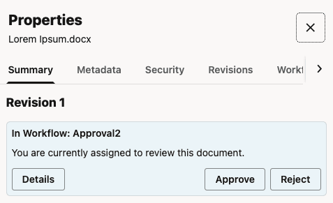
Actions For Workflow Items
Approve : Approves the item in a review step. There are three types of review steps: review, review/edit revision, and review/new revision. Once the required number of reviewers approve the item, it moves to the next step in the workflow. The option to approve is not available for an item in a contribution step.
Reject : Rejects the item in a review step and returns it to the most recent review step that allows editing. If there is no previous review step that allows editing, then it returns to the original contribution step.
Check In : Uploads a revised document for an item in a review or contribution step. If you check in a document in a review/new revision step, the revision number increments with each check in. This allows you to manage changed revisions to a document throughout the workflow process. If you check in a document in a review/edit revision step, then the revision number stays the same throughout the step. If it is the final step in the workflow, it stays at that revision even when the document is released at the end of the workflow. This allows you or others to change the document several times and only manage approved and released revisions.
Remove From Your Assignments: Removes the document from the Content in Workflow list results when the Assigned to you filter is applied. Selecting this option does not change the document’s workflow status or the operations you can perform on the document. If a subsequent workflow step assigns the document to you, it will again appear in the list generated by the Assigned to you filter. This option is available only if the Assigned to you filter is applied.
Workflow Details
To obtain details of the current workflow as well as the workflow history for a document, click the Details button in the workflow message banner on the Summary tab to open the Workflow sidebar panel. Alternatively, you can open the properties sidebar panel and manually select the Workflow sidebar panel tab.
The Redwood UI Viewer
Features of the Redwood UI Viewer
The Redwood UI viewer user interface supports the following key features:
The main document view is presented in the center panel.
A floating toolbar provides controls to adjust the sizing of the document presented in the center panel. This toolbar will appear initially when the document is displayed but will automatically hide after a few seconds. Display of the toolbar can be restored by either moving the mouse to the bottom of the viewer window or by using the hotkey "Shift+c". Use of the hotkey disables the auto-hide behaviour and the toolbar. The "Shift+c" hotkey must be used to toggle it on and off.
The hot key "z" cycles through the Fit width, Fit page, Actual Size, and Full Width options.
Use hotkey "f" to display in full screen. Using the Escape key while in full screen will restore the normal view.
Use the hotkeys "-" and "+" for manual zoom slider.
Use the hotkey "shift-r" to rotate the selected page Left or hotkey "r" to rotate it Right. Note: Rotation is provided to assist in previewing content that may be stored with incorrect rotation. It is a viewer operation only and does not persist with the document.
The page thumbnails panel is displayed on the left side. Selecting a page will navigate the center panel to the selected page.
The properties panel is displayed on the right side, containing tabs for Summary, Metadata, Security, Revisions, Annotations, Workflow, and Links.
The Summary tab provides a general summary of basic attributes of the document including Name, Title, Folder, File Size, Checked Out Status, Author, Create Date, and so on. It also provides a list of the renditions and attachments associated with the document.
In the rendition section, you are provided a list of the renditions created for the document. The exact renditions displayed may differ based on various factors, including Inbound Refinery Configuration and the rendition set chosen when the document was checked in. You can choose to view the renditions, download them, get rendition links to them, and view properties for the rendition.
In the attachment section, you can upload any files you want to attach to the document. For attachments, you can view, download, get direct access links, view properties for the attachment, and delete them (if you have the necessary permissions).
Note: The technology used to view attachments is different than the one used to view the native document. Attachments are downloaded and viewed using the browser’s native ability to view that file type. Some document types may be viewable as a native document but not as an attachment and vice versa. Additionally, annotation functionality is only available for native documents and not for renditions or attachments.The Metadata properties tab presents the documents metadata using the profile associated with the document by default, but users can choose to switch to presenting standard fields instead.
The Metadata properties tab also provides an Edit button to allow users (with appropriate permissions) to edit the metadata. Again, editing is by default done through the profile form, but the display can be switched to editing of standard fields.The Security properties tab displays security-specific metadata fields and provides an Edit button to allow users (with appropriate permissions) to edit the security-related properties of the document.
The Revisions properties tab displays revisions of the documents and supports download, deleting, and viewing specific revisions of the document.
The Annotations properties tab displays details of the annotations applied to the document. See Annotating Documents.
The Workflow properties tab provides access to workflow tasks and other workflow details for the document. See Workflow.
The Links properties tab provides access to the links for sharing the document.
Both the Thumbnails and Properties sidebar panels can be collapsed and expanded using the bar control in the space between the panel and the center area. Note that the Thumbnails panel is displayed and initially open for multi-page documents and initially closed for single page documents.
Redwood UI Viewer URL
In addition to being accessed through links from the native WebCenter Content UI, the Redwood UI Viewer can be accessed directly using the viewer service URL. The service for the viewer is displayed on the Content Information form in the UI as shown above.
.../cs/idcplg?IdcService=REDWOODUI_VIEWER&dID=123
URL Configuration Reference
This URL will present the viewer with all functionalities enabled. However, individual elements of the viewer can be disabled and/or enabled using the parameters on the URL.
| Parameter | Type | Comments |
|---|---|---|
embed
|
Boolean |
If
If
When not provided, this option defaults to |
dID
|
String
|
The dID of the document to display.
|
thumbnails
|
‘on’|‘off’
|
Determines whether the thumbnail panel is displayed.
When not provided, the default is determined by the value of the |
topbarControls
|
‘on’|‘off’|‘custom’
|
Sets the behavior of top bar control configuration.
|
topbarControlsConfig
|
object
|
Required when
|
properties
|
‘on’|‘off’|‘custom’ |
Sets the behavior of properties configuration.
|
propertiesConfig
|
object
|
Required when
|
imageControls
|
‘on’|‘off’|‘custom’
|
Sets the behavior of image controls configuration.
|
imageControlsConfig
|
object
|
Required when
|
videoControls
|
‘on’|‘off’|‘custom’
|
Sets the behavior of video controls configuration.
|
videoControlsConfig
|
object
|
Required when videoControls=custom. Default value for each property is ‘off’.
|
Object properties can either be provided using a full JSON syntax or in simplified JavaScript literal syntax.
Examples
Example 1
Hide all features (only the center area is displayed):
.../cs/idcplg?IdcService=WCC_VIEWER&dID=123&embed=true
Example 2
Hide all features and then show the thumbnails panel:
.../cs/idcplg?IdcService=WCC_VIEWER&dID=123&embed=true&thumbnails=on
Example 3
Show all features (embed=false is implied), but hide the properties panel:
.../cs/idcplg?IdcService=WCC_VIEWER&dID=123&properties=off
Example 4
Hide all features, but show the top bar with only the revision link button, show the thumbnails panel, and show the properties panel with only the Revisions tab:
.../cs/idcplg?IdcService=REDWOODUI_VIEWER&dID=123&embed=true&topbarControls=custom&topbarControlsConfig={"revisionLink":"on"}&thumbnails=on&properties=custom&propertiesConfig={"revisions":"on"}
Annotating Documents
If you have the necessary permissions, you can add or modify annotations to documents. Among other options, documents can be stamped Approved, have a particular text highlighted, or have a note addressing a specific issue added.
About Annotation Security
In some cases, not all annotations should be seen or allowed to be modified by all people. For example, upper management may annotate a request for proposal with pertinent information regarding an upcoming merger. Legally they may not be able to share that information with others in an organization who need access to that proposal, so the annotation permission is set to hide the annotation from those without proper permissions. Or perhaps a manager annotates a raise request denying the raise. The annotation can be restricted so the person who made the request cannot approve it by modifying the annotation. Or a document may contain personal information such as Social Security numbers or health issues that need to be redacted and protected. Redaction annotation can be set to restricted to prevent others from hiding or modifying them to see the information.
When you create an annotation, you can set permissions for the annotation using the annotation toolbar. The permissions you can set, and the annotations you can modify or see, are determined by the permissions you have been given by the system administrator. Generally, the following options are available in the toolbar:
Standard (S): Annotations appear on the document page for all users. They may be applied and changed only by users granted Standard annotation security permissions.
Restricted (T): Annotations are visible to all users but can be modified only by a user granted the restricted permission. If you do not have the restricted permission (permission to change restricted documents), you can view the annotation but cannot alter it or change the permissions.
Hidden (H): Annotations are visible only to users that have been granted the hidden permission. Only users having the hidden permission can mark an annotation as hidden or modify existing hidden annotations.
Note:
If no annotation security is assigned to a person, they cannot create new or modify existing annotations. However, they still can view all Standard and Restricted annotations. This ensures that redaction annotations are applied for all people with rights to view a document. Users must be granted the security level they assign to an annotation. For example, users assigned only the restricted security level can grant only the restricted security level to any annotation they create. Users that have been assigned the standard and restricted security levels by an administrator can specify a security level of standard or restricted, but not hidden.
Note:
Redaction annotations cannot be marked hidden.
Show and Hide Annotations
In some cases when viewing a document, annotations may get in the way of seeing information on the document you need to see. Click the Show Annotations tool (hotkey “a”) in the image viewer toolbar to toggle the display of annotations on the document.

Create Annotations
Before creating annotations, you need to first select the page on which the new annotations are to be placed. Click on the page anywhere other than on an existing annotation. Alternatively, you can select the page from the thumbnails panel to the left of the screen. Once selected, the outer border of the page will change to a highlighted state.
Next, select the type of annotation you want to create from the “Create Annotations” tool drop-down menu on the image viewer toolbar. Choose from one of the following annotation types: Box, Highlight, Line, Redaction, Stamp, or Sticky Note.

Upon selection, a new instance of the annotation type will appear in the center of the selected page, and it will be displayed in its selected state. You can move it by dragging it around the page, resize it by adjusting one of the eight grab handles that appear around its perimeter, or adjust its properties by first selecting the pencil icon in the upper left hand corner of the annotation and then editing its attributes in the Annotations sidebar panel.

Edit Annotations
To edit an existing annotation, you first need to select it, either by clicking it directly on the page or by selecting it from the list in the Annotation sidebar. When selecting from the list in the properties panel, the document page will be scrolled so that the selected annotation is visible in the view port.
Once selected, you can move it by dragging the annotation around the page, resize it by adjusting one of the eight grab handles that appear around its perimeter, or edit its attributes in the Annotations sidebar panel.
To access the annotation’s attributes in the Attributes properties panel, you can either click the pencil icon directly on the annotation, or click the arrow on the right hand side of the item in the annotation lists in the properties panel. The attribute details panel for that annotation will slide in to the Attributes properties, revealing all of its available attributes. The specific attributes presented will vary based on the annotation type. To edit the attributes, click the Edit button at the bottom to enter edit mode, make changes and save or cancel as necessary. At anytime, you can return to the annotation list by click the Back button at the top of the Annotations properties panel.
Delete Annotations
To delete an annotation, you first need to select it and access its attribute details view, as described above. From the details view, select the Edit button at the bottom to enter edit mode. Select the Delete icon at the bottom to delete the annotation. Since this operation cannot be undone, a dialog will appear asking you to confirm your intention to delete the selected annotation.

Filter Annotations
Use the filter tool on the image viewer toolbar to filter the displayed annotations by users. You can filter out or show annotations for all users or filter out or show annotations for specific users, including the annotations created by the current users. If annotations created by the current user (you) are filtered out and you try to create a new annotation, the filter for the current user will be cleared so that the newly created annotation can be displayed.

Accessing the Redwood UI Viewer from the Native WebCenter Content UI
The View in Redwood Viewer option that will allow you to open a document in the Redwood UI Viewer is available as a new Actions menu item in the search results. The Redwood Viewer option is also available in the Content Information page for a document in the links section. Note that these options are only present for logged-in users. The new document viewer is not yet supported for viewing publicly accessible documents anonymously.


If using Trays Layout preference (configurable from the user's profile page), the new UI appears embedded within the UI as shown here. In Top Menus Layout, the viewer will appear full page within the same tab window as the client. In either case, the browser's Back button will return to the page used to launch the viewer.


The Redwood UI Outlook Integration
Features of the Redwood UI Outlook Integration
The Outlook Add-in is contextual to the currently selected item and supports two flows: the first one, to embed documents and folders, either as links or as attachments, into the item, and the second one, to save the item’s content as a new document(s).
The add-in is available for mail and calendar items, either new or existing. It is invoked from the Apps button, which depending on the type of item selected, can be found either on the Outlook top toolbar, for items under composition (new or exisiting), or on the item’s contextual toolbar above the body, for all other existing items (not under composition).
The add-in is displayed as a panel inside of outlook and is structured as a wizard, where users can go back and forth between pages to adjust the settings. All pages have an action button located on the bottom right corner. All secondary pages have a button to return to the main page located on the top left corner.
Before starting using the add-in, the users need to authenticate. This process will take them to a browser page, and once the authentication is successful, they will be instructed to return to the add-in.

Once a flow is completed, a confirmation page will be displayed, and the users can either continue using the add-in or they can close it. Any errors encountered during the usage would be displayed at the top of the panel in a auto closable banner.

Insert Items
This flow is available for outlook items under composition (new or edit) and allows the users to insert links or attachments to the selected item.
Select File Or Folder Page
The users can select a file or a folder by browsing, searching or using the MRU (Most Recently Used>) list. Once a selection is made the Next button will become enabled. The page will open automatically to the previously used location (if available) or to the root.

Insert File Or Folder Page
The users select how the file or folder will be inserted: as a link or as an attachment.
Files can be inserted using either options. As links, files can be inserted either as system link or as public link (if available). When using public links, the users can either create or select an existing one. The insert file operation will result in 2 links being inserted in the item’s body: view only and download.
Folders can be inserted only as native system links (view only).

Save Items
This flow is available for read only (not under composition) items, and allows the user to take the content of the selected item and save it as one or more documents.
Message Parts Page
The users can select which parts of the outlook message they want to save: the whole message and/or the attachments. Each option is associated with a suggested name for the file to be saved. The users can modify the names, and any invalid characters would be highlighted. Any errors would need to be addressed first, before proceeding to the next step.

Select Location Page
The users can select the location where the files would be saved. The page will open automatically to the previously used location (if available) or to the root.

Check In Page
Each file to be saved needs to be associated with a profile. The users can select to use a profile for all files (default behavior) or only for a particular file. If a file has all the profile’s required fields filled up, then it is ready to be saved. When all files satisfy this condition, then the action button will be enabled. Once the save operation starts, each processed file will display a progress bar and an updated status.

Notes for Administrators
In order to use the Redwood UI Outlook Integration, the following steps will need to be performed.- Copy the manifest.xml and save it locally.
- Open the manifest for editing.
- Inside the file, replace all the occurrences of the placeholder text “https://localhost:443” with the url for your instance and save the changes.
- Navigate to Advanced Component Manager tool found under AdminServer in the WebCenter Content web app and enable the WccOutlook component.
- Enable AutoSuggestConfig component to have access to search functionality in the add-in.
- Deploy the modified manifest file to your Exchange server (Microsoft 365 Admin Center).
manifest.xml
<?xml version="1.0" encoding="UTF-8" standalone="yes"?>
<OfficeApp xmlns="http://schemas.microsoft.com/office/appforoffice/1.1" xmlns:xsi="http://www.w3.org/2001/XMLSchema-instance" xmlns:bt="http://schemas.microsoft.com/office/officeappbasictypes/1.0" xmlns:mailappor="http://schemas.microsoft.com/office/mailappversionoverrides/1.0" xsi:type="MailApp">
  <Id>8C6D5898-89ED-433C-993B-077FE1E7D496</Id>
  <Version>1.0.0.1</Version>
  <ProviderName>Oracle</ProviderName>
  <DefaultLocale>en-US</DefaultLocale>
  <DisplayName DefaultValue="Oracle WebCenter"/>
  <Description DefaultValue="Oracle WebCenter Content Outlook Add-in."/>
  <IconUrl DefaultValue="https://localhost:443/cs/resources/wccoutlook/common/assets/icon-64.png"/>
  <HighResolutionIconUrl DefaultValue="https://localhost:443/cs/resources/wccoutlook/common/assets/icon-128.png"/>
  <SupportUrl DefaultValue="https://www.oracle.com/help"/>
  <AppDomains>
    <AppDomain>https://www.oracle.com</AppDomain>
  </AppDomains>
  <Hosts>
    <Host Name="Mailbox"/>
  </Hosts>
  <Requirements>
    <Sets>
      <Set Name="Mailbox" MinVersion="1.1"/>
    </Sets>
  </Requirements>
  <FormSettings>
    <Form xsi:type="ItemRead">
      <DesktopSettings>
        <SourceLocation DefaultValue="https://localhost:443/cs/idcplg?IdcService=WCC_OUTLOOK"/>
        <RequestedHeight>250</RequestedHeight>
      </DesktopSettings>
    </Form>
  </FormSettings>
  <Permissions>ReadWriteItem</Permissions>
  <Rule xsi:type="RuleCollection" Mode="Or">
      <Rule xsi:type="ItemIs" ItemType="Message" FormType="ReadOrEdit"/>
      <Rule xsi:type="ItemIs" ItemType="Appointment" FormType="ReadOrEdit" />
  </Rule>
  <VersionOverrides xmlns="http://schemas.microsoft.com/office/mailappversionoverrides" xsi:type="VersionOverridesV1_0">
    <Hosts>
      <Host xsi:type="MailHost"/>
    </Hosts>
    <VersionOverrides xmlns="http://schemas.microsoft.com/office/mailappversionoverrides/1.1" xsi:type="VersionOverridesV1_1">
      <Requirements>
        <bt:Sets DefaultMinVersion="1.3">
          <bt:Set Name="Mailbox"/>
        </bt:Sets>
      </Requirements>
      <Hosts>
        <Host xsi:type="MailHost">
          <DesktopFormFactor>
            <!-- Message Edit -->
            <ExtensionPoint xsi:type="MessageComposeCommandSurface">
                <!-- Use the default tab of the ExtensionPoint or create your own with <CustomTab id="myTab"> -->
                <OfficeTab id="TabDefault">
                    <Group id="msgEditGroup">
                        <Label resid="GroupLabel" />
                        <Control xsi:type="Button" id="msgEditOpenPaneButton">
                            <Label resid="TaskpaneEditButton.Label" />
                            <Supertip>
                                <Title resid="TaskpaneEditButton.Title" />
                                <Description resid="TaskpaneEditButton.Tooltip" />
                            </Supertip>
                            <Icon>
                      <bt:Image size="16" resid="Icon.16x16"/>
                      <bt:Image size="32" resid="Icon.32x32"/>
                      <bt:Image size="80" resid="Icon.80x80"/>
                            </Icon>
                            <Action xsi:type="ShowTaskpane">
                                <SourceLocation resid="Taskpane.Url" />
                            </Action>
                        </Control>
                        <!-- Go to http://aka.ms/ButtonCommands to learn how to add more Controls: ExecuteFunction and Menu -->
                    </Group>
                </OfficeTab>
            </ExtensionPoint>
            <!-- Appointment Compose-->
            <ExtensionPoint xsi:type="AppointmentOrganizerCommandSurface">
                <!-- Use the default tab of the ExtensionPoint or create your own with <CustomTab id="myTab"> -->
                <OfficeTab id="TabDefault">
                    <!-- Up to 6 Groups added per Tab -->
                    <Group id="apptEditGroup">
                        <Label resid="GroupLabel" />
                        <!-- Launch the add-in : task pane button -->
                        <Control xsi:type="Button" id="apptEditOpenPaneButton">
                            <Label resid="TaskpaneEditButton.Label" />
                            <Supertip>
                                <Title resid="TaskpaneEditButton.Title" />
                                <Description resid="TaskpaneEditButton.Tooltip" />
                            </Supertip>
                            <Icon>
                      <bt:Image size="16" resid="Icon.16x16"/>
                      <bt:Image size="32" resid="Icon.32x32"/>
                      <bt:Image size="80" resid="Icon.80x80"/>
                            </Icon>
                            <Action xsi:type="ShowTaskpane">
                                <SourceLocation resid="Taskpane.Url" />
                            </Action>
                        </Control>
                        <!-- Go to http://aka.ms/ButtonCommands to learn how to add more Controls: ExecuteFunction and Menu -->
                    </Group>
                </OfficeTab>
            </ExtensionPoint>
            <!-- Message Read -->
            <ExtensionPoint xsi:type="MessageReadCommandSurface">
              <OfficeTab id="TabDefault">
                <Group id="msgReadGroup">
                  <Label resid="GroupLabel"/>
                  <Control xsi:type="Button" id="msgReadOpenPaneButton">
                    <Label resid="TaskpaneReadButton.Label"/>
                    <Supertip>
                      <Title resid="TaskpaneReadButton.Title"/>
                      <Description resid="TaskpaneReadButton.Tooltip"/>
                    </Supertip>
                    <Icon>
                      <bt:Image size="16" resid="Icon.16x16"/>
                      <bt:Image size="32" resid="Icon.32x32"/>
                      <bt:Image size="80" resid="Icon.80x80"/>
                    </Icon>
                    <Action xsi:type="ShowTaskpane">
                      <SourceLocation resid="Taskpane.Url"/>
                    </Action>
                  </Control>
                </Group>
              </OfficeTab>
            </ExtensionPoint>
            <!-- Appointment read -->
            <ExtensionPoint xsi:type="AppointmentAttendeeCommandSurface">
              <!-- Use the default tab of the ExtensionPoint or create your own with <CustomTab id="myTab"> -->
              <OfficeTab id="TabDefault">
                <!-- Up to 6 Groups added per Tab -->
                <Group id="apptReadGroup">
                  <Label resid="GroupLabel" />
                  <!-- Launch the add-in : task pane button -->
                  <Control xsi:type="Button" id="apptReadOpenPaneButton">
                    <Label resid="TaskpaneReadButton.Label" />
                    <Supertip>
                      <Title resid="TaskpaneReadButton.Title" />
                      <Description resid="TaskpaneReadButton.Tooltip" />
                    </Supertip>
                    <Icon>
                      <bt:Image size="16" resid="Icon.16x16"/>
                      <bt:Image size="32" resid="Icon.32x32"/>
                      <bt:Image size="80" resid="Icon.80x80"/>
                    </Icon>
                    <Action xsi:type="ShowTaskpane">
                      <SourceLocation resid="Taskpane.Url" />
                    </Action>
                  </Control>
                  <!-- Go to http://aka.ms/ButtonCommands to learn how to add more Controls: ExecuteFunction and Menu -->
                </Group>
              </OfficeTab>
            </ExtensionPoint>
          </DesktopFormFactor>
        </Host>
      </Hosts>
      <Resources>
        <bt:Images>
          <bt:Image id="Icon.16x16" DefaultValue="https://localhost:443/cs/resources/wccoutlook/common/assets/icon-16.png"/>
          <bt:Image id="Icon.32x32" DefaultValue="https://localhost:443/cs/resources/wccoutlook/common/assets/icon-32.png"/>
          <bt:Image id="Icon.80x80" DefaultValue="https://localhost:443/cs/resources/wccoutlook/common/assets/icon-80.png"/>
        </bt:Images>
        <bt:Urls>
          <bt:Url id="Taskpane.Url" DefaultValue="https://localhost:443/cs/idcplg?IdcService=WCC_OUTLOOK"/>
        </bt:Urls>
        <bt:ShortStrings>
          <bt:String id="GroupLabel" DefaultValue="Oracle WebCenter"/>
          <bt:String id="TaskpaneReadButton.Label" DefaultValue="Save Files"/>
          <bt:String id="TaskpaneEditButton.Label" DefaultValue="Insert Links"/>
          <bt:String id="TaskpaneReadButton.Title" DefaultValue="Save files to Oracle WebCenter"/>
          <bt:String id="TaskpaneEditButton.Title" DefaultValue="Insert links from Oracle WebCenter"/>
        </bt:ShortStrings>
        <bt:LongStrings>
          <bt:String id="TaskpaneReadButton.Tooltip" DefaultValue="Opens panel to save files to Oracle WebCenter."/>
          <bt:String id="TaskpaneEditButton.Tooltip" DefaultValue="Opens panel to insert links from Oracle WebCenter."/>
          <bt:String id="ActionButton.Tooltip" DefaultValue="Perform an action when clicked."/>
        </bt:LongStrings>
      </Resources>
    </VersionOverrides>
  </VersionOverrides>
</OfficeApp>Using the Redwood User Interface of Oracle WebCenter Content
G31159-03
Last updated: January 2026
Copyright © 2025, Oracle and/or its affiliates.
Primary Author: Oracle Corporation