Comparing Different Statistics Over the Same Time Period
To compare values of different statistics over the same time period, first set the time range for all visualizations to be compared.
To set the same time range for all visualizations on a sheet, select the time range shown between the arrows at the top of the sheet. Selecting that time range displays the Set Time Range dialog.
-
Set the period. Use the Period menu to select the amount of time that will be shown in the width of the graph. Choices range from five minutes to one year.
-
Set the start or end time of the period.
-
If you select the Time button, select either Start Time or End Time and use the calendar and the clock to specify that start or end time for the selected period. Data scrolling is stopped.
-
Alternatively, select the Ending Now button. Data scrolling is not stopped.
-
-
When you select Set, all visualizations on the sheet adjust to show the time range you specified.
If you want to rearrange the visualizations, select the Move option on a Visualization Actions menu, and select the left and right arrows to move the visualization.
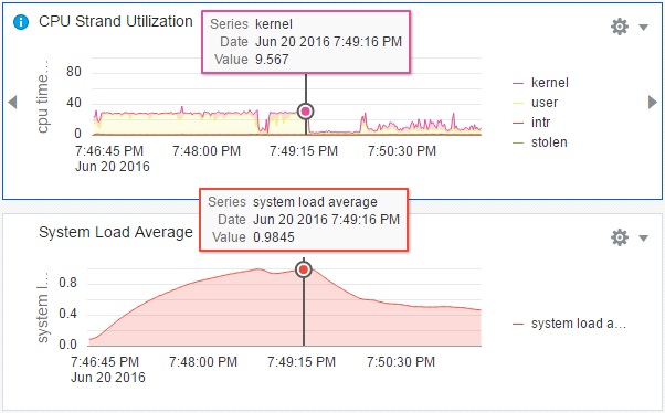
You might want to select Show Data Cursor from the Sheet Actions menu, as shown in the following figure.
The following figure shows an example of two visualizations of different statistics with the same time period set and the data cursor displayed.
Comparison of Different Statistics Over the Same Time Period
