Browser User Interface (BUI)
The Oracle ZFS Storage Appliance Browser User Interface (BUI) is the graphical tool for administration of the appliance. The BUI provides an intuitive environment for administration tasks, visualizing concepts, and analyzing performance data. The BUI provides an uncluttered environment for visualizing system behavior and identifying performance issues with the appliance.
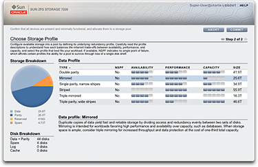
Direct your browser to the system by using either the IP address or host name you assigned to the NET-0 port during initial configuration as follows: https://ipaddress:215 or https://hostname:215
The login screen appears. If multi-factor authentication is enabled, you might be prompted for additional information during the login sequence.
The online help link in the top-right of the BUI screen is context-sensitive. For every top-level and second-level screen in the BUI, the associated help page appears when you click the Help button.
To view the online help library, which contains all online help documents, click the Help button to go to online help, and click the Release OS8.8.x breadcrumb. To view the documents in a different language, use the language selector, and then select a document to view its latest translation.
The masthead contains several interface elements for navigation and notification, as well as primary functionality. At left, from top to bottom, are the Sun/Oracle logo, a hardware model badge, and hardware power off/restart button. Across the right, again from top to bottom: login identification, logout, help, main navigation, and subnavigation.

System alerts appear in the Masthead as they are triggered. If multiple alerts are triggered sequentially, refer to the list of recent alerts found on the Dashboard screen or the full log available on the Logs screen.
Use the main navigation links to view between the Configuration, Maintenance, Shares, Status, and Analytics areas of the BUI. Use sub-navigation links to access features and functions within each area.
If you provide a session annotation, it appears beneath your login ID and the logout control. To change your session annotation for subsequent administrative actions without logging out, click on the text link. For details about session annotations, see Configuring Users.
The title bar appears below the Masthead and provides local navigation and functions that vary depending on the current view.

For example, the Identity mapping service title bar enables the following:
-
Navigation to the full list of services through the side panel
-
Controls to enable or disable the Identity Mapping service
-
A view of Identity Mapping uptime
-
Navigation to the Properties, Rules and Logs screens for your Identity Mapping service
-
Button to Apply configuration changes made on the current screen
-
Button to Revert configuration changes applied on the current screen
To quickly navigate between Service and
Project views, open and close the side panel by clicking the
title or the reveal ![]() arrow.
arrow.
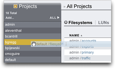
To add projects, click the Add link in the sidebar.
To move shares between projects, click the move icon ![]() and drag a filesystem share to the appropriate project in the side panel. Note that dragging a share into another project will change its properties if they are set to be inherited from its parent project.
and drag a filesystem share to the appropriate project in the side panel. Note that dragging a share into another project will change its properties if they are set to be inherited from its parent project.
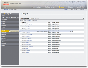
Most BUI controls use standard web form inputs; however, there are a few key exceptions worth noting.
Table 1-1 Key Web Form Exceptions
| Summary of BUI Controls | Description |
|---|---|
|
Modify a property |
Click the edit icon |
|
Add a list item or property entry |
Click the add icon |
|
Remove a list item or property entry |
Click the remove icon |
|
Save changes |
Click the Apply button |
|
Undo saved changes |
Click the Revert button |
|
Delete an item from a list |
Click the trash icon |
|
Search for an item in a list |
Click the search icon |
|
Sort by list headings |
Click on the bold sub-headings to re-sort the list |
|
Move or drag an item |
Click the move icon |
|
Rename an item |
Click the rename icon |
|
View details about your system |
Oracle logo. To navigate to the Oracle product page for your model, click the model badge. |
|
Automatically open side panel |
Drag an item to the side panel |
When setting permissions, the RWX boxes are clickable targets. Clicking on the access group label (User, Group, Other) toggles all permissions for that label on and off.

To edit Share properties, deselect the Inherit from project check box.
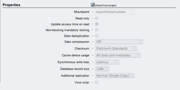
To view controls for an item in a list, hover the mouse over the row.

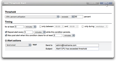
All modal dialog boxes have titles and buttons that identify and commit or cancel the current action at top, and content below. The modal content area follows the same interface conventions as the main content area, but are different in that they must be dismissed using the buttons in the title bar before other actions can be performed.
Icons indicate system status and provide access to functionality, and in most cases serve as buttons to perform actions when clicked. It is useful to hover your mouse over interface icons to view the tool tip. The tables below provide a key to the conventions of the user interface.
The status lights are basic indicators of system health and service state.
Table 1-2 Status Indicators
| Icon | Description | Icon | Description |
|---|---|---|---|
|
|
On |
|
Warning |
|
|
Off |
|
Disabled |
The following icons are found throughout the user interface and cover most of the basic functionality.
Table 1-3 BUI Icons
| Icon | Description | Icon | Description |
|---|---|---|---|
|
|
Rename (edit text) |
|
Sever |
|
|
Move |
|
Clone |
|
Enabled: Disabled: |
Edit |
|
Rollback |
|
Enabled: Disabled: |
Destroy |
|
Appliance power |
|
Enabled: Disabled: |
Add |
|
Apply |
|
Enabled: Disabled: |
Remove |
|
Revert |
|
Enabled: Disabled: |
Cancel or close |
|
Info |
|
|
Error |
|
Sort list column (down) |
|
|
Alert |
|
Sort list column (up) |
|
Enabled: Disabled: |
On/Off toggle |
Enabled: Disabled: |
First page |
|
Enabled: Disabled: |
Restart |
Enabled: Disabled: |
Previous page |
|
|
Locate |
Enabled: Disabled: |
Next page |
|
Enabled: Disabled: |
Disable/Offline |
Enabled: Disabled: |
Last page |
|
Enabled: Disabled: |
Lock |
|
Search |
|
|
Wait spinner |
Enabled: Disabled: |
Menu |
|
|
Reverse direction |
Enabled: Disabled: |
Panel |
The following icons are used to distinguish different types of objects and provide information of secondary importance.
Table 1-4 Miscellaneous Icons
| Icon | Description | Icon | Description |
|---|---|---|---|
|
|
SAS |
|
Storage pool |
|
|
SAS port |