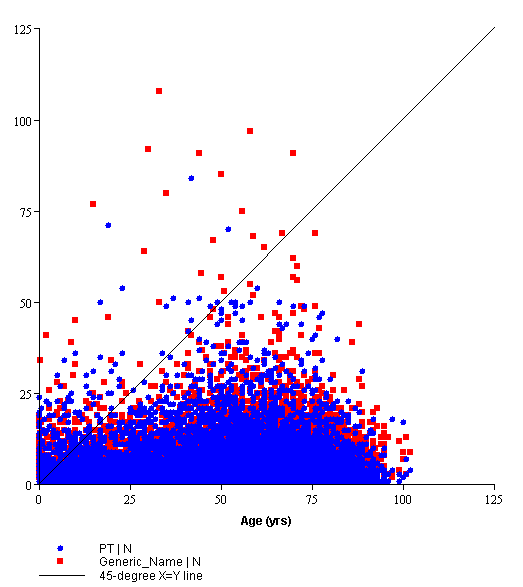
A scatter plot is the plotting of data points against horizontal and vertical axes to show the correlation between two or more continuous variables. You select a variable to plot against the x-axis of the scatter plot, and one or two variables to plot against the y-axis.
You can select a variable by which to subset data. For example, you can view a different scatter plot for each adverse event.
If you want to use a color key to associate each dot on the graph with a particular value, you can specify an inner breakdown variable. For example, to determine the particular case ID associated with each dot, you can use the case ID as the inner breakdown variable.
Note that:
The color key below the scatter plot shows which value of the inner breakdown variable each dot represents.
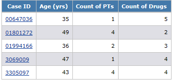
For example, a report shows age, count of PTs, and count of drugs for each case ID:
Depending on the display options that you specify, the graph might look like this: